Punk Grunge

Fusion of punk attitude and grunge texture with maximum rawness

Compare Punk Grunge with another style →
Record035-PG
AestheticPunk Grunge
ClassAnalog / Expressive
StatusINGESTING
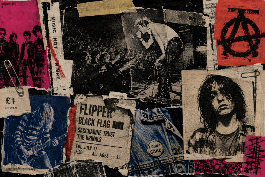
Example of the Punk Grunge aesthetic
Archive platepunk grunge
Source document

Registrar's index cards on the platen glass - captured by the scanner

Omoro Archive - Registrar's OfficePunk GrungeFILE 035-PG
When to use it
  • Aggressive music visuals
  • Maximum authenticity
+2 more in the Style Guide
Perfect for
  • Hardcore and metal bands
  • Underground culture
+2 more in the Style Guide
What it looks like
  • Layered distress
  • Aggressive typography
+2 more in the Style Guide
Omoro Style GuideAll 151 aesthetics, every field on this page, in one PDF.
Get the guide →
History

1976–1994 (formative); 2010s–present (ongoing revival) · UK (punk); Seattle, US (grunge); global (revival)

Punk grunge is the aesthetic hybrid of two distinct but related movements: British punk's confrontational DIY visual culture (1976–1979) and American grunge's thrift-store anti-glamour (1987–1994). The connecting thread is their shared rejection of polish, professionalism, and corporate aesthetics: both movements used visual rawness as a signal of authenticity.

Punk generated a graphic vocabulary from necessity: ransom-note cutout typography, xerox flyers, safety-pinned clothing, hand-drawn band logos. Grunge translated that energy into a more private, depressive mode: flannel, distressed denim, Kurt Cobain's rejection of rock-star presentation. Graphically, grunge added texture, grain, and monochrome photography to punk's aggressive compositions.

Contemporary punk grunge appears in fashion (Vivienne Westwood's continued relevance, ACNE Studios, and Vetements), independent music packaging, and any context that wants to signal authenticity by refusing refinement. It's used in skate culture, independent zine production, and brand identity for businesses that want to communicate anti-corporate values.

Visual markers

The visual DNA: what makes it recognisable

typography
  • Ransom note: cutout letters from different sources, mismatched sizes
  • Distressed and eroded letterforms: type that looks like it survived something
  • Hand-drawn and marker-written text: Sharpie boldness over refined craft
  • Stencil type: the letterforms of protest and the DIY underground
grid
  • Anti-grid: compositions that look assembled without rules
  • Torn edges, folded paper, and physical damage as compositional elements
  • Xerox photocopy texture: high contrast, grainy, slightly degraded
  • Collage: photographs and type cut and layered without pretense of seamlessness
materials
  • Xerox black: #1A1A1A: not rich ink black, the slightly grey black of a photocopy
  • Off-white: #F0EDE6: the color of aged newsprint or cheap paper
  • Blood red: #8B0000, #CC0000: confrontational, aggressive accent
  • Denim blue: #3B4F6E, #4A6FA5: the visual signature of grunge's workwear references
motifs
  • Safety pins, razor blades, and confrontational objects as design elements
  • Xeroxed band photos in hard black and white
  • Torn and ripped paper borders and texture
  • Handwritten lyrics, notes, and journal pages
Aesthetic profile

8-channel console - dominant channels taped & circled by the registrar

Attribute Console - 035-PG 8 CH ACTIVEFIG. 1
CH01Minimal
MaximalR·40
CH02Analog
DigitalL·70
CH03Restrained
ExpressiveR·70
CH04Cool
WarmR·10
CH05Futuristic
NostalgicR·60
CH06Structured
ChaoticR·70
CH07Dark
LightL·30
CH08Organic
GeometricL·30

strongest channels circled - leans analog, expressive, chaotic ✦

Profile card

Your aesthetic passport - share the fingerprint

Aesthetic Profile
Punk Grunge
MaximalAnalogExpressiveWarmNostalgicChaoticDarkOrganic
AnalogExpressiveChaotic
omoro.io/styles/punk-grunge
Color Palettes

4 color interpretations of this aesthetic

Punk Grunge
Crossover chaos - raw and fractured
Riot Grrrl
Bikini Kill and Sleater-Kinney: feminist punk in hot pink
Noise Rock
Sonic Youth feedback: abrasive signal and white noise
Downtown
NYC lower east side: chalk tags and torn show flyers
Photo Direction

How to shoot this aesthetic

"Angry and exhausted simultaneously the DIY spirit worn down to its beautiful irreducible core"

Shot list

  • Portrait with torn and hand-altered clothing against a concrete surface, direct flash, honest and hard
  • Environmental shot in a space that is simultaneously a home and a venue living room show aesthetics
  • Close portrait with inked-on patches, smudged eyeliner, and several days of sleeplessness visible in the face

Lighting

One practical tungsten lamp throwing hard light from the side in a domestic setting, everything else in natural ambient; reject any supplementary lighting entirely

Mood Board

Join waitlist for access

Join the waitlist for full access

Join the waitlist
Creative Application Analysis

Punk Grunge: where the language earns its place

Punk Grunge is most effective when its visual decisions do useful work. Fusion of punk attitude and grunge texture with maximum rawness

Best industries
Fashion and editorialFIT 9/10

The style gives styling, proportion, and image sequencing a clear point of view rather than treating them as decoration.

Hospitality and real estateFIT 8/10

It can turn atmosphere, material, and spatial pacing into evidence of a distinct experience before a visitor arrives.

Culture and premium retailFIT 8/10

It helps a physical or editorial environment feel authored, which raises attention and perceived care.

Best audiences
Design-literate viewersFIT 9/10

They recognize the references, proportion, and restraint that make the language feel intentional.

Considered buyersFIT 8/10

They respond to visible judgment because it reduces the feeling of interchangeable product.

Creative decision makersFIT 8/10

A coherent aesthetic gives them a usable standard for choosing images, objects, and collaborators.

Best products
Flagship productsA singular object benefits when the visual system concentrates attention rather than dispersing it.
Editorial publicationsThe language can hold a sequence of stories together while leaving room for individual subjects.
Spatial and service experiencesIt extends naturally into materials, signage, lighting, and the rhythm of arrival.
Best campaign types
Brand or product launchA defined visual language gives the first encounter enough conviction to establish a durable frame.
Editorial campaignIt rewards a sequence of related images rather than a single isolated hero shot.
Concept film or lookbookMotion, casting, set detail, and typography can all carry the same underlying logic.
Creative feasibility
Production costMedium

The cost comes from consistent art direction, suitable locations or materials, and time to edit the details that would otherwise undermine the premise.

Creative difficultyHigh

The challenge is conceptual. It takes visual literacy and a real point of view to avoid borrowing surface cues without their original logic.

Execution difficultyHigh

Lighting, casting, type, color, material, and retouching must agree. A single weak choice can make the work feel like an imitation.

Overall creative assessment

Punk Grunge creates its strongest advantage when it gives a brand a standard of judgment, not merely an attractive finish. It fails when recognizable cues are collected without a governing idea. The difference between average and exceptional execution is usually proportion: how much is shown, what is withheld, and whether every element belongs to the same world. The most capable teams pair an exacting art director with specialists who understand the medium, from photographer and stylist to set designer, editor, and typographer.

Strategic Recommendation

Should Punk Grunge be the strategic choice?

Best for
A brand with a real point of viewThe aesthetic works when it can sharpen an existing position, not invent one in its place.
High-consideration launchesA controlled visual system helps make an object, place, or service feel intentional before its details are fully understood.
Editorial, spatial, and experiential workThese formats allow composition, material, pacing, and typography to reinforce one another.
Creative portfolios and institutionsA sustained visual language can demonstrate discernment and make a body of work feel coherent.
Avoid if
The message must be read instantly by everyoneAesthetic nuance can compete with direct instructional clarity when accessibility is the first requirement.
The brand cannot sustain production standardsInconsistent imagery, typography, or material choices expose the gap between the concept and the execution.
The product has no credible relationship to the visual promiseStyling cannot compensate for a story, object, or service that does not support it.
Risk of misuseHigh

Surface imitation is easy. The language becomes generic when familiar cues replace proportion, specificity, and a coherent system.

Contemporary prevalenceCommon

Its visual ingredients appear regularly in contemporary work, but a rigorous execution remains distinguishable from a loose collection of references.

LongevityEnduring

Its strongest principles depend on composition, material, and cultural literacy rather than a short-lived visual effect.

Brand investmentHigh

It asks for consistency across photography, typography, motion, environments, and the many details that make a brand feel believable.

Creative verdict

Punk Grunge deserves serious consideration from brands and institutions that can articulate a real point of view and protect it through execution. It is less suitable for work that needs immediate instructional clarity, broad visual neutrality, or low-cost production flexibility. Its greatest advantage is differentiation through judgment: it can make a product, place, or editorial proposition feel authored rather than merely packaged. Average executions borrow recognizable signals, then lose coherence when type, casting, copy, or materials fail to agree. Exceptional executions understand the visual language as a system of choices, including what not to show. The largest mistake is treating the style as a finish applied after strategy. Adopt it only when the product and organization can carry the same standard of care the imagery proposes.

Editorial Depth

Join waitlist for access

Common Misconception
Historical Context
Brands That Accidentally Use This Style
Brands That Perfectly Represent This Style
Psychological Effect

Join the waitlist for editorial depth

Join the waitlist
Related concepts

Connected across the creative knowledge graph

Cross-references
Punkpunk grunge inherits directly from UK punk visual cultureGrungegrunge is one half of the punk grunge hybridGothicgothic and punk share confrontational anti-mainstream valuesPoster Collagecollage technique is central to both aesthetics
Compare
Punk Grunge vs Grunge
About this aesthetic
What is punk grunge aesthetic?
Punk grunge aesthetic combines British punk's confrontational DIY visual language (1976–1979) with Pacific Northwest grunge's distressed anti-glamour (1987–1994): ransom note type, xerox textures, torn paper, hand-drawn elements, and high-contrast black-and-white photography. It uses visual rawness as a signal of authenticity and anti-corporate values.
What colors characterize punk grunge aesthetic?
Punk grunge palette is dominated by xerox black (#1A1A1A), off-white newsprint (#F0EDE6), blood red (#8B0000), and denim blue (#3B4F6E). Deliberately avoids beauty and refinement: if it looks like it was photocopied on a broken machine, it's working. Occasional neon (punk's fluorescent accents) or army green (#4B5320) represents grunge's workwear reference.
How do I achieve punk grunge look in design?
Start with a high-contrast xerox or risograph texture as a background layer. Use ransom-note cut-up typography or distressed fonts. Add torn paper and ripped edge elements. Keep color to near-monochrome with one saturated accent (red or magenta). Avoid symmetry, clean grids, and obvious craft: the goal is a design that looks like it was assembled urgently, with more to say than time to say it politely.

Build with the punk grunge aesthetic

Omoro turns aesthetic references into on-brand visuals. Generate, compose and publish from one studio.

Join the waitlist