Registrar's index cards on the platen glass - captured by the scanner
1976–1982; influence ongoing · London and New York City; music subculture
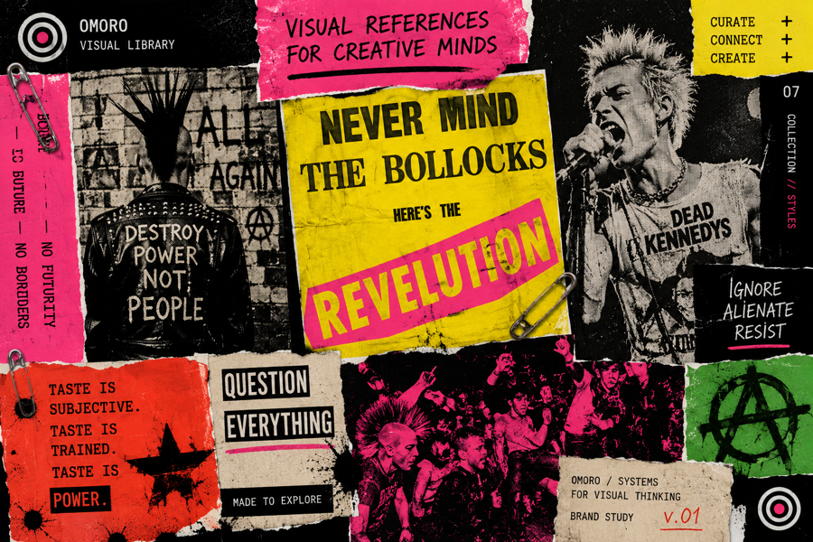
Punk visual culture emerged from the music scene of 1976–1977 in London (the Sex Pistols, the Clash, the Buzzcocks) and New York (Television, the Ramones, Patti Smith), and its graphic design was forged from economic necessity and ideological intention simultaneously. Jamie Reid's work for the Sex Pistols established the template: words cut from newspaper headlines and ransom-note-pasted onto paper, photocopied and distributed cheaply. The visual chaos was the message: a rejection of professional slickness that was also a rejection of the consumer culture that slickness served.
The cut-and-paste aesthetic had a political dimension. By using found materials: newspaper clippings, photocopied images, rubber stamps, stencils: punk graphic designers declared that design was not the province of trained professionals with expensive equipment, but of anyone with scissors, tape, and something to say. The zine (short for 'magazine') became the medium: self-published, photocopied, distributed by hand or through independent record shops, answerable to no advertiser or publisher.
Punk's graphic vocabulary: the ransom note, the safety pin, the spray stencil, the deliberate mis-registration of color printing: has been absorbed into mainstream design culture through fashion (Vivienne Westwood), advertising (the 1980s 'rebel brand' strategies), and digital design (neubrutalism owes it a direct debt). The Sex Pistols' 'God Save the Queen' single sleeve (Jamie Reid, 1977) is one of the most influential graphic design objects of the 20th century.
The visual DNA: what makes it recognisable
- Ransom-note typography: letters cut from newspapers at varying sizes and fonts
- Hand-stamped or stenciled type: imprecise registration is the point
- Distressed or deliberately degraded letterforms
- Photocopied multiple generations: increasing grain and edge deterioration
- No grid: intentional chaos as a political statement about design hierarchy
- Collage layout: torn edges, overlapping, misaligned
- Newspaper-column layout partially adopted, then deliberately violated
- High-contrast black and white with one or two spot colors
- Black (#000000) and white (#FFFFFF) as primary contrast pair
- Safety-pin silver: #A8A8A8, #888888
- Danger accent: red #CC0000, hot pink #FF0066, or acid yellow #FFFF00
- Newsprint grey: #D4D0C8, #C8C4BC: the ground of cheap reproduction
- Safety pins as both structural fastener and decorative element
- The Union Jack or national flag used as subversive or desecrated object
- Photocopied distortion and grain as texture
- Mohawks, leather jackets, and DIY customized clothing
8-channel console - dominant channels taped & circled by the registrar
Your aesthetic passport - share the fingerprint
4 color interpretations of this aesthetic
How to shoot this aesthetic
Join waitlist for access
Join the waitlist for full access
Join the waitlistPunk: where the language earns its place
Punk is most effective when its visual decisions do useful work. DIY rebellion with ransom note typography, safety pins, and anti-establishment energy
The style gives styling, proportion, and image sequencing a clear point of view rather than treating them as decoration.
It can turn atmosphere, material, and spatial pacing into evidence of a distinct experience before a visitor arrives.
It helps a physical or editorial environment feel authored, which raises attention and perceived care.
They recognize the references, proportion, and restraint that make the language feel intentional.
They respond to visible judgment because it reduces the feeling of interchangeable product.
A coherent aesthetic gives them a usable standard for choosing images, objects, and collaborators.
The cost comes from consistent art direction, suitable locations or materials, and time to edit the details that would otherwise undermine the premise.
The challenge is conceptual. It takes visual literacy and a real point of view to avoid borrowing surface cues without their original logic.
Lighting, casting, type, color, material, and retouching must agree. A single weak choice can make the work feel like an imitation.
Punk creates its strongest advantage when it gives a brand a standard of judgment, not merely an attractive finish. It fails when recognizable cues are collected without a governing idea. The difference between average and exceptional execution is usually proportion: how much is shown, what is withheld, and whether every element belongs to the same world. The most capable teams pair an exacting art director with specialists who understand the medium, from photographer and stylist to set designer, editor, and typographer.
Should Punk be the strategic choice?
Surface imitation is easy. The language becomes generic when familiar cues replace proportion, specificity, and a coherent system.
Its visual ingredients appear regularly in contemporary work, but a rigorous execution remains distinguishable from a loose collection of references.
Its strongest principles depend on composition, material, and cultural literacy rather than a short-lived visual effect.
It asks for consistency across photography, typography, motion, environments, and the many details that make a brand feel believable.
Punk deserves serious consideration from brands and institutions that can articulate a real point of view and protect it through execution. It is less suitable for work that needs immediate instructional clarity, broad visual neutrality, or low-cost production flexibility. Its greatest advantage is differentiation through judgment: it can make a product, place, or editorial proposition feel authored rather than merely packaged. Average executions borrow recognizable signals, then lose coherence when type, casting, copy, or materials fail to agree. Exceptional executions understand the visual language as a system of choices, including what not to show. The largest mistake is treating the style as a finish applied after strategy. Adopt it only when the product and organization can carry the same standard of care the imagery proposes.
Join waitlist for access
Join the waitlist for editorial depth
Join the waitlistConnected across the creative knowledge graph