Registrar's index cards on the platen glass - captured by the scanner
1943–1960 · New York City, USA
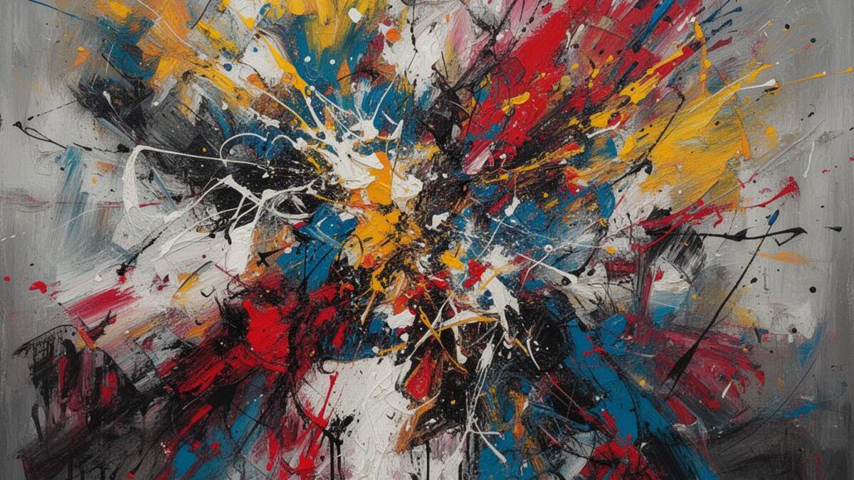
Abstract Expressionism emerged in New York in the early 1940s, nurtured by the presence of European Surrealist artists who had fled the war (Max Ernst, André Breton, Matta) and found in New York a city receptive to avant-garde experiment. The movement's name combines the two traditions it synthesized: European abstraction (Kandinsky, Mondrian) and the emotional directness of Expressionism (Kirchner, Kokoschka). But Abstract Expressionism was distinctly American: larger in scale, more physically assertive in execution, and invested in a mythology of the artist as heroic individual engaged in a existential struggle with the canvas.
The movement divided into two main tendencies. Action painting: Jackson Pollock (who dripped and poured paint directly onto canvas on the floor), Willem de Kooning (whose gestural, aggressive brushwork retained figurative fragments), and Franz Kline (monumental black brushstrokes on white): emphasized the physical act of painting itself as the subject. Color field painting: Mark Rothko (softly luminous rectangles of color), Barnett Newman (vast fields interrupted by thin vertical 'zips'), and Clyfford Still (ragged vertical color forms): used large areas of flat or gradient color to evoke transcendent emotional states rather than physical gesture.
Abstract Expressionism's critical reception was shaped by critic Clement Greenberg, who argued it represented the culmination of the Modernist trajectory toward pure painting: color and shape without representation. The movement's commercial success in the 1950s (MoMA and the State Department actively promoted it during the Cold War as evidence of American cultural freedom versus Soviet Social Realism) made New York rather than Paris the center of the international art world.
The visual DNA: what makes it recognisable
- No defining typography: Abstract Expressionism is a painting movement
- When applied to design: bold brush-mark quality, gestural and spontaneous
- Paint-quality texture translated to digital media
- Handwritten script at large scale as a single expressive mark
- No compositional grid: the entire canvas as a unified field
- All-over composition (Pollock): no hierarchy of figure and ground
- Large format: the paintings require scale to be experienced as intended
- The edge of the canvas as a compositional decision
- Rothko's color fields: deep cadmium red #8B2020, warm orange #D4601A, luminous yellow #D4A820
- Pollock's raw palette: commercial house paints in black, white, and raw umber
- De Kooning's flesh and yellow: #D4B870, #C8A060, #A08050
- Kline's monochrome: carbon black #1A1A1A on brilliant white #FFFFFF
- The gestural mark: the brush stroke as physical trace of the artist's body
- The drip and pour: paint applied by momentum rather than control
- The luminous color field: large areas of slightly graduated color
- The 'zip': Barnett Newman's thin vertical line as compositional division
8-channel console - dominant channels taped & circled by the registrar
Your aesthetic passport - share the fingerprint
4 color interpretations of this aesthetic
How to shoot this aesthetic
Join waitlist for access
Join the waitlist for full access
Join the waitlistAbstract Expressionism: where the language earns its place
Abstract Expressionism is most effective when its visual decisions do useful work. Bold, emotional non-representational art emphasizing spontaneity
The style gives styling, proportion, and image sequencing a clear point of view rather than treating them as decoration.
It can turn atmosphere, material, and spatial pacing into evidence of a distinct experience before a visitor arrives.
It helps a physical or editorial environment feel authored, which raises attention and perceived care.
They recognize the references, proportion, and restraint that make the language feel intentional.
They respond to visible judgment because it reduces the feeling of interchangeable product.
A coherent aesthetic gives them a usable standard for choosing images, objects, and collaborators.
The cost comes from consistent art direction, suitable locations or materials, and time to edit the details that would otherwise undermine the premise.
The challenge is conceptual. It takes visual literacy and a real point of view to avoid borrowing surface cues without their original logic.
Lighting, casting, type, color, material, and retouching must agree. A single weak choice can make the work feel like an imitation.
Abstract Expressionism creates its strongest advantage when it gives a brand a standard of judgment, not merely an attractive finish. It fails when recognizable cues are collected without a governing idea. The difference between average and exceptional execution is usually proportion: how much is shown, what is withheld, and whether every element belongs to the same world. The most capable teams pair an exacting art director with specialists who understand the medium, from photographer and stylist to set designer, editor, and typographer.
Should Abstract Expressionism be the strategic choice?
Surface imitation is easy. The language becomes generic when familiar cues replace proportion, specificity, and a coherent system.
Its visual ingredients appear regularly in contemporary work, but a rigorous execution remains distinguishable from a loose collection of references.
Its strongest principles depend on composition, material, and cultural literacy rather than a short-lived visual effect.
It asks for consistency across photography, typography, motion, environments, and the many details that make a brand feel believable.
Abstract Expressionism deserves serious consideration from brands and institutions that can articulate a real point of view and protect it through execution. It is less suitable for work that needs immediate instructional clarity, broad visual neutrality, or low-cost production flexibility. Its greatest advantage is differentiation through judgment: it can make a product, place, or editorial proposition feel authored rather than merely packaged. Average executions borrow recognizable signals, then lose coherence when type, casting, copy, or materials fail to agree. Exceptional executions understand the visual language as a system of choices, including what not to show. The largest mistake is treating the style as a finish applied after strategy. Adopt it only when the product and organization can carry the same standard of care the imagery proposes.
Join waitlist for access
Join the waitlist for editorial depth
Join the waitlistConnected across the creative knowledge graph