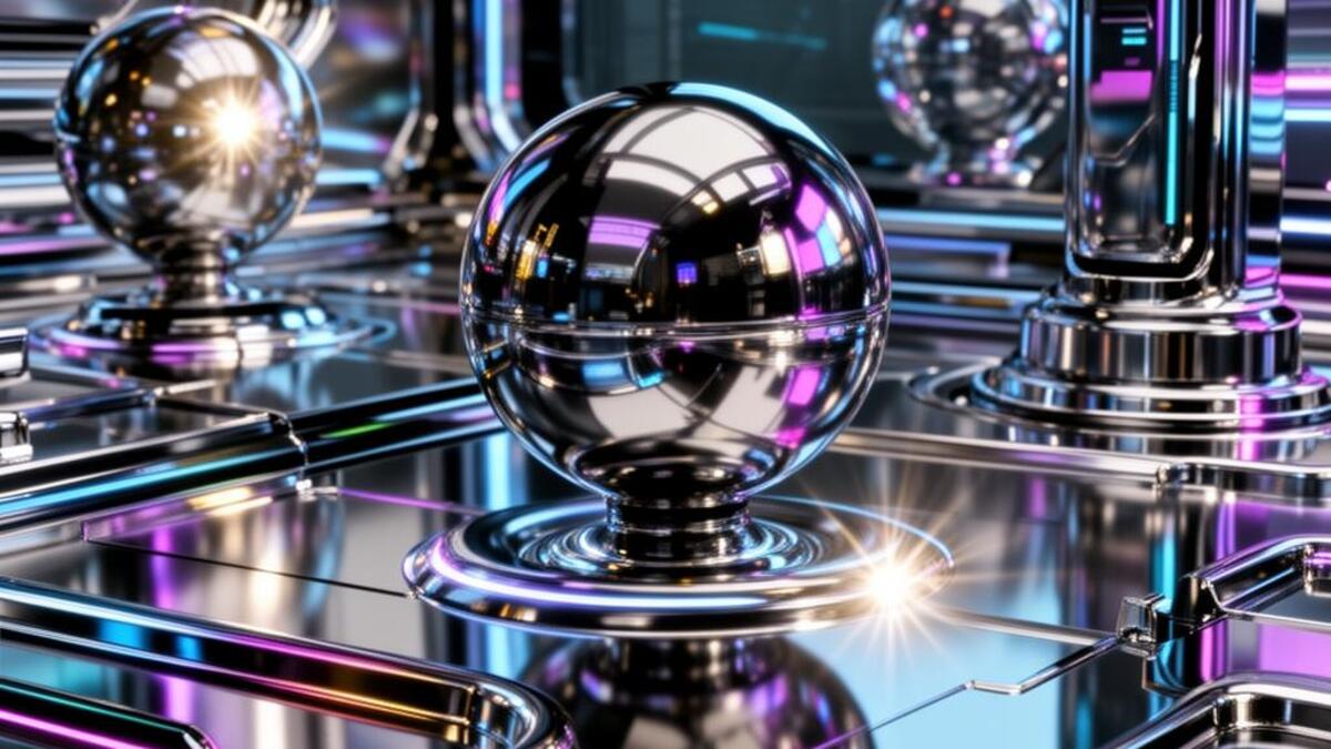
Mood guide · Visual archive

Innovation & Progress

What visual style signals innovation and the future?

system-likeprecision detailforward momentum

Innovation is visible precision.

Visual DNA
Contrast3/5
Geometry5/5
Texture2/5
Warmth1/5
Movement3/5
Precision5/5
Psychological effect

Precision implies engineering. Clear systems, measured spacing, and functional technical detail make a capability feel real before the viewer has studied the specification.

Recognition signals
system-likeprecision detailforward momentum
Common misread

Using future aesthetics to hide a vague product. The visual system must clarify the capability, not replace it.
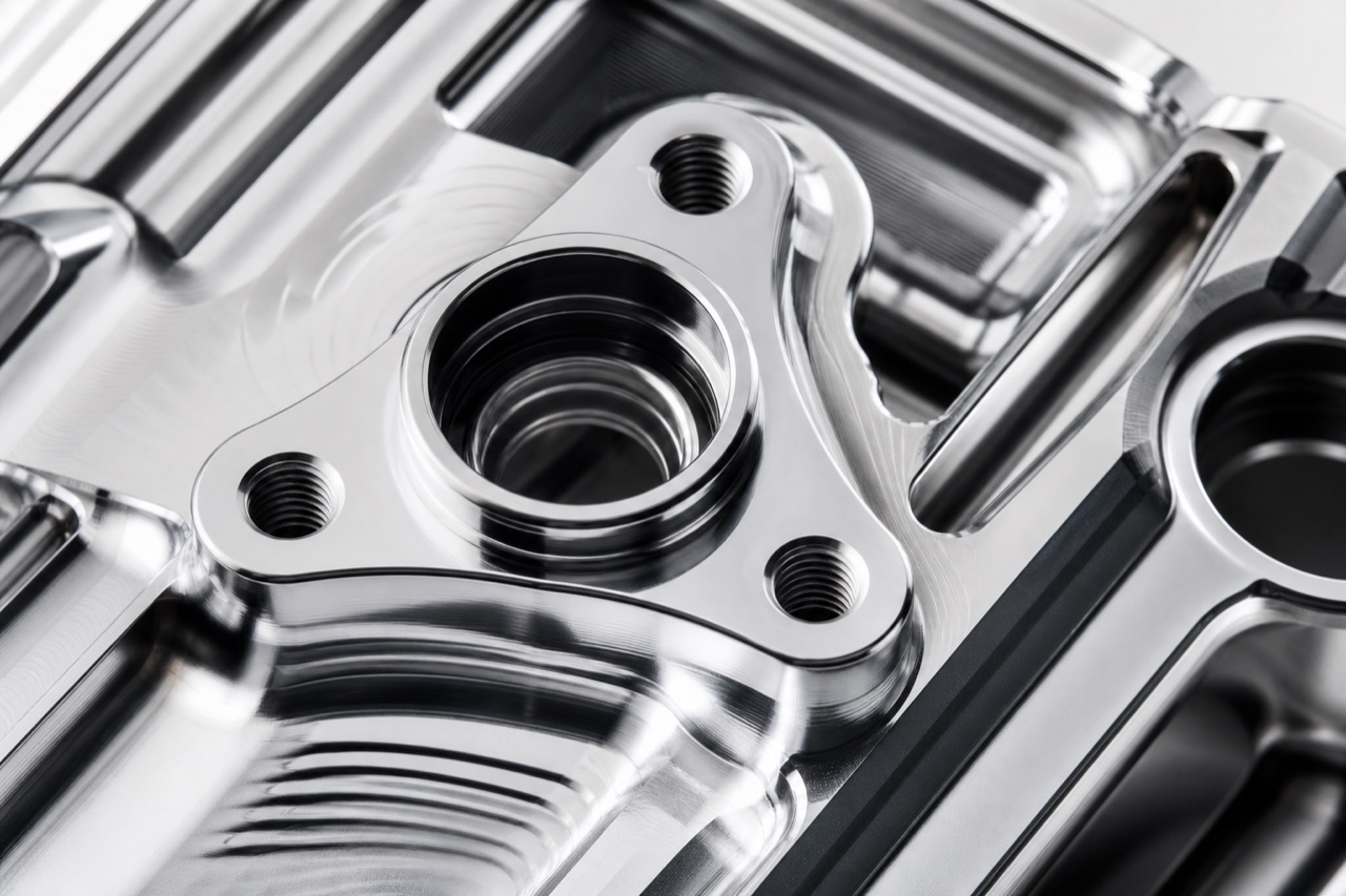

Innovation & Progress editorial reference
Mood referenceInnovation & Progress
Cyber Minimalism aesthetic - Innovation & Progress visual reference
Cyber Minimalism
Glassmorphism aesthetic - Innovation & Progress visual reference
Glassmorphism
Chromecore aesthetic - Innovation & Progress visual reference
Chromecore
Visual referencesInnovation & Progress

Chromecore and cyberminimalism communicate something different from most tech aesthetics: not the warmth of human-centered design but the authority of systems that work. The visual language is precise, material, and confident. Chrome and glass surfaces imply reflection and depth without decoration. Blueprint and technical diagram aesthetics signal that something real is being built underneath. The palette is narrow and controlled. This is the aesthetic of a company that has already solved the problem and is showing you what that looks like. The failure mode is using future-facing visuals as a substitute for a product that actually exists.

Why it works

Precision implies engineering. Clear systems, measured spacing, and functional technical detail make a capability feel real before the viewer has studied the specification.

Visual formula
System thinking+
Technical detail+
Controlled material+
Purposeful whitespace
=Capability & progress
Visual styles that communicate this
Cyber Minimalism
Creative decision support
Best for

Tools with real technical depth

Hardware launches

Infrastructure and research

Works well with

Trust · Sophistication · Energy

Opposite mood

Nostalgia & Memory

Common mistake

Using future aesthetics to hide a vague product. The visual system must clarify the capability, not replace it.

Creative Application Analysis

Innovation & Progress: practical creative value

Innovation & Progress is not a demographic shortcut. It is a perceptual register that changes how a viewer reads pace, care, risk, and relevance in a visual system.

Best industries
TechnologyMeasured detail and consistent interaction cues make a technical capability feel reliable before the viewer studies its specification.
Aerospace and defenseInnovation & Progress gives this context a sharper signal of care and judgment, especially when the work needs to feel authored rather than generic.
AutomotiveInnovation & Progress gives this context a sharper signal of care and judgment, especially when the work needs to feel authored rather than generic.
Best audiences
Creative professionalsThey respond to a mood when it gives them a sharper language for making and evaluating choices.
Considered audiencesThey read cohesion as evidence that the work has been thought through, not assembled by default.
People seeking a specific experienceThe mood creates a clear expectation of what the product, place, or story will feel like before it is explained.
Best products
Tools with real technical depthThe innovation & progress register gives this application a more immediate and distinctive point of entry.
Hardware launchesThe innovation & progress register gives this application a more immediate and distinctive point of entry.
Infrastructure and researchThe innovation & progress register gives this application a more immediate and distinctive point of entry.
Best campaign types
Brand positioningA sustained mood provides a decision rule for art direction, writing, image selection, and physical touchpoints.
Editorial and social seriesRepeated visual signals make a sequence coherent without making every frame identical.
Experience or launch filmSound, pace, casting, lighting, and material can reinforce a single perceptual promise.
Creative feasibility
Production costHigh

Material or render quality has to actually hold up. Weak versions look fake immediately.

Creative difficultyMedium

The visual codes are established. Avoiding generic sci-fi cliche takes real thought.

Execution difficultyHigh

Chrome, glass, and precision surfaces show every shortcut taken.

Overall creative assessment

Innovation & Progress creates competitive advantage where experience matters as much as information. It works best when the product, service, or story already contains evidence that can support the feeling. The common failure is to apply the mood as a filter, then leave the structure, casting, copy, and pacing unchanged. Exceptional work uses it as a governing decision rule. It knows what to amplify, what to withhold, and where a small concrete detail can do more than a large stylistic gesture. The teams most likely to succeed are small, observant, and cross-disciplinary: an art director with a strong editor, photographer or filmmaker, stylist or spatial designer, and a client willing to protect the central idea through production.

Strategic Recommendation

When innovation & progress should guide the work

Best for
Tools with real technical depthInnovation & Progress gives this work a perceptual logic that can carry across image, copy, motion, and environment.
Hardware launchesInnovation & Progress gives this work a perceptual logic that can carry across image, copy, motion, and environment.
Infrastructure and researchInnovation & Progress gives this work a perceptual logic that can carry across image, copy, motion, and environment.
Avoid if
The product doesn't actually have the capability being impliedNo amount of chrome or precision styling saves a claim the product can't back up.
The category needs warmth over technical precisionThis register is built on cold authority, which can work against categories built on care.
Risk of misuseHigh

Future-facing visuals standing in for a capability that doesn't actually exist yet is a common failure.

Contemporary prevalenceCommon

The default visual language for nearly every technology category right now.

LongevityTrend

The specific codes for 'the future' shift as fast as tech culture and hardware design do.

Brand investmentHigh

Material and render quality has to be real. A weak version reads as fake immediately.

Creative verdict

Innovation & Progress is worth adopting when a brand, product, or cultural project needs to make a specific experiential promise before it can be explained in words. It is not a substitute for clarity, proof, or a coherent product. The greatest advantage comes from using the mood as a decision rule: it tells the team how to light a scene, pace a film, select a material, edit a sentence, and decide what to leave out. Average work applies familiar cues and stops there. Exceptional work makes every choice support the same perceptual outcome, while retaining enough specificity that the audience can believe it. The biggest mistake is assuming that emotional recognition alone creates strategic value. Use innovation & progress only when the operation behind the image can honor the experience the image promises.

When to use this visual mood
  • Deep tech and infrastructure companies where the capability needs to feel real
  • AI and machine learning products communicating precision and reliability
  • Hardware launches where material quality is a core selling point
  • B2B SaaS positioning around efficiency and system-level thinking
  • Aerospace, defense, and industrial sectors where authority matters
  • Automotive brands emphasizing engineering over lifestyle
  • Scientific and research institutions communicating rigorous credibility
What to avoid
  • Overloading with technical imagery that obscures what the product actually does
  • Future aesthetics paired with vague or abstract benefit claims
  • Chrome and glass surfaces that feel decorative rather than functional
  • Cold precision applied to categories where warmth builds more trust
  • Retrofit futurism: old ideas dressed in new visual language
Industries and use cases
TechnologyAerospace and defenseAutomotiveHealthcare techB2B softwareIndustrial and manufacturing
Mood relationships
Innovation & ProgressTrustSophisticationEnergyOpposite: Nostalgia & Memory
Trust & ReliabilitySophistication & Culture
About this mood
What visual style communicates innovation & progress?

Chromecore and cyberminimalism communicate something different from most tech aesthetics: not the warmth of human-centered design but the authority of systems that work. The visual language is precise, material, and confident. Chrome and glass surfaces imply reflection and depth without decoration. Blueprint and technical diagram aesthetics signal that something real is being built underneath. The palette is narrow and controlled. This is the aesthetic of a company that has already solved the problem and is showing you what that looks like. The failure mode is using future-facing visuals as a substitute for a product that actually exists.

Styles that carry it

  1. Cyber Minimalism
  2. Glassmorphism
  3. Chromecore
  4. Tech Spec
  5. Blueprint
  6. Motion Design
When should I use a innovation & progress aesthetic?

Deploy it for

  1. Deep tech and infrastructure companies where the capability needs to feel real
  2. AI and machine learning products communicating precision and reliability
  3. Hardware launches where material quality is a core selling point
  4. B2B SaaS positioning around efficiency and system-level thinking
  5. Aerospace, defense, and industrial sectors where authority matters
  6. Automotive brands emphasizing engineering over lifestyle
  7. Scientific and research institutions communicating rigorous credibility
What industries use innovation & progress visual design?

Where it performs

  1. Technology
  2. Aerospace and defense
  3. Automotive
  4. Healthcare tech
  5. B2B software
  6. Industrial and manufacturing
What should I avoid when designing for a innovation & progress mood?

These undo the mood faster than anything else builds it.

Do not

  1. Overloading with technical imagery that obscures what the product actually does
  2. Future aesthetics paired with vague or abstract benefit claims
  3. Chrome and glass surfaces that feel decorative rather than functional
  4. Cold precision applied to categories where warmth builds more trust
  5. Retrofit futurism: old ideas dressed in new visual language

Omoro Studio · Creative System

Generate in the Innovation register

Omoro reads your visual references and generates in your exact aesthetic. Drop in images that carry the right mood and it extracts the DNA automatically.

Join the waitlist