Registrar's index cards on the platen glass - captured by the scanner
Industrial age–present; design appropriation from 2010s · Engineering and technical documentation; NASA, aerospace, military design systems
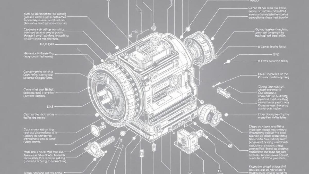
Technical specification drawing: the blueprint, the schematic, the engineering diagram: developed in parallel with modern industrial manufacturing from the mid-19th century onward. The system of orthographic projection (showing an object from multiple fixed viewpoints simultaneously), standardized line weights (thick for visible edges, thin for hidden edges, dashed for center lines), and annotation conventions (dimension lines, tolerance callouts, material specifications) created a visual language of extreme precision that was entirely functional. The aesthetic quality of technical drawings: their geometric clarity, the purity of white lines on blue ground, the information density achieved without decoration: was incidental to their purpose.
The appropriation of technical drawing aesthetics into design began in earnest with the space program visual culture of the 1960s–1970s. NASA's technical publications, with their engineering diagrams of rockets and spacecraft, developed a visual language that combined the precision of technical drawing with the drama of cutting-edge technology. The NASA 'worm' logotype (1975) and the overall visual identity of Apollo-era publications influenced a generation of designers toward the beauty of technical precision.
Contemporary tech-spec design appears in automotive and aerospace branding (every car advertisement now features exploded-view diagrams), technology product marketing (Apple's technical animations of chip architecture), industrial design portfolios, and the broader aesthetic of 'precision as luxury' that uses technical drawing conventions to signal intelligence, complexity, and exactitude. The blueprint aesthetic is also widely used as a decorative surface for wallpaper, textiles, and product packaging.
The visual DNA: what makes it recognisable
- Monospaced type: Courier, OCR-A, or engineering-specification fonts
- Helvetica or Univers at small size for technical annotation
- Uppercase throughout: the convention of engineering callouts
- Dimension lines and annotation arrows as typographic devices
- The technical drawing grid: fine blue or grey lines at regular intervals
- Orthographic projection: front, side, and top views of the same object simultaneously
- Callout lines: thin leader lines connecting labels to features
- Title block: standardized information panel in the lower right corner
- Blueprint: white lines on Prussian blue #003366 or navy #001A4D
- Modern technical: dark blue #0A1428 or near-black #0D0D1A with bright lines
- Bright line color: white #FFFFFF or electric blue #00A8FF on dark backgrounds
- Dimension accent: orange #FF6600 or red #CC0000 for highlighted measurements
- Exploded view diagram: object components separated and arranged in assembly order
- Cross-section: interior structure revealed by cutting through the object
- Callout annotation: circles with leader lines identifying specific features
- The title block: project name, date, revision, and engineering certification
8-channel console - dominant channels taped & circled by the registrar
Your aesthetic passport - share the fingerprint
4 color interpretations of this aesthetic
How to shoot this aesthetic
Join waitlist for access
Join the waitlist for full access
Join the waitlistTech Spec: where the language earns its place
Tech Spec is most effective when its visual decisions do useful work. Technical documentation aesthetics with diagrams, specifications, and schematics
The style gives styling, proportion, and image sequencing a clear point of view rather than treating them as decoration.
It can turn atmosphere, material, and spatial pacing into evidence of a distinct experience before a visitor arrives.
It helps a physical or editorial environment feel authored, which raises attention and perceived care.
They recognize the references, proportion, and restraint that make the language feel intentional.
They respond to visible judgment because it reduces the feeling of interchangeable product.
A coherent aesthetic gives them a usable standard for choosing images, objects, and collaborators.
The cost comes from consistent art direction, suitable locations or materials, and time to edit the details that would otherwise undermine the premise.
The challenge is conceptual. It takes visual literacy and a real point of view to avoid borrowing surface cues without their original logic.
Lighting, casting, type, color, material, and retouching must agree. A single weak choice can make the work feel like an imitation.
Tech Spec creates its strongest advantage when it gives a brand a standard of judgment, not merely an attractive finish. It fails when recognizable cues are collected without a governing idea. The difference between average and exceptional execution is usually proportion: how much is shown, what is withheld, and whether every element belongs to the same world. The most capable teams pair an exacting art director with specialists who understand the medium, from photographer and stylist to set designer, editor, and typographer.
Should Tech Spec be the strategic choice?
Surface imitation is easy. The language becomes generic when familiar cues replace proportion, specificity, and a coherent system.
Its visual ingredients appear regularly in contemporary work, but a rigorous execution remains distinguishable from a loose collection of references.
Its strongest principles depend on composition, material, and cultural literacy rather than a short-lived visual effect.
It asks for consistency across photography, typography, motion, environments, and the many details that make a brand feel believable.
Tech Spec deserves serious consideration from brands and institutions that can articulate a real point of view and protect it through execution. It is less suitable for work that needs immediate instructional clarity, broad visual neutrality, or low-cost production flexibility. Its greatest advantage is differentiation through judgment: it can make a product, place, or editorial proposition feel authored rather than merely packaged. Average executions borrow recognizable signals, then lose coherence when type, casting, copy, or materials fail to agree. Exceptional executions understand the visual language as a system of choices, including what not to show. The largest mistake is treating the style as a finish applied after strategy. Adopt it only when the product and organization can carry the same standard of care the imagery proposes.
Join waitlist for access
Join the waitlist for editorial depth
Join the waitlistConnected across the creative knowledge graph