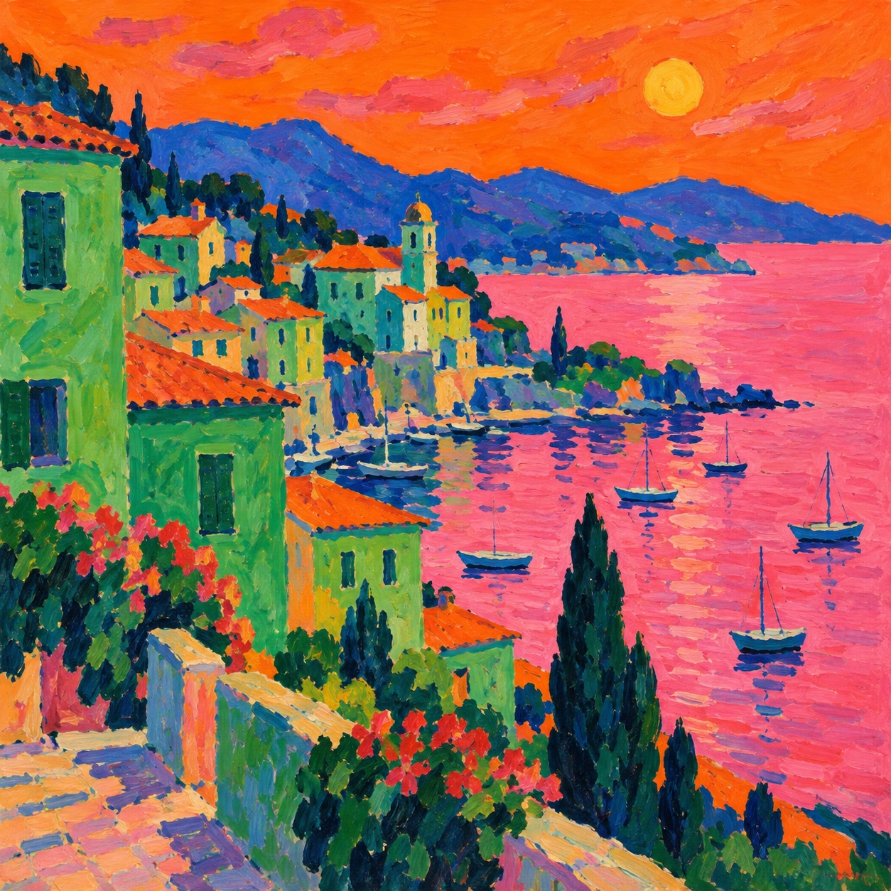
Poppy Orange sets the weight of the palette in warmth and creativity, and Vermilion is the swatch that breaks rank: a single red that stops the set reading as one note. Saturation averages 76 percent with Poppy Orange at the top, which is loud enough that the palette will fight anything else on the page. Poppy Orange and Chrome Yellow are close enough in hue and lightness that most people will read them as one colour, which makes them a pair to separate rather than two choices to spend.
Poppy Orange a citrus-bright orange: enthusiasm, playfulness, an unmistakable call to attention.
Vermilion carries urgency and appetite, the color the eye finds first.
Viridian signals growth, balance, and permission, the color of go, of nature, of money in Western contexts.
Cobalt an electric or cobalt blue: trust with real conviction, confident rather than passive.
Chrome Yellow a citrus-bright orange: enthusiasm, playfulness, an unmistakable call to attention.
Colour used wrongly on purpose: green faces, red seas and violet trees in fast, thick, unblended strokes, from the 1905 Salon d'Automne to an illustration language for brands that want joy
Explore the full Fauvism style guide