When to use it
- Food, drink and hospitality brands that want warmth and appetite
- Travel and destination campaigns with sun in them
- Illustration for editorial, packaging and murals that needs energy
- Fashion and textiles built on clashing colour
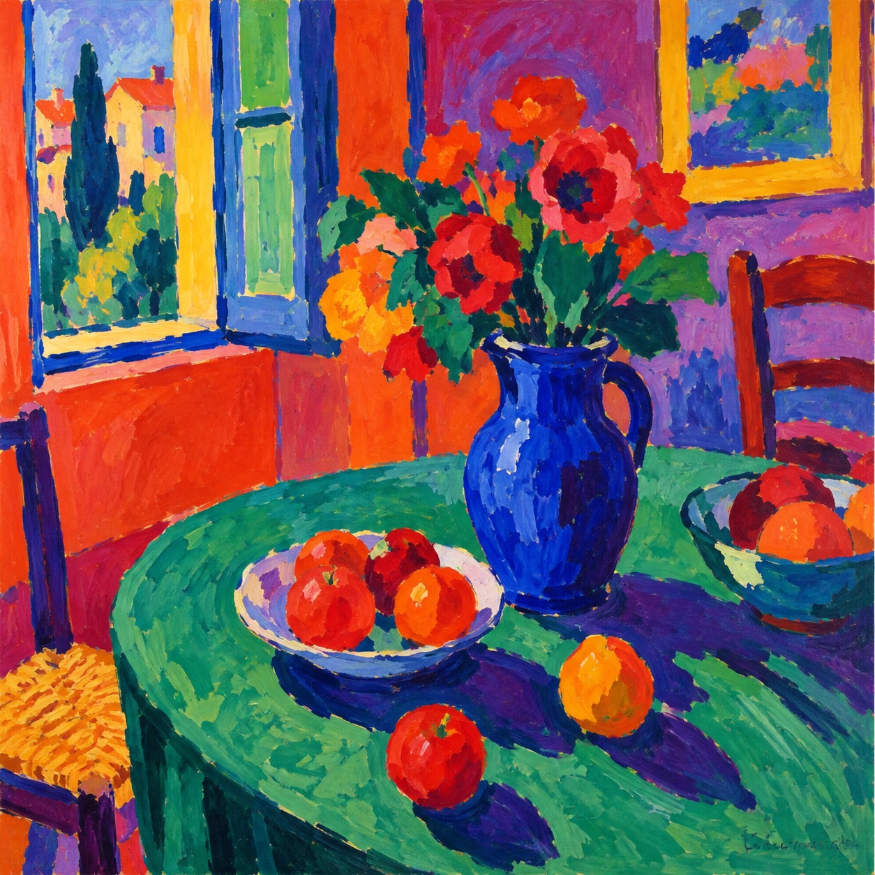
Colour used wrongly on purpose: green faces, red seas and violet trees in fast, thick, unblended strokes, from the 1905 Salon d'Automne to an illustration language for brands that want joy
What it is, when it works, who it is for, and where it already exists.
Record 025-FA - when it works, who it is for, what it looks like
Where this aesthetic shows up in the real world · ↗ opens the source site
Where Fauvism came from, what makes it recognisable, and the fingerprint it leaves.
1905-1908; an illustration language now · Collioure and the Paris Salon d'Automne
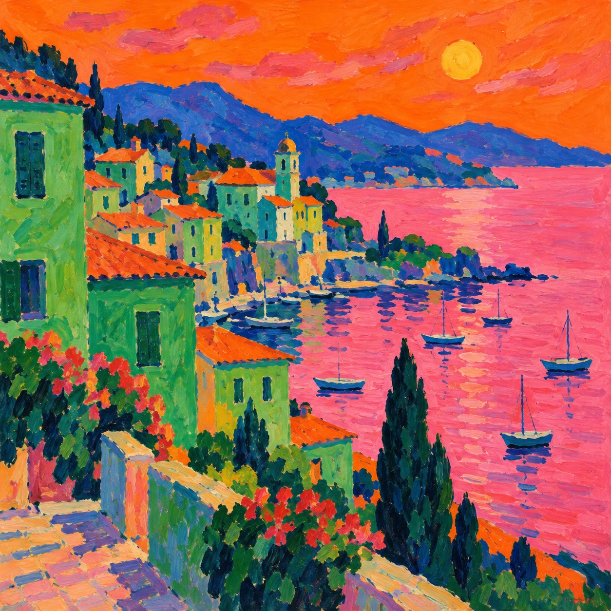
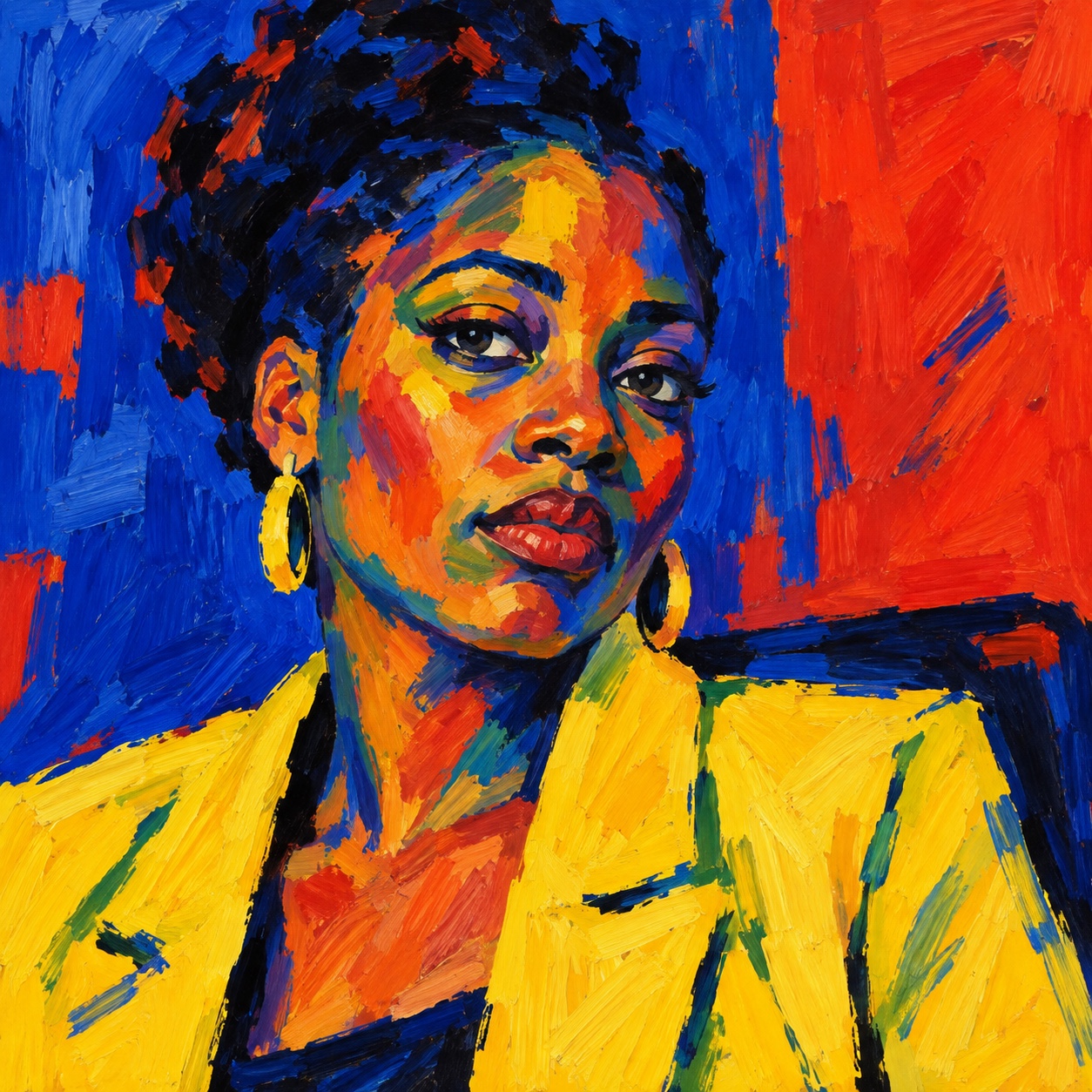
Fauvism happened in one summer and one room. In 1905 Henri Matisse and André Derain painted together at Collioure on the Mediterranean, pushing colour past description: a red sea, a green shadow, a face divided by a stripe of viridian. When their pictures hung at the Salon d'Automne in Paris that October, with Matisse's Woman with a Hat at the centre of the outrage, the critic Louis Vauxcelles called the room a cage of fauves, wild beasts, and the name stuck.
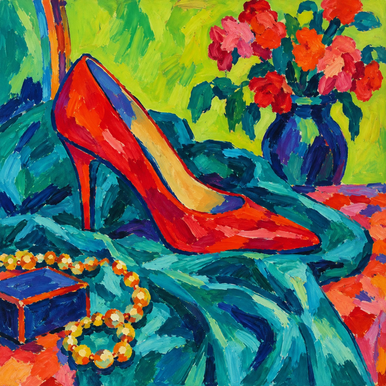
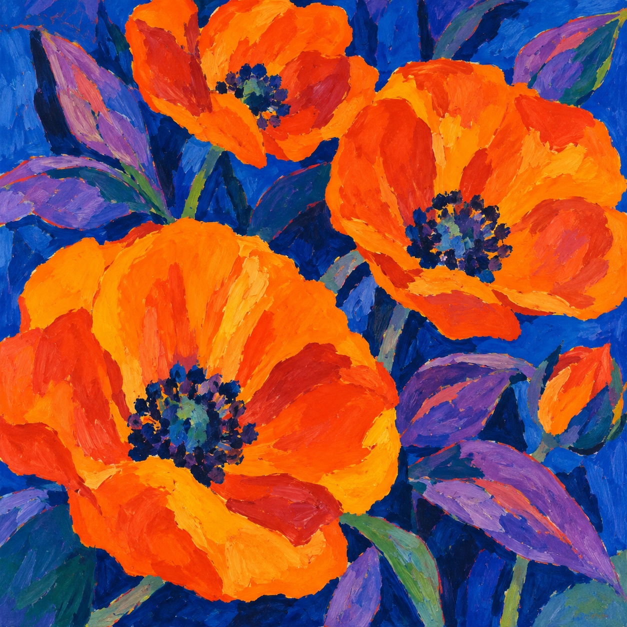
Maurice de Vlaminck, the most instinctive of them, had seen the Van Gogh retrospective that spring and painted red trees and blue roads without apology; Derain went to London in 1906 and painted the Thames in vermilion and violet. The style was colour laid fast and thick, unblended, straight from the tube, with outlines in a contrasting hue and the canvas showing through. It lasted three or four years before the painters moved on, Matisse toward decoration and Derain toward Cézanne.
Its afterlife is in illustration and design. Expressionism took its violence, Matisse's later cut-outs took its joy, and every brand that wants colour without softness, food, wine, travel, summer, ends up close to it. The current version is a language waiting to be named: a few colours used wrongly on purpose, a fast hand, and a subject you can taste or feel the sun on.
“Colour in the wrong place on purpose, laid fast and left raw.
The visual DNA: what makes it recognisable
8-channel console with the fingerprint on its display. Save the card, or share the page

The definitive color scheme for this aesthetic
The colour of the styles sitting closest to this one
How to shoot it, how to prompt it, and how to board it.
How to shoot this aesthetic
"Shoot the subjects Fauvism painted, in hard southern sun, then push the colour wrong in the grade"
Shot list
Lighting
Hard Mediterranean sun, high and direct, so shadows are solid shapes to fill with the wrong colour. No fill; let contrast be extreme. Grade toward a few saturated hues and let the rest go raw.
Drop this into Studio to generate in this aesthetic
Fauvism aesthetic, a 1905 painting of a Mediterranean harbour or terrace, colour used wrongly on purpose, vermilion water, a viridian shadow across a face, a violet tree, cobalt sky, chrome yellow shutters, thick fast unblended brushstrokes, contrasting outlines, raw canvas showing between patches, three or four colours only, joyful and wild, no blending, no gradients, no readable text
The record applied to your project. The record's kit is free; your brand, references and plates come with membership
01 · Hero application02 · Material and finish03 · Palette in context04 · Photography directionWhether to use it, what it costs to do properly, and where it stands right now.
Two written calls, seven meters, and when to walk away
Pick three or four colours and put each one in the wrong place on purpose: a green face, a red shadow. Paint fast, leave the edges raw and the ground showing, and outline in a colour that is not the fill. A full rainbow, blended, is not Fauvism; it is a mess.
Right when the brand sells appetite, sun or pleasure: restaurants, wine, food, travel, resorts, fashion and homeware. It rewards a few colours used boldly and a fast hand, and fails as a rainbow.
Paint, or a few inks; the style was made fast and cheap on purpose.
Misusing colour well is harder than it looks; the choices are the design.
Fast strokes that read as confident rather than careless take a practised hand.
Without the discipline of a few colours it becomes generic bright illustration.
Food, wine, travel and summer brands are circling it under other names.
A hundred and twenty years old, and joy in colour has never gone out of date.
A painter and a few inks cover packaging, menus, murals and a campaign.
A Pro feature: origins, practitioners, and pitfalls
Neighbours, cross-references, blends, and the questions people ask.
Connected across the creative knowledge graph
Where it stands now, and what it costs you to use it
Fauvism is the colour language food, wine, travel and summer brands are already reaching for without the name: a few colours used wrongly on purpose, a fast hand and a subject with sun on it. It reads as joyful and human against smooth, generated images, and it prints beautifully in a few inks.
Its failure mode is the rainbow. Every colour at once, blended, is not Fauvism; the originals used a handful of colours in the wrong places and left the edges raw. The work that lands chooses three or four colours, misuses them on purpose, keeps the strokes fast and lets the ground show.
Mix Fauvism with any style in the library
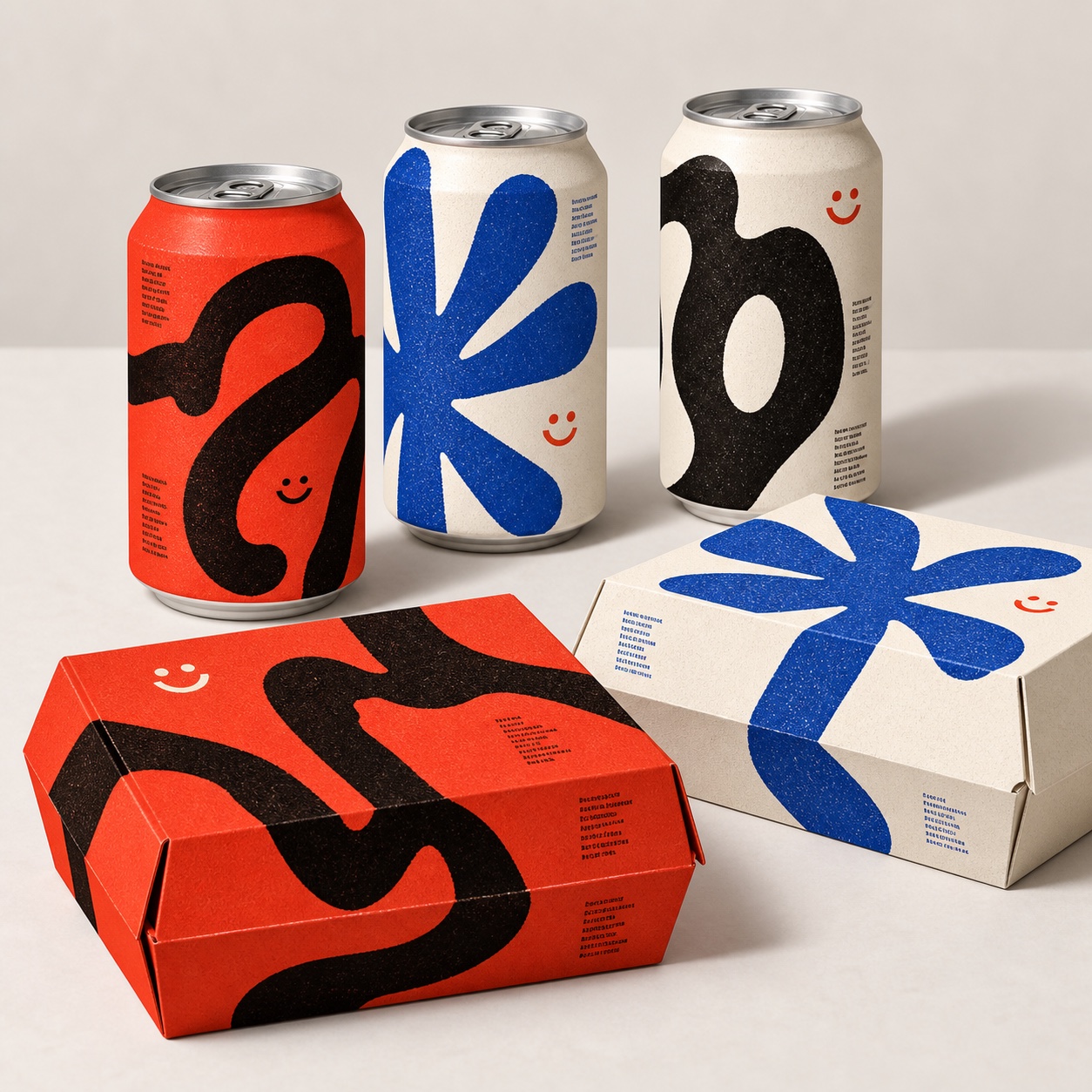 Fauvism 50%Naïve Design 50%
Merged palette
#FB6008
#E8412A
#C5302F
#1E3FCF
#349468
Leads analog, expressive, organic
Typography · from Fauvism
Raleway over Merriweather
Materials
The calls this blend forces
These two disagree on one thing, and a blend cannot average them: you pick a side. At this mix:
Maximal or Minimal? Fauvism is maximal, Naïve Design is minimal. This mix lands maximal.
Use it
Fauvism aesthetic, a 1905 painting of a Mediterranean harbour or terrace, colour used wrongly on purpose, vermilion water, a viridian shadow across a face, a violet tree, cobalt sky, chrome yellow shutters, thick fast unblended brushstrokes, contrasting outlines, raw canvas showing between patches, three or four colours only, joyful and wild, no blending, no gradients, no readable text (50%), infused with Naive design brand identity aesthetic, handmade but disciplined, one oversized abstract brush glyph or loose handwritten scribble as the whole composition, simple symbols such as a smiley face, a five-petal flower or a tomato, raw screenprint and risograph grain with imperfect ink coverage, off-white uncoated paper, generous empty space, tiny registration marks and colour swatch strips as details, restricted palette of tomato red, cobalt blue, emerald green, sulfur yellow, black and cream, real-world print application, direct and optimistic, no busy illustrated scene, no characters, no gradients, no polished vector, no readable text, no logos, color palette strictly #FB6008 #E8412A #C5302F #1E3FCF #349468, leaning maximal over minimal, overall character: analog, expressive, organic
A short, violent moment in French painting around 1905 to 1908 when Matisse, Derain and Vlaminck used colour for feeling rather than description: green faces, red seas, violet trees, laid in fast, thick, unblended strokes. The critic Louis Vauxcelles called them fauves, wild beasts, at the 1905 Salon d'Automne.
Impressionism kept colour tied to light and blended it; Fauvism cut the tie and left the strokes raw. Expressionism, in Germany, took the same freedom toward anguish; Fauvism stayed joyful, decorative and Mediterranean, which is why it suits food, travel and summer.
Because it reads as warm, human and unafraid, and because it is cheap to reproduce: a few flat colours in the wrong places print in three or four inks. Food, wine, hospitality and travel brands want appetite and sun, and Fauvism supplies both without softness.
Choose three or four colours and misuse them on purpose, one per object: a red shadow, a green face. Paint fast, leave the strokes and the ground showing, outline in a colour that is not the fill, and pick a subject you can taste or feel the sun on. Blending, gradients and a full rainbow undo it.
Every style in the library is broken down like this one: the palette, the typography, the materials and the lineage.
Explore the style library →