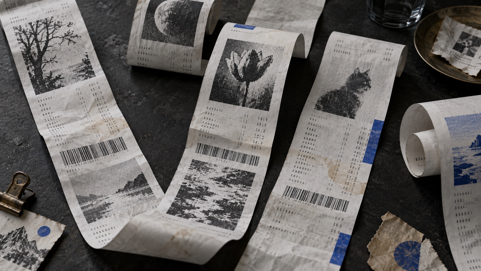
Thermal White sets the weight of the palette in optimism and clarity, and Fresh Print is the swatch that breaks rank: a single charcoal that stops the set reading as one note. Fresh Print to Thermal White spans 81 points of lightness, so the palette can carry its own hierarchy without reaching for a second one. Thermal White and Crease Cream are close enough in hue and lightness that most people will read them as one colour, which makes them a pair to separate rather than two choices to spend.
Thermal White a pale butter yellow, gentle brightness, comfort more than alarm.
Fresh Print is black's softer relative, still authoritative, but with enough warmth to feel considered rather than severe.
Faded Print is true neutrality, balance and restraint, a color that recedes so the palette's other choices can carry the emotional weight.
Crease Cream a burnt or terracotta orange, warmth read through a rustic, sun-worn filter.
End-of-Roll Pink reads as pure adrenaline: alarm, desire, the color of things that move fast.
Thermal receipts treated as keepsakes: narrow vertical strips, faded one-bit images, monospace transaction type, totals, timestamps and barcode marks, creased and slightly degraded
Explore the full Receipt Prints style guide