Where Receipt Prints came from, what makes it recognisable, and the fingerprint it leaves.
History, Receipt Prints aesthetic history
1980s to now · Point-of-sale thermal printing, turned into a personal and social format
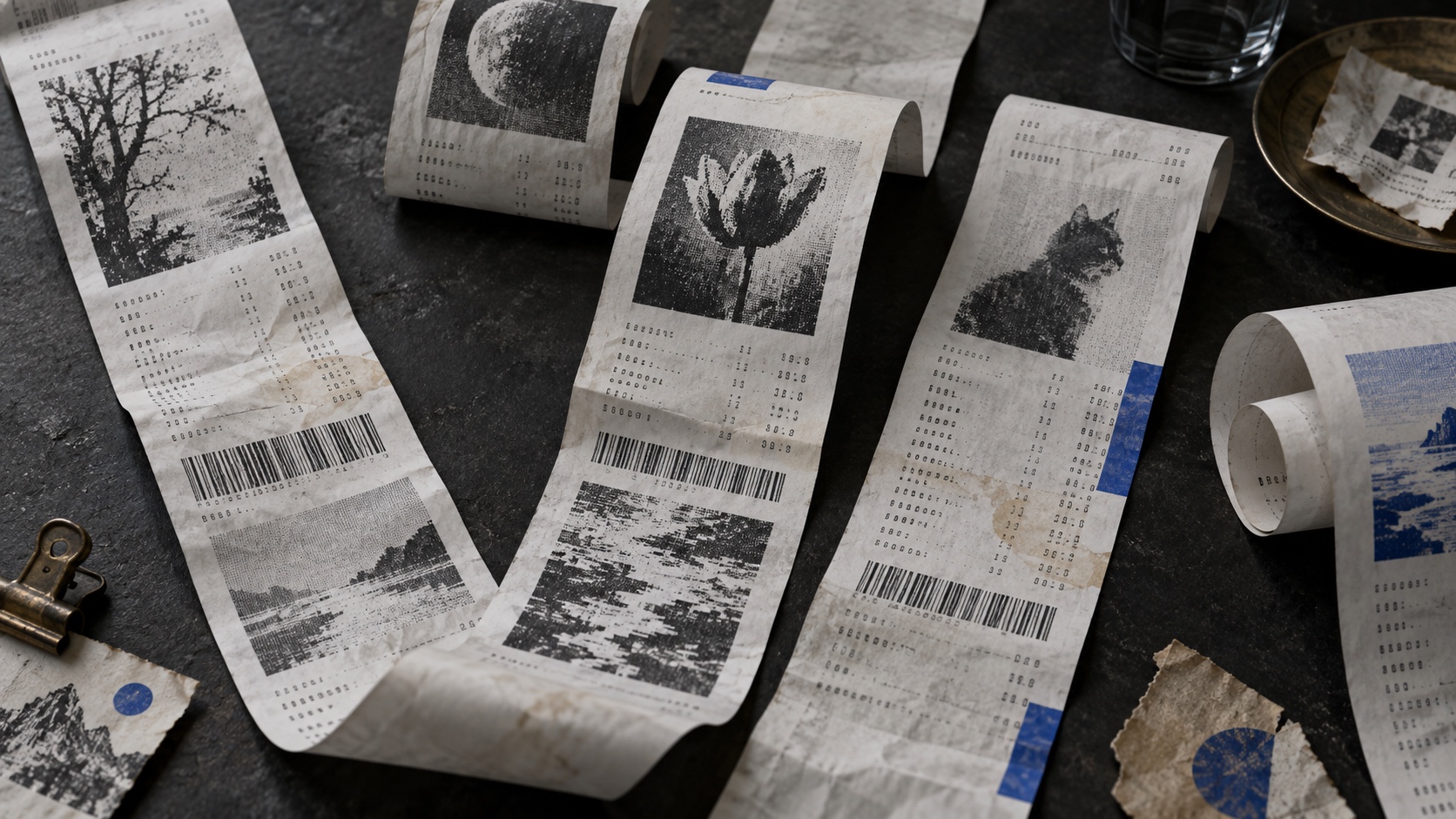
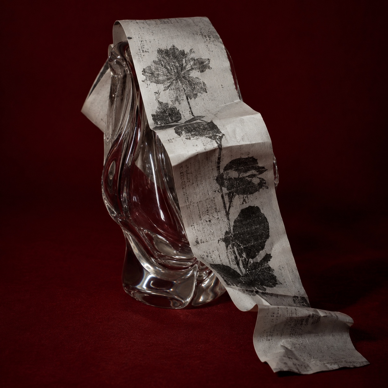
The receipt became thermal in stages. In the 1960s NCR developed a paper coated with a dye and a developer that darken together when heated, and in 1965 Jack Kilby's team at Texas Instruments built a print head of tiny electrically heated elements that could write on it. Thermal printing needed no ink and no ribbon, so it moved into fax machines and tickets and, through the 1980s, onto supermarket tills, where it replaced dot-matrix printers. The result is the strip almost everyone carries home: 58 or 80 millimetres wide, printed in one colour in monospace, often with a coloured stripe warning that the roll is running out.
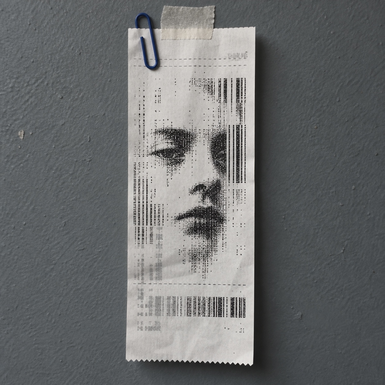
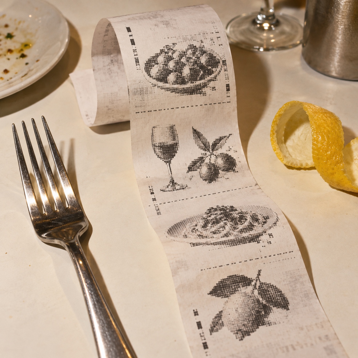
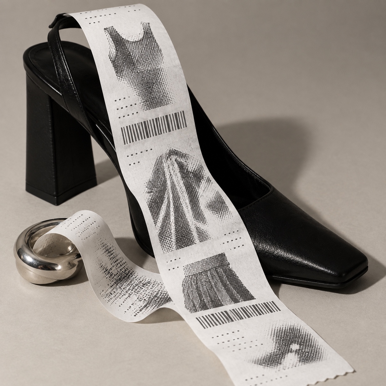
Its look comes from its limits. A thermal head prints a dot or nothing, so any picture has to be dithered into a pattern of black specks, and the error-diffusion method Robert Floyd and Louis Steinberg published in 1976 remains the classic way to do it. Type sits in tabular columns so prices line up, totals are printed double height, and dotted rules divide one part of the transaction from the next. The paper does not keep: heat, light and handling darken or fade it, so a receipt found in a coat a year later is already partly gone.
As an aesthetic it belongs to the moment the receipt began to disappear. With payment moving to screens and email, the paper strip became something closer to a keepsake, and people started making their own. Receiptify, which the student Michelle Liu built in 2020, printed listening histories as receipts and was used more than a million times in its first months; pocket thermal printers went into journals, and receipt-style photo booths into weddings and parties. The version worth using is the quiet one: a real print, a faded image and a few personal lines, kept like an artefact rather than staged as a checkout joke.
“
A proof of purchase, kept long after the purchase stopped mattering.
Visual markers, Receipt Prints aesthetic visual markers
How to shoot it, how to prompt it, and how to board it.
Photo Direction
How to shoot this aesthetic
"Photograph the receipt as an object somebody kept: flat, creased and lit like a document"
Shot list
One long receipt laid flat on a wooden table, a dithered portrait printed at the top, soft window light
A receipt pinned to a corkboard beside a photobooth strip and a ticket stub
A hand holding a crumpled receipt against a wool coat, the print faded along the fold
Lighting
Soft daylight from a window, low and slightly directional so creases and curl read. Document-like, never glossy. Keep the whites warm and let faded areas stay faded.
Drop this into Studio to generate in this aesthetic
Receipt prints aesthetic, found thermal-paper receipts kept as keepsakes, narrow vertical strips laid on a plain surface, a faded one-bit dithered photograph printed on thermal paper, monospace transaction typography, dotted rules, totals and timestamps, barcode-like marks, pocket creases, curled ends, heat-faded grey-violet patches, a pink end-of-roll stripe, intimate and archival, soft daylight, no real store names, no logos, no legible prices
Paste as-is, or append your own subject
Mood Board
The record applied to your project. The record's kit is free; your brand, references and plates come with membership
Demo kit free, the rest with membershipThe record as a demo kit, free. Name a project and it is written for that
Omoro · Mood board · 037-RP
04
The judgement
Whether to use it, what it costs to do properly, and where it stands right now.
Creative verdict, Receipt Prints feasibility and strategic recommendation
Two written calls, seven meters, and when to walk away
Creative verdict
Should Receipt Prints be the call?
7 meters
FIG. 2
Assessment
Print it for real and photograph the strip rather than setting receipt type on a screen. Choose images with strong shapes and dither them for the printer, then keep the itemised lines personal: a date, a place, a total that means something. Invented store names, joke prices and a checkout logo turn it into retro retail branding. Scan anything that has to last, because thermal prints fade.
Verdict
Right when the brand trades in moments people want to keep: restaurants, music, fashion drops, museums and events. It rewards restraint, real printing and personal detail, and fails as a retro checkout joke.
Production cost
Low
A thermal receipt printer and a few paper rolls cost less than a single lens, and the paper is cheap.
Creative difficulty
Medium
The format is fixed; choosing what is worth itemising and which image survives one-bit printing is the design.
Execution difficulty
Medium
Images need careful dithering to read at one bit, and thermal paper fades and darkens with heat and light.
Risk of misuse
Medium
The receipt template is everywhere; set as a gimmick, it reads as a coupon rather than a keepsake.
Prevalence
Emerging
Receipt generators and pocket thermal printers made it a social format; brands are only beginning to use it well.
Longevity
Enduring
Thermal receipts have been part of daily life since the 1980s, and they only grow stranger as payments move to screens.
Brand investment
Low
A printer, a paper roll and a scanner can produce a whole campaign.
Avoid if
The printed piece has to last for years
Thermal paper fades and darkens with heat and light; the originals are temporary unless they are scanned.
The idea is retro supermarket branding
Fake store headers and checkout jokes turn a keepsake into a coupon.
The image depends on fine tonal detail
Thermal printing is one-bit; soft gradients and small faces dissolve into dither.
Omoro · Creative verdict · 037-RP
Editorial Depth
A Pro feature: origins, practitioners, and pitfalls
Editorial depth
The Receipt Prints file
14 sections
FIG. 3
Context02Brands02Perception04Use04Index02
01Common MisconceptionThe principle beneath the surface
02Historical ContextOrigins, cultural moment, and reaction
03Brands That Accidentally Use This StyleNatural alignment, not category claims
04Brands That Perfectly Represent This StyleExceptional execution
07Creative FormulaThe visual system reduced to essentials
08Recognition SignalsHow to recognize it in two seconds
09When To Use This StyleContexts where the language performs
10Common Creative MistakesWhere imitation weakens the signal
11Best Brand ApplicationsIndustries with a natural advantage
12Creative Application AnalysisFit, feasibility, and production reality
13Related StylesClose languages and the key distinction
14Visual DNA SummaryThe sentence to remember
The editorial depth, with membershipOpening soon
Omoro · Editorial depth · 037-RP
05
The index
Neighbours, cross-references, blends, and the questions people ask.
Related concepts
Connected across the creative knowledge graph
Cultural relevance, Receipt Prints cultural relevance today
Where it stands now, and what it costs you to use it
Receipt prints are the ephemera of a cashless decade: the moment a paper record stops being necessary is the moment it becomes worth keeping. The format now turns up in menus, lookbooks, tour merchandise, museum shops and photo booths, and it works because it turns a transaction into a small, specific memory.
Its weakness is the template. A crisp receipt layout generated on a screen, with a fake store name and a joke total, reads as retro checkout branding and is forgotten as fast as a coupon. The versions that hold up are printed for real, photographed with their creases and fading, and carry details that mean something to someone.
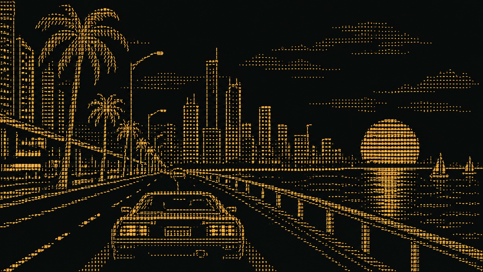
Terminal black #0B0C0C with phosphor green #33FF66 or amber #FFB000
The calls this blend forces
These two disagree on 2 things, and a blend cannot average them: you pick a side. At this mix:
Light or Dark? Receipt Prints is light, ASCII Art is dark. This mix lands light.
Analog or Digital? Receipt Prints is analog, ASCII Art is digital. This mix lands digital.
Use it
Receipt prints aesthetic, found thermal-paper receipts kept as keepsakes, narrow vertical strips laid on a plain surface, a faded one-bit dithered photograph printed on thermal paper, monospace transaction typography, dotted rules, totals and timestamps, barcode-like marks, pocket creases, curled ends, heat-faded grey-violet patches, a pink end-of-roll stripe, intimate and archival, soft daylight, no real store names, no logos, no legible prices (50%), infused with ASCII art aesthetic, an image built entirely from monospace keyboard characters, letters, numbers and punctuation chosen by density, crisp character grid, phosphor green or amber on black or black on white paper, scan lines, terminal or line-printer look, high contrast, legible characters, no photographic texture, no blur, color palette strictly #F3F1EA #0B0C0C #1E1E20 #33FF66 #6E6873, leaning light over dark, analog over digital, overall character: geometric, nostalgic, structured
One-click generation opens with the studio
About this aesthetic
What are receipt prints?+
A visual language built from thermal-paper receipts kept as keepsakes: narrow vertical strips, faded one-bit dithered images, monospace transaction type, totals, timestamps and barcode-like marks, creased and slightly degraded. The tone is intimate and archival, a preserved personal artefact rather than a piece of retail design.
What do people get wrong about it?+
That it is retro checkout branding. The strongest work uses the receipt as a personal record: a faded image, a date and a few lines worth keeping. A mock till slip with an invented store logo and a joke total misses what makes the format moving.
Why does it feel so intimate?+
A receipt is proof that something happened at a particular time and place. Fading, creases and pocket wear show that it was carried and kept, so the viewer reads the image as a memory rather than an advertisement, and the narrow strip draws the eye in close, at the distance of one person reading.
How do you make receipt prints for real?+
Use a thermal receipt printer, 58 or 80 millimetres wide, and dither each image to one bit before printing; pictures with strong shapes survive best. Photograph or scan the strips flat with their creases intact, and scan anything that must last, because thermal paper fades. In the EU, bisphenol A has been restricted in thermal paper since January 2020.
Build with the receipt prints aesthetic
Every style in the library is broken down like this one: the palette, the typography, the materials and the lineage.