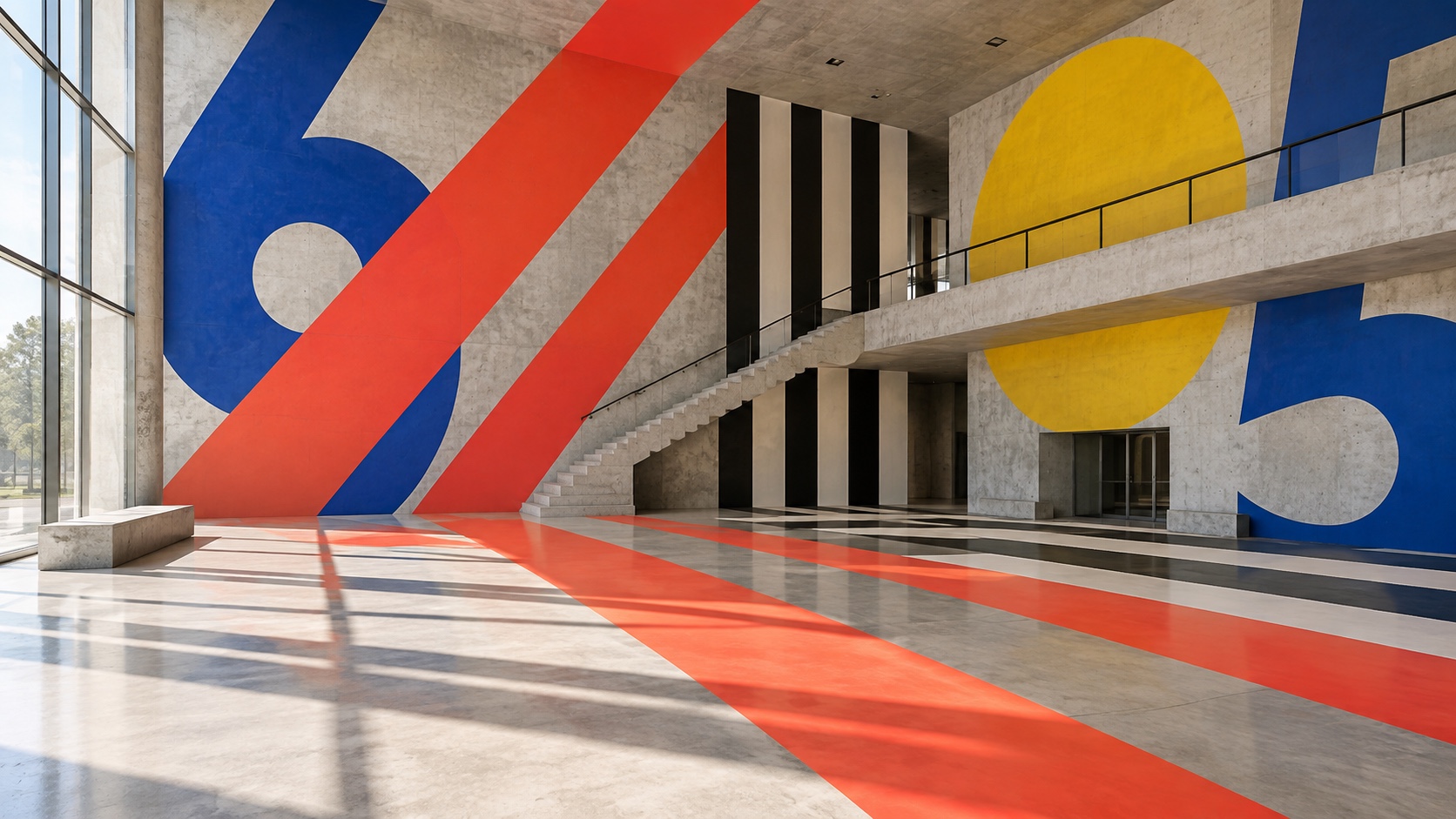
Orange sets the weight of the palette in warmth and creativity, and Signal Red is the swatch that breaks rank: a single red that stops the set reading as one note. Signal Red and Orange are close enough in hue and lightness that most people will read them as one colour, which makes them a pair to separate rather than two choices to spend. Signal Red and Navy sit on opposite sides of the temperature line, which is the tension the palette runs on and the pair to hold apart.
Signal Red reads as pure adrenaline: alarm, desire, the color of things that move fast.
Navy a deep navy or midnight blue, trust deepened into authority and gravity.
Orange a citrus-bright orange: enthusiasm, playfulness, an unmistakable call to attention.
Chrome Yellow a citrus-bright orange: enthusiasm, playfulness, an unmistakable call to attention.
Flat White a peach or apricot tint, all the friendliness of orange with none of the volume.
Stripes, arrows, circles and numerals painted bigger than the walls they are on, running over corners and floors so the graphic changes the room
Explore the full Supergraphics style guide