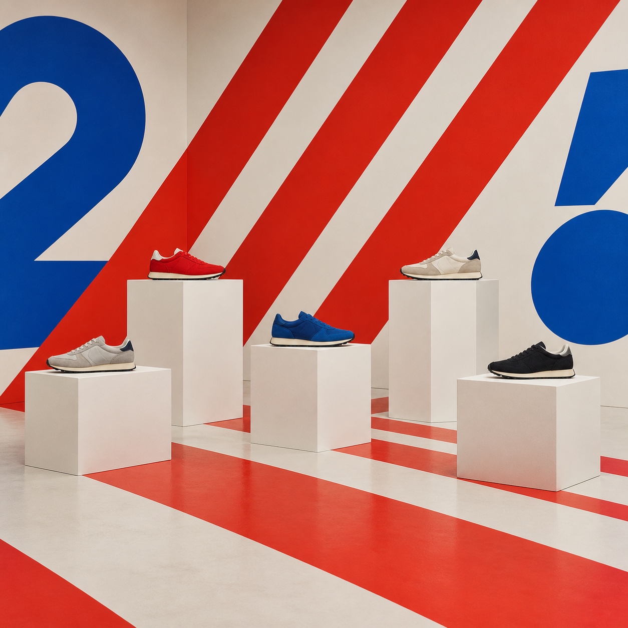
Supergraphics

Stripes, arrows, circles and numerals painted bigger than the walls they are on, running over corners and floors so the graphic changes the room

Compare Supergraphics with another style →See the Supergraphics typefaces →
Record038-SU
AestheticSupergraphics
ClassGeometric / Expressive
StatusINGESTING
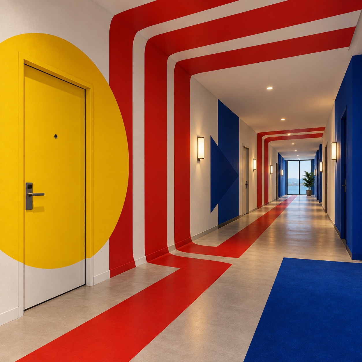
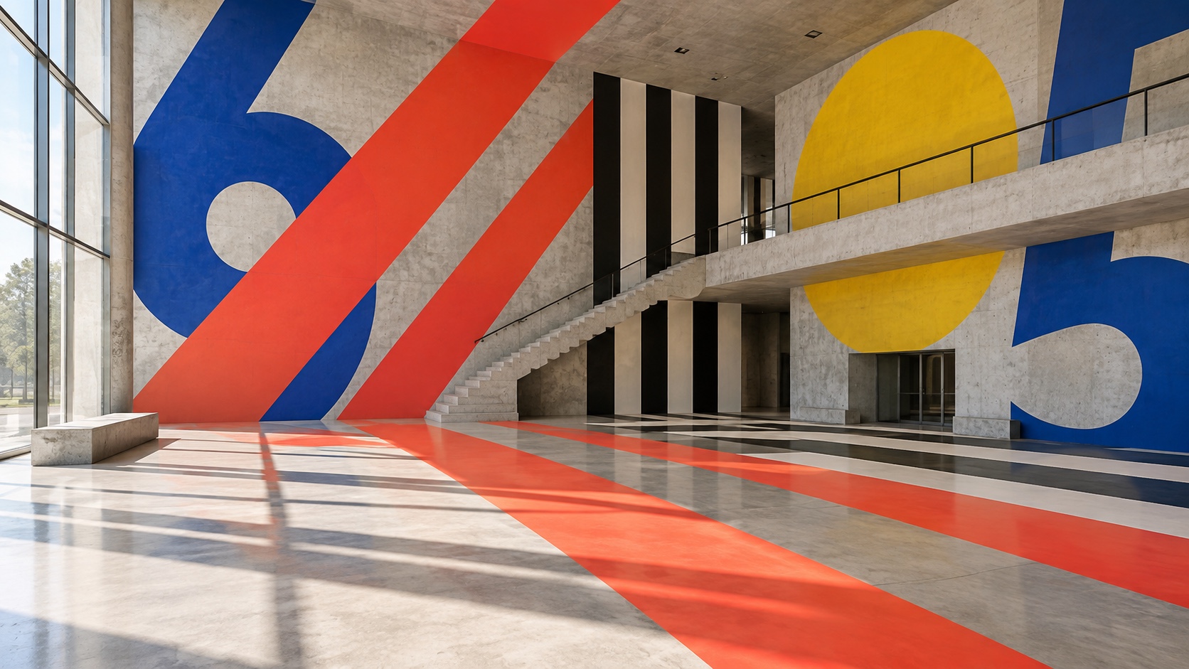
A concrete atrium with giant blue numerals, a yellow circle and red stripes painted across the wall and floor.
Archive plate · Supergraphics
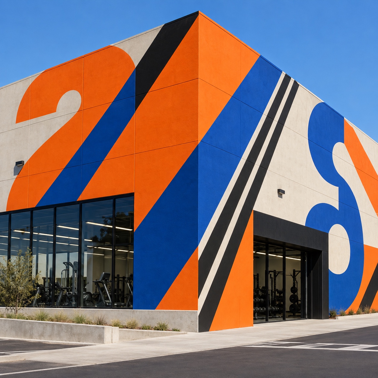
A gym building painted with orange, blue and black diagonal stripes and a giant numeral 2 running over its corner.
Dossier sceneGym · 1/5
01
The record

What it is, when it works, who it is for, and where it already exists.

How to use it

Record 038-SU - when it works, who it is for, what it looks like

FIELD 01

When to use it

  • Buildings that need identity and wayfinding at the same time
  • Gyms, schools, transit and car parks with big blank surfaces
  • Retail and hospitality that want a room to photograph
  • Brands whose mark is simple enough to be painted twenty feet high
FIELD 02

Perfect for

  • Architects and interior studios
  • Gyms, sports clubs and pools
  • Hotels, hostels and co-working
  • Transit, car parks and campuses
FIELD 03

What it looks like

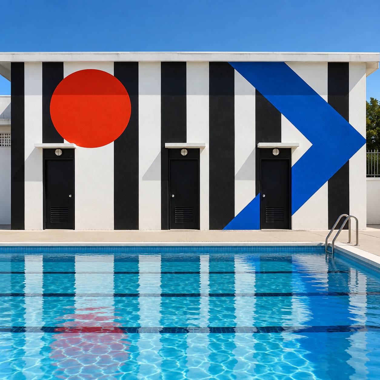
  • Barbara Stauffacher Solomon, Moonraker Athletic Center, The Sea Ranch, 1966
  • C. Ray Smith names the form in Progressive Architecture, 1967
  • The Sea Ranch's striped changing rooms on the cover of Progressive Architecture
  • Solomon's late-career shows at SFMOMA, the form's return to the museum

In the wild, Supergraphics aesthetic real-world examples

Where this aesthetic shows up in the real world · ↗ opens the source site

Omoro Style GuideEvery aesthetic, every field on this page, in one PDF.
Get the guide →
02
The anatomy

Where Supergraphics came from, what makes it recognisable, and the fingerprint it leaves.

History, Supergraphics aesthetic history

1966-1975; revived from the 2010s · The Sea Ranch, California, and the pages of Progressive Architecture

Supergraphics have a birthplace. In 1966 Barbara Stauffacher Solomon, a San Francisco designer trained in Basel under Armin Hofmann, was asked to decorate the interiors of The Sea Ranch, a new community on the Sonoma coast built of plain redwood and concrete. With little budget and big blank walls she painted stripes, circles, arrows and numerals in signal red, cobalt and yellow at architectural scale, running them across corners and ceilings so the geometry reorganised the rooms. The Moonraker Athletic Center's changing rooms are the founding work.

The critic C. Ray Smith gave it a name in Progressive Architecture in 1967: a supergraphic was a two-dimensional form too large for any one plane, and he excluded faces and lettering, though Solomon's numerals broke that rule at once. The idea spread fast through the late 1960s and early 1970s, into schools, shops, boutiques and the first painted car parks, and then went quiet as postmodernism took the colour and left the scale.

It came back with the photograph. From the 2010s, hotels, gyms, offices and stadiums wanted rooms that read on a phone screen, and a stripe turning a corner does. Solomon, working into her nineties, had late shows at SFMOMA and a new generation of admirers before she died in 2024. The current version keeps her rules: one shape, three colours, painted with a hard edge, and big enough to change the architecture.

Paint bigger than the wall, and the room changes shape.

Omoro dossier · 038-SU

Visual markers, Supergraphics aesthetic visual markers

The visual DNA: what makes it recognisable

typography

See the fonts
  • Single grotesk numerals and letters at architectural scale
  • Helvetica or a close grotesk, cropped by walls and doors
  • Arrows as type: wayfinding and decoration in one
  • No paragraphs; the building is the page

grid

  • The room's corners, floors and ceilings as the grid
  • One shape continuing over more than one plane
  • Colour blocks aligned to doors, stairs and structure
  • Scale set by the building, not the eye

materials

  • Signal red #D23F2C, navy #1F2E48 and orange #DA601B on flat white #E6DED7
  • Chrome yellow #DFA34B for circles and doors, black for stripes and edges
  • Masonry paint on concrete, painted plywood, epoxy floors and enamel signs

motifs

  • Stripes running across a corner
  • A circle interrupted by a doorway
  • Giant numerals on stairwells and floors
  • Arrows that point through walls

Aesthetic profile

8-channel console with the fingerprint on its display. Save the card, or share the page

Aesthetic Profile
Supergraphics
1966-1975; revived from the 2010s · The Sea Ranch, California, and the pages of Progressive Architecture
Attribute console · 038-SU
leans geometric, expressive, light
8 CH
FIG. 1
MaximalMinimalAnalogDigitalExpressiveRestrainedWarmCoolNostalgicFuturisticStructuredChaoticLightDarkGeometricOrganic
01Minimal
Maximal30%
02Analog
Digital40%
03Restrained
Expressive60%
04Cool
WarmEVEN
05Futuristic
Nostalgic30%
06Structured
Chaotic50%
07Dark
Light60%
08Organic
Geometric90%
GeometricExpressiveLight
Omoro · Attribute console · 038-SU
omoro.io/styles/supergraphics

Color Palettes, Supergraphics color palettes and hex codes

The definitive color scheme for this aesthetic

Supergraphics
#D23F2C · #1F2E48 · #DA601B · #DFA34B · #E6DED7
A concrete atrium with a red stripe turning the corner: signal red, navy, orange and chrome yellow on flat white
Omoro Palette Pack575 curated palettes across every aesthetic, 5 export formats.
Get the palettes →

Adjacent Palettes, styles related to Supergraphics

The colour of the styles sitting closest to this one

Swiss / International
Memphis
Brutalist Architecture
Neo Swiss
03
The direction

How to shoot it, how to prompt it, and how to board it.

Photo Direction

How to shoot this aesthetic

"Shoot the graphic where it crosses the architecture: a corner, a stair, a doorway, with a person for scale"

Shot list

  • A red stripe running across a concrete corner and up onto the ceiling, one figure at the far end
  • A stairwell with a numeral three storeys tall, shot from the half landing
  • A changing room with cobalt and yellow circles interrupted by lockers

Lighting

Even, flat daylight or bright fluorescent, so painted colour stays flat and edges stay hard. No dramatic shadows across the graphic; the shape must read as paint, not light.

Omoro Director's Briefs212 photo shot-lists like this one, ready to shoot from.
Get the briefs →

Generative Prompt

Drop this into Studio to generate in this aesthetic

Supergraphics aesthetic, 1960s architectural graphics at giant scale, a single flat shape painted across a concrete corner and ceiling, bold stripes, circles, arrows and one enormous grotesk numeral, signal red, cobalt and chrome yellow on flat white, hard masked edges, flat even light, a plain building reorganised by paint, confident and public, no mural, no gradients, no readable words

Paste as-is, or append your own subject

Mood Board

The record applied to your project. The record's kit is free; your brand, references and plates come with membership

Mood board
The Supergraphics board
8 frames · 4 selected
FIG. 4
Signal RedD23F2CNavy1F2E48OrangeDA601BChrome YellowDFA34BFlat WhiteE6DED7
Brand and references
IdleBrand and references open with membership
With membership: the brand's own facts and colours in every prompt, references carried into every frame, and the plates generated.
01 · Hero application
02 · Material and finish
03 · Palette in context
04 · Photography direction
05 · Pattern plate
06 · Object
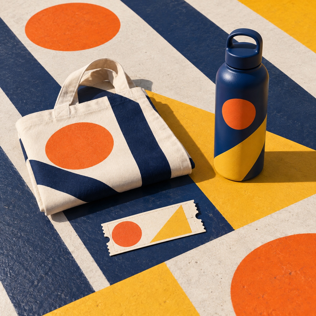
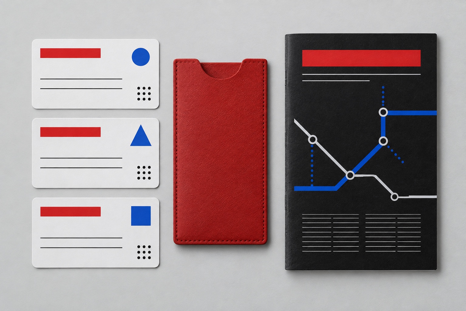
07 · Environment
08 · Digital presence
Demo kit free, the rest with membershipThe record as a demo kit, free. Name a project and it is written for that
Omoro · Mood board · 038-SU
04
The judgement

Whether to use it, what it costs to do properly, and where it stands right now.

Creative verdict, Supergraphics feasibility and strategic recommendation

Two written calls, seven meters, and when to walk away

Creative verdict
Should Supergraphics be the call?
7 meters
FIG. 2
Assessment

Survey the room first and design on the corners, not the walls. One shape, three colours, and it must cross at least one plane. Set numerals and arrows in a grotesk at a size that reads from the far end. A logo blown up, a pictorial mural or a soft gradient is a different job, and it will not change the room.

Verdict

Right when a building has to become a brand: gyms, transit, campuses, hotels, retail and co-working. It rewards a simple mark, hard edges and the courage to paint over a corner, and fails as decoration that respects the walls.

Production cost
Low

Masonry paint, masking tape and a scaffold; the building is the material.

Creative difficulty
Medium

The vocabulary is small; where the shape crosses the architecture is the design.

Execution difficulty
Medium

Hard edges at scale need careful masking, and the form has to be set out from a survey, not a sketch.

Risk of misuse
Medium

A logo stretched across a wall is not a supergraphic; the form has to be abstract and cross a plane.

Prevalence
Common

Gyms, hostels, offices, stadiums and car parks paint their architecture as standard now.

Longevity
Enduring

Sixty years old and structurally simple; it dates only through its colour choices.

Brand investment
Low

Paint and a survey turn a plain building into an identity.

Avoid if
The brand mark is detailed or pictorial
Supergraphics need a shape that survives twenty feet high in flat paint.
The space is small and full
The form needs blank planes and corners to cross; in a cluttered room it becomes wallpaper.
The client wants a mural of something
That is a mural. This form is abstract and changes the architecture rather than picturing anything.
Omoro · Creative verdict · 038-SU

Editorial Depth

A Pro feature: origins, practitioners, and pitfalls

Editorial depth
The Supergraphics file
14 sections
FIG. 3
Context02Brands02Perception04Use04Index02
01Common MisconceptionThe principle beneath the surface
02Historical ContextOrigins, cultural moment, and reaction
03Brands That Accidentally Use This StyleNatural alignment, not category claims
04Brands That Perfectly Represent This StyleExceptional execution
05Psychological EffectHow visual decisions change perception
06Visual ChecklistInclude and avoid
07Creative FormulaThe visual system reduced to essentials
08Recognition SignalsHow to recognize it in two seconds
09When To Use This StyleContexts where the language performs
10Common Creative MistakesWhere imitation weakens the signal
11Best Brand ApplicationsIndustries with a natural advantage
12Creative Application AnalysisFit, feasibility, and production reality
13Related StylesClose languages and the key distinction
14Visual DNA SummaryThe sentence to remember
The editorial depth, with membershipOpening soon
Omoro · Editorial depth · 038-SU
05
The index

Neighbours, cross-references, blends, and the questions people ask.

Related concepts

Connected across the creative knowledge graph

Cultural relevance, Supergraphics cultural relevance today

Where it stands now, and what it costs you to use it

Supergraphics are how buildings get an identity without a facade budget. Gyms, hostels, co-working floors, stadium concourses and car parks paint their architecture because a stripe turning a corner reads on a phone, and because a numeral twenty feet high is wayfinding and brand in one coat of paint.

Its failure mode is the mural. A pictorial wall painting, or a logo stretched large, is not a supergraphic; the form is abstract, continues over more than one plane and changes how the room is read. The work that lands uses one shape, three colours, hard edges and the building's own corners.

Cross-references

Swiss / InternationalThe grid and the grotesk she brought back from BaselMemphisThe 1980s that inherited its stripes and colourBrutalist ArchitectureThe concrete it was painted ontoNeo SwissThe current type-first design that scales it to the screen

Blend

Mix Supergraphics with any style in the library

Supergraphics×
50%50%
66% alike
Supergraphics referenceSwiss / International referenceSupergraphics 50%Swiss / International 50%

Merged palette

#D23F2C

#000000

#1F2E48

#333333

#DA601B

Leads geometric, structured, light

Typography · from Supergraphics

Space Grotesk over Inter

Materials

  • Signal red #D23F2C, navy #1F2E48 and orange #DA601B on flat white #E6DED7
  • Chrome yellow #DFA34B for circles and doors, black for stripes and edges
  • Flat unmodulated color: no gradients, no shadows

The calls this blend forces

These two disagree on 3 things, and a blend cannot average them: you pick a side. At this mix:

Expressive or Restrained? Supergraphics is expressive, Swiss / International is restrained. This mix lands restrained.

Maximal or Minimal? Supergraphics is maximal, Swiss / International is minimal. This mix lands minimal.

Analog or Digital? Supergraphics is analog, Swiss / International is digital. This mix lands analog.

Use it

Supergraphics aesthetic, 1960s architectural graphics at giant scale, a single flat shape painted across a concrete corner and ceiling, bold stripes, circles, arrows and one enormous grotesk numeral, signal red, cobalt and chrome yellow on flat white, hard masked edges, flat even light, a plain building reorganised by paint, confident and public, no mural, no gradients, no readable words (50%), infused with Swiss International Typographic Style with strict grid system, Helvetica or Akzidenz Grotesk typography, asymmetric layouts, functional clarity, objective visual communication, color palette strictly #D23F2C #000000 #1F2E48 #333333 #DA601B, leaning expressive over restrained, maximal over minimal, analog over digital, overall character: geometric, structured, light

One-click generation opens with the studio

About this aesthetic

What are supergraphics?

Graphics too big for the wall they are on: stripes, circles, arrows and numerals painted at architectural scale, running across corners, floors and ceilings so the shape changes the room. Barbara Stauffacher Solomon made the first ones at The Sea Ranch in 1966, and C. Ray Smith named them in 1967.

How are supergraphics different from a mural?

A mural is a picture on a wall; a supergraphic is an abstract shape that ignores the wall's edges and continues over the corner, the ceiling or the floor. It reorganises the architecture rather than decorating a surface, and it is usually one form in a few flat colours.

Why do they work so well now?

Rooms are photographed more than they are described, and a stripe turning a corner reads on a small screen. They also do two jobs at once, identity and wayfinding, which is why gyms, transit and campuses use them.

What are the rules?

One shape, two or three flat colours, hard masked edges, and a scale set by the building rather than the eye. Let the form cross at least one corner or plane. Faces and paragraphs break it; a single numeral or letter does not.

Build with the supergraphics aesthetic

Every style in the library is broken down like this one: the palette, the typography, the materials and the lineage.

Explore the style library →