Shoot brief · Photography archive

Editorial Interface

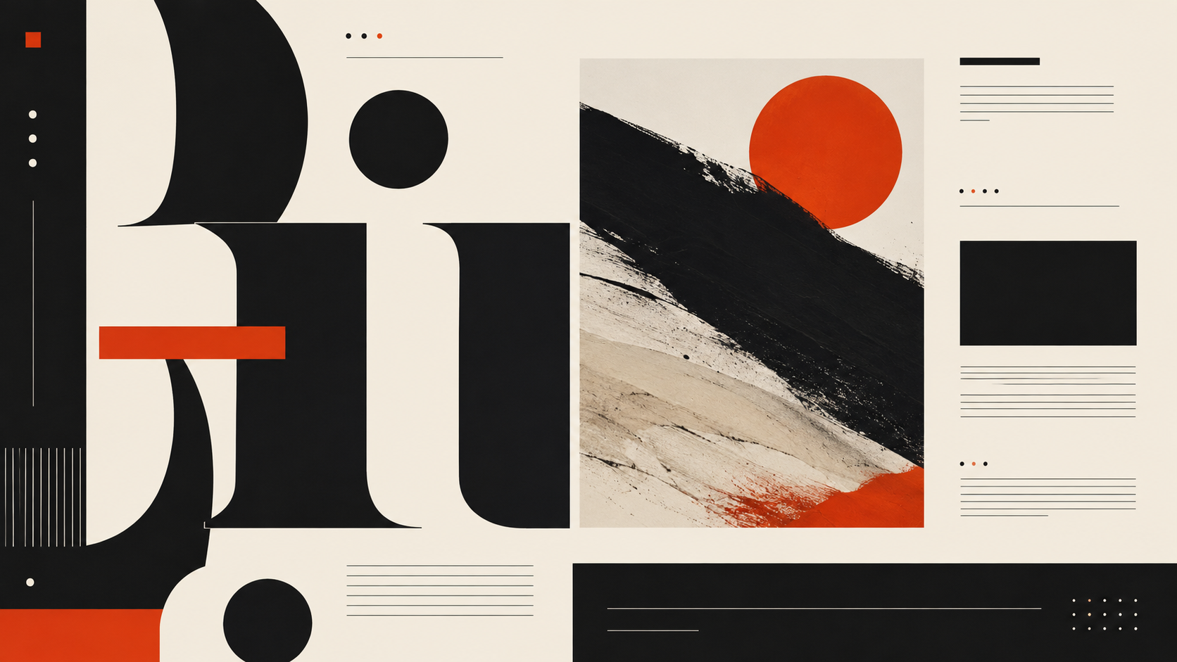
A screen that reads like a broadsheet, where typography does the work color refuses to

Editorial Interface aesthetic photography reference
Photography referenceeditorial interface
Shoot Brief · Call Sheet TC 00:00:00:00
AestheticEditorial Interface
Roll024
Status0 / 5 Shot
LightWarm, steady, and slightly dim, like a reading lamp in a well
WardrobeUnderstated professional. Wool, cotton, neutral tones. The…
Location / first setupA design studio with stacked type specimen…
Palette
Director’s noteCompose as if you are laying out a magazine spread. Use the rule of thirds deliberately. Leave white space in…

Shot list

Tap a frame to mark it shot · grease pencil, saved on this device

FR·01A
Wide shot of a large desktop monitor displaying a text-heavy interface with visible column guides, serif headlines at three sizes, and generous margins, the rest of the desk intentionally sparsewide24mm
FR·02A
Close-up of a screen showing a data table styled like a financial newspaper: thin rules, old-style numerals, category headers in small capsdetail100mm
FR·03A
Medium shot of a designer's workspace with a printed newspaper, a type specimen book, and a laptop showing a UI that clearly descends from bothenvironment35mm
FR·04A
Tight crop of a navigation bar rendered in a single weight of a serif typeface, each label separated by a vertical hairline, no icons anywheresetup50mm
FR·05A
Over-the-shoulder shot of someone reading a long-form article in a web interface that uses indented paragraphs, drop caps, and a two-column layout with marginal notessetup50mm
Take it to set: all 164 briefs as one printable PDF
Roll
00 / 05
⌁ LightingWarm, steady, and slightly dim, like a reading lamp in a well full brief ↓

warm, steady, and slightly dim,…

⌁ WardrobeUnderstated professional. Wool, cotton, neutral tones. The… full brief ↓

understated professional. wool

Director note
Compose as if you are laying out a magazine spread. Use the rule of thirds deliberately. Leave white space in the frame the way the interface leaves it on the screen. If the photograph feels busy, the editorial discipline has not transferred from subject to camera.
All 79 director’s notes, printable: Director’s Briefs →
Locations
A design studio with stacked type specimen books and a single large monitor on a walnut deskA newspaper archive room with bound volumes and microfiche readers alongside a modern terminalA university library reading room with brass lamps and long wooden tablesA publishing house office where print galleys and digital layouts occupy the same desk
Omoro Director’s BriefsAll 164 aesthetics: full shot lists, lighting, wardrobe, and director’s notes, in one PDF.
Get the briefs →
Explore the aesthetic
Style guide
Color palette
About this brief
How do I photograph the Editorial Interface aesthetic?

A screen that reads like a broadsheet, where typography does the work color refuses to.

Compose as if you are laying out a magazine spread. Use the rule of thirds deliberately. Leave white space in the frame the way the interface leaves it on the screen. If the photograph feels busy, the editorial discipline has not transferred from subject to camera.

Director's note

What shots should I get for a Editorial Interface photo shoot?

Leave with every frame on this list.

Shot list

  1. Wide shot of a large desktop monitor displaying a text-heavy interface with visible column guides, serif headlines at three sizes, and generous margins, the rest of the desk intentionally sparse
  2. Close-up of a screen showing a data table styled like a financial newspaper: thin rules, old-style numerals, category headers in small caps
  3. Medium shot of a designer's workspace with a printed newspaper, a type specimen book, and a laptop showing a UI that clearly descends from both
  4. Tight crop of a navigation bar rendered in a single weight of a serif typeface, each label separated by a vertical hairline, no icons anywhere
  5. Over-the-shoulder shot of someone reading a long-form article in a web interface that uses indented paragraphs, drop caps, and a two-column layout with marginal notes
What lighting works for Editorial Interface photography?

Warm, steady, and slightly dim, like a reading lamp in a well-appointed study. The screen itself provides most of the illumination. No color temperature surprises.

Light

Where should I shoot Editorial Interface photography?

Scout these before anything else.

Locations

  1. A design studio with stacked type specimen books and a single large monitor on a walnut desk
  2. A newspaper archive room with bound volumes and microfiche readers alongside a modern terminal
  3. A university library reading room with brass lamps and long wooden tables
  4. A publishing house office where print galleys and digital layouts occupy the same desk
What wardrobe works for Editorial Interface photography?

Understated professional. Wool, cotton, neutral tones. The person looks like they subscribe to three newspapers and none of them are tabloids.

Wardrobe

Omoro Studio · Creative System

Generate shoot references in the Editorial Interface style

Omoro reads your visual references and generates images in your exact aesthetic. Build a mood board before the shoot or create composite references for your client.

Join the waitlist