Registrar's index cards on the platen glass - captured by the scanner
1924–1945 · Paris, France; international spread through exile artists
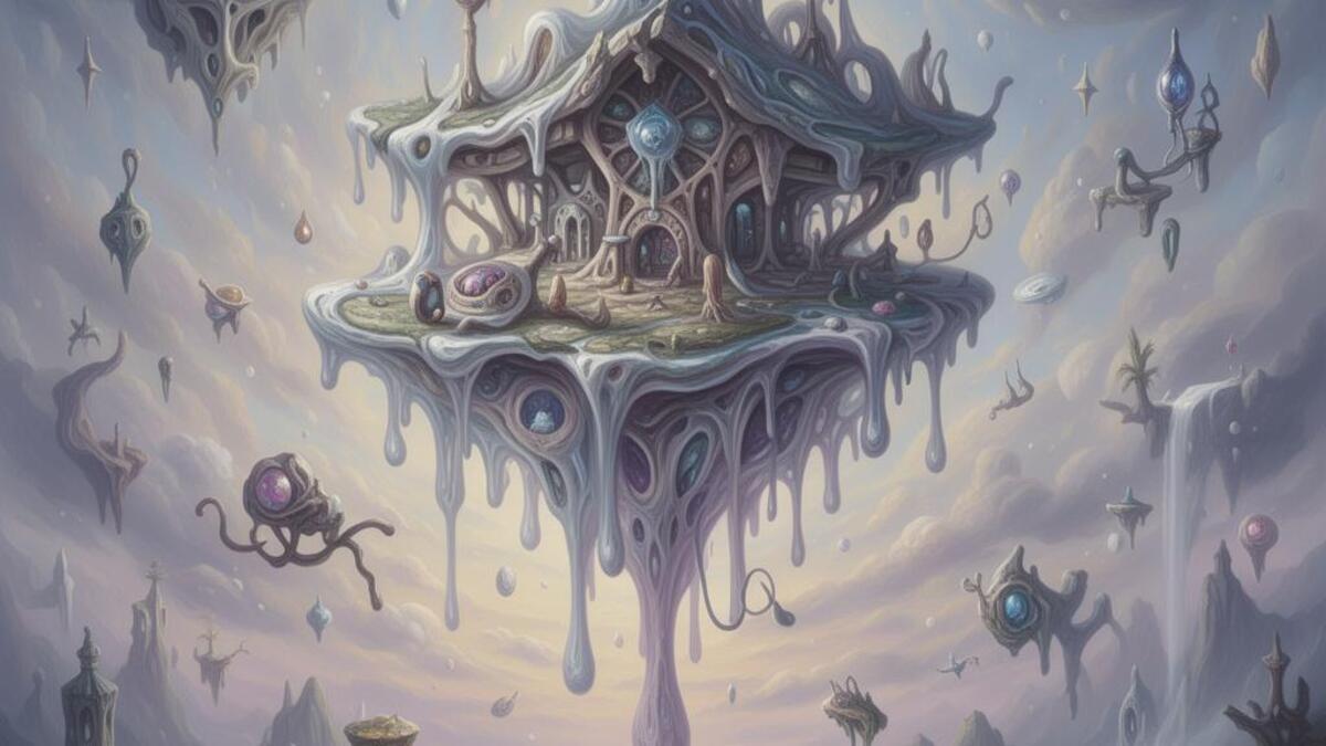
Surrealism was founded by poet André Breton in Paris with the 'Manifesto of Surrealism' (1924), which defined the movement's central method: automatism, or the creation of art bypassing rational control to access the unconscious mind. Breton drew on the psychoanalytic theories of Sigmund Freud, particularly the idea that the unconscious contained repressed desires and imagery more truthful than conscious thought. Visual artists including Salvador Dalí, René Magritte, Max Ernst, Joan Miró, Meret Oppenheim, Frida Kahlo, and Leonora Carrington developed distinct approaches to visualizing this unconscious territory.
The visual vocabulary of Surrealism is paradoxically precise. Dalí's hyperrealistic technique rendered impossible objects with photographic accuracy: the softness of a watch draped over a branch is convincing precisely because the watch is painted with complete technical mastery. Magritte painted ordinary objects in impossible relationships (a man with an apple for a face, a locomotive emerging from a fireplace) with the flat, literal clarity of a commercial painter. The recognizability of the impossible is what creates the Surrealist effect: if the objects were unfamiliar, the wrongness would not register.
Surrealism's influence on commercial design has been enormous and underacknowledged. Advertising agencies began employing Surrealist devices in the 1940s: the unexpected juxtaposition, the object enlarged to impossible scale, the familiar object in a wrong context: to create memorable images. Contemporary fashion photography, music video, and graphic design continue to use Surrealist techniques as their primary means of achieving visual surprise.
The visual DNA: what makes it recognisable
- No specific typography: Surrealism is primarily a painting and sculpture movement
- When applied to design: classical serif type used for ironic stability against impossible imagery
- Text as object within the dream-space: words with physical weight, casting shadows
- The caption as Surrealist device: a word that names the wrong thing in an image
- Illusionistic perspective: architecturally correct spaces containing impossible objects
- The horizon line: infinite desert or dreamscape receding to a flat horizon
- Objects floating without support: gravity suspended as a compositional choice
- Scale disruption: small objects enlarged, large objects shrunk
- Dalí's desert palette: sand #C8A870, sky blue #5A8AB0, cast shadow brown #6B4820
- Magritte's sky: daytime blue #5B8AC0 against grey cloud #C0C4C8
- Dark interior brown-black: #2A1A0E, #1A0E06
- Flesh tone and skin: #D4A888, #C49070: the body as frequent subject
- Melting or liquid solid objects (Dalí's soft watches)
- Eyes and vision: the eye as motif of perception and surveillance
- Birds and feathers (Max Ernst, Magritte's bowler hats)
- The naked body in non-erotic impossible contexts
8-channel console - dominant channels taped & circled by the registrar
Your aesthetic passport - share the fingerprint
4 color interpretations of this aesthetic
How to shoot this aesthetic
Join waitlist for access
Join the waitlist for full access
Join the waitlistSurrealism: where the language earns its place
Surrealism is most effective when its visual decisions do useful work. Dream-like imagery with unexpected juxtapositions and symbolism
The style gives styling, proportion, and image sequencing a clear point of view rather than treating them as decoration.
It can turn atmosphere, material, and spatial pacing into evidence of a distinct experience before a visitor arrives.
It helps a physical or editorial environment feel authored, which raises attention and perceived care.
They recognize the references, proportion, and restraint that make the language feel intentional.
They respond to visible judgment because it reduces the feeling of interchangeable product.
A coherent aesthetic gives them a usable standard for choosing images, objects, and collaborators.
The cost comes from consistent art direction, suitable locations or materials, and time to edit the details that would otherwise undermine the premise.
The challenge is conceptual. It takes visual literacy and a real point of view to avoid borrowing surface cues without their original logic.
Lighting, casting, type, color, material, and retouching must agree. A single weak choice can make the work feel like an imitation.
Surrealism creates its strongest advantage when it gives a brand a standard of judgment, not merely an attractive finish. It fails when recognizable cues are collected without a governing idea. The difference between average and exceptional execution is usually proportion: how much is shown, what is withheld, and whether every element belongs to the same world. The most capable teams pair an exacting art director with specialists who understand the medium, from photographer and stylist to set designer, editor, and typographer.
Should Surrealism be the strategic choice?
Surface imitation is easy. The language becomes generic when familiar cues replace proportion, specificity, and a coherent system.
Its visual ingredients appear regularly in contemporary work, but a rigorous execution remains distinguishable from a loose collection of references.
Its strongest principles depend on composition, material, and cultural literacy rather than a short-lived visual effect.
It asks for consistency across photography, typography, motion, environments, and the many details that make a brand feel believable.
Surrealism deserves serious consideration from brands and institutions that can articulate a real point of view and protect it through execution. It is less suitable for work that needs immediate instructional clarity, broad visual neutrality, or low-cost production flexibility. Its greatest advantage is differentiation through judgment: it can make a product, place, or editorial proposition feel authored rather than merely packaged. Average executions borrow recognizable signals, then lose coherence when type, casting, copy, or materials fail to agree. Exceptional executions understand the visual language as a system of choices, including what not to show. The largest mistake is treating the style as a finish applied after strategy. Adopt it only when the product and organization can carry the same standard of care the imagery proposes.
Join waitlist for access
Join the waitlist for editorial depth
Join the waitlistConnected across the creative knowledge graph