When to use it
- Product dashboards and feature tours
- SaaS marketing and app launch pages
- Data-rich presentations that need visual clarity
- Tech brand identities built around structured density
Grid-locked modular layouts with dense information architecture, rounded corners, and bright accent cards on dark backgrounds
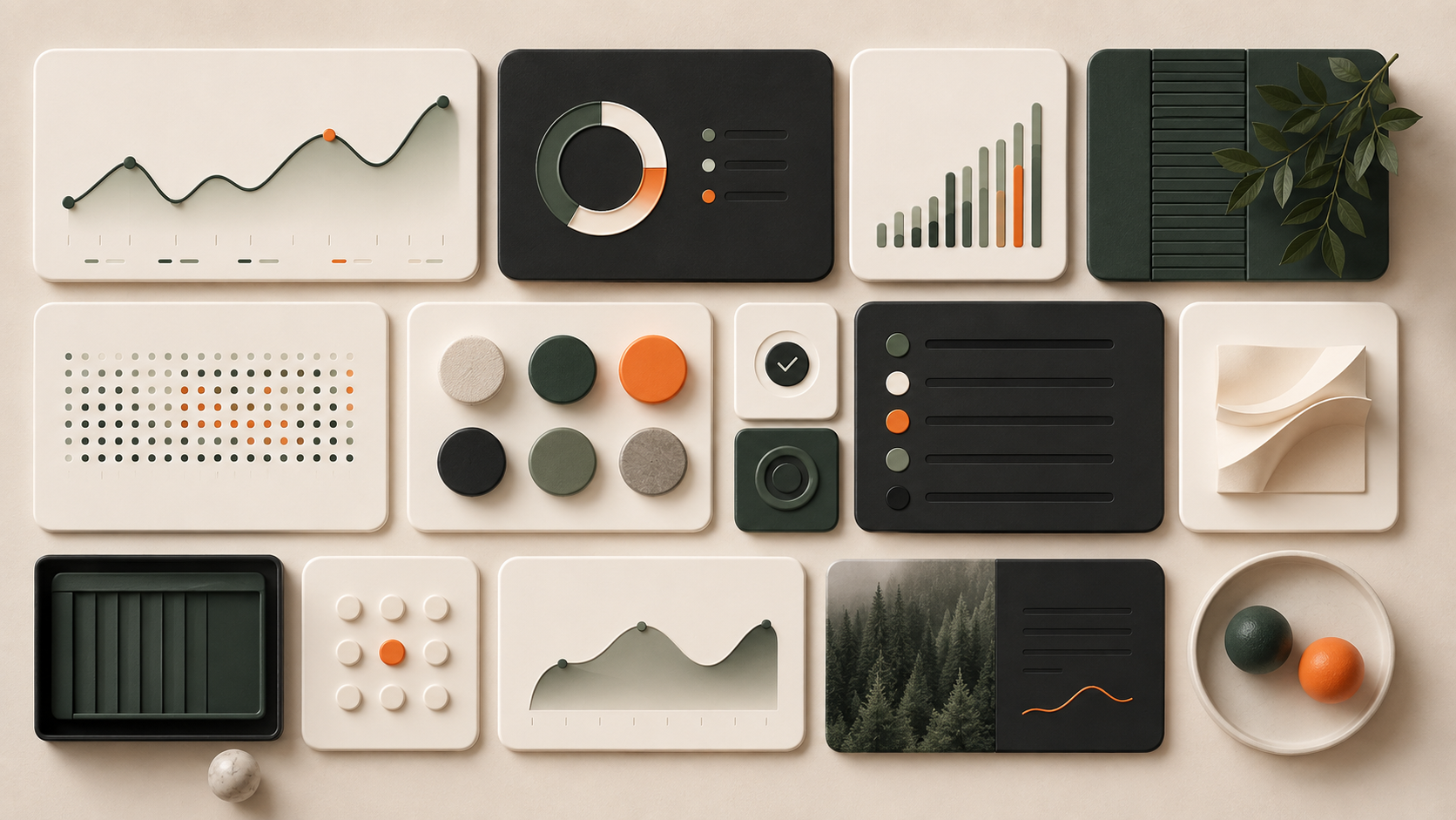
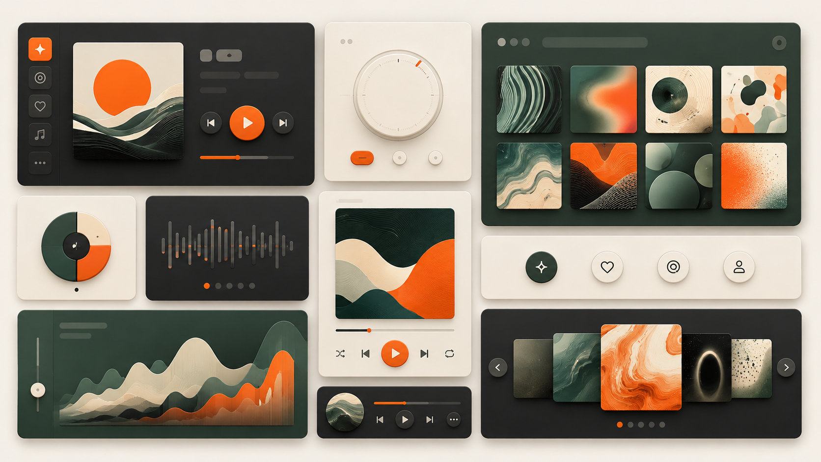
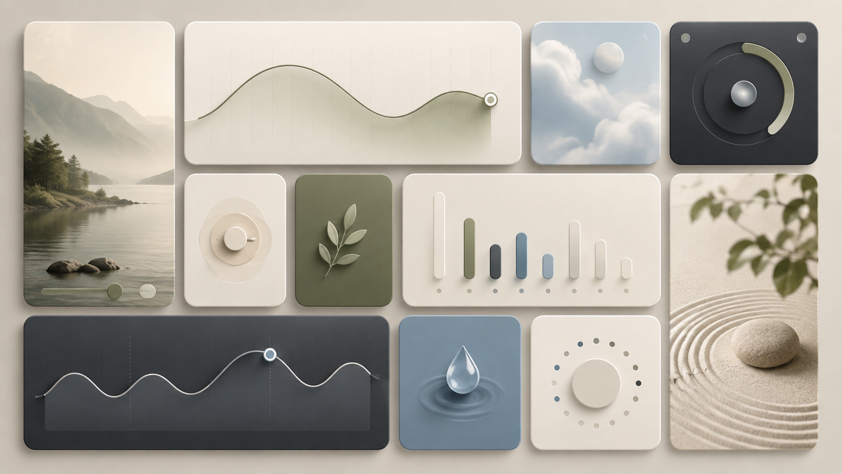
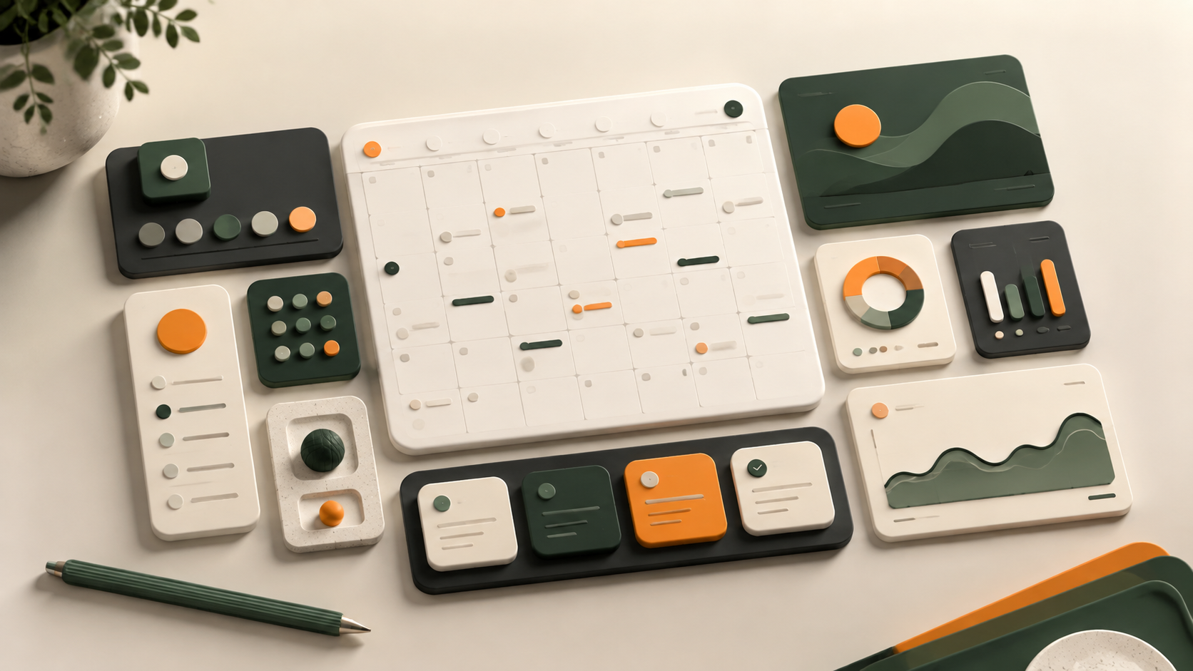
Record 021-BU - when it works, who it is for, what it looks like
2020-present · Product design, Silicon Valley and Japan (inspired by bento box compartmentalisation)
Bento UI crystallised as a named pattern around 2020, though its logic predates the label by years. Apple's product pages began stacking self-contained feature cards in strict grids, each card a miniature poster with its own palette, type hierarchy and hero image. The format gave marketing teams a way to present dense specifications without forcing visitors through a linear scroll. Linear, Vercel and Raycast adopted the same grammar for developer tooling, proving the layout could carry technical detail as comfortably as consumer polish.
The name comes from the Japanese bento box, where a single meal is divided into compartments that keep each dish distinct while composing into a balanced whole. That metaphor is precise: a bento grid works because no card leaks into its neighbour. Each unit is self-contained, with its own internal padding, corner radius and visual tone, yet the outer grid enforces a shared rhythm. The tension between independence and alignment is the entire trick.
Bento grids thrive on screens wide enough to show three or four columns, which limits their strongest expression to desktop viewports. On mobile they collapse into a vertical stack and lose the spatial composition that makes the layout distinctive. The pattern remains one of the dominant formats in SaaS marketing and product pages, though its ubiquity has started to flatten out the visual differences between companies that use it.
The visual DNA: what makes it recognisable
The definitive color scheme for this aesthetic
How to shoot this aesthetic
"Every card a self-contained thought, every grid line a decision made visible"
Shot list
Lighting
Cool, even monitor light supplemented by diffused overhead panels. No dramatic shadows. The light should feel institutional and precise, the kind of controlled illumination you associate with design studios and product labs.
Drop this into Studio to generate in this aesthetic
Grid-locked modular card layout, dense information architecture, rounded corners with generous internal padding, self-contained content tiles, Apple-product-page spatial rhythm, neutral background with high-contrast card surfaces, systematic spacing tokens, clean typographic hierarchy within each module
Join waitlist for access
Join the waitlist for full access
Join the waitlistBento UI is most effective when its visual decisions do useful work. Grid-locked modular layouts with dense information architecture, rounded corners, and bright accent cards on dark backgrounds
Budget goes into art direction and casting, not the toolkit.
Anyone can spot the references. A real system out of them is the hard part.
One wrong prop or one off color reads as costume instead of conviction.
Bento UI earns its keep when it gives a brand a standard of judgment, not just a finish. It falls apart the moment recognizable cues get collected without a point of view behind them. The tell is always proportion: what's shown, what's held back, and whether every choice belongs to the same world.
The surface is easy to copy. What separates the real thing from a knockoff is the system underneath.
The ingredients are everywhere right now. A disciplined execution is still the minority.
This holds up because it's built on composition and material, not a filter that ages out.
It only works if every touchpoint agrees. Cut a corner anywhere and the whole thing shows it.
Use Bento UI when the brand can back a real point of view and protect it through execution. Not when the goal is broad, neutral, or cheap to produce. The advantage is differentiation through judgment: the work reads as authored, not packaged. Average executions borrow the signals and lose the coherence. The best ones treat the visual language as a system of choices, including what they leave out.
Join waitlist for access
Join the waitlist for editorial depth
Join the waitlistConnected across the creative knowledge graph
Where it stands now, and what it costs you to use it
Bento UI became the default layout for SaaS landing pages because it solves a real problem: how to present twelve features without making the visitor read twelve paragraphs. The grid lets each feature carry its own visual proof, a screenshot, an animation, a metric, without competing for hierarchy with its neighbours.
The cost is sameness. When every developer tool and every consumer product uses the same card grid with the same rounded corners and the same frosted surfaces, the layout stops communicating anything about the brand. The pattern is now so widespread that using it well means finding the details that distinguish your version from the template.
Bento UI is a modular grid layout where each card functions as an independent visual unit, inspired by the compartmentalised structure of a Japanese bento box. Cards maintain strict alignment on a shared grid while keeping their own internal content, palette and hierarchy self-contained.
It solves the density problem. Product teams need to present many features at once without overwhelming visitors, and the card grid lets each feature carry its own visual proof in a scannable format. Apple, Linear and Vercel popularised the approach, and the rest of SaaS followed.
On narrow viewports, bento grids collapse into a single-column stack. The spatial composition that makes the layout distinctive on desktop is lost, so mobile versions rely on card sequencing and internal hierarchy rather than grid position to carry the design.
Omoro turns aesthetic references into on-brand visuals. Generate, compose and publish from one studio.
Join the waitlist