Registrar's index cards on the platen glass - captured by the scanner
1895–present · France and US (early cinema); global; Hollywood system; international art cinema
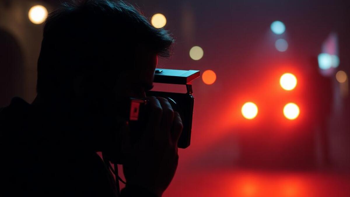
Cinematography is the art and craft of lighting and framing moving images: the director of photography's contribution to how a film looks: camera placement and movement, lighting design, lens choice, and, in contemporary production, the digital color grade that gives a film its distinctive palette. Great cinematography is both technically invisible (you don't notice it's happening) and aesthetically indelible (the look is inseparable from the film's meaning and feeling).
The history of cinema is also a history of cinematographic aesthetics: German Expressionism's high-contrast shadows (Fritz Lang's Metropolis, 1927), Hollywood studio era's glamour lighting (Sven Nykvist for Bergman, Greg Toland's deep-focus for Orson Welles's Citizen Kane), Vittorio Storaro's warm amber palette for Bertolucci and Coppola, Roger Deakins's controlled naturalism, Emmanuel Lubezki's single-source natural light. Each cinematographer has developed a distinct visual signature inseparable from the films they shot.
For visual design, cinematography aesthetic provides: a sophisticated vocabulary of lighting (the psychology of different light sources and their emotional associations), color grading as a design tool (the orange-and-teal blockbuster look, the desaturated cold of art-house drama, the golden warmth of memory sequences), and the compositional traditions of the frame (rule of thirds, leading lines, negative space). Cinema has developed the most studied and systematic visual language of any time-based art form.
The visual DNA: what makes it recognisable
- Title card design: the typographic tradition of film titles from hand-lettered to contemporary motion
- Opening and closing credits: the specific conventions of film typography as temporal sequence
- Intertitle text: the visual language of silent cinema's text cards
- Streaming era promotional typography: the bold, contrast-heavy titles of Netflix and streaming platforms
- The film frame: 1.85:1, 2.39:1, or 1.33:1 aspect ratios as compositional constraint
- Letterbox: the black bars above and below that signal cinematic scope format
- Rule of thirds applied to moving subjects: where the eye rests in a properly framed shot
- Camera angle as emotional language: low angle (power), high angle (vulnerability), Dutch tilt (unease)
- Film grain: #E8E0D8: the silver halide grain of 35mm at its most expressive
- Shadow darkness: #050308: the deep shadow of controlled lighting
- Golden hour amber: #E8A840, #D4943C: the warm light of late afternoon
- Blue hour teal: #1A3A4A, #1E3C50: the blue-shadow color of twilight
- Lens flare: the optical artifact of direct light source in frame, now a deliberate aesthetic choice
- Shallow depth of field: sharp subject, blurred background: the classic cinematic look
- Practical light sources: lamps, windows, and fires visible in frame as atmospheric elements
- Color grade palette: the overall hue cast of the image from the digital grade
8-channel console - dominant channels taped & circled by the registrar
Your aesthetic passport - share the fingerprint
4 color interpretations of this aesthetic
How to shoot this aesthetic
Join waitlist for access
Join the waitlist for full access
Join the waitlistCinematography: where the language earns its place
Cinematography is most effective when its visual decisions do useful work. Cinematic visual storytelling with dramatic lighting and framing
The style gives styling, proportion, and image sequencing a clear point of view rather than treating them as decoration.
It can turn atmosphere, material, and spatial pacing into evidence of a distinct experience before a visitor arrives.
It helps a physical or editorial environment feel authored, which raises attention and perceived care.
They recognize the references, proportion, and restraint that make the language feel intentional.
They respond to visible judgment because it reduces the feeling of interchangeable product.
A coherent aesthetic gives them a usable standard for choosing images, objects, and collaborators.
The cost comes from consistent art direction, suitable locations or materials, and time to edit the details that would otherwise undermine the premise.
The challenge is conceptual. It takes visual literacy and a real point of view to avoid borrowing surface cues without their original logic.
Lighting, casting, type, color, material, and retouching must agree. A single weak choice can make the work feel like an imitation.
Cinematography creates its strongest advantage when it gives a brand a standard of judgment, not merely an attractive finish. It fails when recognizable cues are collected without a governing idea. The difference between average and exceptional execution is usually proportion: how much is shown, what is withheld, and whether every element belongs to the same world. The most capable teams pair an exacting art director with specialists who understand the medium, from photographer and stylist to set designer, editor, and typographer.
Should Cinematography be the strategic choice?
Surface imitation is easy. The language becomes generic when familiar cues replace proportion, specificity, and a coherent system.
Its visual ingredients appear regularly in contemporary work, but a rigorous execution remains distinguishable from a loose collection of references.
Its strongest principles depend on composition, material, and cultural literacy rather than a short-lived visual effect.
It asks for consistency across photography, typography, motion, environments, and the many details that make a brand feel believable.
Cinematography deserves serious consideration from brands and institutions that can articulate a real point of view and protect it through execution. It is less suitable for work that needs immediate instructional clarity, broad visual neutrality, or low-cost production flexibility. Its greatest advantage is differentiation through judgment: it can make a product, place, or editorial proposition feel authored rather than merely packaged. Average executions borrow recognizable signals, then lose coherence when type, casting, copy, or materials fail to agree. Exceptional executions understand the visual language as a system of choices, including what not to show. The largest mistake is treating the style as a finish applied after strategy. Adopt it only when the product and organization can carry the same standard of care the imagery proposes.
Join waitlist for access
Join the waitlist for editorial depth
Join the waitlistConnected across the creative knowledge graph