Registrar's index cards on the platen glass - captured by the scanner
2019–present · Internet; Reddit and Tumblr communities
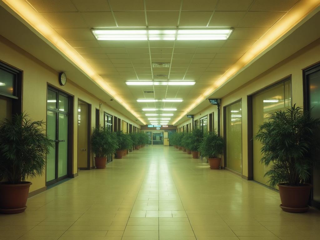
Liminal space as an aesthetic concept emerged on internet communities around 2019, crystallized around a specific type of image: photographs of recognizable but somehow wrong spaces: empty school hallways, closed shopping malls, hotel lobbies at 3am, airport terminals at night. The term 'liminal' (from the Latin 'limen': threshold) was borrowed from anthropology, where it describes the transitional states between recognized social positions (the state of being 'between'). Applied to physical spaces, it describes places that are architecturally designed for transit, occupation, or activity, but are encountered empty and still.
The aesthetic is inseparable from its internet context. The specific images that define it: fluorescent-lit hallways, indoor pools with no swimmers, suburban backyard pools at night, empty playgrounds, Brutalist stairwells: share a quality of institutional or domestic familiarity combined with uncanny wrongness. They should be occupied and aren't. The 'Backrooms' internet folklore (a sprawling improvised fiction about a space accessible only by 'noclipping' out of reality into an infinite expanse of yellow-carpeted office space lit by humming fluorescents) became the most developed expression of the aesthetic.
Liminal space aesthetics connect to the broader cultural moment of pandemic experience (2020–2021 normalized empty public spaces) and to the longer Millennial/Gen Z nostalgia for 1980s–2000s commercial and institutional architecture now largely demolished or transformed. The images are haunted by the memory of the people who should be there.
The visual DNA: what makes it recognisable
- No typography: liminal space imagery is almost entirely photographic
- When text appears: institutional signage in the frame (EXIT, EMPLOYEES ONLY, FLOOR 4)
- Sans-serif way-finding type at institutional scale
- Text as found object in the space, not as design element
- Perspective corridor: the vanishing point in the center of the image
- Symmetrical architecture creating perfect bilateral symmetry in the frame
- Looking down an empty hallway, stairwell, or escalator: the canonical shot
- Vast empty floor plane with small exit or door at the far end
- Fluorescent white: #F8F8F0, slightly greenish cool white: the color of institutional lighting
- Carpet teal and burnt orange: the 1980s–2000s commercial interior palette
- Concrete grey: #A8A4A0, #8C8880: Brutalist stairwells
- Pool blue-green: #4AABB5, #5CC4C8: indoor pool water
- The empty hallway with fluorescent strip lighting and patterned carpet
- The indoor pool with still water and no swimmers
- The closed mall with shuttered stores and atrium skylights
- Stairwells and fire exits: the between-spaces of buildings
8-channel console - dominant channels taped & circled by the registrar
Your aesthetic passport - share the fingerprint
4 color interpretations of this aesthetic
How to shoot this aesthetic
Join waitlist for access
Join the waitlist for full access
Join the waitlistLiminal Space: where the language earns its place
Liminal Space is most effective when its visual decisions do useful work. Empty transitional places: abandoned malls, empty pools, and backrooms evoking eerie familiarity
The style gives styling, proportion, and image sequencing a clear point of view rather than treating them as decoration.
It can turn atmosphere, material, and spatial pacing into evidence of a distinct experience before a visitor arrives.
It helps a physical or editorial environment feel authored, which raises attention and perceived care.
They recognize the references, proportion, and restraint that make the language feel intentional.
They respond to visible judgment because it reduces the feeling of interchangeable product.
A coherent aesthetic gives them a usable standard for choosing images, objects, and collaborators.
The cost comes from consistent art direction, suitable locations or materials, and time to edit the details that would otherwise undermine the premise.
The challenge is conceptual. It takes visual literacy and a real point of view to avoid borrowing surface cues without their original logic.
Lighting, casting, type, color, material, and retouching must agree. A single weak choice can make the work feel like an imitation.
Liminal Space creates its strongest advantage when it gives a brand a standard of judgment, not merely an attractive finish. It fails when recognizable cues are collected without a governing idea. The difference between average and exceptional execution is usually proportion: how much is shown, what is withheld, and whether every element belongs to the same world. The most capable teams pair an exacting art director with specialists who understand the medium, from photographer and stylist to set designer, editor, and typographer.
Should Liminal Space be the strategic choice?
Surface imitation is easy. The language becomes generic when familiar cues replace proportion, specificity, and a coherent system.
Its visual ingredients appear regularly in contemporary work, but a rigorous execution remains distinguishable from a loose collection of references.
Its strongest principles depend on composition, material, and cultural literacy rather than a short-lived visual effect.
It asks for consistency across photography, typography, motion, environments, and the many details that make a brand feel believable.
Liminal Space deserves serious consideration from brands and institutions that can articulate a real point of view and protect it through execution. It is less suitable for work that needs immediate instructional clarity, broad visual neutrality, or low-cost production flexibility. Its greatest advantage is differentiation through judgment: it can make a product, place, or editorial proposition feel authored rather than merely packaged. Average executions borrow recognizable signals, then lose coherence when type, casting, copy, or materials fail to agree. Exceptional executions understand the visual language as a system of choices, including what not to show. The largest mistake is treating the style as a finish applied after strategy. Adopt it only when the product and organization can carry the same standard of care the imagery proposes.
Join waitlist for access
Join the waitlist for editorial depth
Join the waitlistConnected across the creative knowledge graph