Registrar's index cards on the platen glass - captured by the scanner
1970s CCTV origins; aesthetic from 1990s; dominant internet presence 2010s · Security infrastructure; becomes aesthetic through art and digital culture
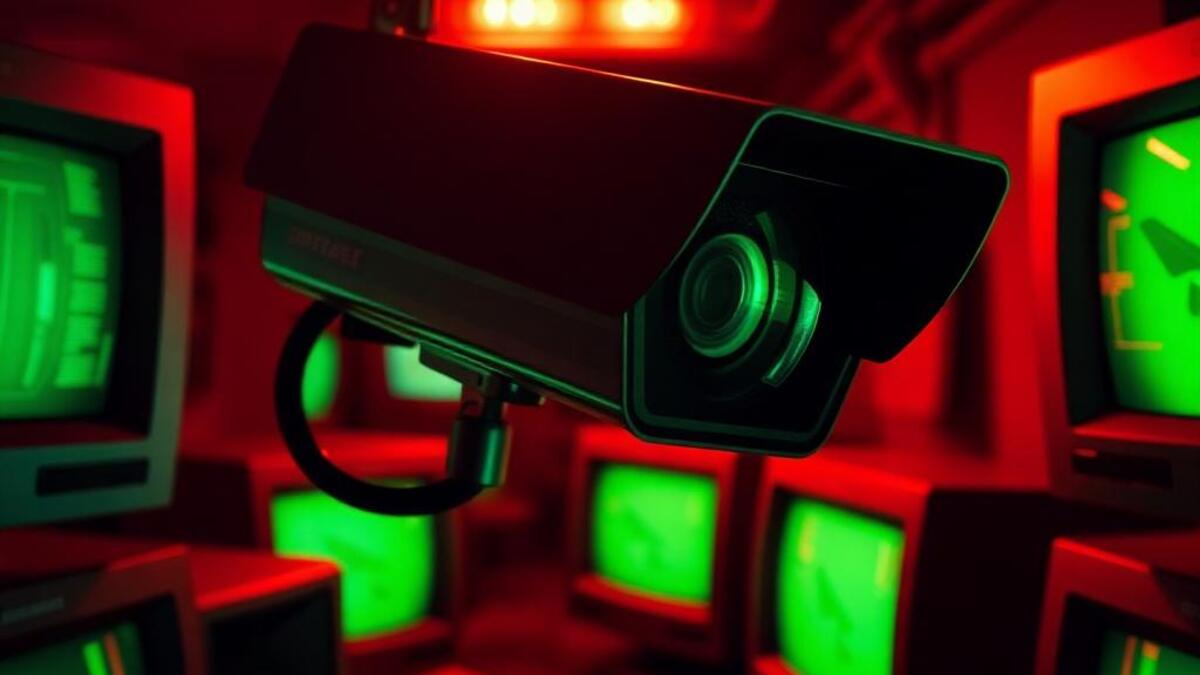
Closed-circuit television systems were first deployed commercially in the late 1940s–1950s (Siemens AG installed an early system in Germany in 1942 for rocket testing; the first US commercial installation was on Wall Street in 1973). The specific visual quality of early CCTV: monochrome, low resolution, wide-angle distortion, the timestamp and camera ID text overlay, the fixed viewpoint looking slightly downward into a space: became culturally recognizable as 'the surveillance gaze' through its proliferation in public spaces from the 1980s onward, and through its use in crime investigation television (the security footage clip became a news staple).
The surveillance aesthetic entered fine art through photographers and artists who recognized the social, political, and visual implications of omnipresent monitoring. Sophie Calle's photography (following strangers and documenting them), Trevor Paglen's work photographing surveillance infrastructure, and Jenny Holzer's use of LED text in public spaces all engaged with surveillance as both a medium and a subject. The surveillance aesthetic also became a tool of political commentary: Banksy's 'CCTV' stencil works, and the broader tradition of art that makes surveillance visible in order to critique it.
Contemporary surveillance aesthetic appears in music video (the CCTV-style shot has become a standard visual convention for edgy and transgressive content), digital art (glitch aesthetics that mimic surveillance camera compression), and as a UI/UX element in any context wanting to signal 'raw, unfiltered, live.' The Y2K and cyberpunk adjacent aesthetics both incorporate surveillance visual elements as markers of technology's social power.
The visual DNA: what makes it recognisable
- Monospaced or LED-matrix timestamp type: DD/MM/YYYY HH:MM:SS format
- Camera ID text in upper corner: CAM01 or similar designation
- System-status text: RECORDING, MOTION DETECTED, LOW LIGHT: institutional labels
- Green-on-black terminal text associated with security system UIs
- The fixed overhead or corner viewpoint: looking slightly downward and at an angle
- Wide-angle distortion: slight barrel distortion at the edges of the frame
- The split-screen quad: four camera feeds visible simultaneously
- Scan-line grid: horizontal scan lines every 2px creating the CRT display quality
- Monochrome or highly desaturated: the absence of accurate color in early CCTV
- Greenish-grey: #7A8A6A, #6A7A5A: the quality of low-light infrared CCTV footage
- High-contrast with crushed shadows: detail lost in dark areas
- Compression artifact quality: blocky MPEG compression visible in movement areas
- The timestamp overlay in a corner of the frame
- The fisheye ceiling dome camera viewed from below
- Public spaces (corridors, parking lots, plazas) from fixed viewpoints
- The empty street or room where something might be about to happen
8-channel console - dominant channels taped & circled by the registrar
Your aesthetic passport - share the fingerprint
4 color interpretations of this aesthetic
How to shoot this aesthetic
Join waitlist for access
Join the waitlist for full access
Join the waitlistSurveillance: where the language earns its place
Surveillance is most effective when its visual decisions do useful work. CCTV aesthetics, data overlays, and voyeuristic documentation
The style gives styling, proportion, and image sequencing a clear point of view rather than treating them as decoration.
It can turn atmosphere, material, and spatial pacing into evidence of a distinct experience before a visitor arrives.
It helps a physical or editorial environment feel authored, which raises attention and perceived care.
They recognize the references, proportion, and restraint that make the language feel intentional.
They respond to visible judgment because it reduces the feeling of interchangeable product.
A coherent aesthetic gives them a usable standard for choosing images, objects, and collaborators.
The cost comes from consistent art direction, suitable locations or materials, and time to edit the details that would otherwise undermine the premise.
The challenge is conceptual. It takes visual literacy and a real point of view to avoid borrowing surface cues without their original logic.
Lighting, casting, type, color, material, and retouching must agree. A single weak choice can make the work feel like an imitation.
Surveillance creates its strongest advantage when it gives a brand a standard of judgment, not merely an attractive finish. It fails when recognizable cues are collected without a governing idea. The difference between average and exceptional execution is usually proportion: how much is shown, what is withheld, and whether every element belongs to the same world. The most capable teams pair an exacting art director with specialists who understand the medium, from photographer and stylist to set designer, editor, and typographer.
Should Surveillance be the strategic choice?
Surface imitation is easy. The language becomes generic when familiar cues replace proportion, specificity, and a coherent system.
Its visual ingredients appear regularly in contemporary work, but a rigorous execution remains distinguishable from a loose collection of references.
Its strongest principles depend on composition, material, and cultural literacy rather than a short-lived visual effect.
It asks for consistency across photography, typography, motion, environments, and the many details that make a brand feel believable.
Surveillance deserves serious consideration from brands and institutions that can articulate a real point of view and protect it through execution. It is less suitable for work that needs immediate instructional clarity, broad visual neutrality, or low-cost production flexibility. Its greatest advantage is differentiation through judgment: it can make a product, place, or editorial proposition feel authored rather than merely packaged. Average executions borrow recognizable signals, then lose coherence when type, casting, copy, or materials fail to agree. Exceptional executions understand the visual language as a system of choices, including what not to show. The largest mistake is treating the style as a finish applied after strategy. Adopt it only when the product and organization can carry the same standard of care the imagery proposes.
Join waitlist for access
Join the waitlist for editorial depth
Join the waitlistConnected across the creative knowledge graph