Where Constructivism came from, what makes it recognisable, and the fingerprint it leaves.
History, Constructivism aesthetic history
1919-1934 · Moscow and Vitebsk, then Berlin and Amsterdam
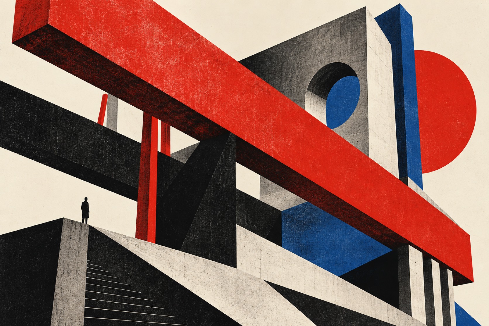
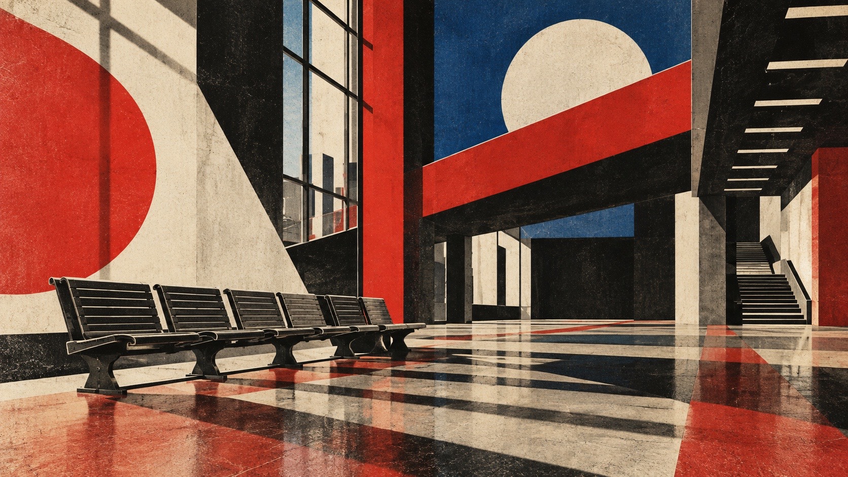
Constructivism began as a sculptural argument.In 1915 Vladimir Tatlin showed corner reliefs made of iron, glass and wood that refused to be pictures of anything, and by 1920 he had built the model for a tower that was to spiral higher than the Eiffel Tower and never left the room it was made in.The word itself came from Aleksei Gan in 1922, in a pamphlet arguing that art should stop representing life and start constructing it.The graphic language followed the sculpture: diagonals because they were the line of motion, bars and circles because they were the elements a machine is made of, red and black because those were the two inks a press could run cheaply and fast.
The posters are where the movement met the public.El Lissitzky reduced a civil war to a red wedge driving into a white circle in 1919 and called it a Proun, a project for the affirmation of the new.Alexander Rodchenko photographed Lilya Brik shouting the word for books and set it inside a megaphone of type.The Stenberg brothers drew film posters that treated the human face as one more component, tilted, cropped and scaled beside a lens or a railway line.Gustav Klutsis pushed photomontage until the photograph was a building material.The work was made in numbers and pasted on walls, and its whole ambition was to be read at speed from a distance.
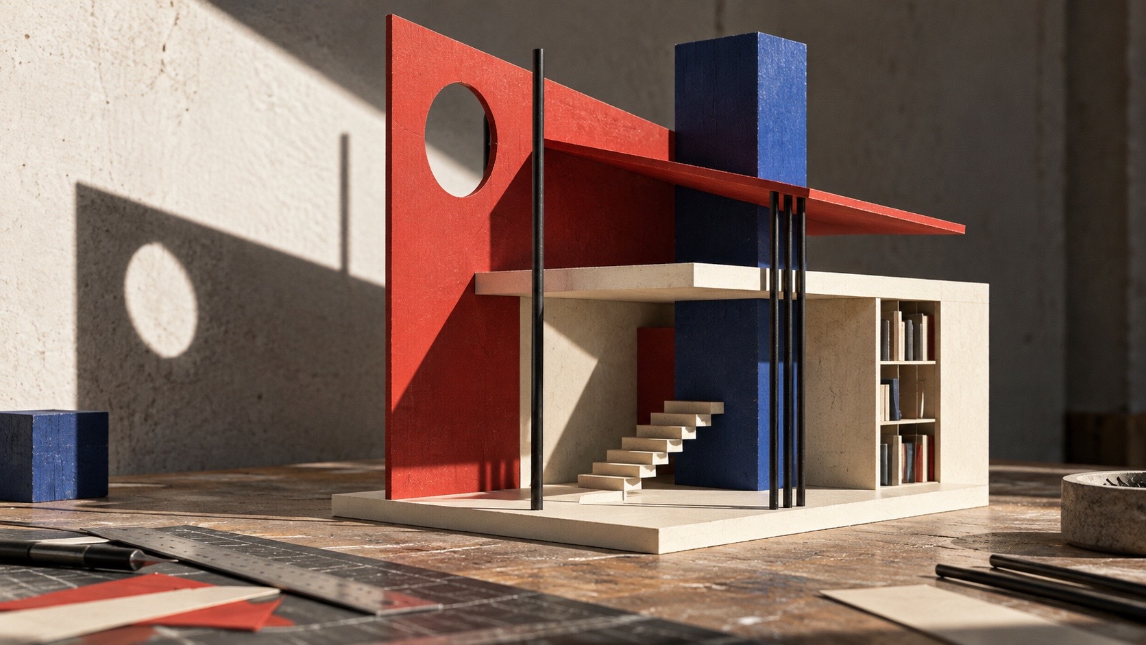
The style outlived the politics that produced it.By 1934 the state had turned to socialist realism and the constructivists were sidelined or worse, but Lissitzky had already carried the vocabulary to the Bauhaus, to De Stijl and to the Swiss designers who would systematise it.What survives as a language is the method rather than the message: build the image from a small kit of parts, let one diagonal organise everything, treat type as shape, and print in as few colours as the job allows.Used honestly it is a discipline of assembly; used as costume it becomes a period reference dressed in someone else's history.
“
The poster as a machine for being seen: assembled from parts, aimed at the street.
How to shoot it, how to prompt it, and how to board it.
Photo Direction
How to shoot this aesthetic
"A poster that has to work from across the street, built out of parts"
Shot list
Frontal shot of a cream wall pasted with layered posters made only of red and black diagonals, bars and circles, no readable words, the paper edges torn and overlapping
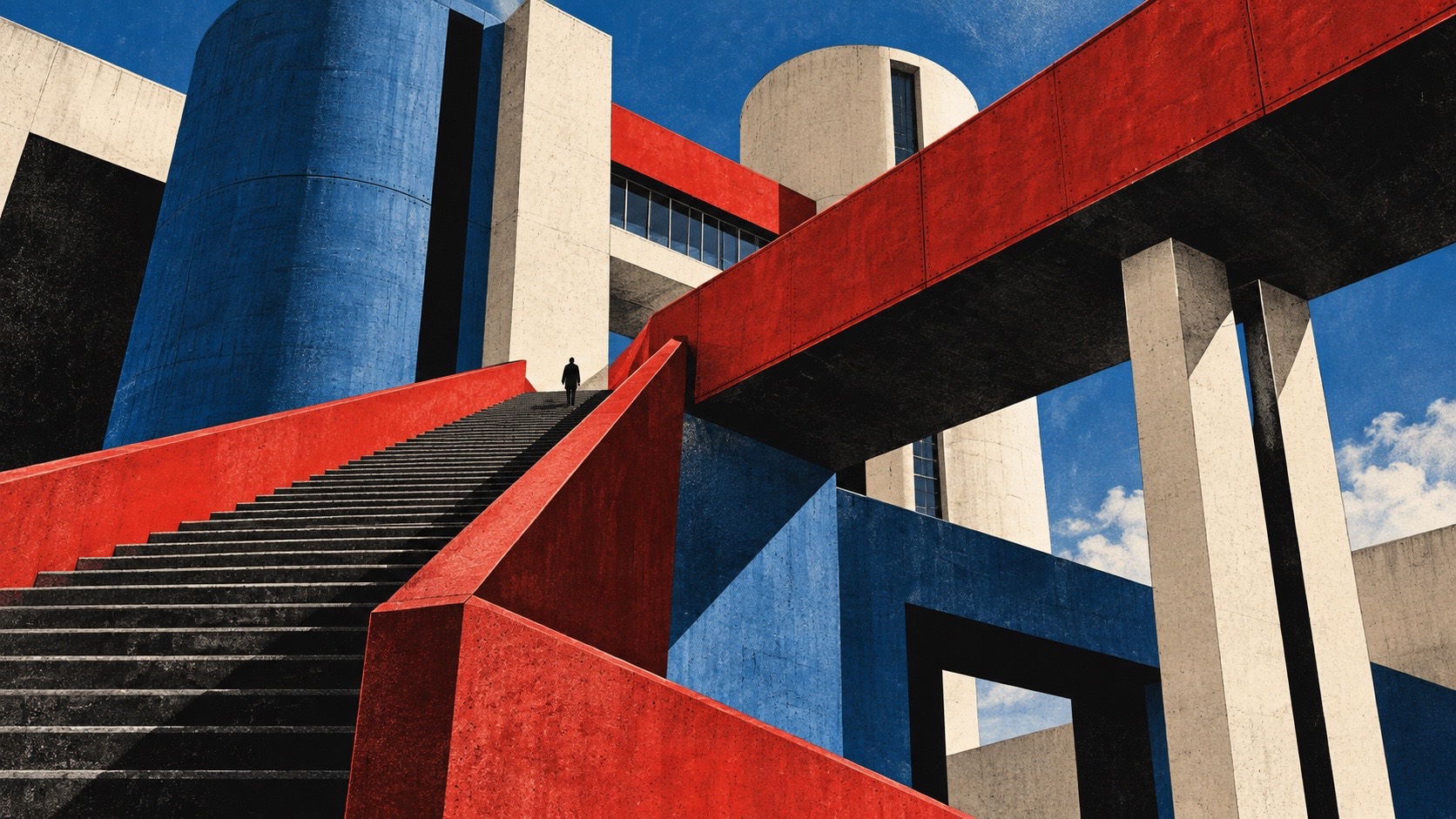
Low-angle shot of a worker in a black coat against a red-painted steel gantry, the diagonal of the structure cutting the frame corner to corner
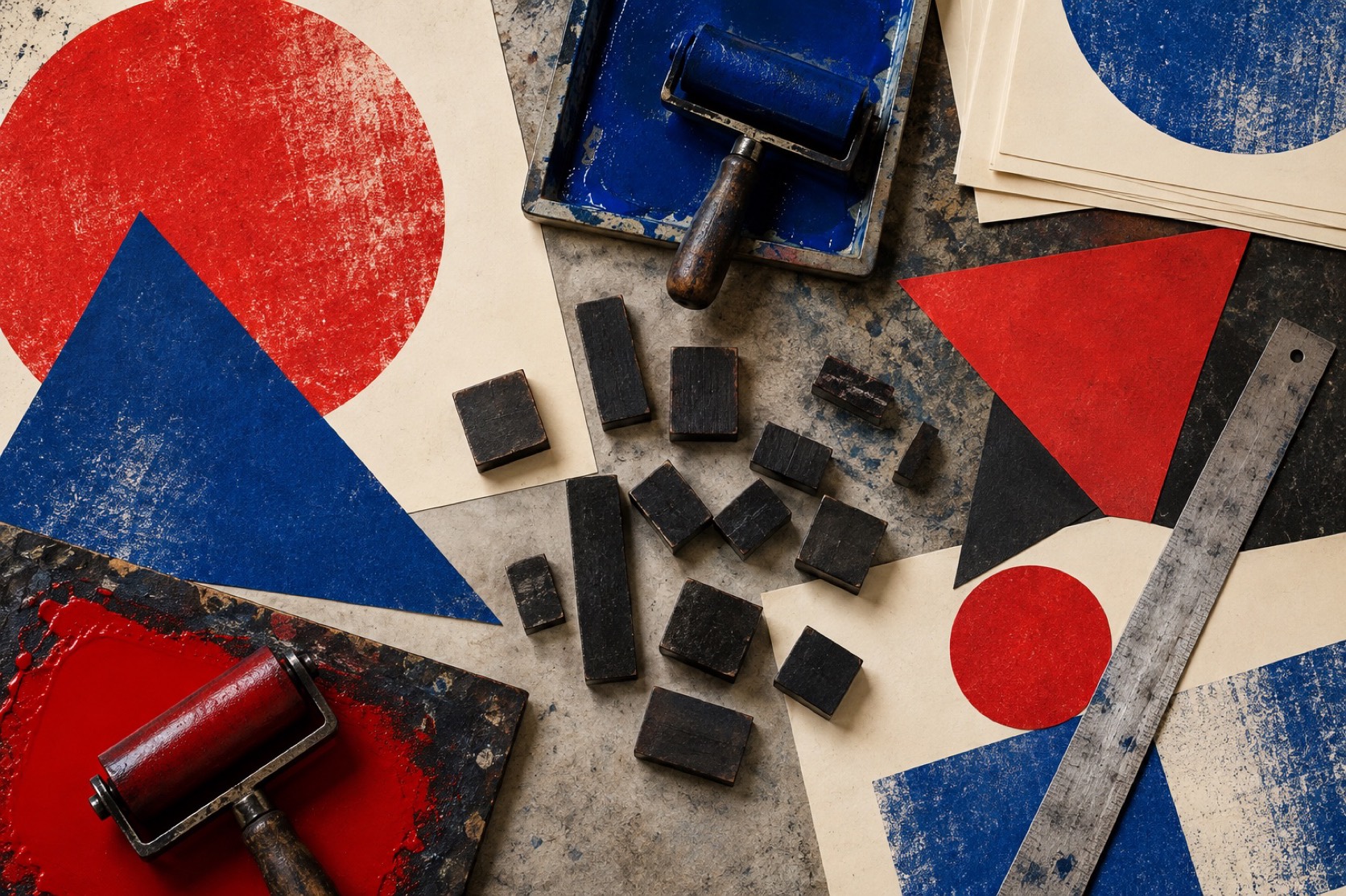
Close detail of letterpress ink on rough cream stock, a single heavy black bar bitten into the paper, red registration slightly off
Lighting
Hard, single-source daylight or one bare tungsten lamp raking across the surface so paper texture and ink relief read. Deep, clean shadows that act as compositional bars in their own right. No fill that softens an edge.
Drop this into Studio to generate in this aesthetic
Constructivist graphic design, 1920s Russian avant-garde poster language, bold diagonal composition, heavy black bars and circles, red and black on unbleached cream paper with one cobalt accent, letterforms treated as physical shapes, photomontage grain, letterpress bite on rough stock, industrial forms and engineered assembly, urgent and public, no slogans, no flags, no real text
Paste as-is, or append your own subject
Mood Board
A Pro feature: a board generated from the record
A generated board, with membership
Opening soon
04
The judgement
Whether to use it, what it costs to do properly, and where it stands right now.
Creative verdict, Constructivism feasibility and strategic recommendation
Two written calls, seven meters, and when to walk away
Creative verdict
Should Constructivism be the call?
7 meters
FIG. 2
Assessment
Assemble, do not decorate. Put the diagonal in first and make every other element obey it, because a constructivist layout with a centred, static structure is a period font on a poster. Treat type as shape and keep words fragmentary. Two inks are the constraint that makes it work; a third colour is the first sign the discipline has slipped.
Verdict
Right when the work has a purpose to declare and needs to be read at speed from a distance, which is what the language was built for. The history is difficult: the state that produced it later suppressed it, and the famous images carry symbols that belong to that moment. Borrow the method and leave the flags, because the assembly transfers and the propaganda does not.
Production cost
Low
Two inks, cheap paper and a rule. The kit of parts is the budget.
Creative difficulty
Medium
The parts are few and documented. The skill is putting them under one diagonal.
Execution difficulty
Medium
Print registration and letter shapes have to be exact or it reads as a costume.
Risk of misuse
High
Slogans, flags and period faces turn a method into propaganda cosplay.
Prevalence
Rare
Cited constantly, used rarely in its full engineered form.
Longevity
Timeless
A century old and still the root of systematic graphic design.
Brand investment
Medium
A kit of parts and two inks carry a whole identity once the rule is set.
Avoid if
The message needs warmth or intimacy
The language is built to shout across a street. It cannot whisper.
There is any temptation to use real slogans or symbols
The method transfers; the propaganda does not, and the history is not yours to borrow.
Omoro · Creative verdict · 022-CO
Editorial Depth
A Pro feature: origins, practitioners, and pitfalls
Editorial Depth · Restricted
Common Misconception
Historical Context
Brands That Accidentally Use This Style
Brands That Perfectly Represent This Style
Psychological Effect
RESTRICTED
The editorial depth, with membership
Opening soon
05
The index
Neighbours, cross-references, blends, and the questions people ask.
Related concepts
Connected across the creative knowledge graph
Cultural relevance, Constructivism cultural relevance today
Where it stands now, and what it costs you to use it
Constructivism is the root of most systematic graphic design that followed it, from the Bauhaus workshops to the Swiss grid to contemporary identity systems built from a small set of parts. Its lesson is that a poster can be engineered, that legibility at distance is a design constraint, and that a limited ink budget is a compositional asset rather than a limitation.
The history around it is difficult and should be handled with care.The movement was bound up with a state that later suppressed it, and its most famous images carry slogans and symbols that belong to that moment.The language transfers; the propaganda does not.Work in this register earns its place by borrowing the method, not by reproducing the flags.
Signal red #C41E1A, print black #0E0D0B, poster cream #E9E1CF
A single cobalt #1F3A8A admitted as the third ink at most
Red, yellow, blue as pure hue: the color triad of the Itten color wheel
The calls this blend forces
These two disagree on 3 things, and a blend cannot average them: you pick a side. At this mix:
Expressive or Restrained? Constructivism is expressive, Bauhaus is restrained. This mix lands expressive.
Maximal or Minimal? Constructivism is maximal, Bauhaus is minimal. This mix lands minimal.
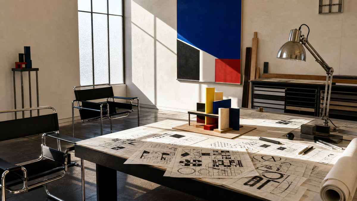
Warm or Cool? Constructivism is warm, Bauhaus is cool. This mix lands warm.
Use it
Constructivist graphic design, 1920s Russian avant-garde poster language, bold diagonal composition, heavy black bars and circles, red and black on unbleached cream paper with one cobalt accent, letterforms treated as physical shapes, photomontage grain, letterpress bite on rough stock, industrial forms and engineered assembly, urgent and public, no slogans, no flags, no real text (50%), infused with Bauhaus design aesthetic with bold primary-color contrast, geometric shapes, functional art principles, Kandinsky-influenced composition, color palette strictly #0E0D0B #000000 #C41E1A #E9E1CF #2B4FAA, leaning expressive over restrained, maximal over minimal, warm over cool, overall character: geometric, structured, nostalgic
One-click generation opens with the studio
About this aesthetic
What is constructivism in graphic design?+
A 1920s Russian avant-garde language that treated posters and books as constructions: diagonals, bars, circles, letterforms as shapes and photomontage, printed in red and black on cheap paper so they could be read at speed from the street.
How is constructivism different from Bauhaus?+
They share a vocabulary and traded people and ideas, but constructivism is louder, more diagonal and aimed at the public wall, while the Bauhaus systematised the same parts into a calmer, grid-led discipline for products and print.
Who are the key figures in constructivism?+
Vladimir Tatlin and Aleksei Gan for the theory and sculpture; El Lissitzky, Alexander Rodchenko, Varvara Stepanova, Gustav Klutsis and the Stenberg brothers for the posters, books and photomontage.
Build with the constructivism aesthetic
Every style in the library is broken down like this one: the palette, the typography, the materials and the lineage.