Registrar's index cards on the platen glass - captured by the scanner
1919–1933 · Weimar, Dessau & Berlin, Germany
Walter Gropius founded the Bauhaus in Weimar in 1919 on a single premise: the artificial boundary between fine art and applied craft should not exist. The school united painters, sculptors, typographers, weavers, and architects under one roof, asking them to produce objects that were beautiful precisely because they were functional. In 14 years across three cities: Weimar, Dessau, Berlin: it produced a visual language still instantly recognizable: primary colors, geometric abstraction, sans-serif typography, and the belief that good design should be manufacturable at scale.
The faculty reads like a hall of fame: Wassily Kandinsky (color and form theory), Paul Klee (pictorial thinking), László Moholy-Nagy (light, space, and photography), Marcel Breuer (tubular steel furniture), Herbert Bayer (universal typeface). When the Nazis forced the school to close in 1933, its faculty dispersed to the United States, carrying the methodology to Chicago, New York, and beyond. The New Bauhaus in Chicago became the IIT Institute of Design; Gropius and Marcel Breuer rebuilt at Harvard.
The Bauhaus's peculiar lasting influence is conceptual as much as visual. Its pedagogical structure: foundation year of perceptual exercises followed by material-specific workshops: is still the model for design schools worldwide. The visual vocabulary (primary color blocking, sans-serif type, geometric ornament) has become a shorthand for 'serious design' in everything from museum posters to startup pitch decks.
The visual DNA: what makes it recognisable
- Universal Typeface (Herbert Bayer, 1925): geometric, lowercase-only
- Sans-serif as the only rational choice: Futura is the closest commercial parallel
- Type treated as graphic form: letters used as geometric building blocks
- Black type on white, or reversed white on black: no decorative color in text
- Asymmetric balance, not classical symmetry
- Diagonal compositions that create kinetic energy
- Circles, squares, and triangles as primary compositional units
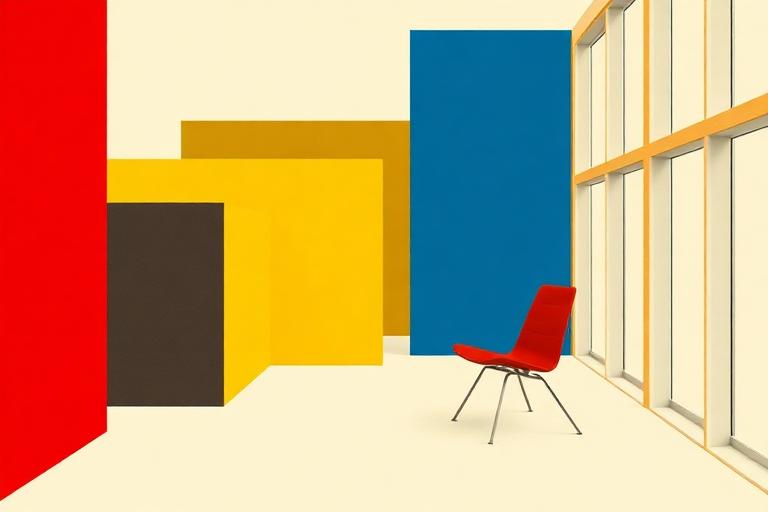
- Primary color planes fill large areas with no internal gradient
- Red, yellow, blue as pure hue: the color triad of the Itten color wheel
- Black and white as structural elements, not neutrals
- Industrial materials celebrated: steel, glass, chrome
- Weave patterns from the textile workshop: geometric, repeating
- The circle in square in triangle: Kandinsky's shape-color assignments
- Abstracted human figure reduced to geometric form
- Industrial photography, especially machinery at close range
- Grid overlays and ruled lines as visible design infrastructure
8-channel console - dominant channels taped & circled by the registrar
Your aesthetic passport - share the fingerprint
4 color interpretations of this aesthetic
How to shoot this aesthetic
Join waitlist for access
Join the waitlist for full access
Join the waitlistBauhaus: where the language earns its place
Bauhaus is most effective when its visual decisions do useful work. Functional minimalist design with geometric forms and primary colors
The style gives styling, proportion, and image sequencing a clear point of view rather than treating them as decoration.
It can turn atmosphere, material, and spatial pacing into evidence of a distinct experience before a visitor arrives.
It helps a physical or editorial environment feel authored, which raises attention and perceived care.
They recognize the references, proportion, and restraint that make the language feel intentional.
They respond to visible judgment because it reduces the feeling of interchangeable product.
A coherent aesthetic gives them a usable standard for choosing images, objects, and collaborators.
The cost comes from consistent art direction, suitable locations or materials, and time to edit the details that would otherwise undermine the premise.
The challenge is conceptual. It takes visual literacy and a real point of view to avoid borrowing surface cues without their original logic.
Lighting, casting, type, color, material, and retouching must agree. A single weak choice can make the work feel like an imitation.
Bauhaus creates its strongest advantage when it gives a brand a standard of judgment, not merely an attractive finish. It fails when recognizable cues are collected without a governing idea. The difference between average and exceptional execution is usually proportion: how much is shown, what is withheld, and whether every element belongs to the same world. The most capable teams pair an exacting art director with specialists who understand the medium, from photographer and stylist to set designer, editor, and typographer.
Should Bauhaus be the strategic choice?
Surface imitation is easy. The language becomes generic when familiar cues replace proportion, specificity, and a coherent system.
Its visual ingredients appear regularly in contemporary work, but a rigorous execution remains distinguishable from a loose collection of references.
Its strongest principles depend on composition, material, and cultural literacy rather than a short-lived visual effect.
It asks for consistency across photography, typography, motion, environments, and the many details that make a brand feel believable.
Bauhaus deserves serious consideration from brands and institutions that can articulate a real point of view and protect it through execution. It is less suitable for work that needs immediate instructional clarity, broad visual neutrality, or low-cost production flexibility. Its greatest advantage is differentiation through judgment: it can make a product, place, or editorial proposition feel authored rather than merely packaged. Average executions borrow recognizable signals, then lose coherence when type, casting, copy, or materials fail to agree. Exceptional executions understand the visual language as a system of choices, including what not to show. The largest mistake is treating the style as a finish applied after strategy. Adopt it only when the product and organization can carry the same standard of care the imagery proposes.
Join waitlist for access
Join the waitlist for editorial depth
Join the waitlistConnected across the creative knowledge graph