Registrar's index cards on the platen glass - captured by the scanner
2010s–present · Internet; BookTok and Bookstagram communities
Romantasy as a recognized aesthetic category emerged alongside the BookTok and Bookstagram communities of the 2010s–2020s, crystallizing around a specific subgenre of fantasy fiction: works like Sarah J. Maas's 'Throne of Glass' and 'A Court of Thorns and Roses' series, Leigh Bardugo's 'Shadow and Bone' (Grisha Verse), and their many imitators: that center romantic relationships and character chemistry alongside the traditional fantasy elements of magic systems, world-building, and heroic quests. The aesthetic draws from several historical traditions: Romantic era painting (pre-Raphaelite, Academic orientalism), the aesthetic of dark fantasy gaming art, and the 'fairytale couture' fashion that appears in editorial and high fantasy illustration.
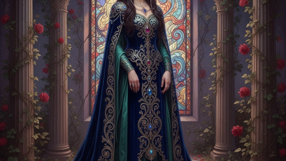
Romantasy's visual vocabulary is deliberately lush and feminine in a tradition that had long been masculine: armor is more likely to suggest a ball gown than a battlefield; forests are dark and enchanted rather than threatening; the dominant mood is desire rather than combat. The color palette combines the deep, rich jewel tones of velvet and court fashion (emerald, sapphire, wine) with the softer romanticism of roses, moonlight, and candlelit stone. Gold filigree and floral motifs appear throughout as decorative elements.
The aesthetic is particularly associated with book cover design of the 2010s–2020s: a specific, highly evolved commercial illustration tradition that uses photomanipulation to place beautiful figures in fantastical landscapes with dramatic lighting. This cover aesthetic is so consistent that readers use it to identify romantasy titles at a glance: the partially-obscured or silhouetted figure, the golden-lit gothic architecture, the floating flowers or falling petals, the deep jewel-tone background.
The visual DNA: what makes it recognisable
- Elegant, flowing serifs: Cormorant Garamond, Playfair Display, or similar high-contrast display faces
- Italic or calligraphic scripts for secondary elements and pull quotes
- Gold metallic or embossed type on dark backgrounds: book cover convention
- Script letterforms with extended ascenders and descenders
- Centered, symmetrical composition: the portal, the window, the court
- Figure against vast architectural or landscape backdrop
- Floating organic elements: petals, leaves, candle sparks
- The vignette: bright center fading to dark edges
- Deep jewel tones: emerald #006B3C, sapphire #0D3B8B, wine #6B1020, amethyst #5A1E6B
- Gold: #C9A84C, #D4AF37: filigree and accent
- Moonlight: silver-blue #A0B4C8, #8090A8
- Dark forest: deep green-black #0A1F0E, #142A18
- Velvet and lace: rich textile texture in dress and cloak
- The enchanted forest: dark trees with luminous details
- Roses: both literal flowers and stylized thorned-rose motifs
- The crown: real or implied, a symbol of power and desire
8-channel console - dominant channels taped & circled by the registrar
Your aesthetic passport - share the fingerprint
4 color interpretations of this aesthetic
Join waitlist for access
Join the waitlist for full access
Join the waitlistRomantasy: where the language earns its place
Romantasy is most effective when its visual decisions do useful work. Dark romantic fantasy meets editorial luxury - jewel tones, baroque filigree, pre-Raphaelite painterly light, and gothic architecture elevated to fashion editorial
The style gives styling, proportion, and image sequencing a clear point of view rather than treating them as decoration.
It can turn atmosphere, material, and spatial pacing into evidence of a distinct experience before a visitor arrives.
It helps a physical or editorial environment feel authored, which raises attention and perceived care.
They recognize the references, proportion, and restraint that make the language feel intentional.
They respond to visible judgment because it reduces the feeling of interchangeable product.
A coherent aesthetic gives them a usable standard for choosing images, objects, and collaborators.
The cost comes from consistent art direction, suitable locations or materials, and time to edit the details that would otherwise undermine the premise.
The challenge is conceptual. It takes visual literacy and a real point of view to avoid borrowing surface cues without their original logic.
Lighting, casting, type, color, material, and retouching must agree. A single weak choice can make the work feel like an imitation.
Romantasy creates its strongest advantage when it gives a brand a standard of judgment, not merely an attractive finish. It fails when recognizable cues are collected without a governing idea. The difference between average and exceptional execution is usually proportion: how much is shown, what is withheld, and whether every element belongs to the same world. The most capable teams pair an exacting art director with specialists who understand the medium, from photographer and stylist to set designer, editor, and typographer.
Should Romantasy be the strategic choice?
Surface imitation is easy. The language becomes generic when familiar cues replace proportion, specificity, and a coherent system.
Its visual ingredients appear regularly in contemporary work, but a rigorous execution remains distinguishable from a loose collection of references.
Its strongest principles depend on composition, material, and cultural literacy rather than a short-lived visual effect.
It asks for consistency across photography, typography, motion, environments, and the many details that make a brand feel believable.
Romantasy deserves serious consideration from brands and institutions that can articulate a real point of view and protect it through execution. It is less suitable for work that needs immediate instructional clarity, broad visual neutrality, or low-cost production flexibility. Its greatest advantage is differentiation through judgment: it can make a product, place, or editorial proposition feel authored rather than merely packaged. Average executions borrow recognizable signals, then lose coherence when type, casting, copy, or materials fail to agree. Exceptional executions understand the visual language as a system of choices, including what not to show. The largest mistake is treating the style as a finish applied after strategy. Adopt it only when the product and organization can carry the same standard of care the imagery proposes.
Join waitlist for access
Join the waitlist for editorial depth
Join the waitlistConnected across the creative knowledge graph