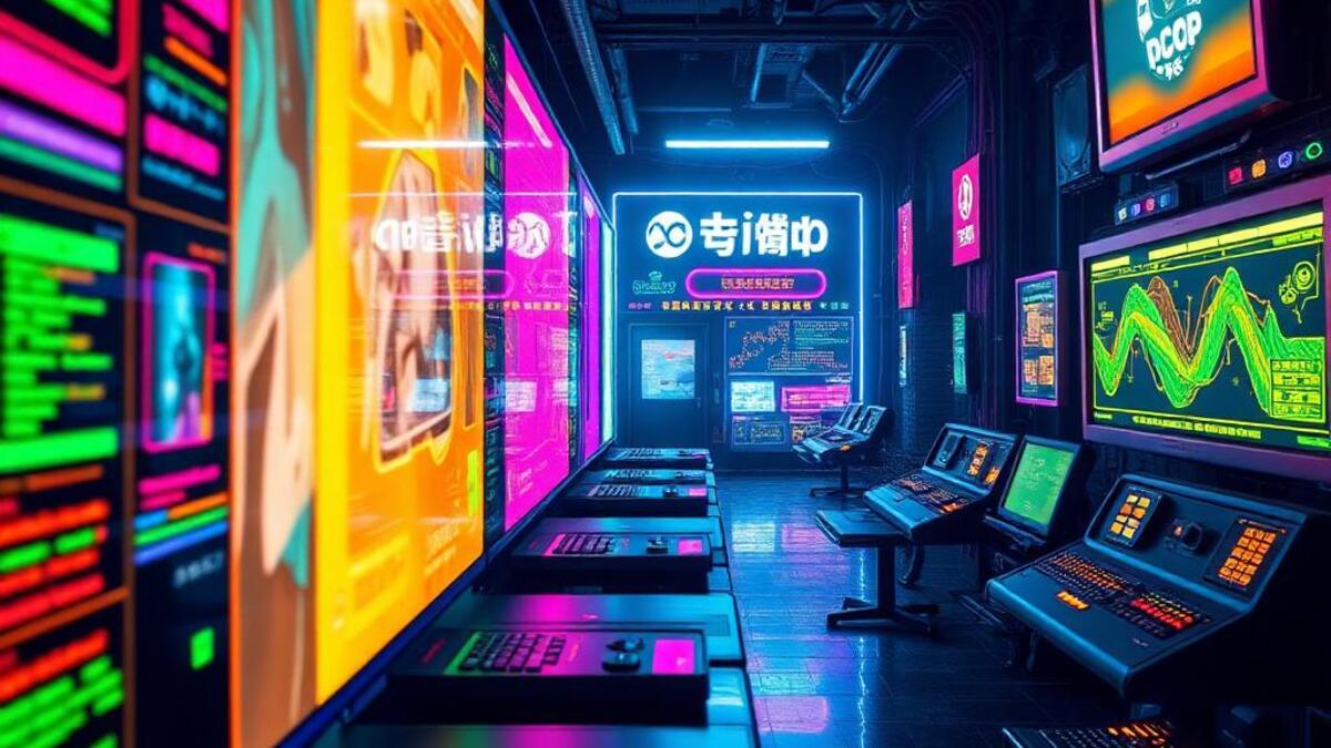
Cyberpop

Digital maximalism meets pop culture with saturated screens and interface elements

Compare Cyberpop with another style →
Record022-CY
AestheticCyberpop
ClassDigital / Maximal
StatusINGESTING
Example of the Cyberpop aesthetic
Archive platecyberpop
Source document

Registrar's index cards on the platen glass - captured by the scanner

Omoro Archive - Registrar's OfficeCyberpopFILE 022-CY
When to use it
  • Hyperpop and electronic music
  • Digital-native Gen-Z brands
+2 more in the Style Guide
Perfect for
  • Hyperpop artists
  • Streaming platforms
+2 more in the Style Guide
What it looks like
  • Layered interface elements
  • Saturated neon colors
+2 more in the Style Guide
Omoro Style GuideAll 151 aesthetics, every field on this page, in one PDF.
Get the guide →
History

2016–present · K-pop visual culture, global pop music; internet aesthetics communities

Cyberpop emerged in the mid-2010s at the intersection of K-pop production design and the global spread of internet aesthetics. Where cyberpunk is dystopian and dark: grimy neons in the rain: cyberpop inverts the palette: bright magenta, electric blue, and holographic silver on white or pastel backgrounds. The future, in cyberpop, is exciting rather than threatening.

K-pop visual language was a central driver: groups like BLACKPINK, aespa, and EXO developed a visual grammar that drew from gaming aesthetics, sci-fi concept art, and digital interfaces but in a hyper-optimistic register. Holographic materials, geometric grids, AR interfaces, and digital avatars were filtered through the production values of major entertainment companies to create something simultaneously futuristic and explicitly commercial.

Cyberpop is now a dominant aesthetic in influencer content, product packaging for tech-adjacent consumer products, and independent music production. It represents the mainstreaming of cyberculture: the future is now an aesthetic choice, available to anyone with a good 3D renderer and a neon gradient preset.

Visual markers

The visual DNA: what makes it recognisable

typography
  • Sharp geometric sans-serifs with heavy tracking: NEUTRA, Bebas Neue, Futura
  • Chrome and holographic type treatments: rainbow gradients on metallic surfaces
  • Glitch effects on otherwise clean typography: controlled imperfection
  • Outlined type: hollow letterforms with glowing strokes on dark backgrounds
grid
  • Digital grid overlays: perspectival grids receding to infinity
  • Hard geometric shapes: hexagons, triangles, and angular panels
  • Symmetric, centered compositions with radial or bilateral symmetry
  • Floating UI elements: panels, progress bars, and HUD-style overlays
materials
  • Hot magenta: #FF007F, #E91E8C: the signature cyberpop color
  • Electric cyan: #00FFFF, #00CED1
  • Holographic gradient: a rainbow spectrum applied to a single surface
  • Black: #0D0D0D as depth anchor, or pure white #FFFFFF for the daytime version
motifs
  • Holographic and iridescent surface treatments
  • Digital avatars and virtual characters
  • AR-style floating UI panels and data readouts
  • Geometric crystals and faceted gem shapes
Aesthetic profile

8-channel console - dominant channels taped & circled by the registrar

Attribute Console - 022-CY 8 CH ACTIVEFIG. 1
CH01Minimal
MaximalR·80
CH02Analog
DigitalR·90
CH03Restrained
ExpressiveR·80
CH04Cool
WarmCTR·0
CH05Futuristic
NostalgicL·30
CH06Structured
ChaoticR·50
CH07Dark
LightR·30
CH08Organic
GeometricR·10

strongest channels circled - leans digital, maximal, expressive ✦

Profile card

Your aesthetic passport - share the fingerprint

Aesthetic Profile
Cyberpop
MaximalDigitalExpressiveWarmFuturisticChaoticLightGeometric
DigitalMaximalExpressive
omoro.io/styles/cyberpop
Color Palettes

3 color interpretations of this aesthetic

Cyberpop
Digital kawaii - neon and cute
Harajuku Digital
Takeshita Street kawaii meets Akihabara neon
Virtual Cute
Digital avatar: pink void and impossible softness
Photo Direction

How to shoot this aesthetic

"Digital maximalism collides with pop fantasy the screen is the stage and everything is content"

Shot list

  • Portrait of subject surrounded by multiple screens showing different content simultaneously, their face lit by the aggregate glow
  • Subject wearing headphones and interactive tech accessories, posed with bold graphic elements behind
  • Action shot at a gaming or streaming setup with multiple colored LED light sources competing

Lighting

RGB LED panels in competing hues; no single color should dominate; cyan, magenta, and yellow provide the widest gamut and the most cyberpop color combinations

Mood Board

Join waitlist for access

Join the waitlist for full access

Join the waitlist
Creative Application Analysis

Cyberpop: where the language earns its place

Cyberpop is most effective when its visual decisions do useful work. Digital maximalism meets pop culture with saturated screens and interface elements

Best industries
Fashion and editorialFIT 9/10

The style gives styling, proportion, and image sequencing a clear point of view rather than treating them as decoration.

Hospitality and real estateFIT 8/10

It can turn atmosphere, material, and spatial pacing into evidence of a distinct experience before a visitor arrives.

Culture and premium retailFIT 8/10

It helps a physical or editorial environment feel authored, which raises attention and perceived care.

Best audiences
Design-literate viewersFIT 9/10

They recognize the references, proportion, and restraint that make the language feel intentional.

Considered buyersFIT 8/10

They respond to visible judgment because it reduces the feeling of interchangeable product.

Creative decision makersFIT 8/10

A coherent aesthetic gives them a usable standard for choosing images, objects, and collaborators.

Best products
Flagship productsA singular object benefits when the visual system concentrates attention rather than dispersing it.
Editorial publicationsThe language can hold a sequence of stories together while leaving room for individual subjects.
Spatial and service experiencesIt extends naturally into materials, signage, lighting, and the rhythm of arrival.
Best campaign types
Brand or product launchA defined visual language gives the first encounter enough conviction to establish a durable frame.
Editorial campaignIt rewards a sequence of related images rather than a single isolated hero shot.
Concept film or lookbookMotion, casting, set detail, and typography can all carry the same underlying logic.
Creative feasibility
Production costMedium

The cost comes from consistent art direction, suitable locations or materials, and time to edit the details that would otherwise undermine the premise.

Creative difficultyHigh

The challenge is conceptual. It takes visual literacy and a real point of view to avoid borrowing surface cues without their original logic.

Execution difficultyHigh

Lighting, casting, type, color, material, and retouching must agree. A single weak choice can make the work feel like an imitation.

Overall creative assessment

Cyberpop creates its strongest advantage when it gives a brand a standard of judgment, not merely an attractive finish. It fails when recognizable cues are collected without a governing idea. The difference between average and exceptional execution is usually proportion: how much is shown, what is withheld, and whether every element belongs to the same world. The most capable teams pair an exacting art director with specialists who understand the medium, from photographer and stylist to set designer, editor, and typographer.

Strategic Recommendation

Should Cyberpop be the strategic choice?

Best for
A brand with a real point of viewThe aesthetic works when it can sharpen an existing position, not invent one in its place.
High-consideration launchesA controlled visual system helps make an object, place, or service feel intentional before its details are fully understood.
Editorial, spatial, and experiential workThese formats allow composition, material, pacing, and typography to reinforce one another.
Creative portfolios and institutionsA sustained visual language can demonstrate discernment and make a body of work feel coherent.
Avoid if
The message must be read instantly by everyoneAesthetic nuance can compete with direct instructional clarity when accessibility is the first requirement.
The brand cannot sustain production standardsInconsistent imagery, typography, or material choices expose the gap between the concept and the execution.
The product has no credible relationship to the visual promiseStyling cannot compensate for a story, object, or service that does not support it.
Risk of misuseHigh

Surface imitation is easy. The language becomes generic when familiar cues replace proportion, specificity, and a coherent system.

Contemporary prevalenceCommon

Its visual ingredients appear regularly in contemporary work, but a rigorous execution remains distinguishable from a loose collection of references.

LongevityEnduring

Its strongest principles depend on composition, material, and cultural literacy rather than a short-lived visual effect.

Brand investmentHigh

It asks for consistency across photography, typography, motion, environments, and the many details that make a brand feel believable.

Creative verdict

Cyberpop deserves serious consideration from brands and institutions that can articulate a real point of view and protect it through execution. It is less suitable for work that needs immediate instructional clarity, broad visual neutrality, or low-cost production flexibility. Its greatest advantage is differentiation through judgment: it can make a product, place, or editorial proposition feel authored rather than merely packaged. Average executions borrow recognizable signals, then lose coherence when type, casting, copy, or materials fail to agree. Exceptional executions understand the visual language as a system of choices, including what not to show. The largest mistake is treating the style as a finish applied after strategy. Adopt it only when the product and organization can carry the same standard of care the imagery proposes.

Editorial Depth

Join waitlist for access

Common Misconception
Historical Context
Brands That Accidentally Use This Style
Brands That Perfectly Represent This Style
Psychological Effect

Join the waitlist for editorial depth

Join the waitlist
Related concepts

Connected across the creative knowledge graph

Cross-references
Cyberpunkcyberpunk is the dark version of the same cyberculture referenceVaporwaveboth draw from digital nostalgia, different temperature registerSynthwavesynthwave is analog-retro, cyberpop is digital-forwardY2KY2K tech-optimism is a direct ancestor of cyberpop
About this aesthetic
What is cyberpop aesthetic?
Cyberpop is an optimistic, high-gloss take on cyberculture aesthetics: neon magentas (#FF007F), electric cyans (#00FFFF), holographic gradients, and digital grid overlays but in a bright, poppy register rather than dark dystopian. It emerged from K-pop visual design (BLACKPINK, aespa) and global pop music production in the mid-2010s. It's the cyberculture aesthetic for the mainstream.
How does cyberpop differ from cyberpunk?
Cyberpunk aesthetic is dark, dystopian, and gritty: neon signs reflected in rain, crumbling urban infrastructure, the hacker's underworld. Cyberpop takes the same neon palette (magenta, cyan, electric blue) and bright gloss materials but places them in a clean, optimistic context: sleek surfaces, light backgrounds, futurism as aspiration rather than warning.
What brands use cyberpop aesthetic?
Cyberpop appears in K-pop entertainment brands (HYBE, SM Entertainment), gaming aesthetics (Fortnite, Valorant), consumer tech products targeting younger demographics, and beauty brands that reference digital culture. Products like AirPods Pro packaging, Samsung Galaxy campaigns, and independent music releases from pop artists frequently use cyberpop visual language.

Build with the cyberpop aesthetic

Omoro turns aesthetic references into on-brand visuals. Generate, compose and publish from one studio.

Join the waitlist