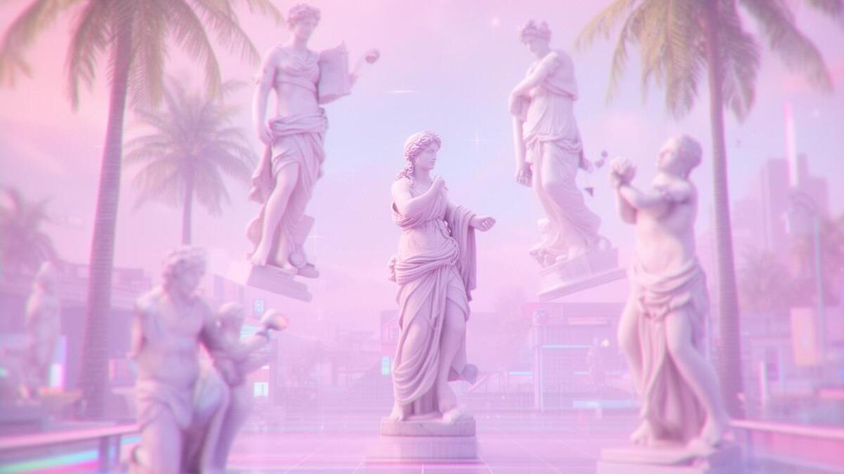
Registrar's index cards on the platen glass - captured by the scanner
2011–present · Internet, global; emerged on Tumblr and Bandcamp
Vaporwave emerged around 2010–2011 as a microgenre of electronic music on Tumblr and Bandcamp: artists like Macintosh Plus (Ramona Xavier) slowing down 1980s–90s corporate ambient and smooth jazz to near-drone tempo, with pitch-shifted vocals that turned elevator music into something both funny and haunting. The aesthetic that formed around this music drew from 1990s corporate multimedia (Windows 95, early internet clip art, CD-ROM graphics) and physical consumer culture (mall architecture, Sharper Image catalogs, Jamba Juice signage).
The color palette: lavender, mint, salmon, and electric teal against near-white: inverts synthwave's noir darkness into something pastel and dream-like. Where synthwave is kinetic and aspirational, vaporwave is disoriented and melancholic, mimicking the uncanny quality of revisiting a childhood memory that's partly wrong. Glitch artifacts, scanlines, and low-resolution JPEG compression are treated as poetic texture.
By 2014–2016, vaporwave had become a visual language independent of the music: applied to fashion, illustration, and graphic design as a form of ironic nostalgia for early digital culture. Its critique of consumer capitalism is often subtle: presenting the ephemera of late-1980s and 1990s commercial culture in a context that makes it feel both beautiful and hollow.
The visual DNA: what makes it recognisable
- Windows system fonts: Arial, Times New Roman, Chicago: used earnestly
- Japanese katakana mixed into English text (aesthetic without linguistic meaning)
- Pixel fonts from 1990s video game UIs
- Bold serifed display type in gradient or chrome treatments
- No formal grid: elements float or overlap as in an early HTML website
- Tiled background patterns: checker, marble, or geometric repeats
- Floating windows and dialog boxes from Windows 95/98 UI
- Deep perspective architecture (corridors, malls) shot with wide lens
- Pastel lavender (#C3A6E0), mint (#A0E4CB), salmon (#F4A688), electric teal (#00FFFF)
- White or near-white backgrounds: vaporwave is light, not dark
- Marble texture: white Carrara marble used on digital objects
- JPEG compression artifacts and RGB chromatic shift
- Classical sculpture heads (David, Venus de Milo) placed in digital environments
- Grids of early CGI objects: dolphins, pyramids, diamonds
- Palm trees (Miami Vice) and sunsets in pastel pink
- Microsoft Windows and Macintosh System 7 UI elements
8-channel console - dominant channels taped & circled by the registrar
Your aesthetic passport - share the fingerprint
4 color interpretations of this aesthetic
How to shoot this aesthetic
Join waitlist for access
Join the waitlist for full access
Join the waitlistVaporwave: where the language earns its place
Vaporwave is most effective when its visual decisions do useful work. Glitched nostalgia with Roman busts, pink gradients, and corporate surrealism
The style gives styling, proportion, and image sequencing a clear point of view rather than treating them as decoration.
It can turn atmosphere, material, and spatial pacing into evidence of a distinct experience before a visitor arrives.
It helps a physical or editorial environment feel authored, which raises attention and perceived care.
They recognize the references, proportion, and restraint that make the language feel intentional.
They respond to visible judgment because it reduces the feeling of interchangeable product.
A coherent aesthetic gives them a usable standard for choosing images, objects, and collaborators.
The cost comes from consistent art direction, suitable locations or materials, and time to edit the details that would otherwise undermine the premise.
The challenge is conceptual. It takes visual literacy and a real point of view to avoid borrowing surface cues without their original logic.
Lighting, casting, type, color, material, and retouching must agree. A single weak choice can make the work feel like an imitation.
Vaporwave creates its strongest advantage when it gives a brand a standard of judgment, not merely an attractive finish. It fails when recognizable cues are collected without a governing idea. The difference between average and exceptional execution is usually proportion: how much is shown, what is withheld, and whether every element belongs to the same world. The most capable teams pair an exacting art director with specialists who understand the medium, from photographer and stylist to set designer, editor, and typographer.
Should Vaporwave be the strategic choice?
Surface imitation is easy. The language becomes generic when familiar cues replace proportion, specificity, and a coherent system.
Its visual ingredients appear regularly in contemporary work, but a rigorous execution remains distinguishable from a loose collection of references.
Its strongest principles depend on composition, material, and cultural literacy rather than a short-lived visual effect.
It asks for consistency across photography, typography, motion, environments, and the many details that make a brand feel believable.
Vaporwave deserves serious consideration from brands and institutions that can articulate a real point of view and protect it through execution. It is less suitable for work that needs immediate instructional clarity, broad visual neutrality, or low-cost production flexibility. Its greatest advantage is differentiation through judgment: it can make a product, place, or editorial proposition feel authored rather than merely packaged. Average executions borrow recognizable signals, then lose coherence when type, casting, copy, or materials fail to agree. Exceptional executions understand the visual language as a system of choices, including what not to show. The largest mistake is treating the style as a finish applied after strategy. Adopt it only when the product and organization can carry the same standard of care the imagery proposes.
Join waitlist for access
Join the waitlist for editorial depth
Join the waitlistConnected across the creative knowledge graph