Registrar's index cards on the platen glass - captured by the scanner
1940s–present (painterly tradition); digital acceleration 2015–present · Expressionist and gestural painting; photography manipulation; digital art communities
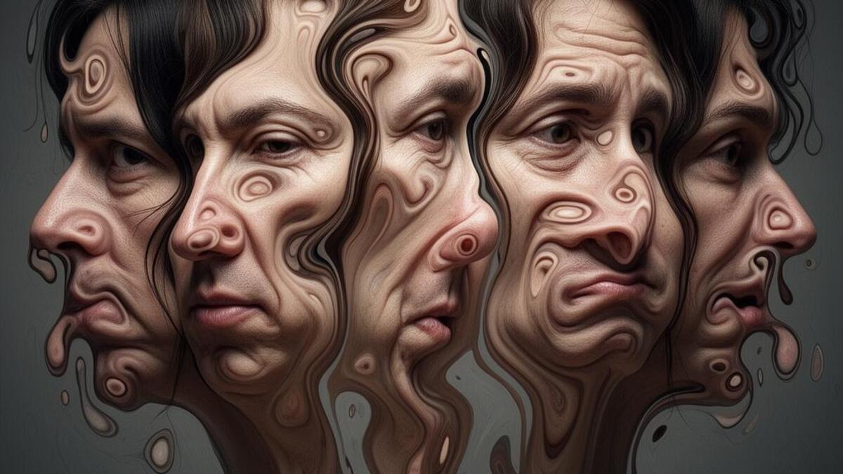
Distorted portrait aesthetics draws from multiple traditions of representing the human face under duress: Francis Bacon's traumatized flesh paintings (1945–1992), Lucian Freud's psychologically intense close studies, the motion-blur portraiture tradition in photography, and the digital distortion tools (liquify, pixel sorting, glitch effects) that became widely available in the 2010s. The connecting logic is that distortion reveals psychological truth that realistic representation cannot.
Digital distortion democratized the aesthetic: the Photoshop Liquify tool, datamosh effects (where video codec artifacts create smearing and glitching), pixel sorting algorithms, and Instagram filters that stretch and warp faces all produced a visual culture where distorted portraiture moved from gallery to social media. Artists like Nicola Samori, David Altmejd, and the digital art community on DeviantArt and later Instagram developed the visual grammar.
Distorted portrait aesthetic appears in: experimental music album art (the tradition from Joy Division's Unknown Pleasures to Arca's visual identity), high-fashion photography (avant-garde magazine shoots that reference Bacon), gallery art that engages with the politics of the face and identity, and the broader internet culture of face-swap, deepfake, and filter aesthetics that constitute contemporary portrait photography's uncanny register.
The visual DNA: what makes it recognisable
- Minimal or no text: the distorted face is sufficient visual content
- When text appears: compressed, stretched, or itself distorted to match the imagery
- White or stark text to contrast with the complexity of the distorted imagery
- Titles that reference the portrait's title tradition: name, year, number
- Close crop: the face filling the entire frame
- Symmetrical portrait format disrupted by asymmetrical distortion
- Black or dark background that isolates the face against darkness
- Close-up detail crops isolating a specific zone of distortion
- Skin tones distorted: #E8C4A0, #D4A880, #B08060: flesh made strange
- Paint blacks and darks: #1A1410, #2A2018: the shadows of gestural painting
- Distortion teal: #30808A, #28707A: digital liquify artifact colors
- Blood and bruise: #8B2020, #6A1818: painterly violence references
- Liquified and stretched facial features: eyes pulled, mouths extended
- Pixel sorting and datamosh artifacts: faces that bleed horizontally
- Paint texture over photography: the face as material surface
- Glass and lens distortion: faces seen through rain-covered glass
8-channel console - dominant channels taped & circled by the registrar
Your aesthetic passport - share the fingerprint
4 color interpretations of this aesthetic
How to shoot this aesthetic
Join waitlist for access
Join the waitlist for full access
Join the waitlistDistorted Portraits: where the language earns its place
Distorted Portraits is most effective when its visual decisions do useful work. Human faces stretched, warped, or manipulated for emotional effect
The style gives styling, proportion, and image sequencing a clear point of view rather than treating them as decoration.
It can turn atmosphere, material, and spatial pacing into evidence of a distinct experience before a visitor arrives.
It helps a physical or editorial environment feel authored, which raises attention and perceived care.
They recognize the references, proportion, and restraint that make the language feel intentional.
They respond to visible judgment because it reduces the feeling of interchangeable product.
A coherent aesthetic gives them a usable standard for choosing images, objects, and collaborators.
The cost comes from consistent art direction, suitable locations or materials, and time to edit the details that would otherwise undermine the premise.
The challenge is conceptual. It takes visual literacy and a real point of view to avoid borrowing surface cues without their original logic.
Lighting, casting, type, color, material, and retouching must agree. A single weak choice can make the work feel like an imitation.
Distorted Portraits creates its strongest advantage when it gives a brand a standard of judgment, not merely an attractive finish. It fails when recognizable cues are collected without a governing idea. The difference between average and exceptional execution is usually proportion: how much is shown, what is withheld, and whether every element belongs to the same world. The most capable teams pair an exacting art director with specialists who understand the medium, from photographer and stylist to set designer, editor, and typographer.
Should Distorted Portraits be the strategic choice?
Surface imitation is easy. The language becomes generic when familiar cues replace proportion, specificity, and a coherent system.
Its visual ingredients appear regularly in contemporary work, but a rigorous execution remains distinguishable from a loose collection of references.
Its strongest principles depend on composition, material, and cultural literacy rather than a short-lived visual effect.
It asks for consistency across photography, typography, motion, environments, and the many details that make a brand feel believable.
Distorted Portraits deserves serious consideration from brands and institutions that can articulate a real point of view and protect it through execution. It is less suitable for work that needs immediate instructional clarity, broad visual neutrality, or low-cost production flexibility. Its greatest advantage is differentiation through judgment: it can make a product, place, or editorial proposition feel authored rather than merely packaged. Average executions borrow recognizable signals, then lose coherence when type, casting, copy, or materials fail to agree. Exceptional executions understand the visual language as a system of choices, including what not to show. The largest mistake is treating the style as a finish applied after strategy. Adopt it only when the product and organization can carry the same standard of care the imagery proposes.
Join waitlist for access
Join the waitlist for editorial depth
Join the waitlistConnected across the creative knowledge graph