Registrar's index cards on the platen glass - captured by the scanner
1971–present · New York City; spread globally through hip-hop culture
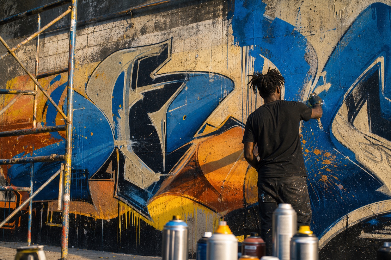
Modern graffiti writing as an art form is conventionally dated to 1971, when 'TAKI 183': a teenager from Washington Heights in Manhattan: was profiled in the New York Times for writing his name and street number repeatedly across the city. But the practice rapidly developed its own formal vocabulary: the tag (a quick signature in one color), the throw-up (a two-color bubble-letter name, fast to execute), the piece (a multi-color production requiring significant time), and the wildstyle (an elaborate, hard-to-read interlocked letter system that required knowledge to decode). The New York subway system (1971–1989) became the primary canvas.
Graffiti writing is a letter-based art form: its primary subject is typography. The challenge that shaped the entire tradition is making a name both legible (to those who know the code) and spectacular, in a medium that must be executed quickly and illegally on surfaces chosen for their visibility. The formal innovations of the tradition: the chrome-and-fade bubble letter, the 3D drop shadow, the wildstyle connection: are all solutions to these constraints. Artists like Phase 2, Dondi, Lady Pink, Seen, and Futura 2000 developed the tradition's visual vocabulary.
Graffiti entered the fine art world through the New York gallery scene of the early 1980s, where the same artists who wrote on trains showed at galleries: Keith Haring's chalk subway drawings and Jean-Michel Basquiat's SAMO tags were adjacent expressions of the same street art tradition. Contemporary street art (Banksy, Shepard Fairey, Os Gemeos) descended from graffiti's visual vocabulary and spatial practice while often departing from its letter-centric tradition.
The visual DNA: what makes it recognisable
- The tag: a signature developed into a personal logotype through repetition
- Bubble letters: inflated, rounded letterforms with thick outlines, designed to read at distance
- Wildstyle: interlocked, hard-to-read letters that require initiation to decode
- 3D drop shadow and chrome-and-fade fill as the primary decorative techniques
- The wall as canvas: architectural surface determines composition
- The whole-car: a train car painted end-to-end as a single composition
- Territorial: the piece occupies space, its size and position asserting presence
- Layered: pieces painted over previous pieces, archaeology of marks
- Spray paint: the medium of graffiti, with its characteristic edge-fade
- Primary and secondary colors at full saturation: the palette of spray can availability
- Chrome: silver metallic spray used for highlights and backgrounds
- Black outlines: fat caps (wide spray tips) for bold outlines
- The bubble letter: rounded, inflated letterform as the foundational motif
- The arrow: directional motion device that links letter elements
- The star and crown as symbolic decorative elements
- The character: a cartoon figure adjacent to or integrated with the lettering
8-channel console - dominant channels taped & circled by the registrar
Your aesthetic passport - share the fingerprint
4 color interpretations of this aesthetic
How to shoot this aesthetic
Join waitlist for access
Join the waitlist for full access
Join the waitlistGraffiti / Street Art: where the language earns its place
Graffiti / Street Art is most effective when its visual decisions do useful work. Urban street art with bold colors and powerful social commentary
The style gives styling, proportion, and image sequencing a clear point of view rather than treating them as decoration.
It can turn atmosphere, material, and spatial pacing into evidence of a distinct experience before a visitor arrives.
It helps a physical or editorial environment feel authored, which raises attention and perceived care.
They recognize the references, proportion, and restraint that make the language feel intentional.
They respond to visible judgment because it reduces the feeling of interchangeable product.
A coherent aesthetic gives them a usable standard for choosing images, objects, and collaborators.
The cost comes from consistent art direction, suitable locations or materials, and time to edit the details that would otherwise undermine the premise.
The challenge is conceptual. It takes visual literacy and a real point of view to avoid borrowing surface cues without their original logic.
Lighting, casting, type, color, material, and retouching must agree. A single weak choice can make the work feel like an imitation.
Graffiti / Street Art creates its strongest advantage when it gives a brand a standard of judgment, not merely an attractive finish. It fails when recognizable cues are collected without a governing idea. The difference between average and exceptional execution is usually proportion: how much is shown, what is withheld, and whether every element belongs to the same world. The most capable teams pair an exacting art director with specialists who understand the medium, from photographer and stylist to set designer, editor, and typographer.
Should Graffiti / Street Art be the strategic choice?
Surface imitation is easy. The language becomes generic when familiar cues replace proportion, specificity, and a coherent system.
Its visual ingredients appear regularly in contemporary work, but a rigorous execution remains distinguishable from a loose collection of references.
Its strongest principles depend on composition, material, and cultural literacy rather than a short-lived visual effect.
It asks for consistency across photography, typography, motion, environments, and the many details that make a brand feel believable.
Graffiti / Street Art deserves serious consideration from brands and institutions that can articulate a real point of view and protect it through execution. It is less suitable for work that needs immediate instructional clarity, broad visual neutrality, or low-cost production flexibility. Its greatest advantage is differentiation through judgment: it can make a product, place, or editorial proposition feel authored rather than merely packaged. Average executions borrow recognizable signals, then lose coherence when type, casting, copy, or materials fail to agree. Exceptional executions understand the visual language as a system of choices, including what not to show. The largest mistake is treating the style as a finish applied after strategy. Adopt it only when the product and organization can carry the same standard of care the imagery proposes.
Join waitlist for access
Join the waitlist for editorial depth
Join the waitlistConnected across the creative knowledge graph