Registrar's index cards on the platen glass - captured by the scanner
1955–1970 · London and New York City
Pop Art emerged simultaneously in London and New York in the mid-1950s as a response to Abstract Expressionism's seriousness and the growing commercial visual culture of consumer society. In London, the Independent Group (Richard Hamilton, Eduardo Paolozzi, Lawrence Alloway) appropriated American advertising, science fiction magazines, and consumer products as both subject matter and visual language. In New York, a second generation: Andy Warhol, Roy Lichtenstein, Jasper Johns, Robert Rauschenberg, Claes Oldenburg: took this further, producing work that was often indistinguishable from commercial design in its techniques while exhibited as fine art.
The movement's central provocation was the question of value: if Warhol's silkscreened Brillo boxes were displayed in a gallery, were they art? If Lichtenstein's enlarged and refined comic strip panels were painted in oils on large canvas, did they transcend their source material? Pop Art refused to answer these questions and thrived in the ambiguity: it was simultaneously a celebration of consumer culture and a critique of the fine art world's elitism. Andy Warhol's 'Factory' studio deliberately mimicked industrial production, creating art in edition runs rather than unique objects.
Pop Art's visual language is its most enduring legacy. Ben-Day dots (the half-tone printing technique Lichtenstein magnified to compositional scale), bold primary outlines, flat unmodulated color, speech bubbles, and product packaging as subject matter have all entered the permanent vocabulary of graphic design, advertising, and fashion: the original appropriation reversed.
The visual DNA: what makes it recognisable
- Comic book lettering: hand-drawn or simulated comic sans-serif in speech bubbles
- Bold, outlined type: the typography of advertising headlines and product packaging
- Stencil and stamp quality: industrial reproduction as aesthetic choice
- Primary color type against primary color backgrounds
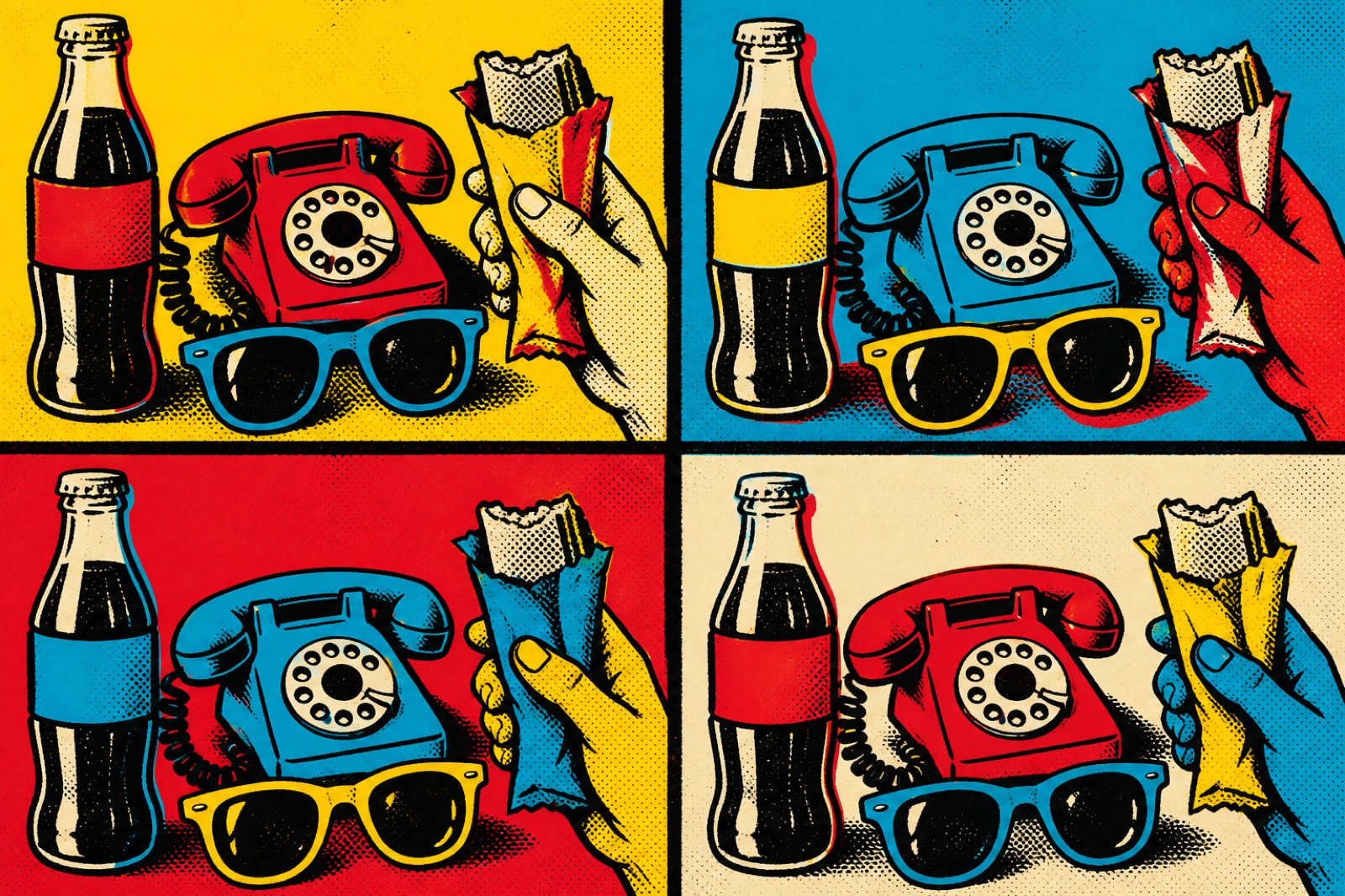
- The grid of the print run: multiple identical images repeated with color variation
- Comic panel grid: divided picture plane with gutters between cells
- Centered subject against flat-color background: product-photography format
- Bold border/outline as compositional frame
- Primary palette: red #CC0000, yellow #FFCC00, blue #0055A4, cyan #00AAFF
- Ben-Day dot pattern: halftone dots at visible scale in the image
- Black bold outline on all forms: comic and commercial art convention
- Flat unmodulated fills: no shading, no gradient, no tonal transition
- Consumer product packaging: soup cans, Brillo boxes, Coca-Cola bottles
- Celebrity portrait in flat color with variable repeated elements
- Comic book panels with speech bubbles and action words (KAPOW, POW)
- Ben-Day dot pattern applied to flesh tones and shading areas
8-channel console - dominant channels taped & circled by the registrar
Your aesthetic passport - share the fingerprint
4 color interpretations of this aesthetic
How to shoot this aesthetic
Join waitlist for access
Join the waitlist for full access
Join the waitlistPop Art: where the language earns its place
Pop Art is most effective when its visual decisions do useful work. Bold, colorful art celebrating popular culture and mass media
The style gives styling, proportion, and image sequencing a clear point of view rather than treating them as decoration.
It can turn atmosphere, material, and spatial pacing into evidence of a distinct experience before a visitor arrives.
It helps a physical or editorial environment feel authored, which raises attention and perceived care.
They recognize the references, proportion, and restraint that make the language feel intentional.
They respond to visible judgment because it reduces the feeling of interchangeable product.
A coherent aesthetic gives them a usable standard for choosing images, objects, and collaborators.
The cost comes from consistent art direction, suitable locations or materials, and time to edit the details that would otherwise undermine the premise.
The challenge is conceptual. It takes visual literacy and a real point of view to avoid borrowing surface cues without their original logic.
Lighting, casting, type, color, material, and retouching must agree. A single weak choice can make the work feel like an imitation.
Pop Art creates its strongest advantage when it gives a brand a standard of judgment, not merely an attractive finish. It fails when recognizable cues are collected without a governing idea. The difference between average and exceptional execution is usually proportion: how much is shown, what is withheld, and whether every element belongs to the same world. The most capable teams pair an exacting art director with specialists who understand the medium, from photographer and stylist to set designer, editor, and typographer.
Should Pop Art be the strategic choice?
Surface imitation is easy. The language becomes generic when familiar cues replace proportion, specificity, and a coherent system.
Its visual ingredients appear regularly in contemporary work, but a rigorous execution remains distinguishable from a loose collection of references.
Its strongest principles depend on composition, material, and cultural literacy rather than a short-lived visual effect.
It asks for consistency across photography, typography, motion, environments, and the many details that make a brand feel believable.
Pop Art deserves serious consideration from brands and institutions that can articulate a real point of view and protect it through execution. It is less suitable for work that needs immediate instructional clarity, broad visual neutrality, or low-cost production flexibility. Its greatest advantage is differentiation through judgment: it can make a product, place, or editorial proposition feel authored rather than merely packaged. Average executions borrow recognizable signals, then lose coherence when type, casting, copy, or materials fail to agree. Exceptional executions understand the visual language as a system of choices, including what not to show. The largest mistake is treating the style as a finish applied after strategy. Adopt it only when the product and organization can carry the same standard of care the imagery proposes.
Join waitlist for access
Join the waitlist for editorial depth
Join the waitlistConnected across the creative knowledge graph