When to use it
- Music releases and artist branding in experimental pop
- Gen-Z forward campaigns that want sensory overload
- Social content designed to stop the scroll
- Digital fashion and virtual identity projects
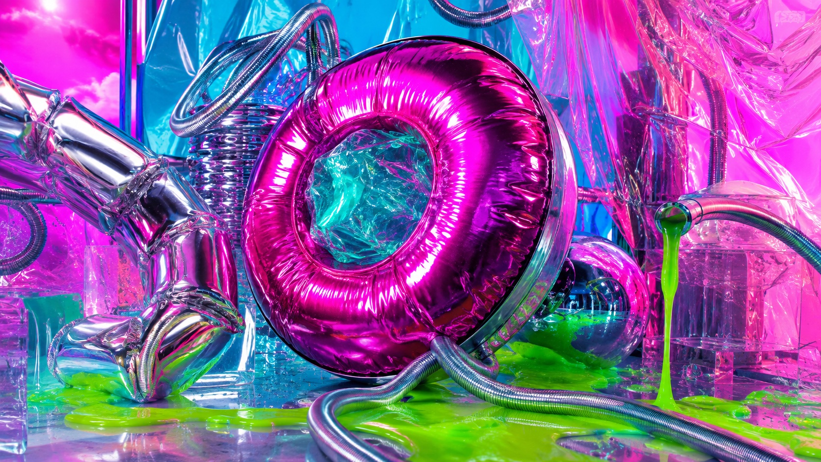
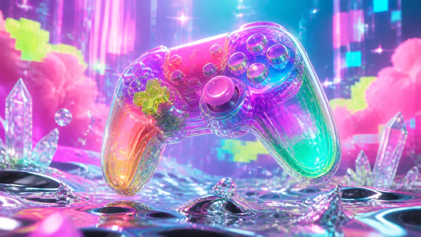
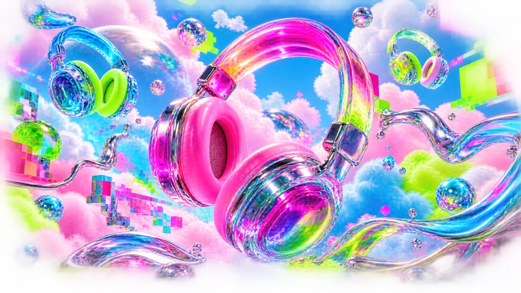
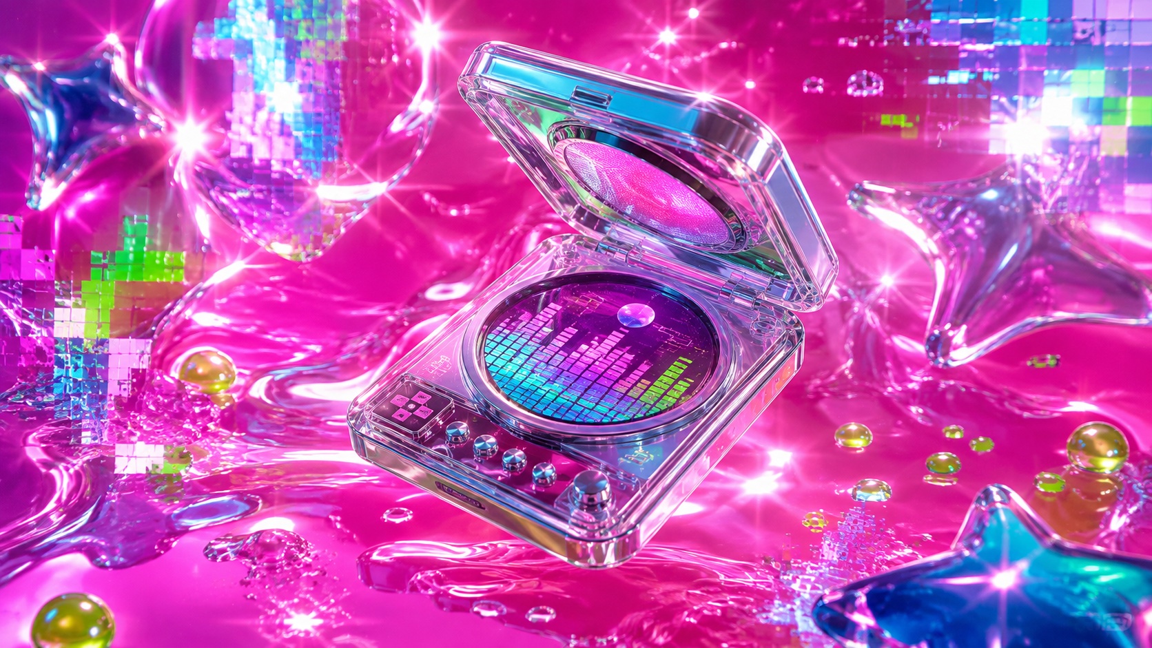
Maximalist, glitchy, and loud, with chrome type, neon gradients, and a deliberate overload that treats restraint as the enemy
Record 027-HY - when it works, who it is for, what it looks like
2018-present · Internet, PC Music label, A.G. Cook
Hyperpop coalesced around 2018 as a Spotify-playlist genre label, but the sonic and visual language had been building since A.G. Cook founded the PC Music label in 2013. The project treated pop music as raw material to be compressed, pitch-shifted and layered until it became something simultaneously more pop and less listenable than the original. SOPHIE, Charli XCX, 100 gecs and Dorian Electra pushed the production further. The visual identity followed the same logic: take the signifiers of mainstream pop, gloss, colour, shine, and amplify them until they glitch.
The visual language of hyperpop borrows from Y2K, rave flyers, early-internet graphics and anime, then processes everything through a maximalist filter. Chrome and liquid-metal type, neon gradient backgrounds, lens flares, pixel distortion, sparkle effects and deliberately clashing colour palettes stack without hierarchy. The aesthetic is post-ironic: it loves the trash it is quoting, and it loves how abrasive the love becomes when everything is turned up at once.
Hyperpop's influence has moved beyond music into fashion, graphic design, web aesthetics and brand identity for companies marketing to Gen Z. The look is identifiable at a glance, which is both its strength and its limitation. It communicates a specific cultural position, internet-native, queer-adjacent, anti-gatekeeping, and that specificity makes it powerful for the audiences it speaks to and alienating for everyone else.
The visual DNA: what makes it recognisable
The definitive color scheme for this aesthetic
How to shoot this aesthetic
"Visual sugar refined past sweetness into something that burns"
Shot list
Lighting
Multiple colored light sources firing simultaneously with no regard for subtlety. Neon pink from the left, electric blue from the right, a green uplight from below. The face should be lit in a way that no cinematographer would endorse. Clipping highlights are correct.
Drop this into Studio to generate in this aesthetic
Maximalist neon-gradient overload, Chrome 3D type, glitch artifacts and JPEG compression as texture, clashing saturated color from multiple light sources, holographic and reflective surfaces, deliberately overprocessed, visual sugar pushed into abrasion, pitch-shifted everything
Join waitlist for access
Join the waitlist for full access
Join the waitlistHyperpop is most effective when its visual decisions do useful work. Maximalist, glitchy, and loud, with chrome type, neon gradients, and a deliberate overload that treats restraint as the enemy
Budget goes into art direction and casting, not the toolkit.
Anyone can spot the references. A real system out of them is the hard part.
One wrong prop or one off color reads as costume instead of conviction.
Hyperpop earns its keep when it gives a brand a standard of judgment, not just a finish. It falls apart the moment recognizable cues get collected without a point of view behind them. The tell is always proportion: what's shown, what's held back, and whether every choice belongs to the same world.
The surface is easy to copy. What separates the real thing from a knockoff is the system underneath.
The ingredients are everywhere right now. A disciplined execution is still the minority.
This holds up because it's built on composition and material, not a filter that ages out.
It only works if every touchpoint agrees. Cut a corner anywhere and the whole thing shows it.
Use Hyperpop when the brand can back a real point of view and protect it through execution. Not when the goal is broad, neutral, or cheap to produce. The advantage is differentiation through judgment: the work reads as authored, not packaged. Average executions borrow the signals and lose the coherence. The best ones treat the visual language as a system of choices, including what they leave out.
Join waitlist for access
Join the waitlist for editorial depth
Join the waitlistConnected across the creative knowledge graph
Where it stands now, and what it costs you to use it
Hyperpop is the first aesthetic movement that treats processing itself as the medium. The source material matters less than what happens to it: compression, pitch-shifting, layering, glitching. This makes it native to digital tools in a way that earlier styles, which adapted analogue instincts to screens, never were.
The visual language is now diffusing into mainstream design through brand campaigns targeting younger audiences, but the diffusion dilutes the point. Hyperpop works because it commits to being too much. A tasteful version is a contradiction, and the brands that borrow the chrome and the gradients while pulling back from the abrasion are making something else entirely.
Hyperpop's visual language takes the signifiers of mainstream pop aesthetics, gloss, colour, shine, and amplifies them past the point of comfort. Chrome type, neon gradients, glitch effects and sparkle layers stack without hierarchy. The excess is deliberate and structural, not decorative.
The movement grew out of A.G. Cook's PC Music label (founded 2013) and became a named genre around 2018. Artists like SOPHIE, Charli XCX and 100 gecs defined the sonic template. The visual language draws from Y2K graphics, rave flyers, anime and early internet aesthetics, all processed through a maximalist filter.
The specific genre label has peaked, but the visual strategies it introduced, chrome surfaces, neon gradients, glitch as texture, deliberate sensory overload, continue to influence design aimed at younger, internet-native audiences. The aesthetic's DNA is visible in brand campaigns and web design that never use the word hyperpop.
Omoro turns aesthetic references into on-brand visuals. Generate, compose and publish from one studio.
Join the waitlist