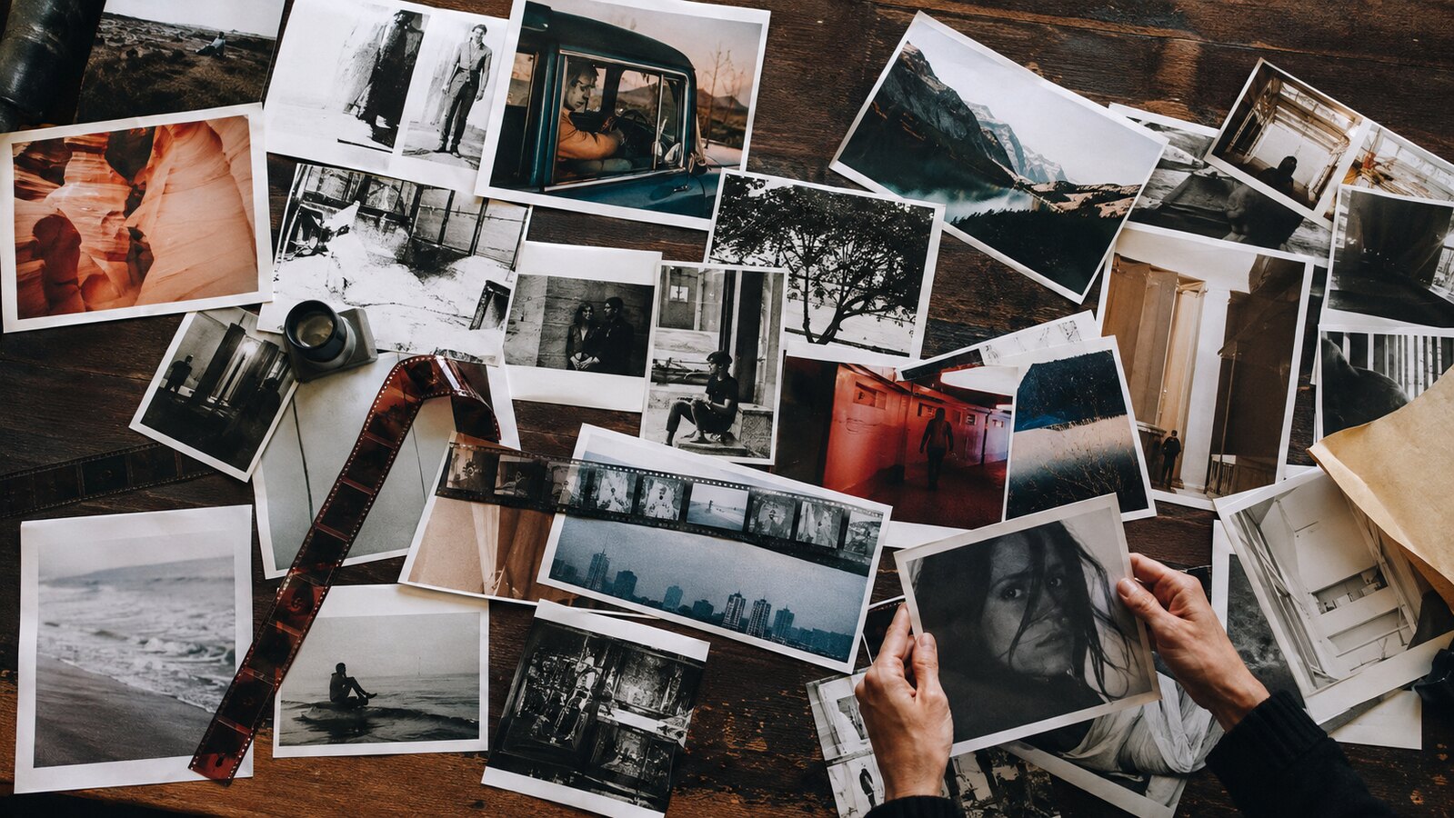
Infrared Photography

Real landscapes in false colour: foliage turned pink and coral, water and sky turned teal, with the optics, the weather and the grain left honest

Compare Infrared Photography with another style →See the Infrared Photography typefaces →
Record028-IP
AestheticInfrared Photography
ClassOrganic / Analog
StatusINGESTING
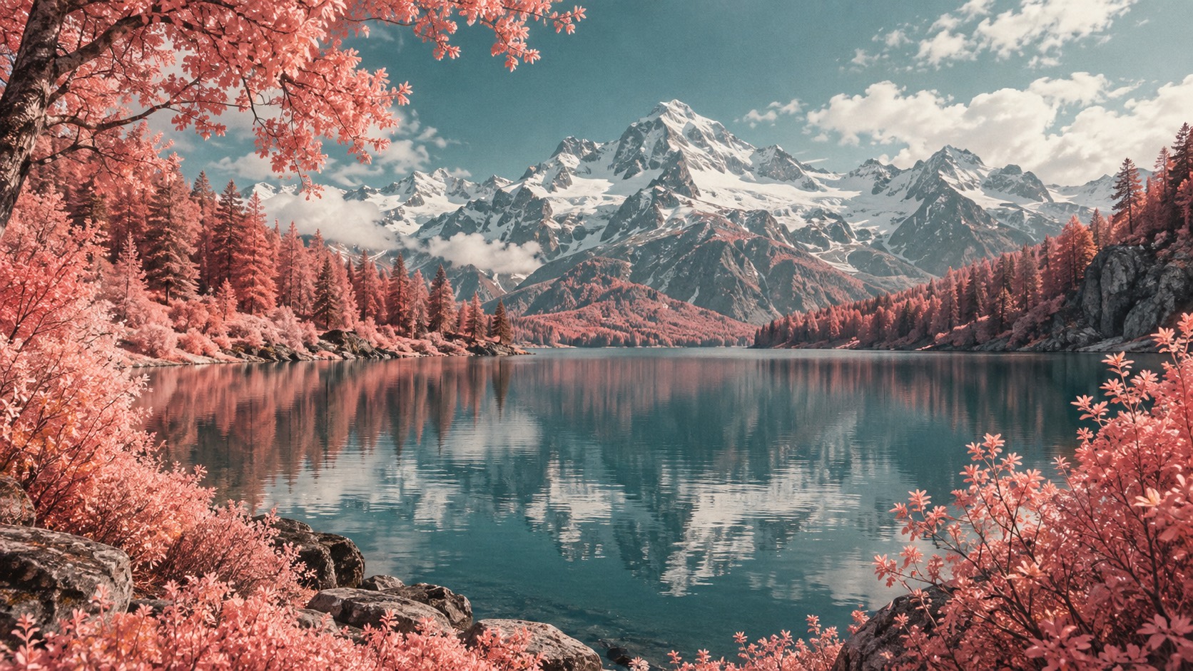
Pink and coral trees frame a still teal alpine lake beneath snow-covered mountains, photographed in colour infrared.
Archive plate · Infrared Photography
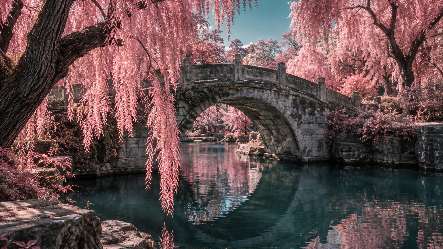
A stone arch bridge spans dark teal water beneath pink willow branches, photographed in colour infrared.
Dossier sceneStone bridge · 1/4
01
The record

What it is, when it works, who it is for, and where it already exists.

How to use it

Record 028-IP - when it works, who it is for, what it looks like

FIELD 01

When to use it

  • Landscape, travel and place-based stories that want to feel unfamiliar without being invented
  • Album covers, festival and label identities that need a surreal but photographic world
  • Wellness, sleep, fragrance and outdoor brands that want calm with a strangeness to it
  • Editorial and book covers where one uncanny colour shift carries the whole idea
FIELD 02

Perfect for

  • Record labels, ambient and electronic musicians
  • Travel and landscape publications
  • Fragrance, skincare and wellness brands
  • Outdoor, cycling and trail brands with a real place to show
FIELD 03

What it looks like

  • Richard Mosse, Infra, 2012
  • Richard Mosse, The Enclave, 2013
  • Kodak Aerochrome colour infrared film, discontinued 2009
  • Edward Thompson, The Unseen, 2016

In the wild, Infrared Photography aesthetic real-world examples

Where this aesthetic shows up in the real world · ↗ opens the source site

Colour infrared photography, bookRichard Mosse, Infra (opens in a new tab)2012
Six-screen film installation, Venice BiennaleRichard Mosse, The Enclave (opens in a new tab)2013
False-colour infrared film, discontinuedKodak Aerochrome colour infrared film (opens in a new tab)2009
Colour infrared photography, bookEdward Thompson, The Unseen (opens in a new tab)2016
Omoro Style GuideEvery aesthetic, every field on this page, in one PDF.
Get the guide →
02
The anatomy

Where Infrared Photography came from, what makes it recognisable, and the fingerprint it leaves.

History, Infrared Photography aesthetic history

1960s film stock, revived from 2010 · Kodak's Ektachrome Infrared and Aerochrome, made for forestry and reconnaissance

Chlorophyll reflects near-infrared light strongly, and film that can record that light was made for people who needed to see vegetation clearly from the air: foresters counting healthy trees, surveyors mapping crops, military analysts telling camouflage from leaf. Kodak's Ektachrome Infrared arrived in the early 1960s and its aerial descendant, Aerochrome, followed. Both used a false-colour scheme in which the infrared record was printed as red, so living foliage came out in pinks and reds while sky and water, which reflect little infrared, went blue and cyan. The look was a by-product of a measurement.

Photographers borrowed it almost immediately, on record sleeves in the late 1960s and in landscape work through the decades after, but it stayed a curiosity until Richard Mosse took the last of the Aerochrome stock to the eastern Congo. Infra, published in 2012, and the six-screen installation The Enclave at the 2013 Venice Biennale photographed a war in a landscape turned pink, and the collision between the beauty of the colour and the subject made the film famous just as Kodak discontinued it in 2009 and the remaining rolls became collector objects. Edward Thompson's The Unseen in 2016 used some of the last of it on English landscapes, the ordinary countryside made strange.

The film is gone but the method survived. A digital sensor with its infrared-blocking filter removed records the same light, and a custom white balance with the red and blue channels swapped reproduces the Aerochrome scheme closely enough that the difference is in the grain. That is where the discipline now lies: the digital version can be pushed to neon and a heat-map gradient in a second, and the style dies there. Held back, with soft highlights, a little fade and every leaf still legible, it remains one of the few ways to make a real place look unfamiliar without inventing anything.

A landscape seen in light the eye cannot see: the leaves turn pink, the water turns teal, and nothing else changes.

Omoro dossier · 028-IP

Visual markers, Infrared Photography aesthetic visual markers

The visual DNA: what makes it recognisable

typography

See the fonts
  • A plain grotesk set small in black on a white margin, never on the photograph
  • Captions and titles kept quiet so the colour shift stays the only event
  • No coloured type: the pinks and teals belong to the pictures

grid

  • Wide landscape frames with strong foreground-to-background depth and a single focal point
  • Generous white margins around every photograph; the interface stays white with black type
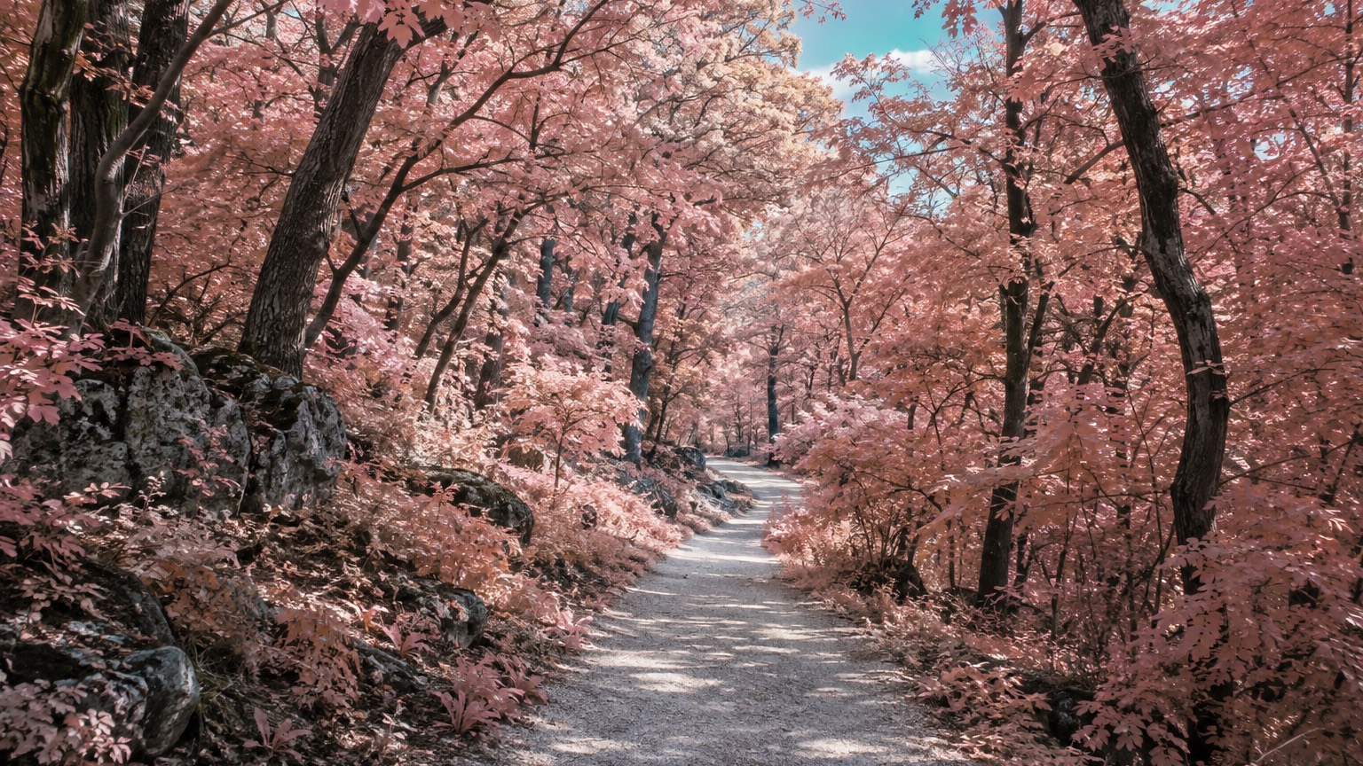
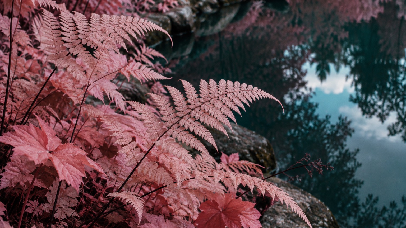
  • Sequences that move from wide to close: lake, hillside, path, then fern
  • Room to crop: the composition survives a portrait cut for a phone

materials

  • Blush canopy #E98AA0 and vermilion leaf #D9563F for foliage
  • Deep teal water #1F6E73, pale mint sky #BFE6E0, charcoal trunk #2A2C2E
  • Stone, snow and cloud left cool and nearly neutral, so the colour reads as a shift, not a tint
  • Restrained film grain, soft highlight roll-off and a slight fade, as if printed on matte paper

motifs

  • Foliage in pink, coral and vermilion against water and sky in cyan and teal
  • Still water carrying a dark teal reflection of a coloured shore
  • Snow-covered mountains and stone left neutral behind coloured trees
  • Charcoal trunks and shadows anchoring a frame that would otherwise float
  • A path or bridge leading into atmospheric haze

Aesthetic profile

8-channel console with the fingerprint on its display. Save the card, or share the page

Aesthetic Profile
Infrared Photography
1960s film stock, revived from 2010 · Kodak's Ektachrome Infrared and Aerochrome, made for forestry and reconnaissance
Attribute console · 028-IP
leans organic, analog, structured
8 CH
FIG. 1
MinimalMaximalAnalogDigitalExpressiveRestrainedCoolWarmNostalgicFuturisticStructuredChaoticLightDarkOrganicGeometric
01Minimal
Maximal20%
02Analog
Digital50%
03Restrained
Expressive30%
04Cool
Warm10%
05Futuristic
Nostalgic20%
06Structured
Chaotic40%
07Dark
Light40%
08Organic
Geometric80%
OrganicAnalogStructured
Omoro · Attribute console · 028-IP
omoro.io/styles/infrared-photography

Color Palettes, Infrared Photography color palettes and hex codes

The definitive color scheme for this aesthetic

Infrared Photography
#E98AA0 · #D9563F · #1F6E73 · #BFE6E0 · #2A2C2E
An alpine lake on Aerochrome: pink canopy, teal water, charcoal trunks and a mint sky
Omoro Palette Pack575 curated palettes across every aesthetic, 5 export formats.
Get the palettes →
03
The direction

How to shoot it, how to prompt it, and how to board it.

Photo Direction

How to shoot this aesthetic

"Photograph a real landscape in light the eye cannot see, and let only the colour be strange"

Shot list

  • Wide editorial landscape of a still alpine lake ringed by pink and coral trees, distant snow-covered mountains in cool near-neutral tones, a pale teal sky, the lake holding a dark teal reflection, strong foreground-to-background depth with one clear focal point and room to crop
  • A stone arch bridge framed by pink willow foliage over dark teal water, the stonework cool and nearly neutral, architectural detail sharp, willow fronds fine and countable
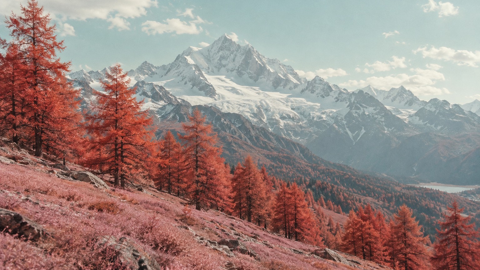
  • Coral alpine trees crossing a hillside beneath a snow-covered mountain and a mint sky, a spacious composition with a softer film finish and pale cyan atmosphere between the ridges

Lighting

Natural daylight only, ideally with high thin cloud or late sun so the highlights roll off softly. Infrared rewards open sky and healthy vegetation; overcast flattens it and dead foliage stays grey. Never add a coloured light source. The colour is a property of the light, not of a lamp.

Omoro Director's Briefs183 photo shot-lists like this one, ready to shoot from.
Get the briefs →

Generative Prompt

Drop this into Studio to generate in this aesthetic

Colour infrared landscape photography in the Kodak Aerochrome tradition, believable real-world optics, foliage rendered in blush pink, coral and vermilion, sky and water in cyan, teal and pale mint, tree trunks and shadows in deep charcoal, stone and snow cool and nearly neutral, natural daylight, atmospheric depth, fine foliage detail, restrained analogue film grain, soft highlight roll-off, slightly faded colour, no neon, no heat-map gradient, no glossy CGI, no oversharpening, no text

Paste as-is, or append your own subject

Mood Board

The record applied to your project. The record's kit is free; your brand, references and plates come with membership

Mood board
The Infrared Photography board
8 frames · 4 selected
FIG. 4
Blush CanopyE98AA0Vermilion LeafD9563FDeep Teal Water1F6E73Pale Mint SkyBFE6E0Charcoal Trunk2A2C2E
Brand and references
IdleBrand and references open with membership
With membership: the brand's own facts and colours in every prompt, references carried into every frame, and the plates generated.
01 · Hero application
02 · Material and finish
03 · Palette in context
04 · Photography direction
05 · Pattern plate
06 · Object
07 · Environment
08 · Digital presence
Demo kit free, the rest with membershipThe record as a demo kit, free. Name a project and it is written for that
Omoro · Mood board · 028-IP
04
The judgement

Whether to use it, what it costs to do properly, and where it stands right now.

Creative verdict, Infrared Photography feasibility and strategic recommendation

Two written calls, seven meters, and when to walk away

Creative verdict
Should Infrared Photography be the call?
7 meters
FIG. 2
Assessment

The colour is the only thing that is allowed to be strange. Everything else stays honest: real optics, real weather, real depth, leaves you can count. Set a custom white balance off grass, swap the red and blue channels, then pull the whole thing back with grain, a soft roll-off in the highlights and a little fade, so it reads as Aerochrome rather than a filter. The moment the sky goes neon or the foliage loses its detail, it has become a heat map, and that is a different style.

Verdict

Right when the brand has a real place to show and wants it to feel unfamiliar without leaving photography: landscape, travel, ambient music, fragrance, the outdoors. It is one idea, colour moved and nothing else, so the discipline is to change nothing else. Keep the interface white and the type black, let the photographs carry every colour, and never let the grade drift toward a heat map.

Production cost
Medium

A full-spectrum converted body and an infrared filter, or the last rolls of Aerochrome at collector prices.

Creative difficulty
Medium

The colour shift is a given; the picture still has to be a good landscape underneath it.

Execution difficulty
High

Custom white balance, channel swapping, focus shift and lens hotspots all have to be handled before the grade looks like film.

Risk of misuse
Medium

A pink hue shift on an ordinary photograph is what it looks like, and it looks like that immediately.

Prevalence
Rare

Mosse made it famous a decade ago; it turns up on record sleeves and in travel editorial, seldom in branding.

Longevity
Enduring

The film is gone but the look has outlived it, because the strangeness is physical rather than fashionable.

Brand investment
Medium

One converted camera and a consistent grade carry a whole campaign; the interface around it costs nothing.

Avoid if
There is no landscape or vegetation in the story
The effect lives in chlorophyll. Without foliage there is nothing for the colour to move.
The interface or the packaging wants colour of its own
Pink surfaces beside pink photographs turn the whole thing into a palette, and the photographs stop being strange.
Thermal or heat-map imagery is already in the brief
They are cousins, and side by side they cancel: one is a landscape seen differently, the other is a diagram.
Omoro · Creative verdict · 028-IP

Editorial Depth

A Pro feature: origins, practitioners, and pitfalls

Editorial depth
The Infrared Photography file
14 sections
FIG. 3
Context02Brands02Perception04Use04Index02
01Common MisconceptionThe principle beneath the surface
02Historical ContextOrigins, cultural moment, and reaction
03Brands That Accidentally Use This StyleNatural alignment, not category claims
04Brands That Perfectly Represent This StyleExceptional execution
05Psychological EffectHow visual decisions change perception
06Visual ChecklistInclude and avoid
07Creative FormulaThe visual system reduced to essentials
08Recognition SignalsHow to recognize it in two seconds
09When To Use This StyleContexts where the language performs
10Common Creative MistakesWhere imitation weakens the signal
11Best Brand ApplicationsIndustries with a natural advantage
12Creative Application AnalysisFit, feasibility, and production reality
13Related StylesClose languages and the key distinction
14Visual DNA SummaryThe sentence to remember
The editorial depth, with membershipOpening soon
Omoro · Editorial depth · 028-IP
05
The index

Neighbours, cross-references, blends, and the questions people ask.

Related concepts

Connected across the creative knowledge graph

Cultural relevance, Infrared Photography cultural relevance today

Where it stands now, and what it costs you to use it

Infrared is the rare surreal look that stays photographic. Everything the viewer trusts about a landscape, the optics, the weather, the detail, is intact, and one physical fact about light has changed. That makes it valuable to brands that need a real place to feel unfamiliar: travel, ambient and electronic music, fragrance, wellness and the outdoors all use it for the same reason, a calm that is slightly wrong.

The failure mode is the filter. Because a hue shift can be applied to any photograph in a second, the style is only convincing when the source was actually shot for it: healthy foliage, open sky, real depth. A pink grade on a stock landscape reads as a preset, and the audience that knows Aerochrome, which is the audience these brands want, sees it at once.

Cross-references

PhotographyThe parent discipline: everything here is still a landscape photographAnalog PhotographyWhere the grain, the fade and the highlight roll-off come fromThermal Club PrintThe cousin that turned false colour into a poster language rather than a landscapeSurrealismThe same unease reached by changing one fact about the world, not by inventing one

Blend

Mix Infrared Photography with any style in the library

Infrared Photography×
50%50%
64% alike
Infrared Photography referencePhotography referenceInfrared Photography 50%Photography 50%

Merged palette

#E98AA0

#1C1A18

#D9563F

#4A4640

#1F6E73

Leads organic, structured, expressive

Typography · from Infrared Photography

Cormorant Garamond over Lora

Materials

  • Blush canopy #E98AA0 and vermilion leaf #D9563F for foliage
  • Deep teal water #1F6E73, pale mint sky #BFE6E0, charcoal trunk #2A2C2E
  • Black and white documentary: pure black #0A0A0A through pure white #FAFAFA

The calls this blend forces

These two disagree on one thing, and a blend cannot average them: you pick a side. At this mix:

Analog or Digital? Infrared Photography is analog, Photography is digital. This mix lands analog.

Use it

Colour infrared landscape photography in the Kodak Aerochrome tradition, believable real-world optics, foliage rendered in blush pink, coral and vermilion, sky and water in cyan, teal and pale mint, tree trunks and shadows in deep charcoal, stone and snow cool and nearly neutral, natural daylight, atmospheric depth, fine foliage detail, restrained analogue film grain, soft highlight roll-off, slightly faded colour, no neon, no heat-map gradient, no glossy CGI, no oversharpening, no text (50%), infused with Fine art photography with intentional composition and considered light, full tonal range and sharp technical execution, decisive-moment or carefully staged image-making, gallery-print quality, an authored point of view over snapshot documentation, color palette strictly #E98AA0 #1C1A18 #D9563F #4A4640 #1F6E73, leaning analog over digital, overall character: organic, structured, expressive

One-click generation opens with the studio

About this aesthetic

What is colour infrared photography?

Photography that records near-infrared light, which living vegetation reflects strongly, and maps it to visible colour. In the Kodak Aerochrome scheme the infrared record prints as red, so foliage turns pink and vermilion while sky and water, which reflect little infrared, turn cyan and teal.

How do you get the infrared look without Aerochrome film?

Use a digital camera with its infrared-blocking filter removed, fit an orange or yellow filter, set a custom white balance from grass, and swap the red and blue channels in editing. Then hold the result back with grain, a soft highlight roll-off and a slight fade so it reads as film rather than a preset.

How is infrared photography different from thermal imaging?

Infrared photography records reflected near-infrared light with a normal lens, so it is still a landscape photograph with real optics and detail. Thermal imaging records emitted heat and renders it as a false-colour map, closer to a diagram than a picture. Omoro files the thermal look under Thermal Club Print.

Build with the infrared photography aesthetic

Every style in the library is broken down like this one: the palette, the typography, the materials and the lineage.

Explore the style library →