Where Thermal Club Print came from, what makes it recognisable, and the fingerprint it leaves.
History, Thermal Club Print aesthetic history
2010s-present · Club flyers, record stores and art photography, mostly European and North American
The colour comes from instruments that were never meant to make pictures. Thermal cameras map temperature to a false palette so a body reads as orange against a cold blue room, and false-colour infrared film, Kodak Aerochrome above all, turned foliage magenta and skies into ink. Richard Mosse carried both into art photography, Infra in 2012 on Aerochrome and Incoming in 2017 on a military thermal camera, and the look of surveillance turned into something tender and strange became part of the visual vocabulary of the decade.
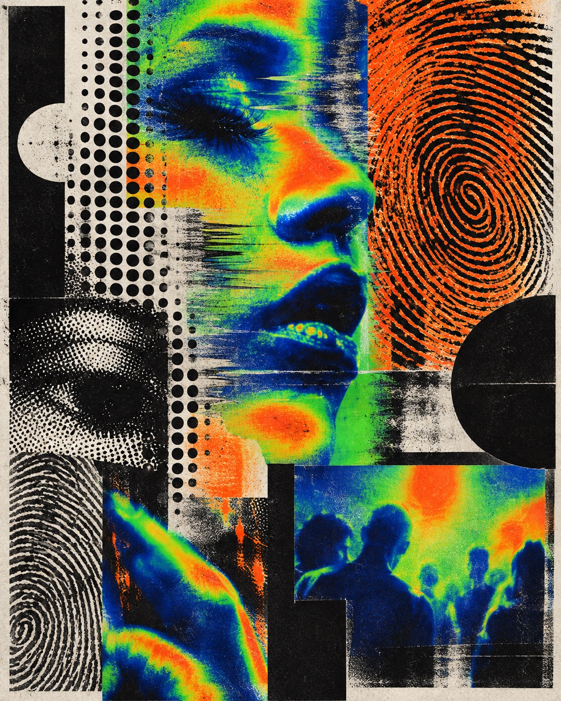
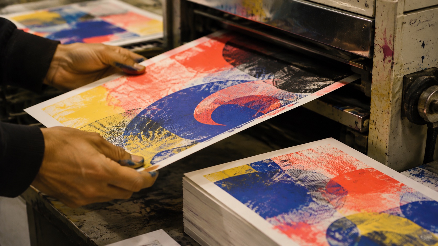
The texture comes from the cheapest printing there is. Club flyers and record-store posters have always been photocopied, risographed and pasted up, and the grain, the misregistration, the scanner lines and the fingerprint on the glass are the marks of that process rather than a filter. Riso studios in Berlin, London, New York and Tokyo made the duplicator a design tool again in the 2010s, and the two-colour drum limit turned out to suit the thermal palette exactly: one warm ink, one cold ink, black for the frame.
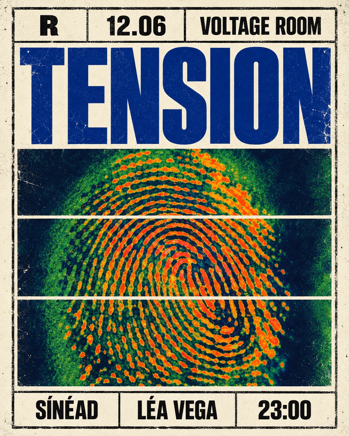
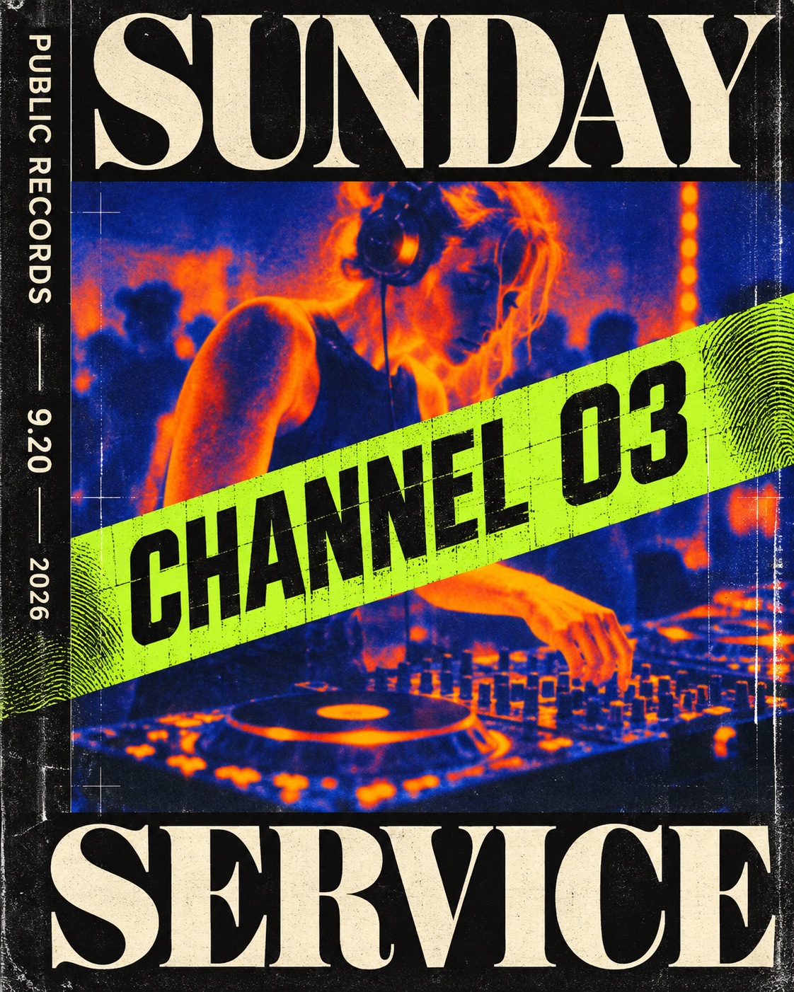
The two met on the wall.Promoters and small labels wanted imagery that felt like a night rather than a product, and a heat map of a crowd or a pair of headphones, cropped hard, degraded honestly and held inside black bars, did that without a logo.The typography followed the poster tradition it grew out of: a blunt oversized grotesk for the name and the date, a high-contrast display serif for the one line that is allowed to be beautiful, stacked in bands like a bill.It is a print aesthetic first, and a screen one only by reproduction.
“
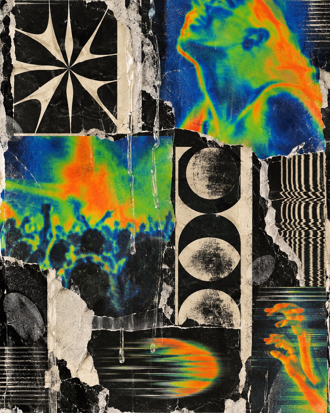
A heat map put through the copier and pasted on a wall: the poster language of underground music.
Visual markers, Thermal Club Print aesthetic visual markers
How to shoot it, how to prompt it, and how to board it.
Photo Direction
How to shoot this aesthetic
"Shoot the heat of the room, not the room, then print it badly on purpose"
Shot list
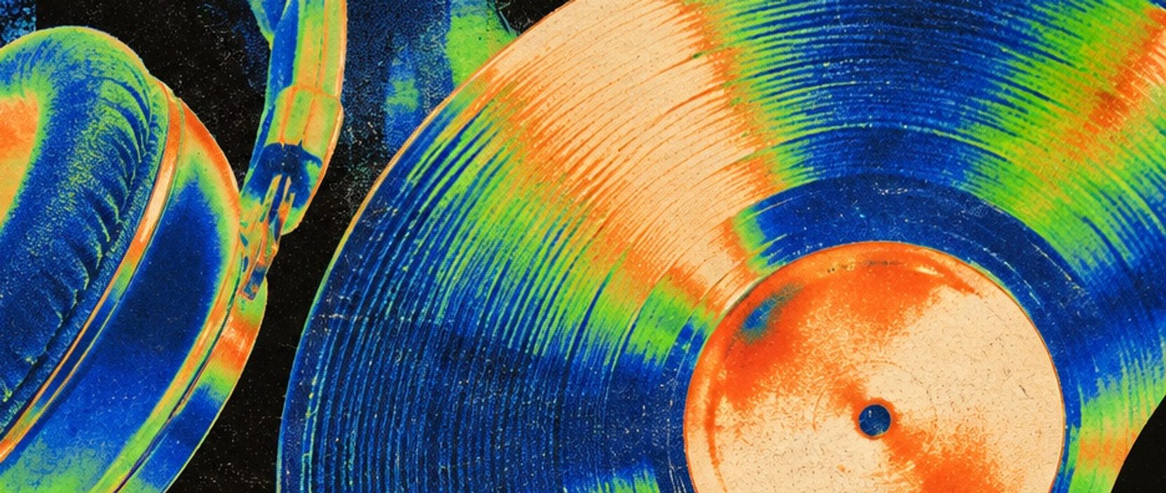
Overhead shot of headphones resting on a vinyl record on a turntable, captured as a false-colour thermal image, the warm motor and pads reading hot orange, the platter cobalt and green, cropped hard
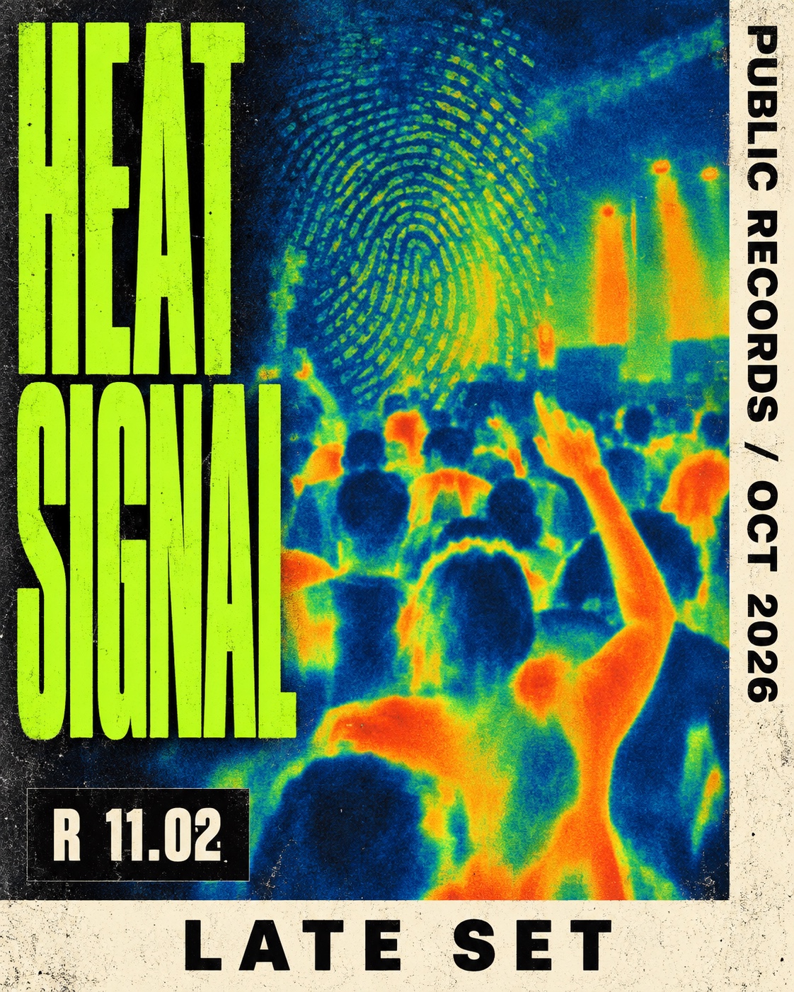
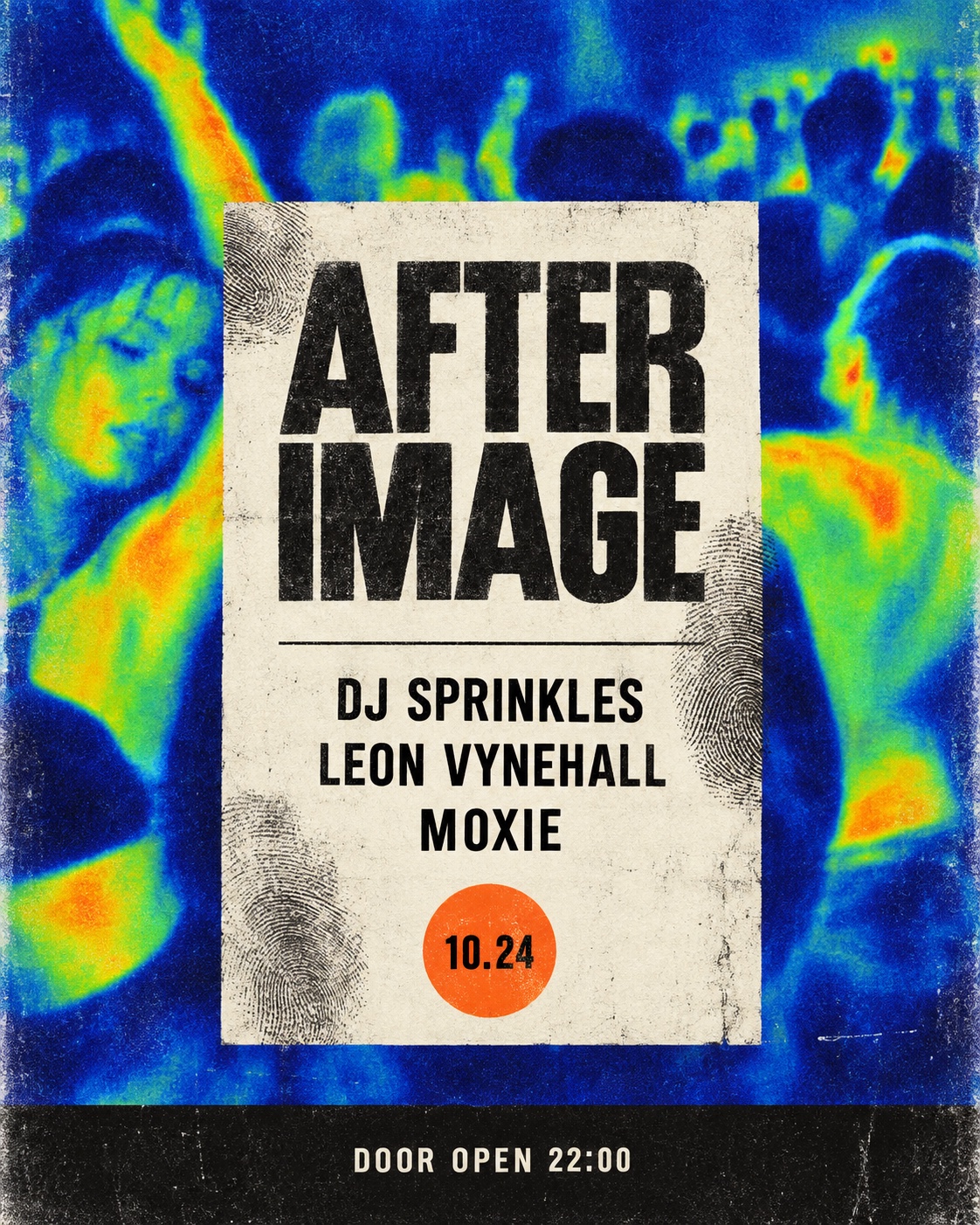
Wide shot of a dancefloor from above and behind, bodies reduced to warm heat shapes against cobalt dark, motion blurred, no faces readable
Frontal shot of a street wall layered with torn thermal-image posters in orange, green and cobalt, paste ridges and fingerprints on the cream paper, one corner peeling
Lighting
Two kinds, never mixed in one frame. The thermal images are lit by heat, so shoot them with an actual thermal or infrared camera, or convert a photograph to a false-colour heat map with a three-stop palette: cobalt, green, orange. The documentary frames of the prints in the world use flat, available light so the paper reads as paper.
Drop this into Studio to generate in this aesthetic
Thermal club print aesthetic, underground music poster, false-colour thermal imaging photography with heat-map colours limited to electric green, cobalt ultramarine and hot orange on faded cream paper, dense black framing bars, photocopy and scanner grain, risograph misregistration, halftone dots, moiré interference and a faint fingerprint smudge, record-store poster culture, DIY club flyer, experimental editorial, no readable text, no letters, no logos
Paste as-is, or append your own subject
Mood Board
A Pro feature: a board generated from the record
A generated board, with membership
Opening soon
04
The judgement
Whether to use it, what it costs to do properly, and where it stands right now.
Creative verdict, Thermal Club Print feasibility and strategic recommendation
Two written calls, seven meters, and when to walk away
Creative verdict
Should Thermal Club Print be the call?
7 meters
FIG. 2
Assessment
Three stops of false colour, cream paper and black bars carry the whole thing. Keep people abstract, keep type oversized, and let the process make the grain. The failure mode is polish: a clean neon gradient with a grain overlay is cyberpunk in a hat.
Verdict
Right for independent music, venues, record stores and print-led editorial that want to feel nocturnal and hand-made without a retro costume. Wrong the moment the brief says premium, platform or trust. Borrow the heat map, the copier and the black bars; refuse the glow.
Production cost
Low
A thermal or infrared camera, or a three-stop false-colour conversion, then a photocopier and a riso. Cheap by design.
Creative difficulty
Medium
The palette and the framing are fixed; the judgement is in what to crop and how far to degrade the print.
Execution difficulty
Medium
Print noise from a filter looks like a filter. It has to come from an actual scan, copy or riso pass.
Risk of misuse
High
One step toward smooth gradients and glow and it collapses into generic cyberpunk or festival neon.
Prevalence
Rare
Thermal false colour appears in art photography and the odd sleeve; as a named poster language it is still niche.
Longevity
Trend
The print grain is timeless; the thermal palette is a current signal and will date as it spreads.
Brand investment
Low
A poster series, a sleeve and a flyer rack are the whole system. It does not scale to an app.
Avoid if
The brand needs to look polished or trustworthy
Toner grain and fingerprints read as a night out, not a bank.
There is no music, venue or print in the story
Thermal colour without a poster to live on is a filter, and it reads as one.
Omoro · Creative verdict · 039-TC
Editorial Depth
A Pro feature: origins, practitioners, and pitfalls
Editorial Depth · Restricted
Common Misconception
Historical Context
Brands That Accidentally Use This Style
Brands That Perfectly Represent This Style
Psychological Effect
RESTRICTED
The editorial depth, with membership
Opening soon
05
The index
Neighbours, cross-references, blends, and the questions people ask.
Related concepts
Connected across the creative knowledge graph
Cultural relevance, Thermal Club Print cultural relevance today
Where it stands now, and what it costs you to use it
Right now this is the working language of a particular slice of music culture: small labels, promoters, listening bars and the print studios that serve them. It reads as independent because its production is, and it travels from a wall to a story frame without losing that. The people doing it well shoot real heat, print real copies and let the process supply the grain; the ones doing it badly apply a thermal gradient and a noise overlay to a stock photo and end up with cyberpunk.
What has gone stale around it is the glow.Neon gradients, lens flares and rainbow spectra were the festival look of the last decade, and this style is partly a refusal of them: three stops of colour, paper you can feel, black that does the framing.Its cost is that it does not scale to a platform or a product interface, and it should not be asked to.It is a poster, a sleeve and a flyer rack.
Thermal green #2BE06A, cobalt ultramarine #1F3FBF, hot orange #FF5A1F
Faded cream #EDE4D0 as the substrate, dense black #0B0B0B as the frame
Riso standard inks: fluorescent pink #FF48B0, blue #0078BF, yellow #FFE800
The calls this blend forces
These two disagree on 3 things, and a blend cannot average them: you pick a side. At this mix:
Dark or Light? Thermal Club Print is dark, Risograph is light. This mix lands dark.
Futuristic or Nostalgic? Thermal Club Print is futuristic, Risograph is nostalgic. This mix lands nostalgic.
Maximal or Minimal? Thermal Club Print is maximal, Risograph is minimal. This mix lands maximal.
Use it
Thermal club print aesthetic, underground music poster, false-colour thermal imaging photography with heat-map colours limited to electric green, cobalt ultramarine and hot orange on faded cream paper, dense black framing bars, photocopy and scanner grain, risograph misregistration, halftone dots, moiré interference and a faint fingerprint smudge, record-store poster culture, DIY club flyer, experimental editorial, no readable text, no letters, no logos (50%), infused with Soy-ink layered spot-color printing, visible halftone grain, deliberate misregistration between ink passes, limited two-or-three-color palette, transparent ink overlap producing accidental third colors, flat matte paper texture, zine-culture graphic economy, color palette strictly #2BE06A #FF48B0 #1F3FBF #0078BF #FF5A1F, leaning dark over light, futuristic over nostalgic, maximal over minimal, overall character: expressive, analog, maximal
One-click generation opens with the studio
About this aesthetic
What is thermal club print?+
A poster aesthetic from underground music culture that combines false-colour thermal or infrared imagery with cheap, tactile print production: photocopy, scan and risograph grain, moiré and fingerprint interference, all held inside hard black framing. The palette is fixed at electric green, cobalt, hot orange, cream and black, and the type is an oversized grotesk paired with a high-contrast display serif.
How is it different from cyberpunk or synthwave?+
Cyberpunk and synthwave are screen aesthetics built on glow: neon gradients, lens flare, polished futures. Thermal club print is a paper aesthetic built on process: three flat stops of false colour, toner grain and a black frame, with nothing that shines. If the image glows, it has left the style.
Do I need a thermal camera?+
It helps, and small thermal modules for phones are cheap, but a three-stop false-colour conversion of an ordinary photograph works if the palette is held to cobalt, green and orange and the print degradation is real. Scan a copy of a copy; do not simulate the grain with a filter.
Build with the thermal club print aesthetic
Every style in the library is broken down like this one: the palette, the typography, the materials and the lineage.