Registrar's index cards on the platen glass - captured by the scanner
1912–present (Cubist collage); ongoing · Cubist collage (Picasso, Braque); Dadaism; contemporary expanded practice
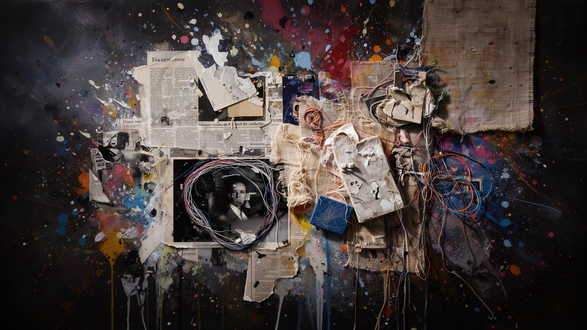
Mixed media as a conscious art strategy begins with Cubist collage: Picasso's Still Life with Chair Caning (1912), which incorporated actual chair caning material into an oil painting, and Braque's papier collé works that glued newspaper and patterned paper into painted compositions. By introducing non-art materials into fine art contexts, these works raised fundamental questions about what art is made of and what it refers to. Dadaists (Hannah Höch, John Heartfield) extended this into photomontage: cutting up mass-media photographs and reassembling them into critical commentaries.
The 20th century expanded mixed media practice enormously: Rauschenberg's Combines (1954–1964) incorporated everyday objects (quilts, taxidermy goat, tires) with painting; Joseph Cornell's boxes enclosed found objects in shadow boxes; Louise Nevelson built wall sculptures from collected wooden fragments. In each case, the mixing of materials produces meaning that no single medium could generate: the tension between the different kinds of reality each material brings creates the work's content.
Contemporary mixed media encompasses digital/analogue combinations (photography layered with painting, digital print with hand-drawn annotation), three-dimensional assemblage, textile and painting, video and sculpture, and essentially any combination of materials that a practitioner chooses. The aesthetic is defined by the seam between materials: where one medium ends and another begins is where the meaning is concentrated.
The visual DNA: what makes it recognisable
- Text incorporated as material: newspaper headlines, torn labels, handwriting
- Multiple type sources: printed text, handwritten text, stenciled text in combination
- Text as found object: language from the world brought into the art context
- Annotation and over-writing: text added on top of imagery
- Collage composition: elements assembled without conventional layout rules
- Layering as structure: depth created through overlapping materials
- Seam and edge as design element: where materials meet is intentional
- No background: the materials create the ground, not a separate designed backdrop
- No single palette: mixed media's palette is the accumulation of all constituent materials
- Found material color: newspaper grey (#B0A898), magazine color, fabric pattern
- Paint over collage: the layering of painted and pasted surface
- Oxidation and decay: rust, stain, and aging as color and texture
- The visible seam: where two materials meet without concealing the join
- Found text and image: newspaper, magazine, map, receipt as visual material
- Accumulation: the piling up of materials rather than the refinement of a single element
- The three-dimensional collage: assemblage that extends off the picture plane
8-channel console - dominant channels taped & circled by the registrar
Your aesthetic passport - share the fingerprint
4 color interpretations of this aesthetic
How to shoot this aesthetic
Join waitlist for access
Join the waitlist for full access
Join the waitlistMixed Media: where the language earns its place
Mixed Media is most effective when its visual decisions do useful work. Collage, assemblage, and hybrid works that combine multiple materials, techniques, and disciplines into unified compositions
The style gives styling, proportion, and image sequencing a clear point of view rather than treating them as decoration.
It can turn atmosphere, material, and spatial pacing into evidence of a distinct experience before a visitor arrives.
It helps a physical or editorial environment feel authored, which raises attention and perceived care.
They recognize the references, proportion, and restraint that make the language feel intentional.
They respond to visible judgment because it reduces the feeling of interchangeable product.
A coherent aesthetic gives them a usable standard for choosing images, objects, and collaborators.
The cost comes from consistent art direction, suitable locations or materials, and time to edit the details that would otherwise undermine the premise.
The challenge is conceptual. It takes visual literacy and a real point of view to avoid borrowing surface cues without their original logic.
Lighting, casting, type, color, material, and retouching must agree. A single weak choice can make the work feel like an imitation.
Mixed Media creates its strongest advantage when it gives a brand a standard of judgment, not merely an attractive finish. It fails when recognizable cues are collected without a governing idea. The difference between average and exceptional execution is usually proportion: how much is shown, what is withheld, and whether every element belongs to the same world. The most capable teams pair an exacting art director with specialists who understand the medium, from photographer and stylist to set designer, editor, and typographer.
Should Mixed Media be the strategic choice?
Surface imitation is easy. The language becomes generic when familiar cues replace proportion, specificity, and a coherent system.
Its visual ingredients appear regularly in contemporary work, but a rigorous execution remains distinguishable from a loose collection of references.
Its strongest principles depend on composition, material, and cultural literacy rather than a short-lived visual effect.
It asks for consistency across photography, typography, motion, environments, and the many details that make a brand feel believable.
Mixed Media deserves serious consideration from brands and institutions that can articulate a real point of view and protect it through execution. It is less suitable for work that needs immediate instructional clarity, broad visual neutrality, or low-cost production flexibility. Its greatest advantage is differentiation through judgment: it can make a product, place, or editorial proposition feel authored rather than merely packaged. Average executions borrow recognizable signals, then lose coherence when type, casting, copy, or materials fail to agree. Exceptional executions understand the visual language as a system of choices, including what not to show. The largest mistake is treating the style as a finish applied after strategy. Adopt it only when the product and organization can carry the same standard of care the imagery proposes.
Join waitlist for access
Join the waitlist for editorial depth
Join the waitlistConnected across the creative knowledge graph