Registrar's index cards on the platen glass - captured by the scanner
Ancient–present · Ancient Greece and Asia; European court theater; contemporary global performance culture
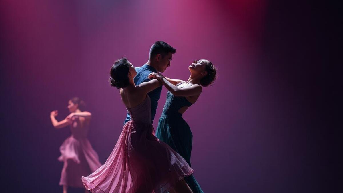
The performing arts: theater, dance, opera, ballet, circus: generate distinctive visual cultures through their documentation and promotion: stage photography that captures the living moment, production design (set and lighting) that creates visual worlds, costume design that communicates character through fabric, color, and silhouette, and the graphic design of programs, posters, and institutional identity that represents performing arts organizations.
The visual history of theater and dance documentation runs from the theatrical portrait tradition (actors depicted in character, from the Renaissance to the 19th century) through 20th-century stage photography. Martha Graham, Vaslav Nijinsky, and the Ballets Russes produced revolutionary visual cultures: Nijinsky's costume designs and Leon Bakst's set designs for Diaghilev's company in 1910–1929 were as influential as any fine art of the period. Contemporary dance photography by Chris Nash, Richard Avedon (his dance photographs), and photographers documenting the Alvin Ailey Dance Theater operate in a strong tradition.
Performing arts institutional identity: the visual systems of the Metropolitan Opera, the Royal Ballet, the National Theatre London: represents some of the most sophisticated cultural brand design. These organizations must communicate the live, ephemeral nature of their art through static media while serving audiences with high cultural expectations. The graphic design tradition here runs from the Bauhaus theater typography of the 1920s through the contemporary systems of major cultural institutions.
The visual DNA: what makes it recognisable
- Cultural institution sans-serif: Helvetica and Akzidenz-Grotesk as institutional standards
- Program typography: hierarchical setting of production title, creators, cast
- Poster drama: large-scale theatrical lettering with high contrast
- Digital playbill: the adaptation of print program conventions to screen formats
- Stage photograph: figure or figures in dramatic light against theatrical environment
- Program grid: the structured hierarchy of credits and production information
- Poster format: vertical format, single image, strong typographic hierarchy
- Production still: the controlled documentation image of the staged production
- Stage black: #050508: the theatrical darkness that makes everything else visible
- Spotlight warm: #F0C880, #E8B840: the warm color of theatrical lighting
- Curtain red: #8B0018, #7A0014: the traditional velvet of the theater
- Costume white: #F5F2EE: the lit costume caught in performance photography
- Motion blur: the dancer or actor in movement captured at long exposure
- Dramatic lighting: the spotlight, the gobo, the theatrical chiaroscuro
- Costume in performance: fabric in motion, silhouette against stage light
- The empty stage: potential and architecture before the performance begins
8-channel console - dominant channels taped & circled by the registrar
Your aesthetic passport - share the fingerprint
4 color interpretations of this aesthetic
How to shoot this aesthetic
Join waitlist for access
Join the waitlist for full access
Join the waitlistPerforming Arts: where the language earns its place
Performing Arts is most effective when its visual decisions do useful work. Theater, dance, and performance art captured in visual form
The style gives styling, proportion, and image sequencing a clear point of view rather than treating them as decoration.
It can turn atmosphere, material, and spatial pacing into evidence of a distinct experience before a visitor arrives.
It helps a physical or editorial environment feel authored, which raises attention and perceived care.
They recognize the references, proportion, and restraint that make the language feel intentional.
They respond to visible judgment because it reduces the feeling of interchangeable product.
A coherent aesthetic gives them a usable standard for choosing images, objects, and collaborators.
The cost comes from consistent art direction, suitable locations or materials, and time to edit the details that would otherwise undermine the premise.
The challenge is conceptual. It takes visual literacy and a real point of view to avoid borrowing surface cues without their original logic.
Lighting, casting, type, color, material, and retouching must agree. A single weak choice can make the work feel like an imitation.
Performing Arts creates its strongest advantage when it gives a brand a standard of judgment, not merely an attractive finish. It fails when recognizable cues are collected without a governing idea. The difference between average and exceptional execution is usually proportion: how much is shown, what is withheld, and whether every element belongs to the same world. The most capable teams pair an exacting art director with specialists who understand the medium, from photographer and stylist to set designer, editor, and typographer.
Should Performing Arts be the strategic choice?
Surface imitation is easy. The language becomes generic when familiar cues replace proportion, specificity, and a coherent system.
Its visual ingredients appear regularly in contemporary work, but a rigorous execution remains distinguishable from a loose collection of references.
Its strongest principles depend on composition, material, and cultural literacy rather than a short-lived visual effect.
It asks for consistency across photography, typography, motion, environments, and the many details that make a brand feel believable.
Performing Arts deserves serious consideration from brands and institutions that can articulate a real point of view and protect it through execution. It is less suitable for work that needs immediate instructional clarity, broad visual neutrality, or low-cost production flexibility. Its greatest advantage is differentiation through judgment: it can make a product, place, or editorial proposition feel authored rather than merely packaged. Average executions borrow recognizable signals, then lose coherence when type, casting, copy, or materials fail to agree. Exceptional executions understand the visual language as a system of choices, including what not to show. The largest mistake is treating the style as a finish applied after strategy. Adopt it only when the product and organization can carry the same standard of care the imagery proposes.
Join waitlist for access
Join the waitlist for editorial depth
Join the waitlistConnected across the creative knowledge graph