When to use it
- Work that wants to reward close looking
- Product and still-life imagery with real surface detail
- Editorial about craft, patience or process
- Campaigns that need the ordinary to feel monumental
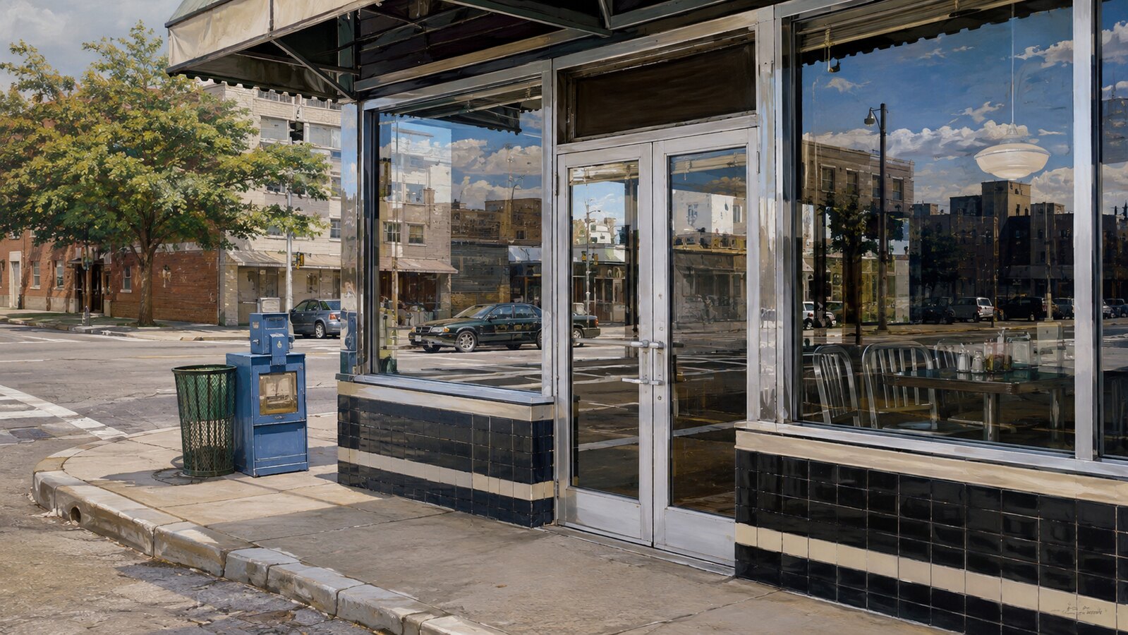
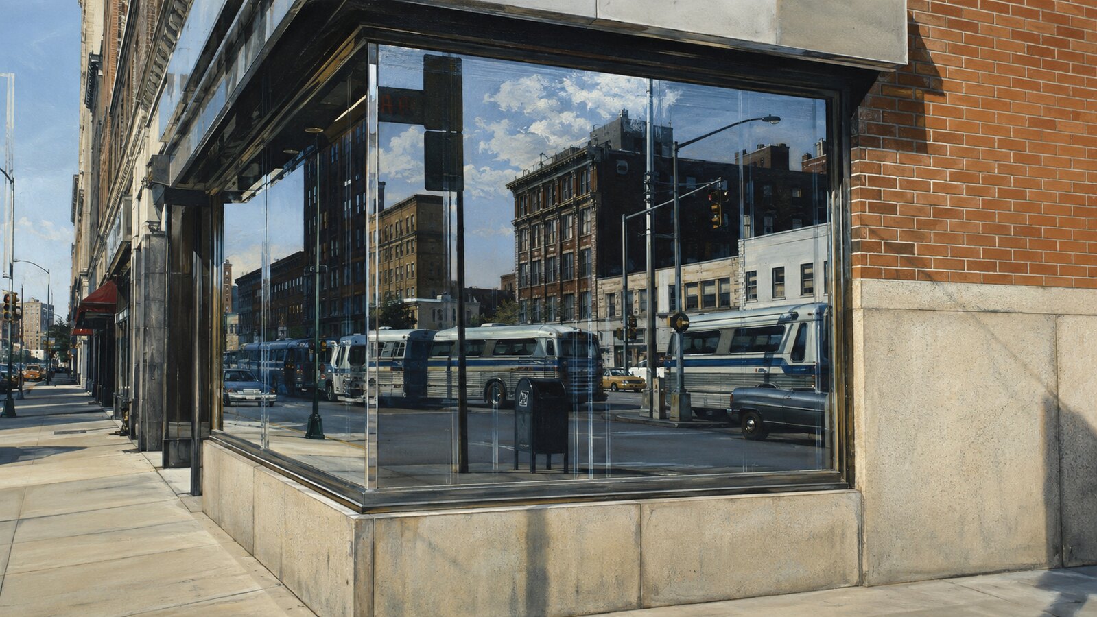
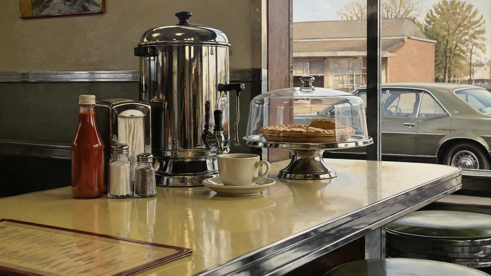
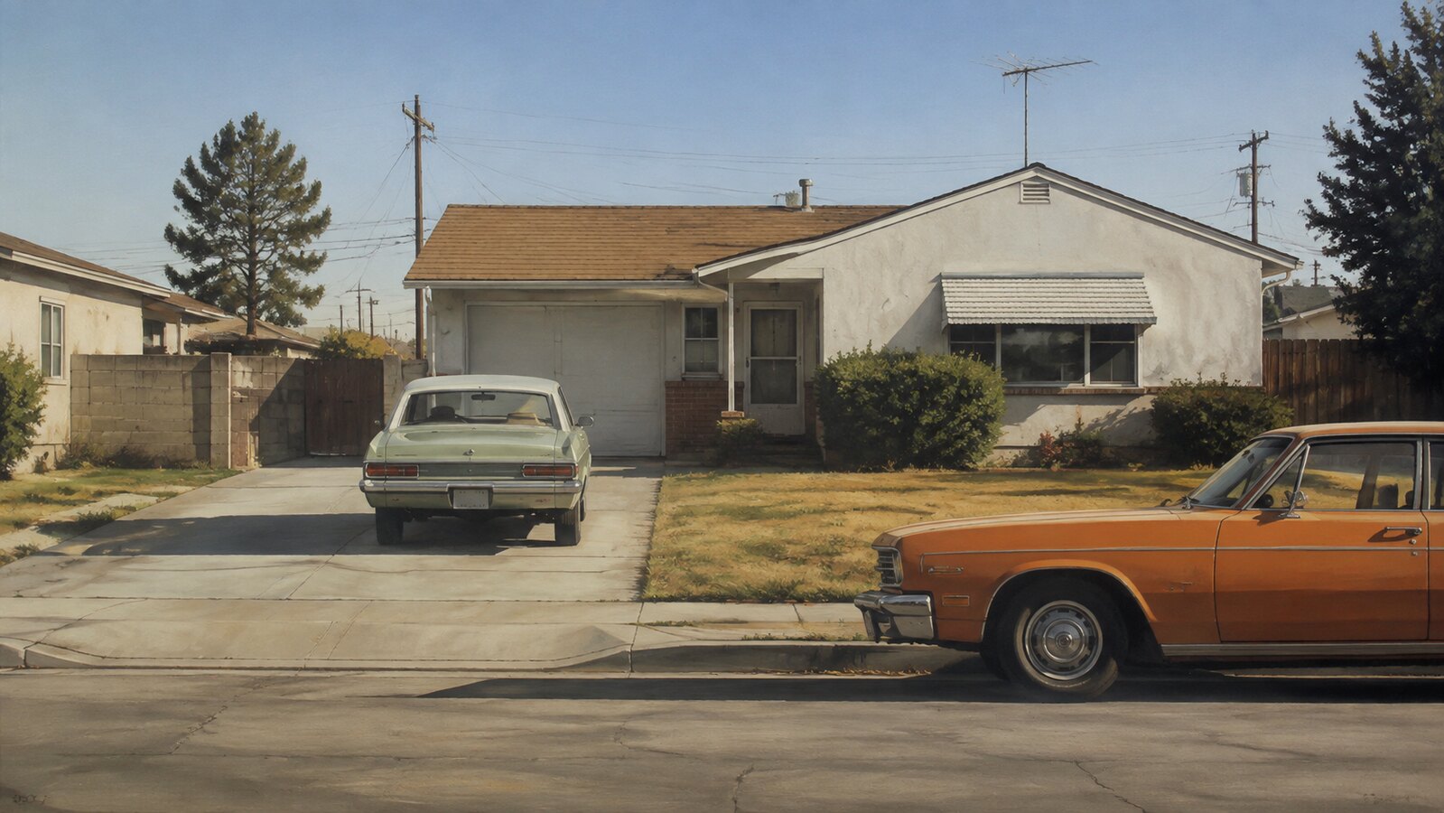
Camera-level detail rebuilt by hand: reflections, chrome and ordinary daylight painted with the gesture taken out
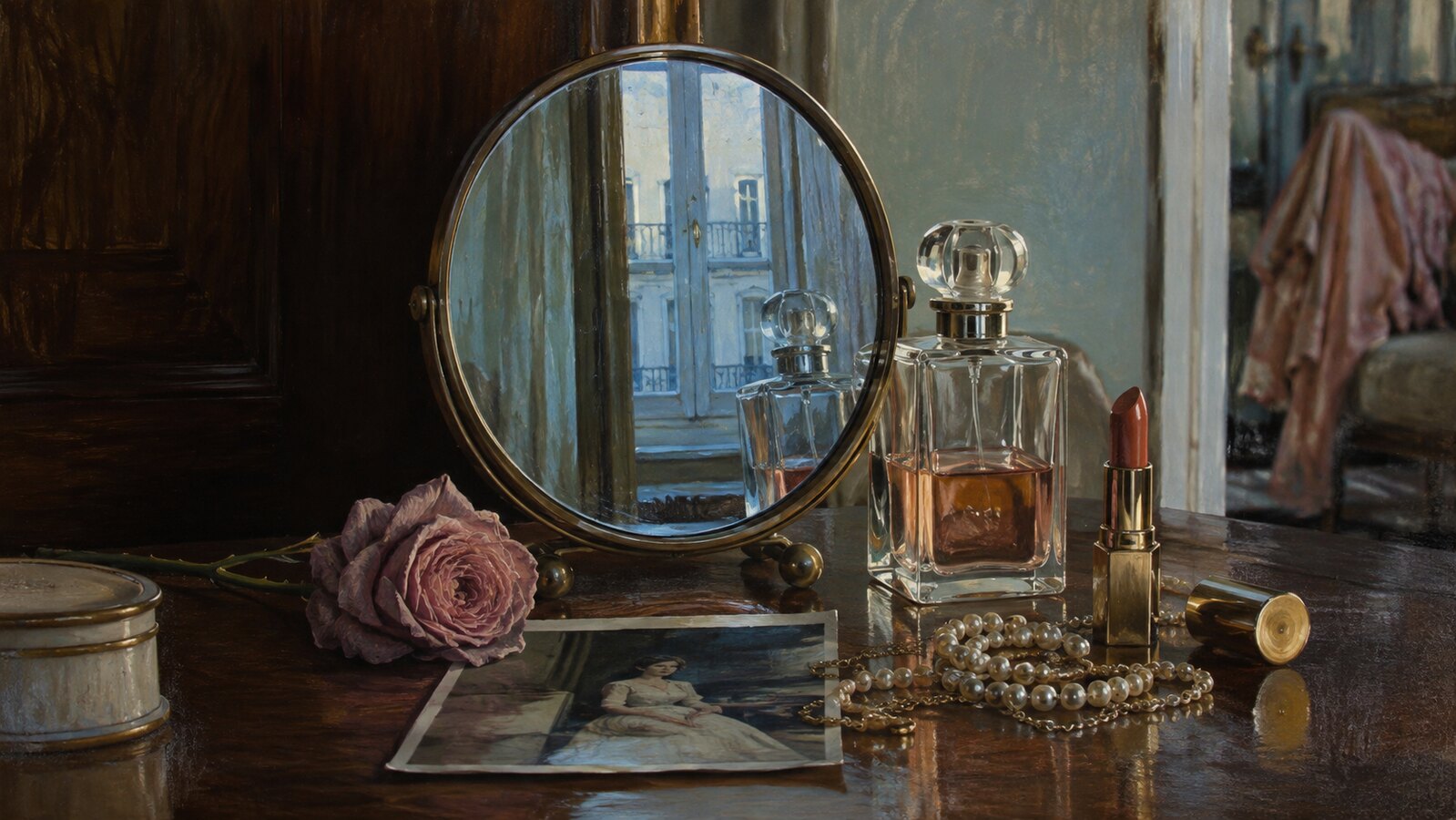
Record 035-PH - when it works, who it is for, what it looks like
1960s–present · United States; New York and the Bay Area
Photorealism emerged in the United States in the late 1960s as a deliberate turn away from Abstract Expressionism. Where the previous generation had made the artist's gesture the subject, these painters worked from photographs and suppressed the brushmark almost entirely. The dealer Louis K. Meisel named the movement in 1969 and set criteria for it: the artist uses a camera to gather the information, uses mechanical or semi-mechanical means to transfer it to the canvas, and has the technical skill to make the result read as photographic.
Documenta 5 in Kassel in 1972, curated by Harald Szeemann, put the Americans in front of a European audience and made the movement international news. Richard Estes painted plate-glass storefronts in which the reflection is more legible than whatever sits behind it. Ralph Goings found monumentality in diner counters, pickup trucks and condiment bottles. Robert Bechtle painted parked cars on Bay Area streets in flat, unhelpful daylight. Audrey Flack built dense vanitas still lifes, and with Marilyn (Vanitas) in 1977 became the first photorealist whose painting entered the Museum of Modern Art's collection. Chuck Close gridded photographs of faces up to wall scale.
The movement is routinely confused with hyperrealism, which came later and pushes past the photograph into a heightened version of it. Photorealism is the stricter proposition: match the source, including its flatness, its banal light and its uninteresting crop. What carries into contemporary design is that discipline rather than the subject matter, and it has become newly legible now that a convincing photographic image costs nothing to produce.
The visual DNA: what makes it recognisable
The definitive color scheme for this aesthetic
Join waitlist for access
Join the waitlist for full access
Join the waitlistPhotorealism is most effective when its visual decisions do useful work. Camera-level detail rebuilt by hand: reflections, chrome and ordinary daylight painted with the gesture taken out
Budget goes into art direction and casting, not the toolkit.
Anyone can spot the references. A real system out of them is the hard part.
One wrong prop or one off color reads as costume instead of conviction.
Photorealism earns its keep when it gives a brand a standard of judgment, not just a finish. It falls apart the moment recognizable cues get collected without a point of view behind them. The tell is always proportion: what's shown, what's held back, and whether every choice belongs to the same world.
The surface is easy to copy. What separates the real thing from a knockoff is the system underneath.
The ingredients are everywhere right now. A disciplined execution is still the minority.
This holds up because it's built on composition and material, not a filter that ages out.
It only works if every touchpoint agrees. Cut a corner anywhere and the whole thing shows it.
Use Photorealism when the brand can back a real point of view and protect it through execution. Not when the goal is broad, neutral, or cheap to produce. The advantage is differentiation through judgment: the work reads as authored, not packaged. Average executions borrow the signals and lose the coherence. The best ones treat the visual language as a system of choices, including what they leave out.
Join waitlist for access
Join the waitlist for editorial depth
Join the waitlistConnected across the creative knowledge graph
Where it stands now, and what it costs you to use it
Photorealism's argument was that a painting could carry the information of a photograph and still be worth the months it took. That argument lands differently now that generating a photographic image takes seconds and no skill at all.
What reads today is the restraint, not the rendering. The flat light, the ordinary crop and the refusal to dramatise are the parts that still look modern. The technical feat on its own now reads as pastiche.
It is an expensive reference to borrow honestly. The whole premise is time visibly spent, so a version that was quick to make tends to announce that it was quick to make.
Photorealism sets out to match a photograph, including its flat light and unremarkable framing. Hyperrealism came later and goes past the source: higher contrast, more detail than a lens would resolve, and lighting chosen for drama. Photorealism is a discipline of fidelity; hyperrealism is one of intensification.
Richard Estes for reflections and storefronts, Ralph Goings for diners and chrome, Robert Bechtle for suburban cars and daylight, Audrey Flack for symbolically loaded still lifes, and Chuck Close for gridded portraits at wall scale. Louis K. Meisel named the movement and set out its criteria in 1969.
No. Realism describes painting the world as observed. Photorealism works specifically from photographs and accepts what a camera does to a scene: the compression, the flattening, the reflections a human eye would look past. The subject is the photograph as much as the thing photographed.
Take the framing rather than the rendering. Flat frontal composition, even daylight, ordinary crops and reflective surfaces carry the reference without needing a painted finish. Reach for the airbrushed surface only when the work can afford to look laboured over.
Omoro turns aesthetic references into on-brand visuals. Generate, compose and publish from one studio.
Join the waitlist