Registrar's index cards on the platen glass - captured by the scanner
1977–present · Early video games and computing; Atari, Nintendo, Sega
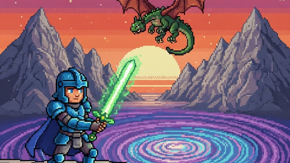
Pixel art emerged from the technical constraints of early computer graphics hardware. The Atari 2600 (1977), Nintendo Entertainment System (1985), and Sega Genesis (1988) imposed strict limits: fixed screen resolutions (as low as 160×192 pixels), limited color palettes (4 to 64 simultaneous colors), and tiny sprite sizes (typically 8×8 to 16×16 pixels for characters). Game artists working within these constraints developed sophisticated techniques: dithering (alternating two colors to simulate a third), sub-pixel shading (placing dark pixels at edges to simulate anti-aliasing), and color cycling (animating a fixed palette to suggest moving water or fire): that constitute the craft vocabulary of pixel art.
When hardware constraints were lifted in the mid-1990s with the transition to polygon 3D graphics, pixel art became a choice rather than a necessity: and immediately acquired the nostalgic charge of a recently lost medium. Independent game developers (Spelunky, Stardew Valley, Undertale, Celeste) have adopted it continuously since, partly for its nostalgic associations, partly for its immediate visual readability, and partly because a single developer can produce pixel art at a pace impossible with 3D modeling.
Contemporary pixel art exists both as game aesthetic and as standalone art form. Pixel art communities online (Pixilart, Lospec) maintain active traditions around specific limited palettes: particularly the Game Boy 4-color palette (4 shades of grey-green) and various 16-color and 32-color palettes derived from historical hardware. The Lospec Palette List has catalogued thousands of community-designed palettes, making palette selection a distinctive creative act within the medium.
The visual DNA: what makes it recognisable
- Bitmap fonts: each character drawn on a pixel grid, sharp and blocky
- 6×8 or 8×8 pixel letterforms: the most common game UI type sizes
- No anti-aliasing: edges are perfectly sharp, one pixel wide
- Shadow created by duplicating the text one pixel down-right in a contrasting color
- The visible pixel grid as the defining structural element
- Orthographic or isometric perspective (no vanishing-point foreshortening)
- Sprites against solid-color or tileset backgrounds
- HUD elements: health bars, score displays, and menus in the same pixel aesthetic
- NES palette: specific 54-color set with bright reds, blues, and greens
- Game Boy palette: #0F380F, #306230, #8BAC0F, #9BBC0F: four greens
- CGA palette: cyan #55FFFF, magenta #FF55FF, white #FFFFFF, black #000000
- Any limited palette: the constraint (4, 8, 16, or 32 colors) is part of the medium
- Character sprites: walking, jumping, and attacking animations at small scale
- Tileset environments: ground tiles, wall tiles, and transition tiles
- UI elements: heart containers, coin indicators, score numbers
- Enemy sprites with distinctive silhouettes readable at 16×16 pixels
8-channel console - dominant channels taped & circled by the registrar
Your aesthetic passport - share the fingerprint
4 color interpretations of this aesthetic
Join waitlist for access
Join the waitlist for full access
Join the waitlistPixel Art: where the language earns its place
Pixel Art is most effective when its visual decisions do useful work. Retro video game sprites and limited palettes - the 8-bit and 16-bit fidelity of NES and SNES as a fully realized aesthetic language
The style gives styling, proportion, and image sequencing a clear point of view rather than treating them as decoration.
It can turn atmosphere, material, and spatial pacing into evidence of a distinct experience before a visitor arrives.
It helps a physical or editorial environment feel authored, which raises attention and perceived care.
They recognize the references, proportion, and restraint that make the language feel intentional.
They respond to visible judgment because it reduces the feeling of interchangeable product.
A coherent aesthetic gives them a usable standard for choosing images, objects, and collaborators.
The cost comes from consistent art direction, suitable locations or materials, and time to edit the details that would otherwise undermine the premise.
The challenge is conceptual. It takes visual literacy and a real point of view to avoid borrowing surface cues without their original logic.
Lighting, casting, type, color, material, and retouching must agree. A single weak choice can make the work feel like an imitation.
Pixel Art creates its strongest advantage when it gives a brand a standard of judgment, not merely an attractive finish. It fails when recognizable cues are collected without a governing idea. The difference between average and exceptional execution is usually proportion: how much is shown, what is withheld, and whether every element belongs to the same world. The most capable teams pair an exacting art director with specialists who understand the medium, from photographer and stylist to set designer, editor, and typographer.
Should Pixel Art be the strategic choice?
Surface imitation is easy. The language becomes generic when familiar cues replace proportion, specificity, and a coherent system.
Its visual ingredients appear regularly in contemporary work, but a rigorous execution remains distinguishable from a loose collection of references.
Its strongest principles depend on composition, material, and cultural literacy rather than a short-lived visual effect.
It asks for consistency across photography, typography, motion, environments, and the many details that make a brand feel believable.
Pixel Art deserves serious consideration from brands and institutions that can articulate a real point of view and protect it through execution. It is less suitable for work that needs immediate instructional clarity, broad visual neutrality, or low-cost production flexibility. Its greatest advantage is differentiation through judgment: it can make a product, place, or editorial proposition feel authored rather than merely packaged. Average executions borrow recognizable signals, then lose coherence when type, casting, copy, or materials fail to agree. Exceptional executions understand the visual language as a system of choices, including what not to show. The largest mistake is treating the style as a finish applied after strategy. Adopt it only when the product and organization can carry the same standard of care the imagery proposes.
Join waitlist for access
Join the waitlist for editorial depth
Join the waitlistConnected across the creative knowledge graph