Registrar's index cards on the platen glass - captured by the scanner
1991–2003 · CERN (World Wide Web); spread globally through Geocities, AOL, early browsers
Web 1.0 refers to the visual and functional culture of the World Wide Web in its first decade: roughly 1991 (Tim Berners-Lee's first public website at CERN) through 2003–2004 (when broadband, Flash, and more sophisticated browser capabilities enabled Web 2.0's richer visual language). This was the internet of Geocities, Angelfire, and personal homepages: a genuinely democratic medium where anyone with a text editor could publish to a global audience, and almost no one had any design training.
The aesthetic emerged from constraints, not choices. Early browsers (Mosaic, Netscape Navigator) could display only a small set of 'web-safe' colors (216 colors that rendered consistently across platforms), limited fonts (browser defaults: Times New Roman for serif, Arial for sans), and tiled GIF background images. Animated GIFs were a major creative medium because animation in any other format was prohibitively heavy for dial-up connections. Horizontal rules (`<hr>` tags) were used as design elements. Tables were the only layout mechanism.
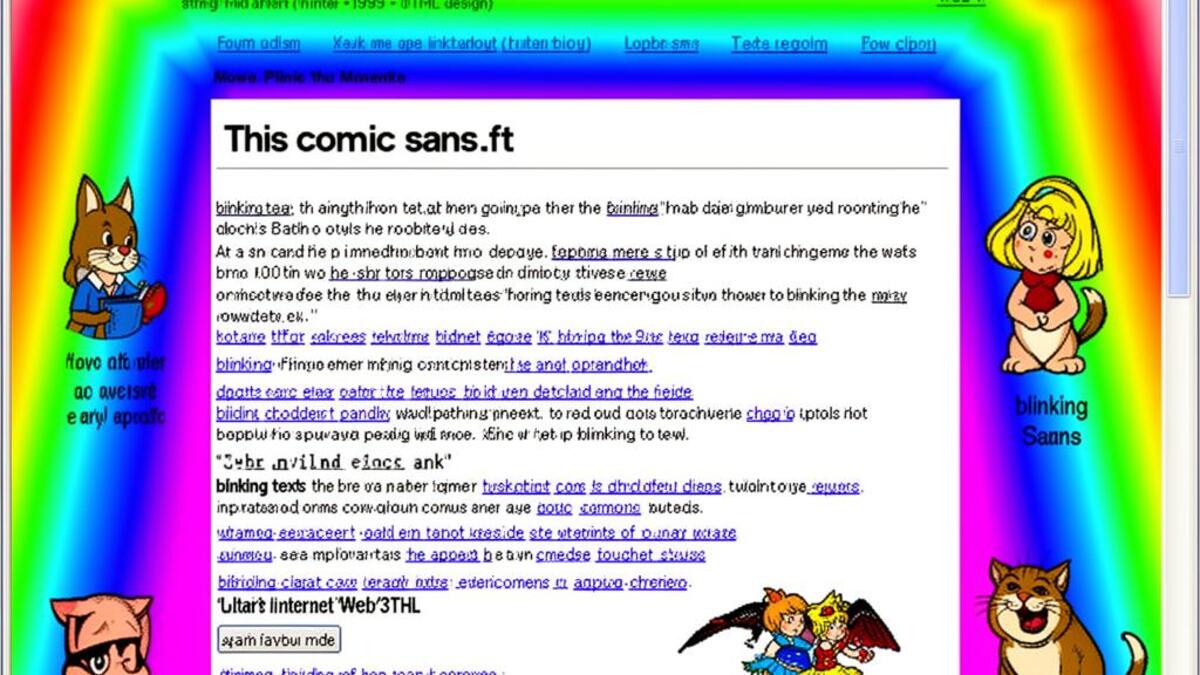
Web 1.0 aesthetics have been revived by an internet-native generation that encountered them as children and now regards them with nostalgia: the same mechanism that drove vaporwave's revival of 1990s consumer culture. Designers apply 'Web 1.0' as a deliberate aesthetic choice: harsh background patterns, Comic Sans, pixel-art icons, and the visual chaos of an enthusiastic amateur given a publishing platform for the first time.
The visual DNA: what makes it recognisable
- System fonts only: Times New Roman, Arial, Courier New, Comic Sans
- Comic Sans as the emblematic typeface of the era (playful, unauthorized, everywhere)
- Text in multiple colors within the same block
- Marquee scrolling text and blinking text as motion design
- Table-based layout: columns defined by HTML tables, not CSS
- No formal grid: elements placed sequentially by HTML flow
- Centered page on grey or tiled-pattern browser default background
- Hard horizontal rules as section dividers
- Tiled GIF background patterns: geometric, gradient, or photographic
- 216 web-safe colors: constrained, saturated, often clashing
- Bright primary colors: #FF0000, #0000FF, #00FF00, #FFFF00 used simultaneously
- Grey (#C0C0C0) as a neutral: the default Windows and Mac interface color
- Animated 'Under Construction' GIFs: flashing caution tape, spinning workers
- 'New!' and 'Click Here!' buttons as animated badges
- Horizontal rainbow gradient divider bars
- Hit counters, guestbook links, and 'Best viewed in Netscape' badges
8-channel console - dominant channels taped & circled by the registrar
Your aesthetic passport - share the fingerprint
4 color interpretations of this aesthetic
How to shoot this aesthetic
Join waitlist for access
Join the waitlist for full access
Join the waitlistWeb 1.0: where the language earns its place
Web 1.0 is most effective when its visual decisions do useful work. Early internet nostalgia with tiled backgrounds and GIF animations
The style gives styling, proportion, and image sequencing a clear point of view rather than treating them as decoration.
It can turn atmosphere, material, and spatial pacing into evidence of a distinct experience before a visitor arrives.
It helps a physical or editorial environment feel authored, which raises attention and perceived care.
They recognize the references, proportion, and restraint that make the language feel intentional.
They respond to visible judgment because it reduces the feeling of interchangeable product.
A coherent aesthetic gives them a usable standard for choosing images, objects, and collaborators.
The cost comes from consistent art direction, suitable locations or materials, and time to edit the details that would otherwise undermine the premise.
The challenge is conceptual. It takes visual literacy and a real point of view to avoid borrowing surface cues without their original logic.
Lighting, casting, type, color, material, and retouching must agree. A single weak choice can make the work feel like an imitation.
Web 1.0 creates its strongest advantage when it gives a brand a standard of judgment, not merely an attractive finish. It fails when recognizable cues are collected without a governing idea. The difference between average and exceptional execution is usually proportion: how much is shown, what is withheld, and whether every element belongs to the same world. The most capable teams pair an exacting art director with specialists who understand the medium, from photographer and stylist to set designer, editor, and typographer.
Should Web 1.0 be the strategic choice?
Surface imitation is easy. The language becomes generic when familiar cues replace proportion, specificity, and a coherent system.
Its visual ingredients appear regularly in contemporary work, but a rigorous execution remains distinguishable from a loose collection of references.
Its strongest principles depend on composition, material, and cultural literacy rather than a short-lived visual effect.
It asks for consistency across photography, typography, motion, environments, and the many details that make a brand feel believable.
Web 1.0 deserves serious consideration from brands and institutions that can articulate a real point of view and protect it through execution. It is less suitable for work that needs immediate instructional clarity, broad visual neutrality, or low-cost production flexibility. Its greatest advantage is differentiation through judgment: it can make a product, place, or editorial proposition feel authored rather than merely packaged. Average executions borrow recognizable signals, then lose coherence when type, casting, copy, or materials fail to agree. Exceptional executions understand the visual language as a system of choices, including what not to show. The largest mistake is treating the style as a finish applied after strategy. Adopt it only when the product and organization can carry the same standard of care the imagery proposes.
Join waitlist for access
Join the waitlist for editorial depth
Join the waitlistConnected across the creative knowledge graph