Registrar's index cards on the platen glass - captured by the scanner
1980s (theory); 2010s–present (mainstream practice) · Biophilia theory (E.O. Wilson, 1984); architecture; workplace design; hospitality industry
Biophilic design is grounded in E.O. Wilson's 1984 concept of biophilia: the innate human affinity for other living organisms and natural systems. Wilson proposed that humans who evolved in natural environments retain biological preferences for the sensory qualities of nature: natural light, water, plants, organic form, and prospect-refuge spatial configurations. Design that incorporates these elements produces measurable improvements in wellbeing, productivity, and recovery from stress.
The biophilic design movement codified these principles for architects and interior designers. Key elements include: direct nature (plants, water, daylight, natural ventilation), indirect nature (natural materials, textures, and colors), and space configurations that evoke evolved preferences (prospect views, refuge spaces, mystery and complexity). Patrick Terrapin Bright Green, Stephen Kellert, and the WELL Building Standard have developed the design applications of biophilia research.
Biophilic aesthetics have become dominant in workplace design (tech companies compete on their green credentials), hospitality (Singapore's Gardens by the Bay and Jewel Changi Airport are landmark examples), retail, and residential design. The aesthetic is now commercially mainstream: though its visual application often ranges from superficial (potted plants added to corporate offices) to deeply integrated (buildings designed around natural systems from the ground up).
The visual DNA: what makes it recognisable
- Natural material typefaces: wood-grain, stone-texture, or leaf-pressed letterforms
- Organic serif or humanist sans-serif faces: warmth, not precision
- Earth-toned color on natural material backgrounds
- Handwritten or craft quality typography suggesting human connection to process
- No hard grid: layouts that follow organic, asymmetrical natural forms
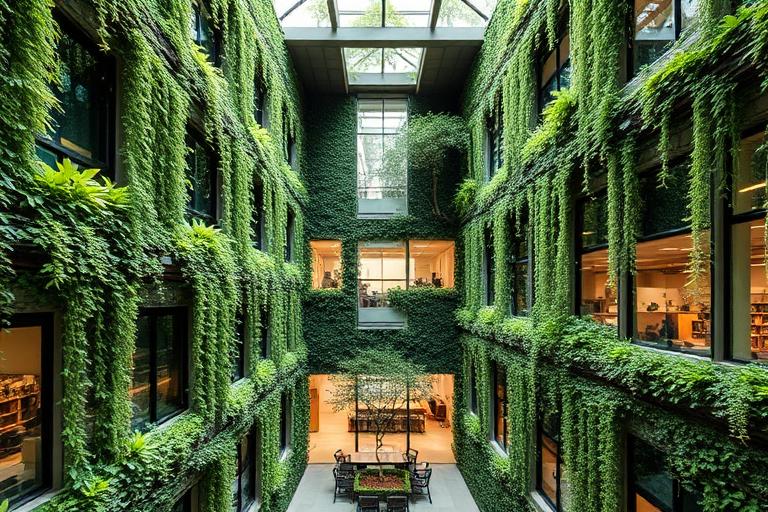
- Living wall photography as primary visual element and background
- Natural light as compositional element: golden hour, dappled light, shadows
- Prospect and refuge spatial configurations: open views with sheltered foreground
- Forest green: #2D5A27, #3A7030: the deep green of mature foliage
- Warm sand: #C8B890, #D4C8A0: natural stone and earth
- Timber warm: #8B5E3C, #9A6A42: the color of unfinished wood
- Sky blue: #7AB0CC, #8FC0D8: natural light and water reference
- Living walls and vertical gardens as primary architectural features
- Natural material surfaces: stone, timber, rattan, wool, leather
- Water features: pools, streams, and water walls
- Plant forms: leaf shapes, branch structures, moss textures
8-channel console - dominant channels taped & circled by the registrar
Your aesthetic passport - share the fingerprint
The style's primary materials, assembled bottom-up
Tap a stratum for material detail · Full catalog
Future-Facing · 2005–present - tap any style to travel
Join waitlist for access
Join the waitlist for full access
Join the waitlistBiophilic Design: where the language earns its place
Biophilic Design is most effective when its visual decisions do useful work. Architecture that reconnects people with nature - Biophilic design weaves living systems into every surface, with vertical gardens, water, daylight, and natural materials, treating greenery not as decoration but as the building's organising principle.
The style gives styling, proportion, and image sequencing a clear point of view rather than treating them as decoration.
It can turn atmosphere, material, and spatial pacing into evidence of a distinct experience before a visitor arrives.
It helps a physical or editorial environment feel authored, which raises attention and perceived care.
They recognize the references, proportion, and restraint that make the language feel intentional.
They respond to visible judgment because it reduces the feeling of interchangeable product.
A coherent aesthetic gives them a usable standard for choosing images, objects, and collaborators.
The cost comes from consistent art direction, suitable locations or materials, and time to edit the details that would otherwise undermine the premise.
The challenge is conceptual. It takes visual literacy and a real point of view to avoid borrowing surface cues without their original logic.
Lighting, casting, type, color, material, and retouching must agree. A single weak choice can make the work feel like an imitation.
Biophilic Design creates its strongest advantage when it gives a brand a standard of judgment, not merely an attractive finish. It fails when recognizable cues are collected without a governing idea. The difference between average and exceptional execution is usually proportion: how much is shown, what is withheld, and whether every element belongs to the same world. The most capable teams pair an exacting art director with specialists who understand the medium, from photographer and stylist to set designer, editor, and typographer.
Should Biophilic Design be the strategic choice?
Surface imitation is easy. The language becomes generic when familiar cues replace proportion, specificity, and a coherent system.
Its visual ingredients appear regularly in contemporary work, but a rigorous execution remains distinguishable from a loose collection of references.
Its strongest principles depend on composition, material, and cultural literacy rather than a short-lived visual effect.
It asks for consistency across photography, typography, motion, environments, and the many details that make a brand feel believable.
Biophilic Design deserves serious consideration from brands and institutions that can articulate a real point of view and protect it through execution. It is less suitable for work that needs immediate instructional clarity, broad visual neutrality, or low-cost production flexibility. Its greatest advantage is differentiation through judgment: it can make a product, place, or editorial proposition feel authored rather than merely packaged. Average executions borrow recognizable signals, then lose coherence when type, casting, copy, or materials fail to agree. Exceptional executions understand the visual language as a system of choices, including what not to show. The largest mistake is treating the style as a finish applied after strategy. Adopt it only when the product and organization can carry the same standard of care the imagery proposes.
Join waitlist for access
Join the waitlist for editorial depth
Join the waitlistConnected across the creative knowledge graph