Where PS1 / Dreamcast Low-Poly came from, what makes it recognisable, and the fingerprint it leaves.
History, PS1 / Dreamcast Low-Poly aesthetic history
1994-2001 · Console 3D hardware, Japan and its studios, then everywhere the discs shipped
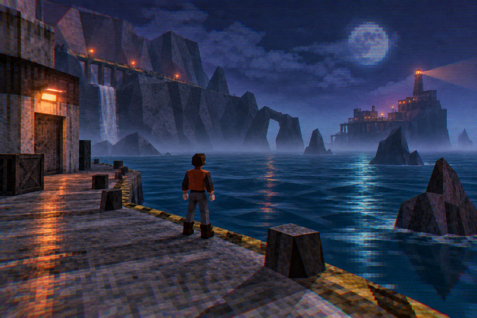
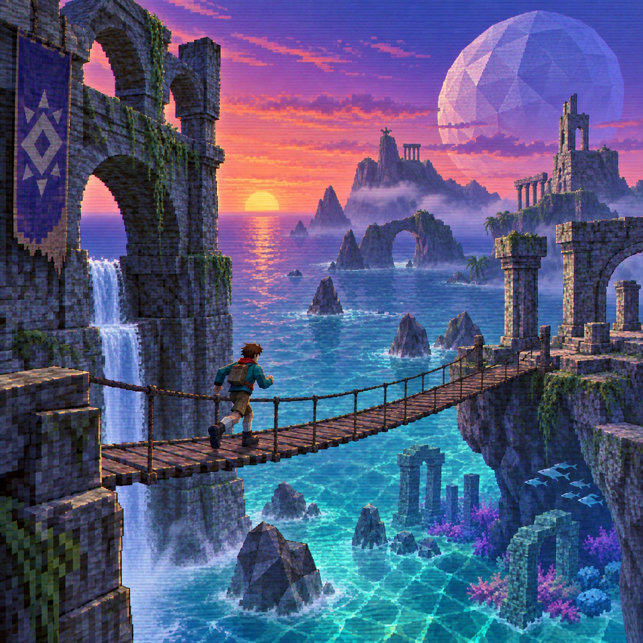
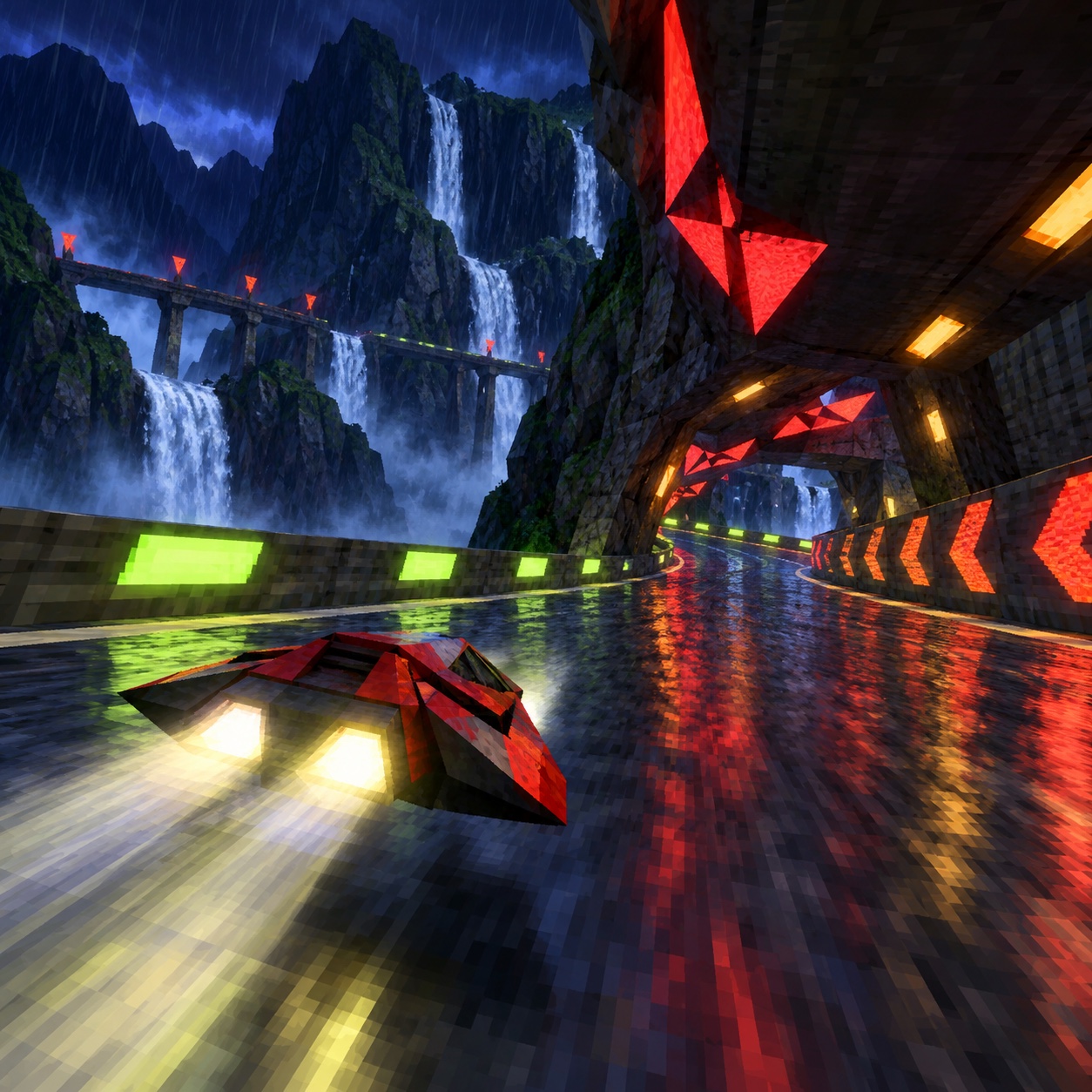
The look came from limits.The PlayStation, released in 1994, rendered polygons without perspective-correct texturing or a depth buffer, so textures slid and warped as the camera moved and edges fought each other at a distance.The Dreamcast, from 1998, drew more and cleaner but still lit by vertex and still hid the far edge of every world behind fog, because the hardware could not draw it.Designers learned to make the fog the mood: Silent Hill's town in 1999 is the clearest case, a technical ceiling turned into dread.
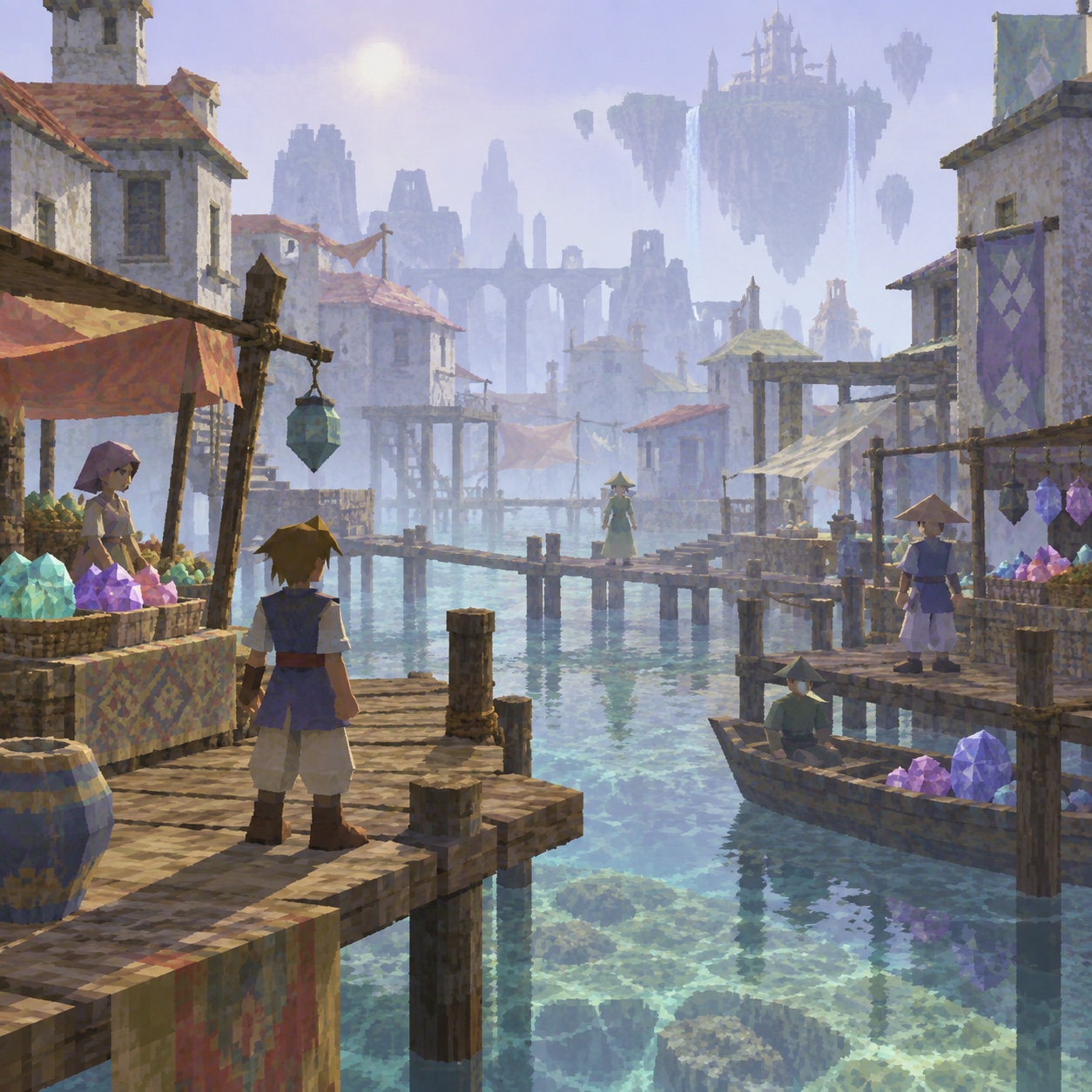
The spaces were empty because empty was cheap, and the emptiness became a quality of its own.LSD: Dream Emulator in 1998 built a whole game from rendered rooms with nobody in them; racing games left their tracks under a single cyan or orange light; menus and save screens sat on banded gradients with bitmap type because that was what the machine could draw at a readable size.Everything passed through a CRT, which bled colour at the edges and laid scanlines over all of it.
The revival is not about the games.From the mid-2010s independent developers, musicians and fashion labels reached for the grammar, the polygon budget, the warp, the fog, the vertex light, as a way of making worlds that feel uncanny and quiet rather than photoreal.Done well it is atmospheric and iconic, an aesthetic of distance and suggestion.Done badly it is a modern render with a scanline filter, and it reads that way at once.
“
A world drawn to its draw distance and no further, with fog doing the composing.
How to shoot it, how to prompt it, and how to board it.
Photo Direction
How to shoot this aesthetic
"Photograph the world as a machine from 1998 would have drawn it, and let the fog do the composing"
Shot list
Wide shot of a coastal or industrial space rendered in visible polygons, textures warping at the seams, the far edge dissolving into hazy grey fog, one orange marker in the middle distance
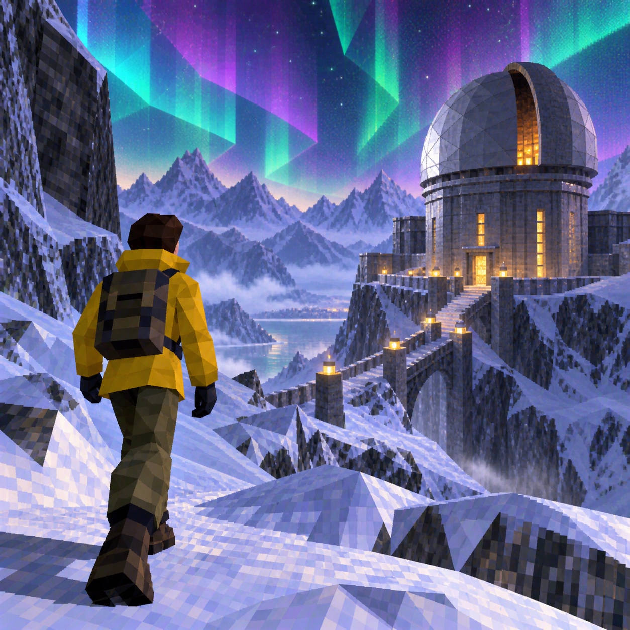
Medium shot of an original angular avatar silhouette standing alone in an empty plaza, vertex-lit, edges jagged, no face detail
Frontal composition of an abstract save screen or menu: angular panels on a banded midnight-blue gradient, bitmap microtype, no real game branding
Lighting
Vertex lighting: one or two coloured point lights, cyan and orange, with no soft shadows and no global illumination. Fog is the third light; it flattens everything beyond a set distance to grey. Finish with scanlines and slight chromatic separation as if through a CRT.
Drop this into Studio to generate in this aesthetic
Late 1990s low-polygon 3D game render aesthetic, PlayStation and Dreamcast era, visible low polygon count, affine texture warping, vertex lighting, banded gradients, distance fog swallowing the horizon, jagged aliased silhouettes, CRT scanlines and chromatic colour bleed, compressed video artefacts, palette of midnight blue, icy cyan, signal orange, low-saturation purple, black and hazy grey, strange empty game space, atmospheric and quiet, original design, no real game characters, no console branding, no logos, no readable text
Paste as-is, or append your own subject
Mood Board
A Pro feature: a board generated from the record
A generated board, with membership
Opening soon
04
The judgement
Whether to use it, what it costs to do properly, and where it stands right now.
Creative verdict, PS1 / Dreamcast Low-Poly feasibility and strategic recommendation
Two written calls, seven meters, and when to walk away
Creative verdict
Should PS1 / Dreamcast Low-Poly be the call?
7 meters
FIG. 2
Assessment
Set the polygon budget and the draw distance first and refuse to exceed them. Fog composes the frame, cyan and orange light it, and the space stays empty. The moment a smooth shadow or a fine texture appears, it has become a modern engine wearing a costume.
Verdict
Right for independent games, music visuals, streetwear and editorial that want an uncanny, atmospheric world rather than a nostalgia joke. Wrong for anything that must look precise. Own the world you render; borrow nothing from the games that taught it.
Production cost
Low
Any 3D tool can be told to render badly on purpose; the constraint is the whole method.
Creative difficulty
Medium
The era supplies the grammar. The judgement is in the emptiness and the fog, which is where atmosphere lives.
Execution difficulty
High
A modern render with a scanline overlay is the obvious failure; the polygon count, the vertex lighting and the texture warping have to be real constraints.
Risk of misuse
High
It slides into generic retro gaming, and any real character or console drags in IP the brand does not own.
Prevalence
Emerging
Independent games, music visuals and fashion lookbooks have been reaching for it since the mid-2010s; it is no longer obscure.
Longevity
Trend
The nostalgia cycle that carries it will move on; the atmospheric version outlives the ironic one.
Brand investment
Medium
One rendered world can carry a campaign, but building it properly means real 3D work under real constraints.
Avoid if
The product has to look precise or premium
Warping textures and jagged edges read as a deliberate roughness, and the brief wants the opposite.
The reference is a real game or console
Characters, consoles and logos are someone's IP; the era's grammar is the style, not its titles.
Omoro · Creative verdict · 035-PD
Editorial Depth
A Pro feature: origins, practitioners, and pitfalls
Editorial Depth · Restricted
Common Misconception
Historical Context
Brands That Accidentally Use This Style
Brands That Perfectly Represent This Style
Psychological Effect
RESTRICTED
The editorial depth, with membership
Opening soon
05
The index
Neighbours, cross-references, blends, and the questions people ask.
Related concepts
Connected across the creative knowledge graph
Cultural relevance, PS1 / Dreamcast Low-Poly cultural relevance today
Where it stands now, and what it costs you to use it
This is a live language in independent games, electronic music visuals and a slice of fashion, and it has moved past the ironic phase.The work that holds up treats the constraints as real: a fixed polygon budget, vertex lighting, a draw distance, textures that warp because the maths says so.The atmosphere comes from what the machine could not draw, which is why the spaces are empty and the horizon is fog.
What has gone stale is the costume version: a modern engine render with scanlines on top, a real console's logo, a borrowed character.It also carries an IP hazard, because the era is owned by named games and named hardware.The discipline is to render an original world under the era's rules and never reach for its titles.
Midnight blue #101C3A, icy cyan #5FD9E8, signal orange #FF7A1A
Low-saturation purple #6B5B8C, hazy grey #9A9EA6, and black
Terminal green: #00FF00, #33FF33: the phosphor monitor glow
The calls this blend forces
These two disagree on 2 things, and a blend cannot average them: you pick a side. At this mix:
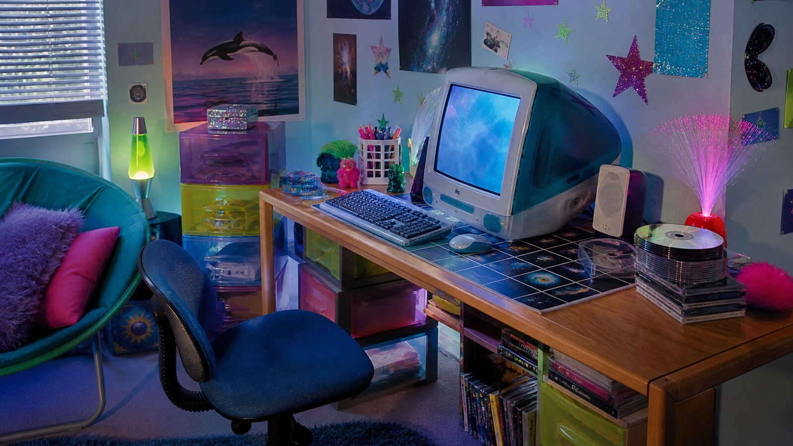
Minimal or Maximal? PS1 / Dreamcast Low-Poly is minimal, Cybercore is maximal. This mix lands maximal.
Structured or Chaotic? PS1 / Dreamcast Low-Poly is structured, Cybercore is chaotic. This mix lands chaotic.
Use it
Late 1990s low-polygon 3D game render aesthetic, PlayStation and Dreamcast era, visible low polygon count, affine texture warping, vertex lighting, banded gradients, distance fog swallowing the horizon, jagged aliased silhouettes, CRT scanlines and chromatic colour bleed, compressed video artefacts, palette of midnight blue, icy cyan, signal orange, low-saturation purple, black and hazy grey, strange empty game space, atmospheric and quiet, original design, no real game characters, no console branding, no logos, no readable text (50%), infused with Cybercore aesthetic with early internet visual maximalism, lens flares and starburst sparkle GIF energy translated to static image, electric neon color glow against pure black, under-construction signs and visitor counter motifs reimagined, GeoCities homepage aesthetic elevated to art direction, corporate clip art meets rave flyer, color palette strictly #101C3A #1A1A1A #5FD9E8 #00E676 #FF7A1A, leaning minimal over maximal, structured over chaotic, overall character: digital, expressive, cool
One-click generation opens with the studio
About this aesthetic
What is the PS1 / Dreamcast low-poly aesthetic?+
The visual grammar of late-1990s console 3D: low polygon counts, textures that warp as the camera moves, fog that hides the far edge of the world, jagged silhouettes, vertex lighting and the colour bleed and scanlines of a CRT. As a style it is atmospheric and quiet, built on empty rendered spaces rather than on any particular game.
How is it different from pixel art or vaporwave?+
Pixel art is two-dimensional and hand-placed; this is three-dimensional and rendered under hardware limits. Vaporwave borrows some of the same-era objects but treats them as pastel nostalgia. Low-poly is colder and stranger: midnight blue and fog, one cyan light, a world that ends at its draw distance.
Can I use real game characters or console branding?+
No. Every recognisable character, console and logo from the era is someone's property, and using them turns the style into a licensing problem. Render an original world and an original avatar under the era's constraints; the constraints are the style.
Build with the ps1 / dreamcast low-poly aesthetic
Every style in the library is broken down like this one: the palette, the typography, the materials and the lineage.