When to use it
- Club nights and festivals
- Electronic music releases
- Nightlife photography
- Event and venue branding
Warehouse party culture: sound systems, strobe haze, and the spaces where the night happens
Record 037-RA - when it works, who it is for, what it looks like
1988-present · UK warehouses and fields; Chicago and Detroit clubs before them
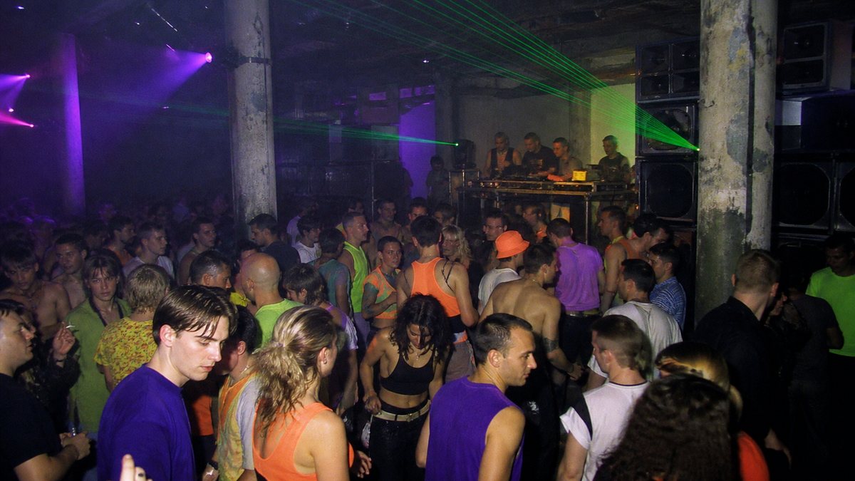
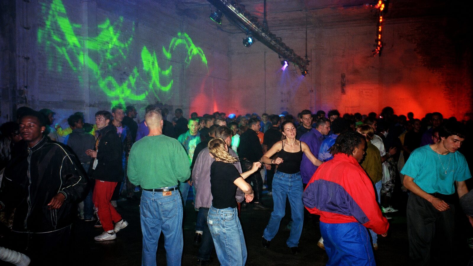
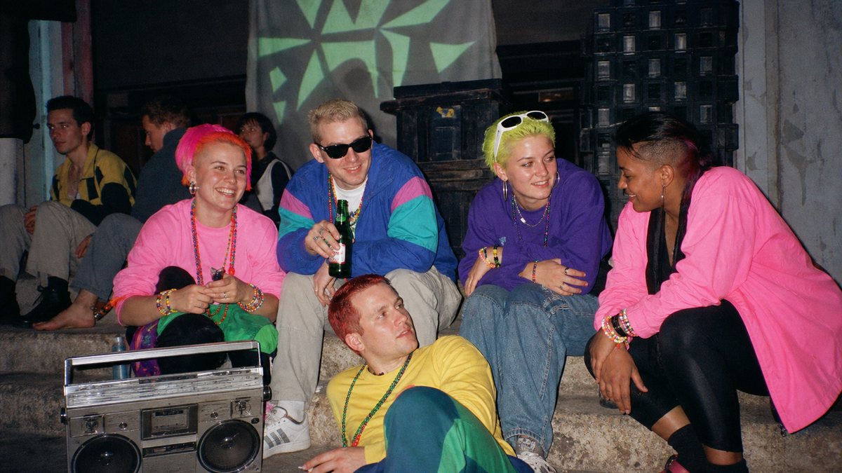
Rave began in 1988 when acid house crossed from Chicago and Detroit clubs into British warehouses and fields, and a genre became an event format. The Second Summer of Love put thousands of people in unlicensed industrial spaces with a sound system, a smoke machine and very little else, and the aesthetic formed from exactly those materials: raw concrete, stacked speakers, strobe light cutting through haze, and bodies as the only decoration the room needed.
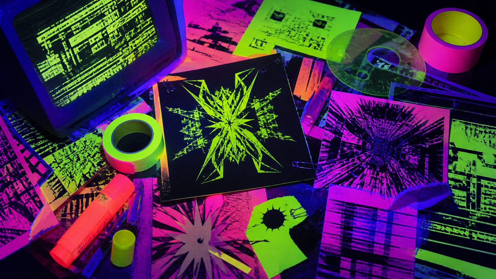
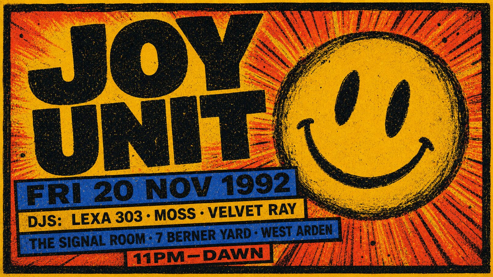
The visual culture that grew around it was made fast and cheap by necessity. Flyers were designed overnight and photocopied by the thousand, which produced a graphic language of bold shapes, toxic colour and typography that read at arm's length in a dark club. The chill-out room added the softer register: dawn light, draped fabric, bodies at rest, the comedown as part of the composition. Photographers who documented the scene shot available light through smoke, and the blur was the truth of it.
Rave never fully ended; it dispersed. Its language resurfaces every time club culture is invoked: in festival production design, in fashion editorial that wants euphoria, in the revival of flyer graphics as a collectible form. The distinction that matters is between the room and the graphics: Acid is the smiley and the typeface, Rave is the warehouse, the sound system and the haze the graphics advertised.
The visual DNA: what makes it recognisable
8-channel console - dominant channels taped & circled by the registrar
strongest channels circled - leans expressive, chaotic, maximal
Save the fingerprint as a card, or share the page
The definitive color scheme for this aesthetic
Join waitlist for access
Join the waitlist for full access
Join the waitlistRave is most effective when its visual decisions do useful work. Warehouse party culture: sound systems, strobe haze, and the spaces where the night happens
Flyer production and lighting rather than a shoot.
A loud, forgiving language, but the references are tribal and specific.
Deliberate excess is easy to produce and hard to keep coherent.
The visual language belongs to specific scenes and gets flattened. Acid house yellow, hardcore breakbeat flyers and modern techno minimalism are separate cultures, and blending them signals an outsider immediately. Pick a scene and study its actual flyers. Low-fidelity reproduction is the texture: photocopy grain and cheap spot colour are correct, and clean vector output is not.
Made by and for a scene; brand versions are spotted immediately.
A recurring reference in music, fashion and nightlife design.
Thirty years of continuous subcultural output behind it.
Flyer economics: cheap, fast, and disposable by design.
Right when the work is genuinely for the night rather than about it, because the flyer economics are the aesthetic: cheap, fast, disposable, and made by people inside the scene. Wrong as a brand borrowing energy it did not earn, which that audience spots instantly. The unreadable type is a filter, not a mistake, and removing it removes the point.
Join waitlist for access
Join the waitlist for editorial depth
Join the waitlistConnected across the creative knowledge graph
Where it stands now, and what it costs you to use it
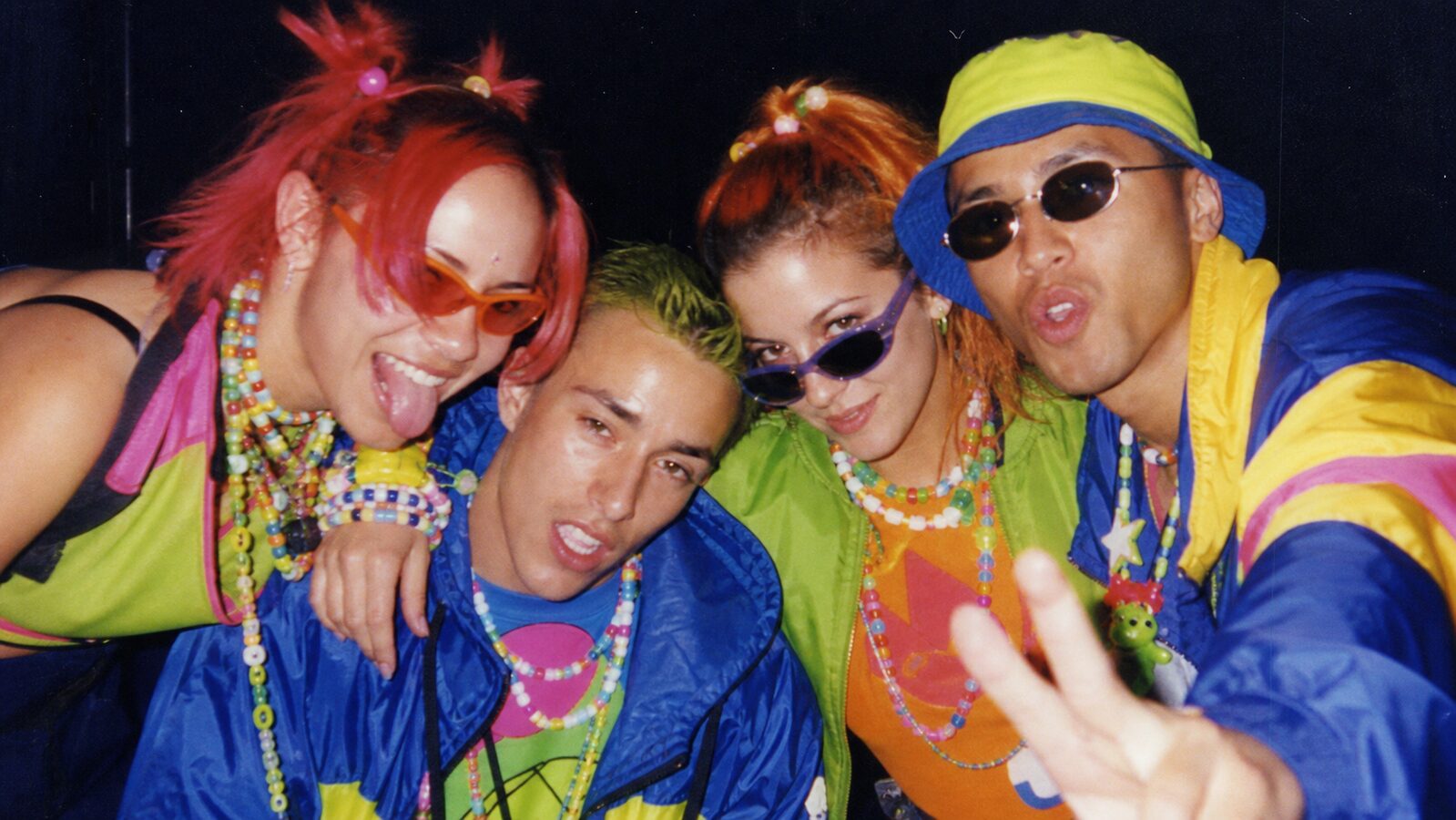
Rave is in active revival, led by people too young to have been there, and the scene's veterans are mostly generous about it: the point was always that anyone could turn up. What they police is the economics, since the culture was built free or nearly free and reads wrong at luxury prices.
The distinction insiders hold onto is participation over spectacle. A rave is something you are in, not something you watch, and imagery that shoots the crowd as performers for a camera misses the entire point.
Commercially it is one of the most usable club aesthetics because it carries euphoria without a specific drug reference in the visuals themselves. The failure mode is cleanliness: a rave with flat lighting and no haze is a product launch.
Mix Rave with any of the library's 150+ styles
Rave 50%Acid 50%Merged palette
#FF3EB5
#0A0A0A
#39FF6A
#FF00CC
#F5B942
Leads expressive, chaotic, maximal
Typography · from Rave
Anton over Karla
Materials
The calls this blend forces
These two disagree on one thing, and a blend cannot average them: you pick a side. At this mix:
Dark or Light? Rave is dark, Acid is light. This mix lands dark.
Use it
Rave aesthetic (50%), infused with Acid house rave graphic design with smiley-face iconography, warped liquid typography, Day-Glo neon color intensity, 1988 UK rave-flyer aesthetic, swirling psychedelic tie-dye patterns, euphoric electronic-music visual energy, color palette strictly #FF3EB5 #0A0A0A #39FF6A #FF00CC #F5B942, leaning dark over light, overall character: expressive, chaotic, maximal
The rave aesthetic is the visual culture of warehouse party scenes from 1988 onward: raw industrial spaces, stacked sound systems, strobe and laser light cut through smoke haze, fast-photocopied flyer graphics, and the chill-out room's softer dawn register.
Acid is the graphic language: smiley faces, warped typography, toxic colour on flyers and records. Rave is the environment those graphics advertised: the warehouse, the sound system, the haze and the crowd. They share a history but describe different things.
Strobe magenta (#FF3EB5) and laser green (#39FF6A) against near-black, with a warm sodium haze (#F5B942) as the ambient wash. The palette is light-in-darkness: a few saturated beams against an unlit industrial ground.
Omoro turns aesthetic references into on-brand visuals. Generate, compose and publish from one studio.
Join the waitlist