When to use it
- Productivity and wellness apps that need warmth
- Onboarding flows and forms that should feel inviting
- Stationery, planner, and journaling product lines
- Brands bridging craft and digital without nostalgia
Warm functional design with rounded inputs, earth-toned palettes, paper textures, and an approachable softness that makes tools feel friendly
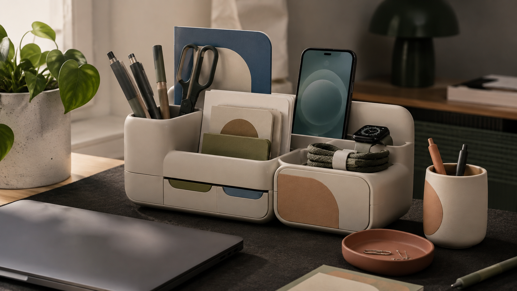
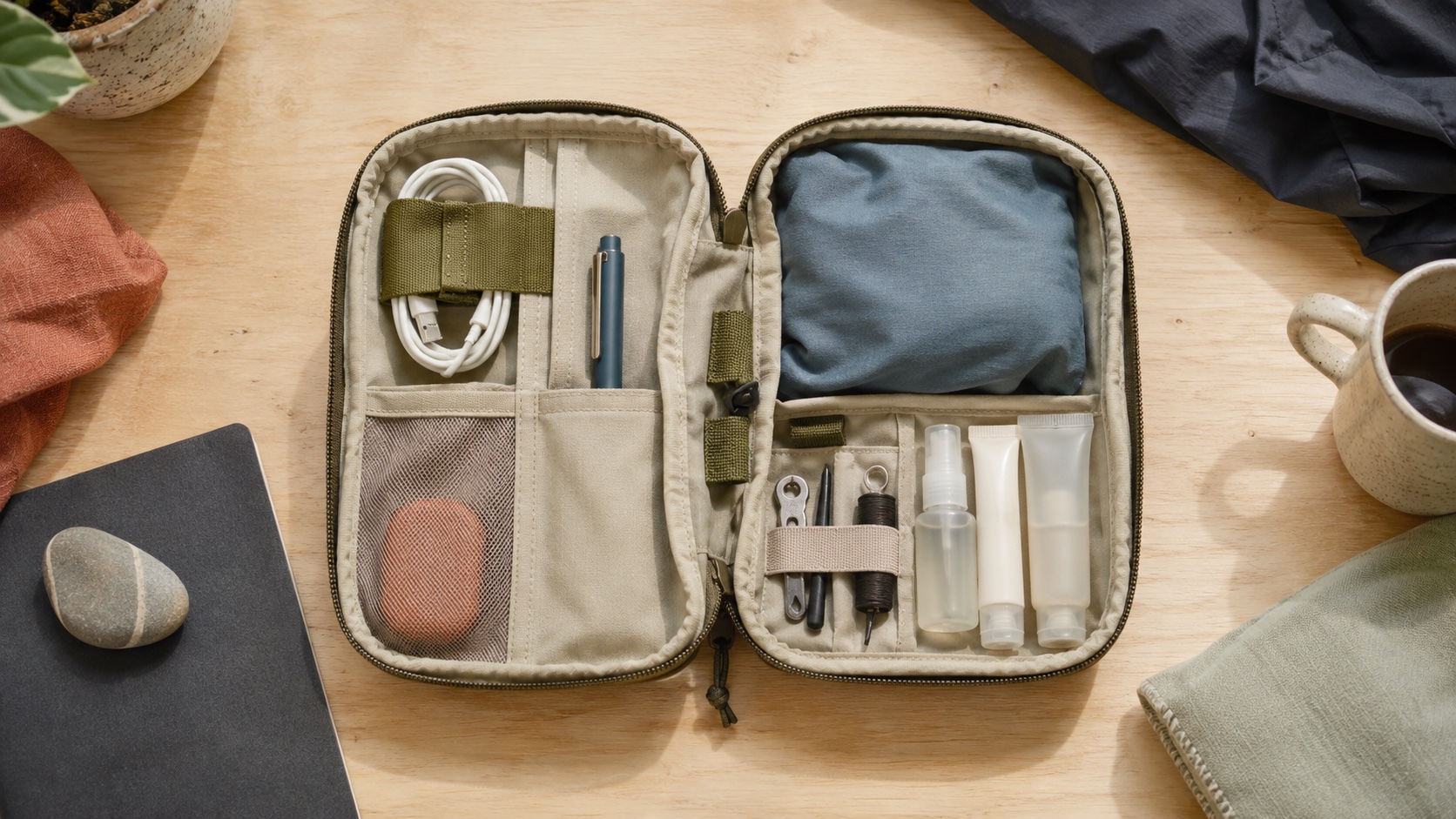
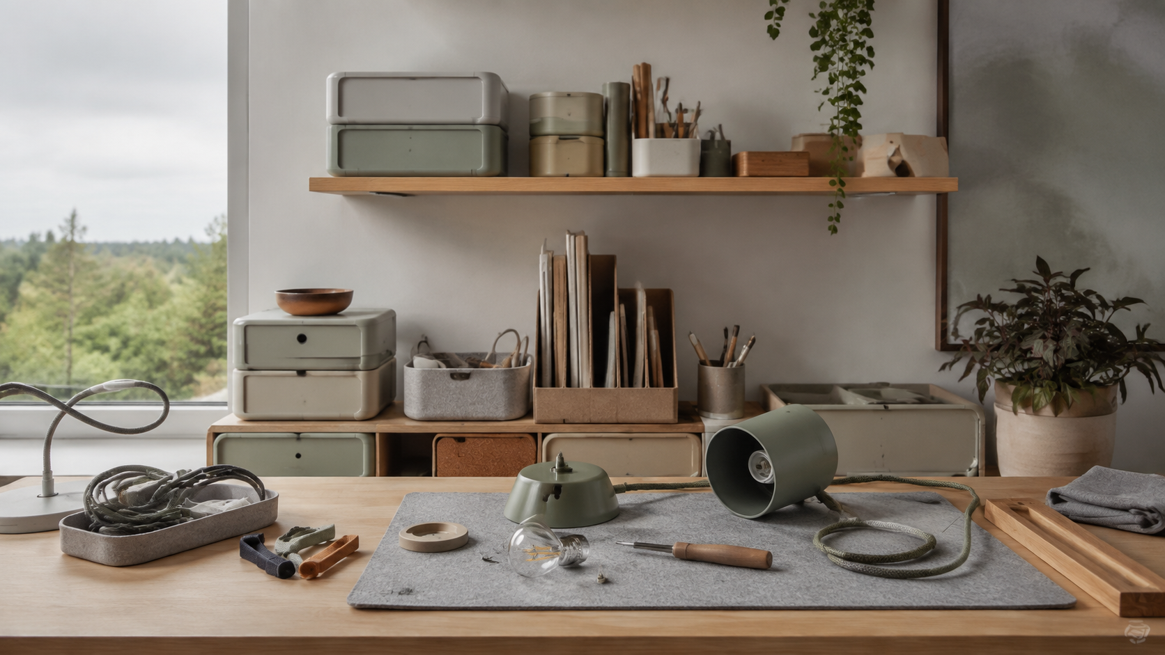
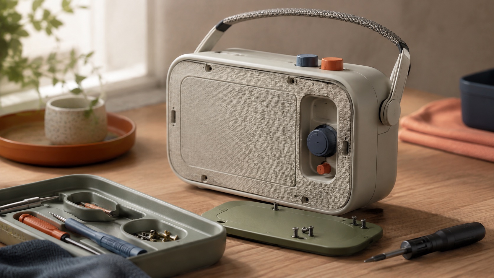
Record 038-SU - when it works, who it is for, what it looks like
2021-present · Indie software, tools like Notion, Linear, Are.na
Soft utility emerged in the early 2020s from indie software studios that rejected the cold precision of enterprise design without abandoning its functionality. The earliest signals came from tools like Notion, which paired a powerful block-based editor with warm typography and rounded corners, and Are.na, whose spartan interface felt more like a personal library than a productivity app. Linear followed with a developer tool that was visually warm without sacrificing information density.
The style is a direct response to a decade of design systems that prioritised consistency and scalability over personality. Material Design and its imitators had made software legible but impersonal. Soft utility keeps the legibility and brings back warmth through specific material choices: rounded input fields instead of sharp ones, muted earth tones instead of pure greys, paper and linen textures instead of flat colour, and hand-drawn or imperfect icons instead of geometric ones. The overall effect is functional design that feels like it was made by a person rather than generated by a system.
The pattern has spread from indie tools into broader product design. Startups in particular have adopted soft utility as a way to differentiate from enterprise competitors. The warmth signals approachability, the functionality signals competence, and the combination positions a product as both serious and human. The style is still young enough that it has not yet been diluted by mass adoption, though the early signs of that dilution are visible.
The visual DNA: what makes it recognisable
The definitive color scheme for this aesthetic
How to shoot this aesthetic
"Functional tools dressed in linen instead of steel, warm where software is usually cold"
Shot list
Lighting
Golden-hour warmth or soft overcast daylight. The light should feel domestic and unhurried. Avoid anything clinical or cool. If the scene could be lit by a window with sheer curtains, that is the reference.
Drop this into Studio to generate in this aesthetic
Functional interface design rendered warm, rounded input fields in muted earth tones, paper and linen textures, hand-drawn icon details, quiet humanist sans-serif type, cream and sage and clay palette, utility software dressed in natural materials, no sharp corners, no cold steel
Join waitlist for access
Join the waitlist for full access
Join the waitlistSoft Utility is most effective when its visual decisions do useful work. Warm functional design with rounded inputs, earth-toned palettes, paper textures, and an approachable softness that makes tools feel friendly
Budget goes into art direction and casting, not the toolkit.
Anyone can spot the references. A real system out of them is the hard part.
One wrong prop or one off color reads as costume instead of conviction.
Soft Utility earns its keep when it gives a brand a standard of judgment, not just a finish. It falls apart the moment recognizable cues get collected without a point of view behind them. The tell is always proportion: what's shown, what's held back, and whether every choice belongs to the same world.
The surface is easy to copy. What separates the real thing from a knockoff is the system underneath.
The ingredients are everywhere right now. A disciplined execution is still the minority.
This holds up because it's built on composition and material, not a filter that ages out.
It only works if every touchpoint agrees. Cut a corner anywhere and the whole thing shows it.
Use Soft Utility when the brand can back a real point of view and protect it through execution. Not when the goal is broad, neutral, or cheap to produce. The advantage is differentiation through judgment: the work reads as authored, not packaged. Average executions borrow the signals and lose the coherence. The best ones treat the visual language as a system of choices, including what they leave out.
Join waitlist for access
Join the waitlist for editorial depth
Join the waitlistConnected across the creative knowledge graph
Where it stands now, and what it costs you to use it
Soft utility reflects a broader cultural desire for technology that feels less industrial. After a decade of interfaces that looked machine-made, users responded to software that felt handcrafted, even when the craft was itself systematic. The warmth is engineered, every rounded corner is a deliberate choice, but the result reads as personal rather than corporate.
The challenge for the style is durability. Warmth and personality are easy to introduce but difficult to maintain across a growing product. As features accumulate and edge cases multiply, the hand-drawn icon set needs to cover more states, the earth-tone palette needs to accommodate more semantic colours, and the generous spacing needs to fit more information. The tools that sustain soft utility at scale are the ones that built it into their design system foundations rather than applying it as a surface layer.
Soft utility is functional design that replaces cold precision with warmth. Rounded inputs, muted earth tones, paper textures and hand-drawn icons make utility software feel approachable without sacrificing usability. The style emerged from indie tools like Notion, Are.na and Linear.
Skeuomorphism imitates physical objects, leather textures, stitched edges, wooden shelves. Soft utility does not imitate anything; it uses material warmth, rounded forms and muted colour to make flat, functional interfaces feel human. The functionality stays digital; only the emotional register changes.
Those are the most visible markers, but the style runs deeper. Generous padding, comfortable type sizes, warm shadow colours, gentle micro-interactions and imperfect illustrations all contribute. The goal is an interface that feels considered rather than generated, and that requires attention to every touchpoint, not just the corner radius.
Omoro turns aesthetic references into on-brand visuals. Generate, compose and publish from one studio.
Join the waitlist