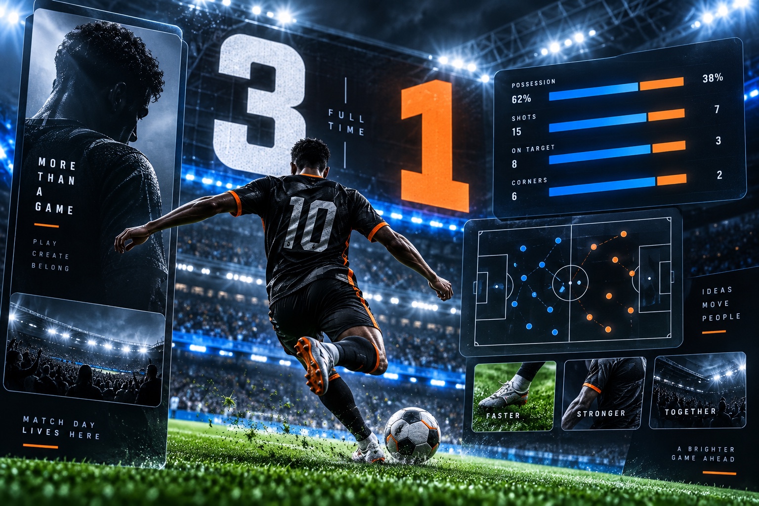
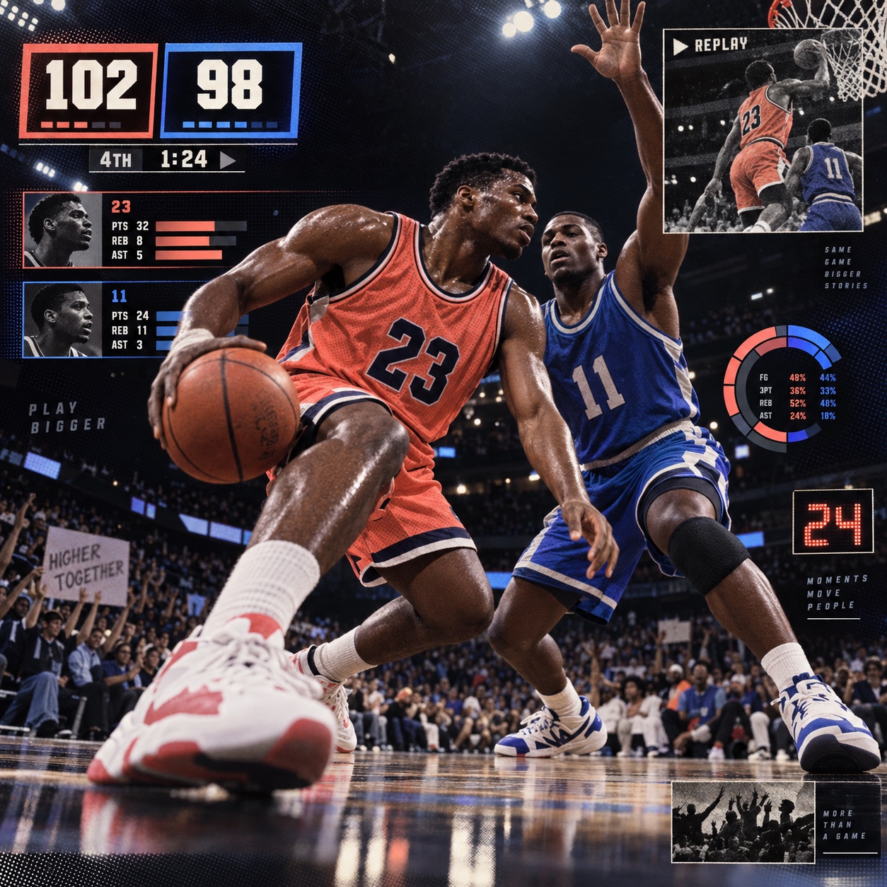
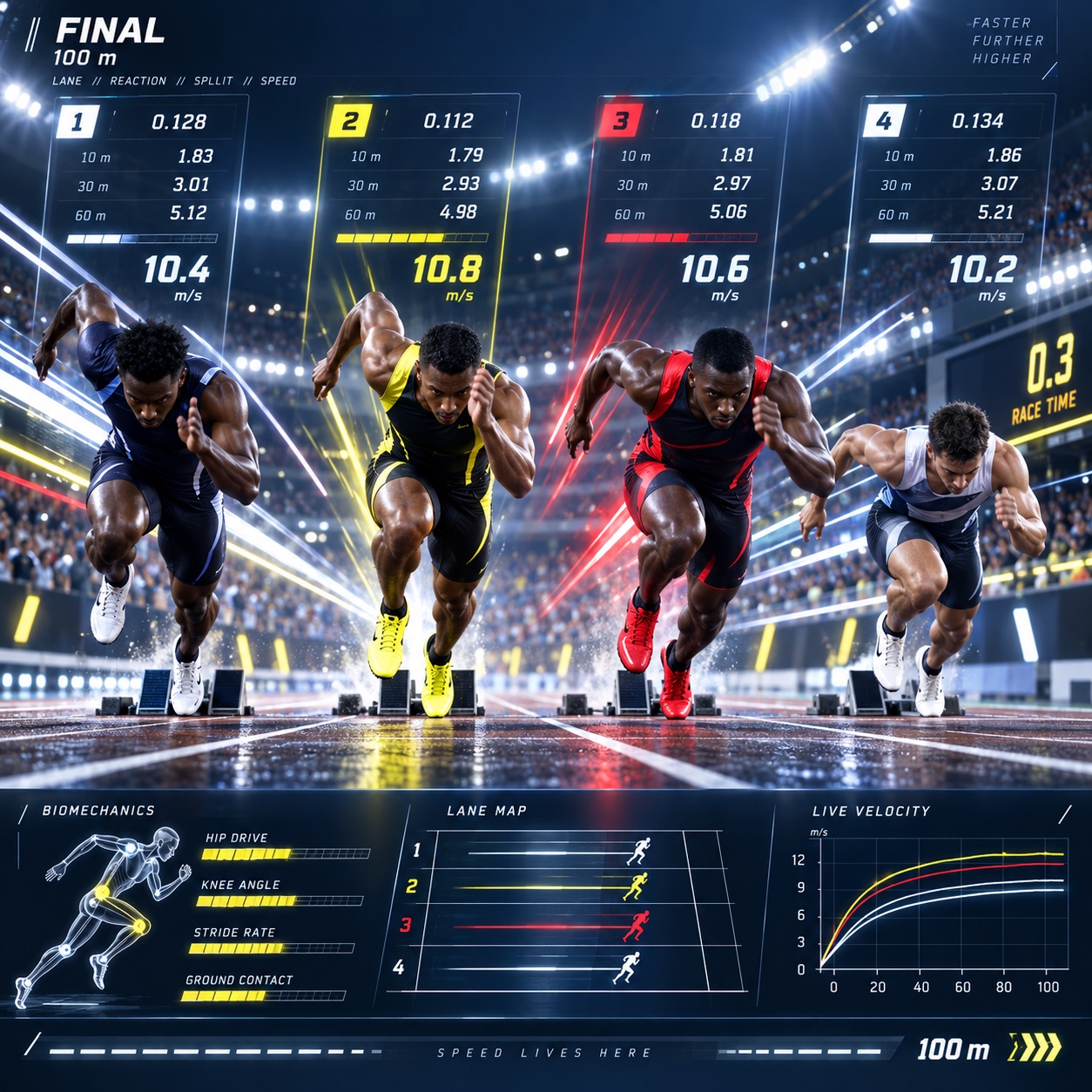
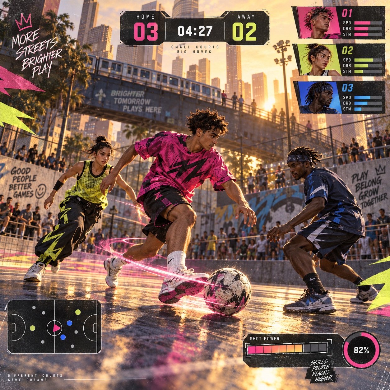
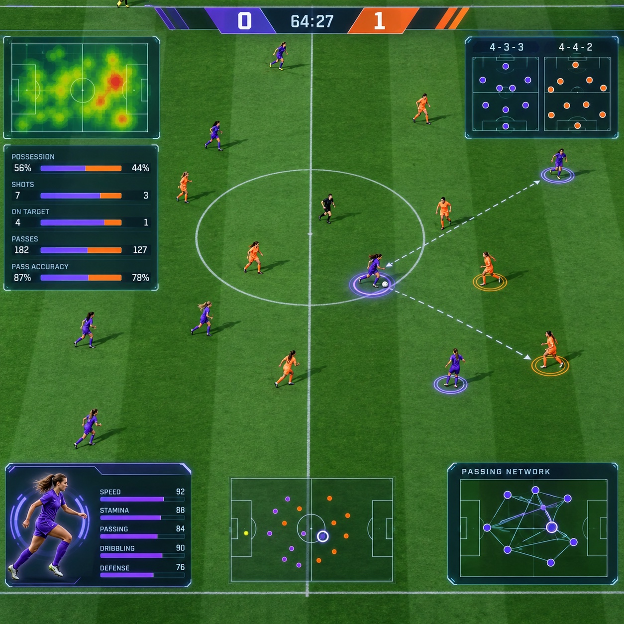
Player cards, scoreboards, stat systems and match-day overlays: a bold numerical hierarchy under stadium lights, cropped fast, for a premium fictional league
Where Sports-Game UI came from, what makes it recognisable, and the fingerprint it leaves.
History, Sports-Game UI aesthetic history
1990s-present · Sports video games and the television broadcasts they imitate
Sports games learned their look from television.Once consoles could draw a broadcast, the early 1990s football and basketball series copied the scoreboard bug, the lower third, the replay wipe and the commentary graphics, and the audience read them as authority because they already trusted them from the screen at home.The numerals came first: score, clock, ratings, and everything else was arranged around them.
The trading card supplied the other half. Panini stickers and sports cards had a composition, an athlete cropped hard against a plain ground, a name band, a number, a foil frame for the rare ones, and when games began selling card packs inside the game in the 2010s that composition became the centre of the interface. Ratings became the number that mattered, gold became the colour of value, and the card system grew a whole ceremony of reveals, tiers and glass panels.
The current form is premium and fast. Ink black grounds, white numerals, one red and one blue for the sides, gold reserved for the top tier, athletes cropped at the shoulder under floodlight glare, overlays that read as glass. It is a language of urgency and status, and it is now copied by fantasy apps, betting products and fitness trackers that want the feeling of an event.
“
Numbers as the hero, athletes cropped to serve them, and floodlights doing the drama.
How to shoot it, how to prompt it, and how to board it.
Photo Direction
How to shoot this aesthetic
"Shoot the athlete like a card and the room like a broadcast, then let the numbers lead"
Shot list
Scoreboard: a fictional match-day scoreboard band in stadium white on ink black, two team colours in signal red and electric blue, tabular numerals oversized, one gold accent for the leader
Player card: a single athlete silhouette cropped fast at the shoulder against a floodlight glare, gold foil frame, a giant numeral, condensed caps label zone
Match day: a wide stadium under floodlights rendered as a broadcast overlay, lower-third panels, glass overlays, no crowd faces readable
Lighting
Stadium floodlight: hard, top-heavy, with glare and a cool blue fill, so skin and kit read as broadcast rather than editorial. Overlays are lit by their own glass. Gold is the only warm light and it belongs to the trophy.
Drop this into Studio to generate in this aesthetic
Premium sports video game interface aesthetic, fictional league, broadcast graphics language, player card and scoreboard composition, bold numerical hierarchy with extended athletic sans numerals and condensed caps labels, stadium floodlight drama, fast editorial cropping of an athlete silhouette, palette of ink black, stadium white, signal red, electric blue and gold, brushed metal and foil card frames, glass overlay panels, no real teams, no real players, no real league or sponsor logos, no readable text
Paste as-is, or append your own subject
Mood Board
A Pro feature: a board generated from the record
A generated board, with membership
Opening soon
04
The judgement
Whether to use it, what it costs to do properly, and where it stands right now.
Creative verdict, Sports-Game UI feasibility and strategic recommendation
Two written calls, seven meters, and when to walk away
Creative verdict
Should Sports-Game UI be the call?
7 meters
FIG. 2
Assessment
One oversized numeral per frame and everything else serves it. Crop the athlete fast, keep the league fictional all the way down, and give gold only to the trophy. The failure is polish without drama: a clean grid of stats with no floodlight is analytics, not a game.
Verdict
Right for games, sports media, fantasy and fitness products that want competitive energy and a premium feel. Wrong for real analytics tools and for anything that cannot afford the licences it evokes. Lead with the numeral, keep the league fictional, and let the floodlight do the drama.
Production cost
Medium
Type, numerals and a floodlit shoot. The card frames and overlays are design work, not production spend.
Creative difficulty
Medium
The grammar is documented in every sports game; the judgement is in how fast the crop is and how big the number gets.
Execution difficulty
High
Numerical hierarchy has to be exact: tabular figures, consistent weights, one size that leads. Sloppy numbers make it a dashboard.
Risk of misuse
Medium
It slides toward a generic dashboard without the floodlight, and toward a licensing problem with any real team.
Prevalence
Common
Every major sports franchise ships this language yearly, and fantasy and betting apps copy it.
Longevity
Enduring
Scoreboards and cards have looked like this for decades; the foil and glass overlays date, the numbers do not.
Brand investment
Medium
A card system, a scoreboard and an overlay set are the whole kit and they scale to a product.
Avoid if
The product is a real dashboard
Floodlights and card frames on actual analytics read as theatre, and users notice.
Any real league, club or player is in reach
Kits, crests and likenesses are licensed; the fictional league is the whole point.
Omoro · Creative verdict · 038-SG
Editorial Depth
A Pro feature: origins, practitioners, and pitfalls
Editorial Depth · Restricted
Common Misconception
Historical Context
Brands That Accidentally Use This Style
Brands That Perfectly Represent This Style
Psychological Effect
RESTRICTED
The editorial depth, with membership
Opening soon
05
The index
Neighbours, cross-references, blends, and the questions people ask.
Related concepts
Connected across the creative knowledge graph
Cultural relevance, Sports-Game UI cultural relevance today
Where it stands now, and what it costs you to use it
This language is shipped fresh every year by the big sports franchises, and it has escaped the games: fantasy leagues, betting apps, run trackers and even language-learning streaks borrow the card, the rating and the floodlight to make ordinary numbers feel like an event.Used with intent it gives a product competitive energy and a sense of status without a word of copy.
Its two traps are opposite.Without the drama it collapses into a dashboard, a grid of stats nobody feels anything about.With too much reality it becomes a licensing problem, because the kits, crests and likenesses it evokes are all owned.The working discipline is a fictional league, drawn all the way down, with one number in charge of every frame.
Ink black #0B0B0F, stadium white #F5F5F0, signal red #E8232A
Electric blue #1E5BFF for the other side, gold #E6B422 only for value
Flat colour fields with a fine film-grain overlay: cobalt, cream, ink
Use it
Premium sports video game interface aesthetic, fictional league, broadcast graphics language, player card and scoreboard composition, bold numerical hierarchy with extended athletic sans numerals and condensed caps labels, stadium floodlight drama, fast editorial cropping of an athlete silhouette, palette of ink black, stadium white, signal red, electric blue and gold, brushed metal and foil card frames, glass overlay panels, no real teams, no real players, no real league or sponsor logos, no readable text (50%), infused with A single keyframe from a motion design piece, locked camera, one stable hero element with letterforms and shapes caught mid-movement around it, motion blur on the fast elements only, cobalt blue ground with orange and lime accents, fine film grain over flat colour, orbit lines and guide rules exposing the structure, rhythm and timing implied in a still frame, no watermark, no interface chrome, color palette strictly #0B0B0F #2244F2 #F5F5F0 #FF5A1F #E8232A, overall character: digital, expressive, geometric
One-click generation opens with the studio
About this aesthetic
What is sports-game UI?+
The interface language of sports video games: scoreboards, player cards, stat systems and match-day overlays, built on a bold numerical hierarchy, trading-card composition and stadium-light drama. It borrows from television broadcast graphics and from collectible cards, and it is defined by numerals that lead every frame.
How is it different from a data dashboard?+
A dashboard is designed to be read calmly; this is designed to be felt. The numbers are oversized, the athlete is cropped fast, the light is a floodlight and the colours belong to sides. Take the drama out and it is a dashboard; put the drama on real analytics and it is theatre.
Can I use real teams and players?+
Not without licences. Kits, crests, league marks and player likenesses are all owned, which is why sports games pay for them. The style works with a fictional league: invent the teams, the colours and the names, and keep the numbers real.
Build with the sports-game ui aesthetic
Every style in the library is broken down like this one: the palette, the typography, the materials and the lineage.