Registrar's index cards on the platen glass - captured by the scanner
References 1837–1901; movement from 1980s onward · Science fiction literature; cyberpunk literature's Victorian cousin
Steampunk as a named aesthetic emerged in the 1980s as an offshoot of cyberpunk, substituting steam technology for electronics and the Victorian era for the near-future. The term was coined (partially in jest) by author K.W. Jeter in a 1987 letter to Locus magazine, but the mode it described had precedents in H.G. Wells, Jules Verne, and Michael Moorcock's 'Nomad of Time' (1971). The premise: an alternate history where Victorian-era steam technology was developed to far greater sophistication: steam-powered computers, airships, mechanical automata, analytical engines: without the transition to electrical power.
The visual vocabulary draws from actual Victorian industrial design (the ornate cast iron of early industrial architecture, the brass and mahogany of navigation instruments, the leather and rivet of military equipment) and fantasy extrapolation of those elements into flight machines, mechanical prosthetics, and analytical computers. Isambard Kingdom Brunel's engineering: the Great Eastern steamship, the Clifton Suspension Bridge: provides a visual model: massive, confident, ornately detailed without sacrificing function.
Contemporary steampunk is primarily a subculture (cosplay, music, convention culture) and a visual design language (applied to clocks, lamps, goggles, firearms, and custom computer cases). Its color palette and material vocabulary have been absorbed by craft markets, alternative fashion, and themed entertainment design.
The visual DNA: what makes it recognisable
- Victorian display faces: condensed wood type, slab serifs, and decorative letterforms with elaborate ornament
- Engraved type on metal plaques: fine serif with regular tracking
- Blackletter for ceremonial or official documents
- Hand-painted signage quality: slightly uneven, substantial, authoritative
- Symmetrical, formal Victorian layout: centered compositions for official documents and advertisements
- Mechanical schematic drawing: orthographic projections, cross-section views
- Blueprint or technical drawing as background texture
- Framed compositions: ornate Victorian borders containing content
- Brass: #B5860D, #C9A84C, #8B6914: the defining material
- Aged leather: #5C3A1E, #7A4E2D, #3D2310: brown and warm black
- Verdigris copper: #4F8076, #3D6B60: oxidized metal surfaces
- Aged parchment: #D4B483, #C8A870, #B89650
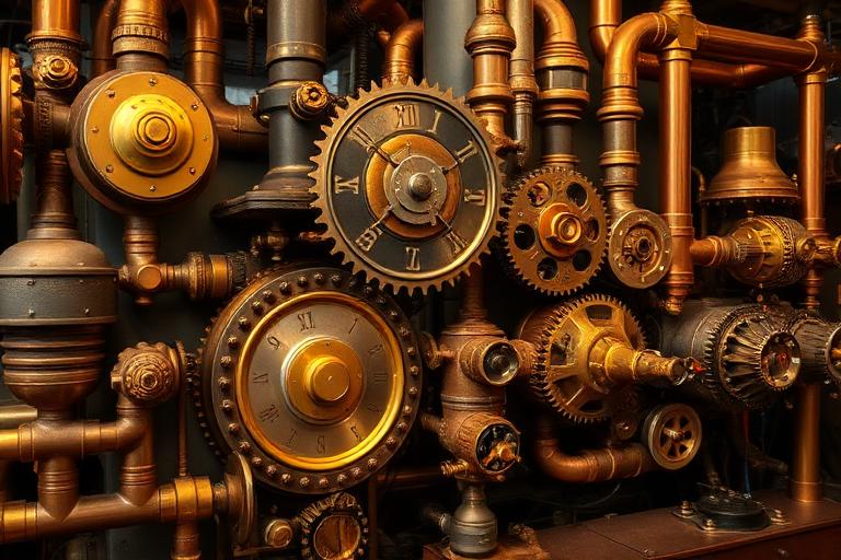
- Exposed gears and clockwork mechanisms as decorative elements
- Airships and dirigibles over Victorian cityscapes
- Brass goggles, top hats, and waistcoats as character signifiers
- Mechanical prosthetic limbs and analytical engines
8-channel console - dominant channels taped & circled by the registrar
Your aesthetic passport - share the fingerprint
4 color interpretations of this aesthetic
How to shoot this aesthetic
Join waitlist for access
Join the waitlist for full access
Join the waitlistSteampunk: where the language earns its place
Steampunk is most effective when its visual decisions do useful work. Victorian-era machinery meets speculative fiction with brass and gears
The style gives styling, proportion, and image sequencing a clear point of view rather than treating them as decoration.
It can turn atmosphere, material, and spatial pacing into evidence of a distinct experience before a visitor arrives.
It helps a physical or editorial environment feel authored, which raises attention and perceived care.
They recognize the references, proportion, and restraint that make the language feel intentional.
They respond to visible judgment because it reduces the feeling of interchangeable product.
A coherent aesthetic gives them a usable standard for choosing images, objects, and collaborators.
The cost comes from consistent art direction, suitable locations or materials, and time to edit the details that would otherwise undermine the premise.
The challenge is conceptual. It takes visual literacy and a real point of view to avoid borrowing surface cues without their original logic.
Lighting, casting, type, color, material, and retouching must agree. A single weak choice can make the work feel like an imitation.
Steampunk creates its strongest advantage when it gives a brand a standard of judgment, not merely an attractive finish. It fails when recognizable cues are collected without a governing idea. The difference between average and exceptional execution is usually proportion: how much is shown, what is withheld, and whether every element belongs to the same world. The most capable teams pair an exacting art director with specialists who understand the medium, from photographer and stylist to set designer, editor, and typographer.
Should Steampunk be the strategic choice?
Surface imitation is easy. The language becomes generic when familiar cues replace proportion, specificity, and a coherent system.
Its visual ingredients appear regularly in contemporary work, but a rigorous execution remains distinguishable from a loose collection of references.
Its strongest principles depend on composition, material, and cultural literacy rather than a short-lived visual effect.
It asks for consistency across photography, typography, motion, environments, and the many details that make a brand feel believable.
Steampunk deserves serious consideration from brands and institutions that can articulate a real point of view and protect it through execution. It is less suitable for work that needs immediate instructional clarity, broad visual neutrality, or low-cost production flexibility. Its greatest advantage is differentiation through judgment: it can make a product, place, or editorial proposition feel authored rather than merely packaged. Average executions borrow recognizable signals, then lose coherence when type, casting, copy, or materials fail to agree. Exceptional executions understand the visual language as a system of choices, including what not to show. The largest mistake is treating the style as a finish applied after strategy. Adopt it only when the product and organization can carry the same standard of care the imagery proposes.
Join waitlist for access
Join the waitlist for editorial depth
Join the waitlistConnected across the creative knowledge graph