Registrar's index cards on the platen glass - captured by the scanner
References 1930s–1970s; revival ongoing from 1990s · Mid-century American popular culture; World's Fair design tradition
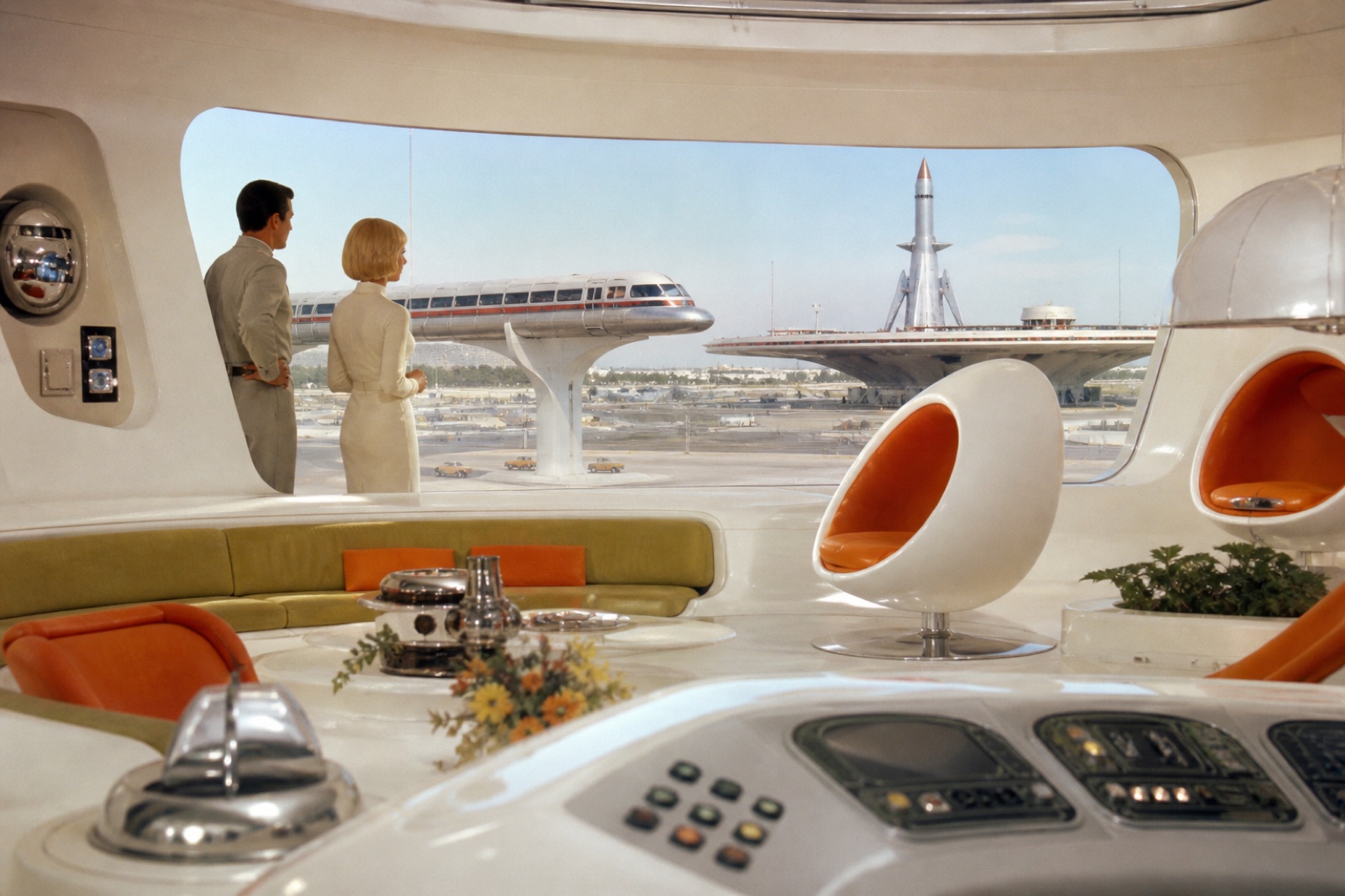
Retrofuturism describes the nostalgic appreciation of past eras' visions of the future: specifically the visual vocabulary of 1930s–1970s optimism about what the 21st century would look like. Its primary reference periods are the Space Age (1957–1972, Sputnik through Apollo 17), the Atomic Age (1945–1960s, nuclear power as limitless energy), and the World's Fair tradition (1933 Chicago Century of Progress, 1939 New York World of Tomorrow, 1964–65 New York World's Fair). These events commissioned the world's leading industrial designers: Norman Bel Geddes, Raymond Loewy, Henry Dreyfuss: to visualize a future of mobility, abundance, and technological liberation.
The aesthetic is defined by the specific visual language of each era it references. The Streamline Moderne of the 1930s–40s: teardrop cars, chrome horizontal speed lines, rounded corners. The Atomic Age of the 1950s: boomerang tables, Eames chairs, the Googie architecture of California diners and bowling alleys. The Space Age of the 1960s–70s: modular white plastic, bubble chairs, op-art graphics, and the NASA visual culture of control rooms and mission patches.
Retrofuturism as a conscious aesthetic emerged in the 1990s through films like 'The Rocketeer' (1991) and 'Sky Captain and the World of Tomorrow' (2004), the Diesel-punk and Atompunk subgenres, and the Art Deco revival in neo-classical architecture. Contemporary expression appears in branding that wants retro-authority combined with optimism: the typefaces, palettes, and compositional rules of the mid-century applied to contemporary products.
The visual DNA: what makes it recognisable
- Futura as the canonical retrofuturist typeface: used for NASA mission patches and 2001: A Space Odyssey
- Condensed sans-serifs with strong vertical thrust
- Inline or outlined letterforms for '1950s poster' quality
- All-caps with generous tracking: the typography of official signage
- Symmetrical, heroic composition: rocket or figure centered, moving upward
- Radiating lines from a central point: motion and energy
- The horizon line with a planet or moon visible above it
- Circular badge or medallion format for information panels
- Cream and warm white: #F5F0E0, #EDE8D5: retro paper quality
- Chrome silver: #C0C0C0, #A8A8A8: rocket and appliance material
- Space age accent: turquoise #00B5AD, orange-red #E8450A, atomic yellow #F0C320
- Deep navy or slate: #1A3A5C, #2C4A6B: the night sky
- Rocket ships and spaceships in aerodynamic form
- Atom diagrams: orbital rings around a nucleus
- Monorails and elevated transit systems
- World's Fair pavilions: domed, circular, elevated on stilts
8-channel console - dominant channels taped & circled by the registrar
Your aesthetic passport - share the fingerprint
4 color interpretations of this aesthetic
How to shoot this aesthetic
Join waitlist for access
Join the waitlist for full access
Join the waitlistRetrofuturism: where the language earns its place
Retrofuturism is most effective when its visual decisions do useful work. Past eras' visions of the future: Jetsons-era optimism, atomic age, and space-age design
The style gives styling, proportion, and image sequencing a clear point of view rather than treating them as decoration.
It can turn atmosphere, material, and spatial pacing into evidence of a distinct experience before a visitor arrives.
It helps a physical or editorial environment feel authored, which raises attention and perceived care.
They recognize the references, proportion, and restraint that make the language feel intentional.
They respond to visible judgment because it reduces the feeling of interchangeable product.
A coherent aesthetic gives them a usable standard for choosing images, objects, and collaborators.
The cost comes from consistent art direction, suitable locations or materials, and time to edit the details that would otherwise undermine the premise.
The challenge is conceptual. It takes visual literacy and a real point of view to avoid borrowing surface cues without their original logic.
Lighting, casting, type, color, material, and retouching must agree. A single weak choice can make the work feel like an imitation.
Retrofuturism creates its strongest advantage when it gives a brand a standard of judgment, not merely an attractive finish. It fails when recognizable cues are collected without a governing idea. The difference between average and exceptional execution is usually proportion: how much is shown, what is withheld, and whether every element belongs to the same world. The most capable teams pair an exacting art director with specialists who understand the medium, from photographer and stylist to set designer, editor, and typographer.
Should Retrofuturism be the strategic choice?
Surface imitation is easy. The language becomes generic when familiar cues replace proportion, specificity, and a coherent system.
Its visual ingredients appear regularly in contemporary work, but a rigorous execution remains distinguishable from a loose collection of references.
Its strongest principles depend on composition, material, and cultural literacy rather than a short-lived visual effect.
It asks for consistency across photography, typography, motion, environments, and the many details that make a brand feel believable.
Retrofuturism deserves serious consideration from brands and institutions that can articulate a real point of view and protect it through execution. It is less suitable for work that needs immediate instructional clarity, broad visual neutrality, or low-cost production flexibility. Its greatest advantage is differentiation through judgment: it can make a product, place, or editorial proposition feel authored rather than merely packaged. Average executions borrow recognizable signals, then lose coherence when type, casting, copy, or materials fail to agree. Exceptional executions understand the visual language as a system of choices, including what not to show. The largest mistake is treating the style as a finish applied after strategy. Adopt it only when the product and organization can carry the same standard of care the imagery proposes.
Join waitlist for access
Join the waitlist for editorial depth
Join the waitlistConnected across the creative knowledge graph