When to use it
- Music releases, tours and gig promotion
- Event and festival marketing aimed at people who skip advertising
- Youth and independent labels building from real material
- Community, club and scene work that belongs to its audience
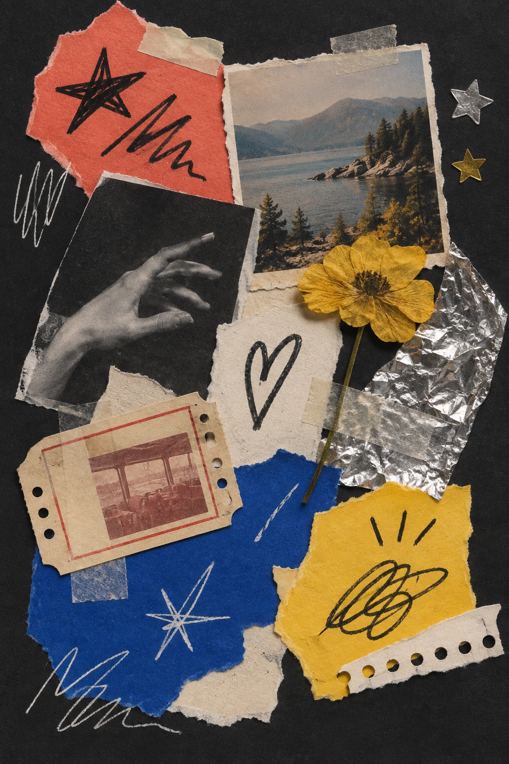
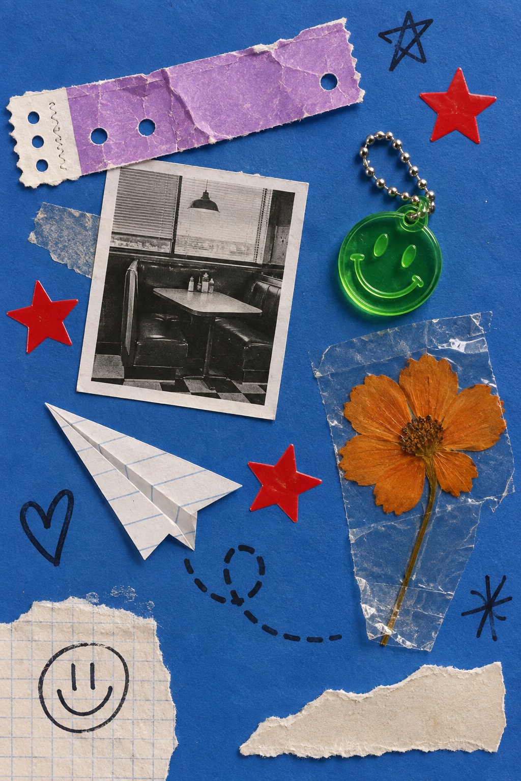
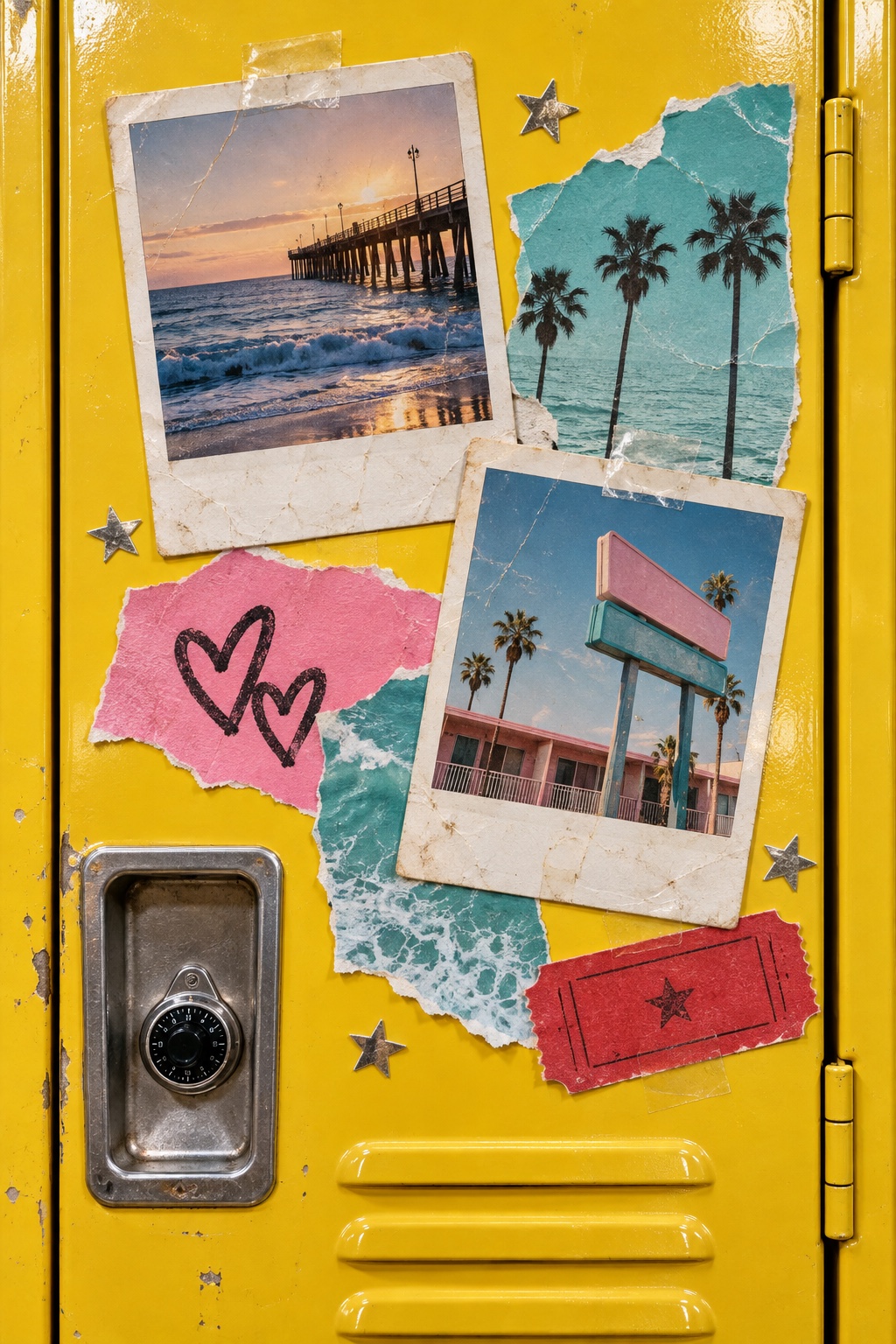
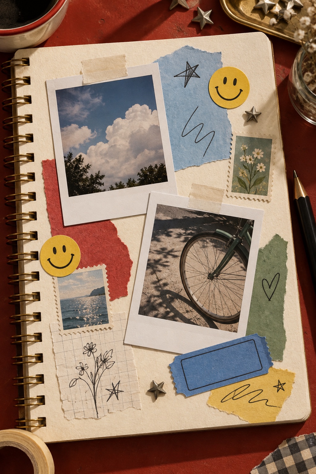
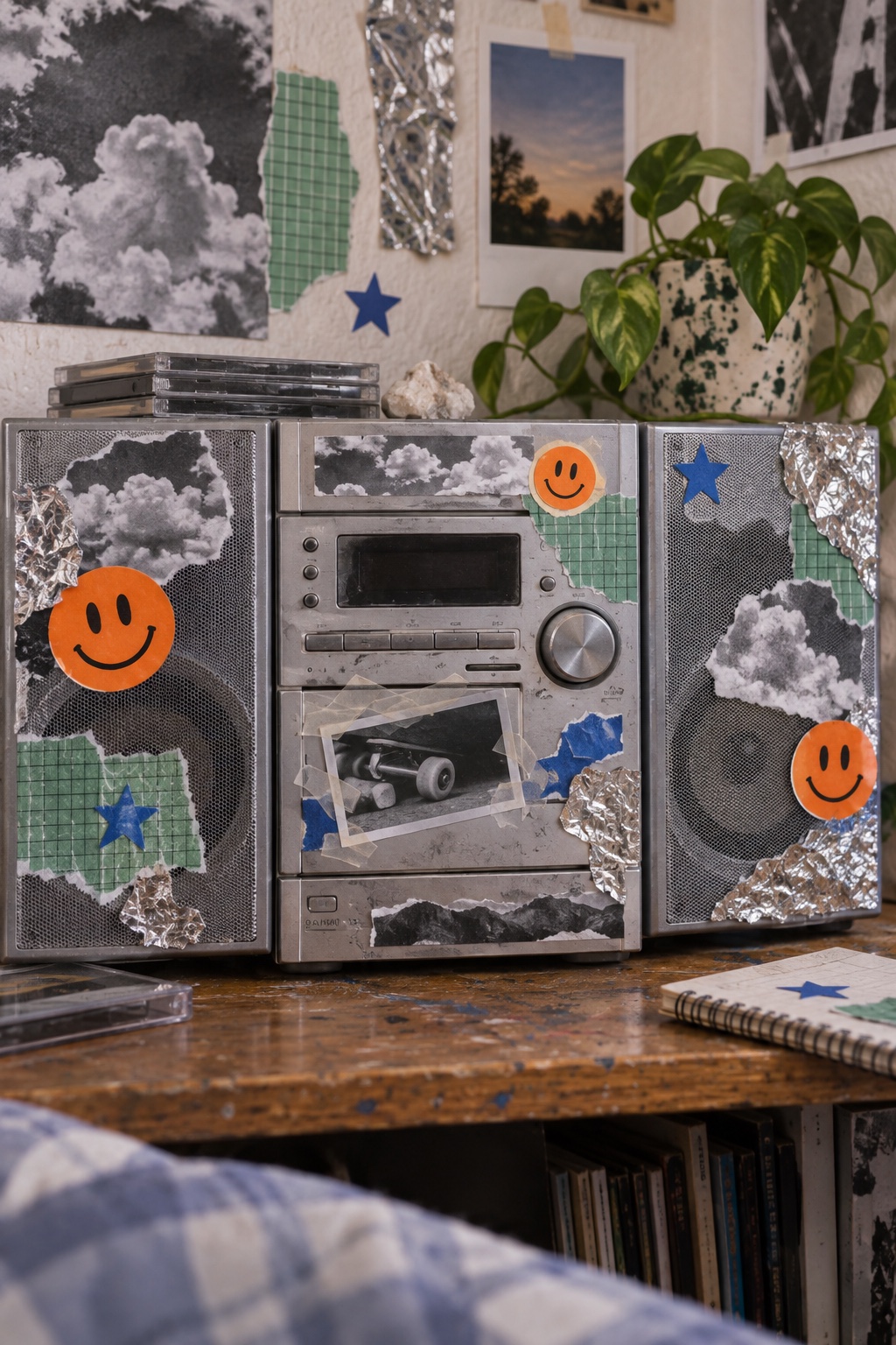
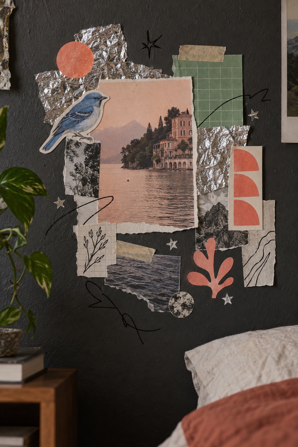
Snapshots, ticket stubs and foil star stickers taped down on coloured card, overlapping and crooked: a bedroom wall rather than a layout
What it is, when it works, who it is for, and where it already exists.
Record 038-SC - when it works, who it is for, what it looks like
Where this aesthetic shows up in the real world · ↗ opens the source site
Where Sticker Collage came from, what makes it recognisable, and the fingerprint it leaves.
1970s to now; the cut-out sleeve it descends from, 1967 · Punk zines, gig flyers and bedroom walls, by way of the pop-art cut-out sleeve
The pop-art precedent is the most photographed collage in music. In 1967 Peter Blake and Jann Haworth posed The Beatles in front of life-sized cardboard cut-outs of famous people for the cover of Sgt. Pepper, hand-tinting black-and-white photographs pasted onto hardboard, and the sleeve shipped with a sheet of cut-outs to punch out: a moustache, sergeant stripes, two badges. The record was also an object you were expected to take apart.
Punk industrialised the amateur version. Zines were cut, taped and photocopied because that was what was available, and the result, overlapping fragments, handwriting, found type, ransom-note headlines, became a look precisely because it was a production method rather than a design. Riot grrrl carried the same page into the early 1990s, and the format survives every revival because nothing about it requires a budget or a designer.
Stickers made the collage portable. In 1989 Shepard Fairey, then at Rhode Island School of Design, made the Andre the Giant Has a Posse stickers with a handful of friends; skaters and writers spread them across American cities, and the OBEY version followed in 1996. Sticker art is now a street form in its own right, and the commercial style returns all of it to a tabletop: snapshots, tickets, tape and foil stars laid on coloured card and photographed flat, because a board that looks like somebody's wall does not look like an advertisement.
“A bedroom wall rather than a layout, which is why people stop on it.
The visual DNA: what makes it recognisable
8-channel console with the fingerprint on its display. Save the card, or share the page

The definitive color scheme for this aesthetic
The colour of the styles sitting closest to this one
How to shoot it, how to prompt it, and how to board it.
How to shoot this aesthetic
"Build it on a table, shoot it from directly above, and leave the crooked bits crooked"
Shot list
Lighting
Soft, even daylight from one side, close to what a bedroom actually looks like. Keep enough angle that tape edges and lifted corners throw a small shadow, because those shadows are what say this was assembled rather than laid out.
Drop this into Studio to generate in this aesthetic
Sticker collage, snapshots, ticket stubs, flyers and cheap foil star stickers stuck down on coloured card, overlapping and slightly crooked, torn photo edges and white borders, masking tape and washi tape holding the corners, handwritten ballpoint captions, a pressed flower, a smiley sticker, corrugated card showing at the edges, warm orange and blush card, photographed flat from above in soft daylight with enough angle for the tape to cast a shadow, a bedroom wall rather than a layout, no readable brand text
The record applied to your project. The record's kit is free; your brand, references and plates come with membership
01 · Hero application02 · Material and finish03 · Palette in context04 · Photography directionWhether to use it, what it costs to do properly, and where it stands right now.
Two written calls, seven meters, and when to walk away
Use real material: snapshots somebody actually took, a ticket from a show that happened, a flyer that was printed. Stock props read as set dressing, and the audience for this is the audience that can tell. Build it on a table, let the corners lift, and shoot it flat with enough side light for the tape to cast a shadow. The failure is tidiness: even spacing, aligned edges and one clean logo turn it straight back into an advertisement.
Right when the brand is trying not to look like a brand: music, events, youth and independent labels. It rewards real snapshots, real ephemera and a crooked edge, and fails the moment it is tidied into a grid.
Prints, card, tape and a pack of stickers.
Choosing ephemera that actually belongs to the brand is the work; generic props read as set dressing.
Convincing mess is harder than order, and one over-designed corner gives the whole board away.
Art-directed into neat rows it becomes an advertisement in costume, which is the one thing this audience notices.
Music, youth and festival marketing have used the scrapbook look for years; what still varies is the execution.
Zines, gig flyers and bedroom walls have looked like this since punk, and the format survives every revival.
Card, tape, prints and a pack of stickers; the cost is an hour making it and an hour shooting it.
A Pro feature: origins, practitioners, and pitfalls
Neighbours, cross-references, blends, and the questions people ask.
Connected across the creative knowledge graph
Where it stands now, and what it costs you to use it
Sticker collage is the format people trust because it looks like it was made by somebody rather than approved by somebody. Music, festivals and youth brands use it for exactly that reason: it reads as a scene's own material, and a scene's own material gets looked at in a feed where advertising gets scrolled past.
Its failure mode is tidiness. The moment the fragments are evenly spaced, the corners are aligned and a clean logo is placed bottom-right, the board becomes a campaign again and everyone can see the seam. So can stock props: a generic ticket stub from an image library reads as set dressing to the one audience that has real ones.
Mix Sticker Collage with any style in the library
 Sticker Collage 50%Collage 50%
Merged palette
#E0642A
#263238
#E89184
#8D6E63
#2B4FD8
Leads analog, maximal, expressive
Typography · from Sticker Collage
Caveat over Lora
Materials
Use it
Sticker collage, snapshots, ticket stubs, flyers and cheap foil star stickers stuck down on coloured card, overlapping and slightly crooked, torn photo edges and white borders, masking tape and washi tape holding the corners, handwritten ballpoint captions, a pressed flower, a smiley sticker, corrugated card showing at the edges, warm orange and blush card, photographed flat from above in soft daylight with enough angle for the tape to cast a shadow, a bedroom wall rather than a layout, no readable brand text (50%), infused with Poster collage with photomontage cut-and-paste layering, Dada and Constructivist influence, mismatched scales and unexpected juxtapositions, halftone printed textures, aged paper background with foxing and yellowing, torn edges and tape marks, Hannah Hoch-inspired visual tension, color palette strictly #E0642A #263238 #E89184 #8D6E63 #2B4FD8, overall character: analog, maximal, expressive
A style built from real ephemera: snapshots, ticket stubs, flyers, handwritten captions and cheap foil star stickers taped or glued onto coloured card, overlapping and deliberately crooked, then photographed flat. The reference is a bedroom wall or a locker door rather than a page layout.
From punk and riot grrrl zines, which were cut, taped and photocopied, and from gig flyers and sticker culture, including Shepard Fairey's Andre the Giant Has a Posse campaign from 1989. The pop-art precedent is the Sgt. Pepper sleeve of 1967, built from life-sized cardboard cut-outs by Peter Blake and Jann Haworth.
Build the board physically and photograph the board. Use material that actually belongs to the brand rather than stock props, let corners lift and one sticker sit crooked, and light it from the side so the tape casts a shadow. Keep the logo small or leave it off entirely.
Poster collage is a composition: photomontage cut and arranged to argue something, in the line from Heartfield to Kruger. Sticker collage is an accumulation, with no argument and no alignment, and its credibility comes from looking unplanned rather than from looking composed.
Every style in the library is broken down like this one: the palette, the typography, the materials and the lineage.
Explore the style library →