Registrar's index cards on the platen glass - captured by the scanner
2020–present · Internet; TikTok and Tumblr communities
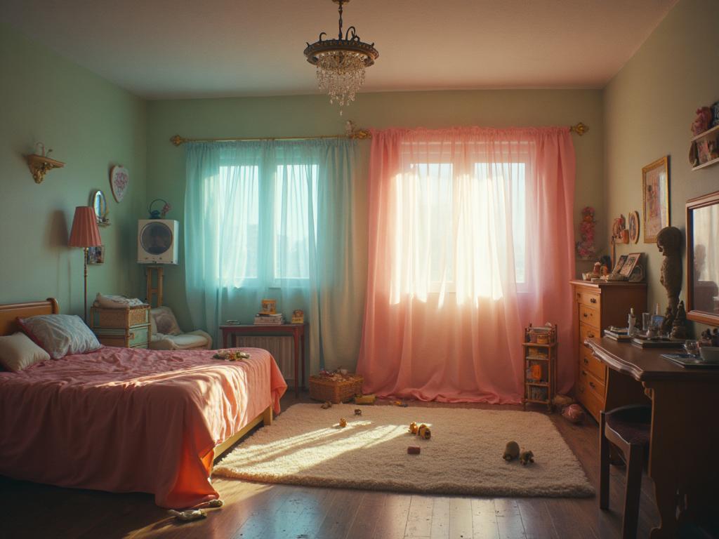
Dreamcore emerged as a distinct internet aesthetic around 2020–2021, closely related to liminal space aesthetics but more explicitly surreal and psychologically inflected. Where liminal spaces focus on real architectural environments that feel wrong, dreamcore focuses on the visual grammar of actual dream experience: recognizable elements assembled in impossible or contradictory ways, the sense of place without coherent geography, the emotional certainty of familiar location alongside the cognitive impossibility of the scene. The aesthetic draws heavily from the creative interpretations of dream logic that appear in outsider art, children's illustration, and Surrealist visual art.
The visual vocabulary is deliberately hybrid: real photography processed with incorrect color palettes, illustrations that use accurate perspective to portray physically impossible spaces, CGI environments that are technically correct but semantically wrong. The characteristic dreamcore image places a recognizable object or figure in an environment that is simultaneously interior and exterior, simultaneously familiar and geographically impossible. The tonal quality is often hazy and slightly overexposed: mimicking the visual quality of memory and the way that dreams partially dissolve on waking.
Dreamcore intersects with multiple other internet aesthetics: weirdcore (more distressing and paranoid than dreamcore's more neutral strangeness), liminal space (the empty architectural uncanny), and cottagecore (some dreamcore images involve pastoral settings made impossible by their dreamy light and impossible scale). Its emotional register is more ambiguous than most internet aesthetics: neither reassuringly nostalgic nor straightforwardly frightening.
The visual DNA: what makes it recognisable
- Impact font or bold system font: the type of internet memes processed into art
- Slightly wrong color or size: text that is recognizable but somehow off-register
- Text dissolving into the image, or appearing in locations where text shouldn't be
- No typography: purely visual dreamcore images frequently use no text
- Wrong perspective: spaces that look correctly rendered but lead nowhere or everywhere
- Infinite or impossible architecture: staircases to nowhere, doors in ceilings
- Aerial views of domestic or institutional interiors from impossible angles
- Overlaid or layered spaces: one environment visible through another
- Washed-out pastels: pale yellow #F5EDD0, hazy blue #BDDAF0, fog grey #D0D4D8
- Oversaturated single color: scenes in which one hue dominates everything
- The golden hour palette pushed past realism: amber #F0B840 flooding entire scenes
- Desaturated near-monochrome: everything reduced to one hue family
- Domestic settings in impossible locations: a living room above clouds
- Figures whose faces are not visible, turned away, or obscured
- Objects at wrong scale: enormous everyday items in landscape contexts
- Doorways and windows revealing impossible views
8-channel console - dominant channels taped & circled by the registrar
Your aesthetic passport - share the fingerprint
7 color interpretations of this aesthetic
How to shoot this aesthetic
Join waitlist for access
Join the waitlist for full access
Join the waitlistDreamcore: where the language earns its place
Dreamcore is most effective when its visual decisions do useful work. Surreal liminal nostalgia with uncanny spaces, soft focus, and childhood memory distortion
The style gives styling, proportion, and image sequencing a clear point of view rather than treating them as decoration.
It can turn atmosphere, material, and spatial pacing into evidence of a distinct experience before a visitor arrives.
It helps a physical or editorial environment feel authored, which raises attention and perceived care.
They recognize the references, proportion, and restraint that make the language feel intentional.
They respond to visible judgment because it reduces the feeling of interchangeable product.
A coherent aesthetic gives them a usable standard for choosing images, objects, and collaborators.
The cost comes from consistent art direction, suitable locations or materials, and time to edit the details that would otherwise undermine the premise.
The challenge is conceptual. It takes visual literacy and a real point of view to avoid borrowing surface cues without their original logic.
Lighting, casting, type, color, material, and retouching must agree. A single weak choice can make the work feel like an imitation.
Dreamcore creates its strongest advantage when it gives a brand a standard of judgment, not merely an attractive finish. It fails when recognizable cues are collected without a governing idea. The difference between average and exceptional execution is usually proportion: how much is shown, what is withheld, and whether every element belongs to the same world. The most capable teams pair an exacting art director with specialists who understand the medium, from photographer and stylist to set designer, editor, and typographer.
Should Dreamcore be the strategic choice?
Surface imitation is easy. The language becomes generic when familiar cues replace proportion, specificity, and a coherent system.
Its visual ingredients appear regularly in contemporary work, but a rigorous execution remains distinguishable from a loose collection of references.
Its strongest principles depend on composition, material, and cultural literacy rather than a short-lived visual effect.
It asks for consistency across photography, typography, motion, environments, and the many details that make a brand feel believable.
Dreamcore deserves serious consideration from brands and institutions that can articulate a real point of view and protect it through execution. It is less suitable for work that needs immediate instructional clarity, broad visual neutrality, or low-cost production flexibility. Its greatest advantage is differentiation through judgment: it can make a product, place, or editorial proposition feel authored rather than merely packaged. Average executions borrow recognizable signals, then lose coherence when type, casting, copy, or materials fail to agree. Exceptional executions understand the visual language as a system of choices, including what not to show. The largest mistake is treating the style as a finish applied after strategy. Adopt it only when the product and organization can carry the same standard of care the imagery proposes.
Join waitlist for access
Join the waitlist for editorial depth
Join the waitlistConnected across the creative knowledge graph