Registrar's index cards on the platen glass - captured by the scanner
2004-2012 · Silicon Valley and the global web design community
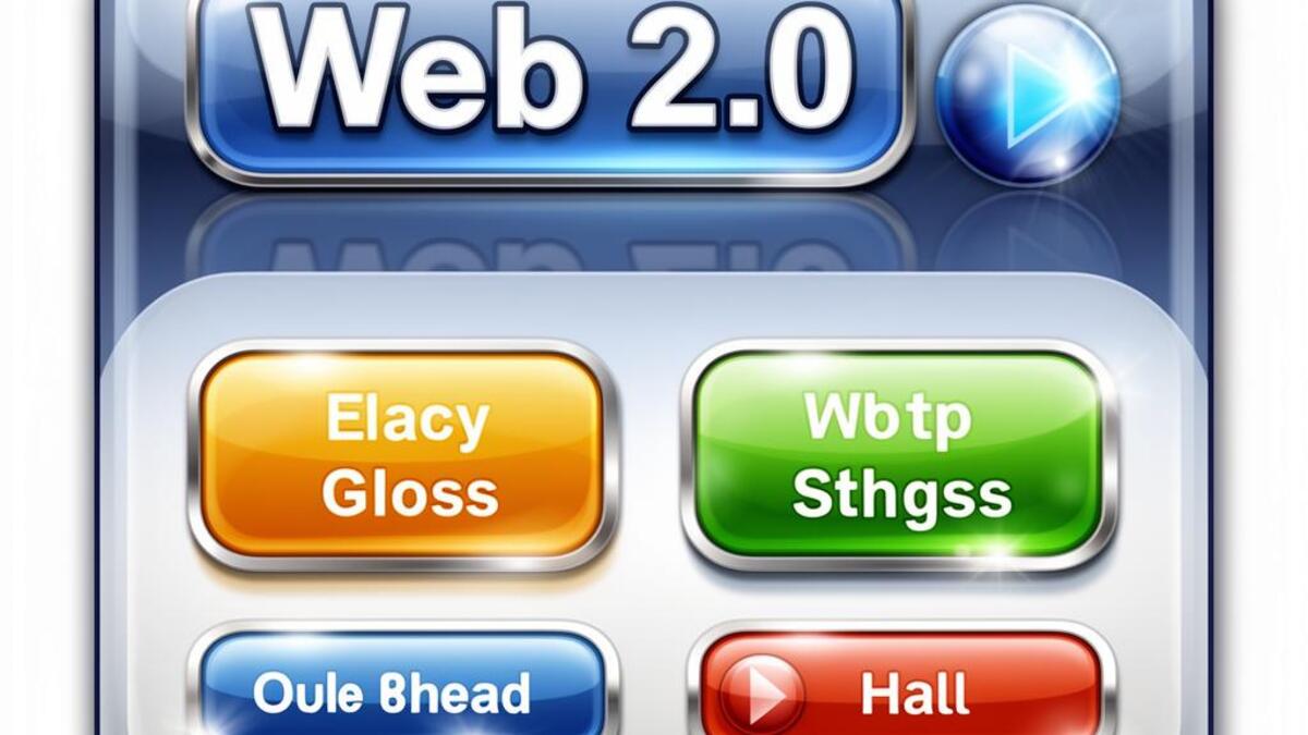
Web 2.0 was not just a technology shift but a visual one. When Tim O'Reilly coined the term in 2004, the web was transitioning from flat HTML tables to dynamic, user-generated platforms. The design language that accompanied this shift was unmistakable: glossy buttons with specular highlights, heavy drop shadows, rounded corners on everything, and gradients that made every surface look like polished candy. Flickr, Digg, del.icio.us, and early Twitter all spoke this visual dialect.
The aesthetic had technical roots. CSS3 was not yet widely supported, so designers faked rounded corners with image sprites, built glossy buttons in Photoshop, and exported them as PNGs. The gloss itself signaled modernity: it said 'this is not your 1990s web.' Apple's Aqua interface (2001) had primed users to expect this level of surface polish, and web designers followed. The 'Web 2.0 logo generator' became a running joke because the formula was so repeatable: bold sans-serif, bright gradient, optional reflection, done.
By 2010 the backlash was underway. Flat design, led by Microsoft's Metro language and later iOS 7 (2013), stripped away every shadow and shine. Web 2.0 Gloss became a period marker, as dated as geocities sparkle GIFs had been a decade earlier. Today it survives as deliberate retro nostalgia, in Y2K revival aesthetics and indie web projects that celebrate the exuberance of an internet that still believed shiny things were inherently better.
The visual DNA: what makes it recognisable
- Rounded sans-serifs: Rounded Myriad, Museo, VAG Rounded
- Bold, friendly type at large sizes with tight tracking
- Lowercase logotypes as default (flickr, digg, tumblr)
- Occasional use of reflections beneath type
- Centered layouts, typically 960px wide
- Generous padding around glossy UI elements
- Card-like containers with rounded corners and drop shadows
- Badge and sticker metaphors for social proof elements
- Linear and radial gradients on every surface
- Specular highlights (white-to-transparent overlays)
- Heavy drop shadows with soft spread
- Saturated primary colors: #3B5998, #FF6600, #0084B4
- Glossy pill-shaped buttons with hover states
- Star ratings and badge systems
- Speech bubble icons and RSS feed symbols
- Beta labels and invitation-only markers
8-channel console - dominant channels taped & circled by the registrar
Your aesthetic passport - share the fingerprint
4 color interpretations of this aesthetic
How to shoot this aesthetic
Join waitlist for access
Join the waitlist for full access
Join the waitlistWeb 2.0 Gloss: where the language earns its place
Web 2.0 Gloss is most effective when its visual decisions do useful work. Shiny buttons, rounded corners, and gradient-heavy social web aesthetics
The style gives styling, proportion, and image sequencing a clear point of view rather than treating them as decoration.
It can turn atmosphere, material, and spatial pacing into evidence of a distinct experience before a visitor arrives.
It helps a physical or editorial environment feel authored, which raises attention and perceived care.
They recognize the references, proportion, and restraint that make the language feel intentional.
They respond to visible judgment because it reduces the feeling of interchangeable product.
A coherent aesthetic gives them a usable standard for choosing images, objects, and collaborators.
The cost comes from consistent art direction, suitable locations or materials, and time to edit the details that would otherwise undermine the premise.
The challenge is conceptual. It takes visual literacy and a real point of view to avoid borrowing surface cues without their original logic.
Lighting, casting, type, color, material, and retouching must agree. A single weak choice can make the work feel like an imitation.
Web 2.0 Gloss creates its strongest advantage when it gives a brand a standard of judgment, not merely an attractive finish. It fails when recognizable cues are collected without a governing idea. The difference between average and exceptional execution is usually proportion: how much is shown, what is withheld, and whether every element belongs to the same world. The most capable teams pair an exacting art director with specialists who understand the medium, from photographer and stylist to set designer, editor, and typographer.
Should Web 2.0 Gloss be the strategic choice?
Surface imitation is easy. The language becomes generic when familiar cues replace proportion, specificity, and a coherent system.
Its visual ingredients appear regularly in contemporary work, but a rigorous execution remains distinguishable from a loose collection of references.
Its strongest principles depend on composition, material, and cultural literacy rather than a short-lived visual effect.
It asks for consistency across photography, typography, motion, environments, and the many details that make a brand feel believable.
Web 2.0 Gloss deserves serious consideration from brands and institutions that can articulate a real point of view and protect it through execution. It is less suitable for work that needs immediate instructional clarity, broad visual neutrality, or low-cost production flexibility. Its greatest advantage is differentiation through judgment: it can make a product, place, or editorial proposition feel authored rather than merely packaged. Average executions borrow recognizable signals, then lose coherence when type, casting, copy, or materials fail to agree. Exceptional executions understand the visual language as a system of choices, including what not to show. The largest mistake is treating the style as a finish applied after strategy. Adopt it only when the product and organization can carry the same standard of care the imagery proposes.
Join waitlist for access
Join the waitlist for editorial depth
Join the waitlistConnected across the creative knowledge graph