Luxury doesn't ask for attention. It assumes it already has it.
Luxury reduces visual noise. Space around an object makes it feel scarce, while material detail gives the eye evidence that the object deserves attention. The result is confidence without urgency.
Confusing expensive with decorative. More gold, more type, or more effects dilute the signal.
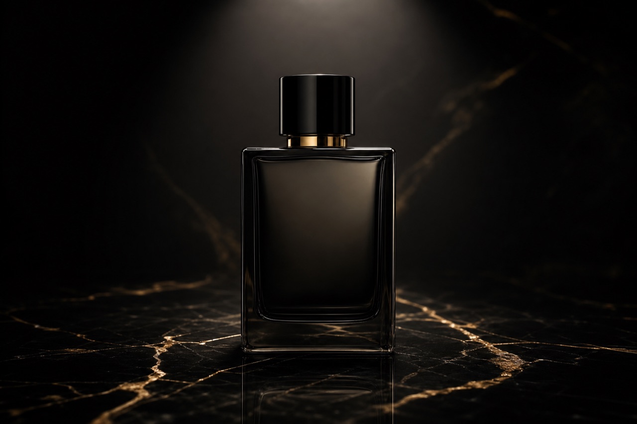
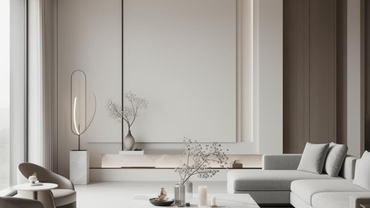
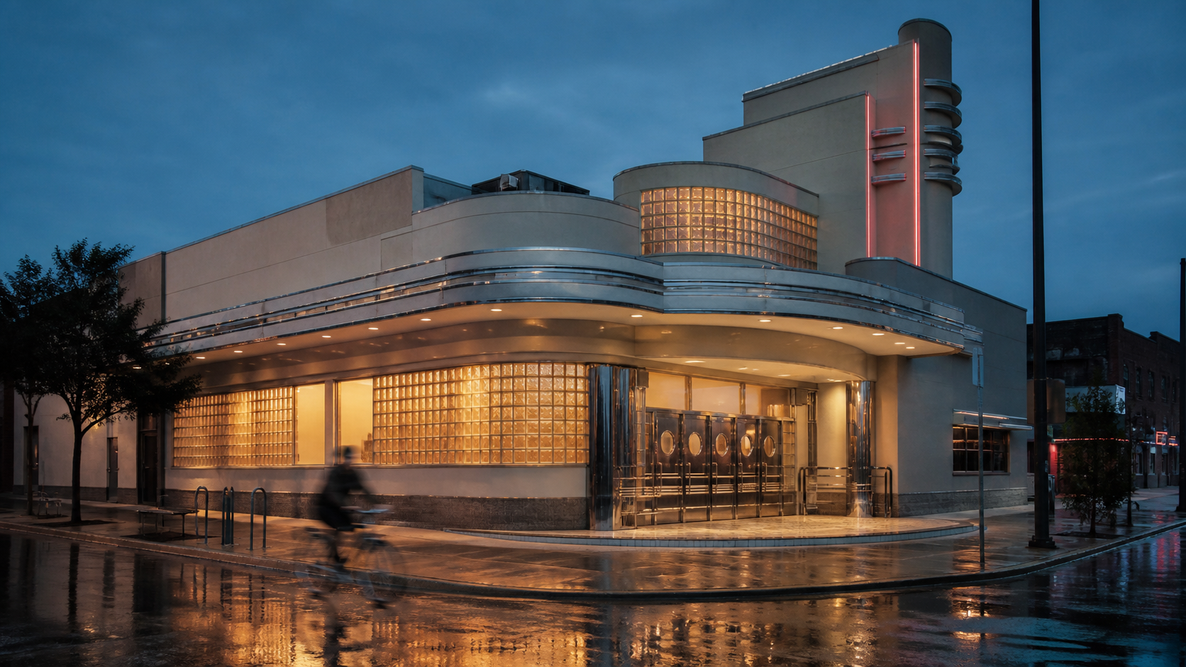
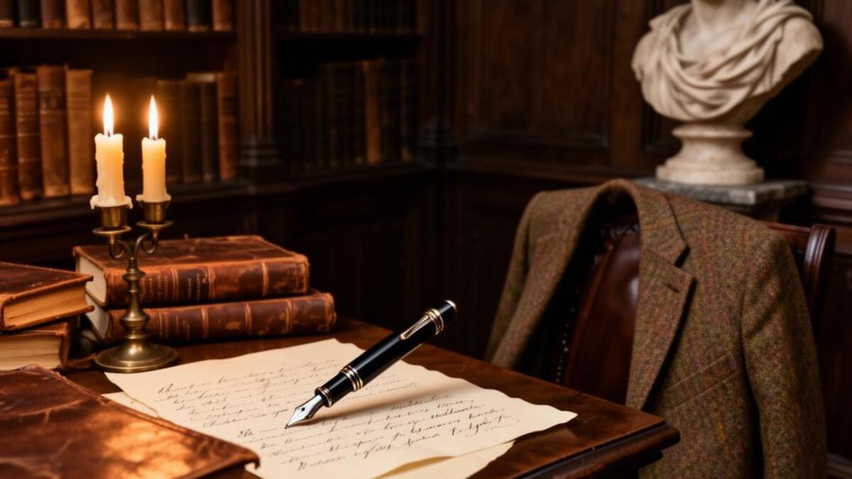
Luxury is a language of omission. Every unnecessary element removed is a signal: we have the confidence to leave things out. The palette narrows. The typography slows down. Textures become tactile and earned. This is not minimalism for its own sake but restraint as an expression of sufficiency. True luxury visuals never announce themselves. They let the viewer arrive at the conclusion alone.
Luxury reduces visual noise. Space around an object makes it feel scarce, while material detail gives the eye evidence that the object deserves attention. The result is confidence without urgency.
High-consideration launches
Hospitality and private experiences
Objects with material value
Sophistication · Mystery · Craft
Energy & Excitement
Confusing expensive with decorative. More gold, more type, or more effects dilute the signal.
Luxury & Prestige: practical creative value
Luxury & Prestige is not a demographic shortcut. It is a perceptual register that changes how a viewer reads pace, care, risk, and relevance in a visual system.
Luxury & Prestige gives this context a sharper signal of care and judgment, especially when the work needs to feel authored rather than generic.
The mood can make service feel considered through calm pacing, clear cues, and a sense that nothing is accidental.
Luxury & Prestige gives this context a sharper signal of care and judgment, especially when the work needs to feel authored rather than generic.
They respond to a mood when it gives them a sharper language for making and evaluating choices.
They read cohesion as evidence that the work has been thought through, not assembled by default.
The mood creates a clear expectation of what the product, place, or story will feel like before it is explained.
The investment is usually in control: locations, styling, casting, lighting, and post-production must all support the same register.
A mood needs a real point of view. Generic visual shorthand weakens it because audiences recognize a feeling that has not been earned.
Once the direction is clear, execution depends on disciplined choices in color, composition, pacing, and material detail.
Luxury & Prestige creates competitive advantage where experience matters as much as information. It works best when the product, service, or story already contains evidence that can support the feeling. The common failure is to apply the mood as a filter, then leave the structure, casting, copy, and pacing unchanged. Exceptional work uses it as a governing decision rule. It knows what to amplify, what to withhold, and where a small concrete detail can do more than a large stylistic gesture. The teams most likely to succeed are small, observant, and cross-disciplinary: an art director with a strong editor, photographer or filmmaker, stylist or spatial designer, and a client willing to protect the central idea through production.
When luxury & prestige should guide the work
A mood is often mistaken for a filter. Repeated shorthand or generic references create a feeling without the evidence that makes it convincing.
Mood-led work is widespread, but the specific visual logic of a well-art-directed register remains distinctive when it is consistently observed.
Human perception responds to pace, contrast, material, and narrative suggestion across periods. The execution changes, while the underlying principles remain useful.
The commitment lies in continuity across image-making, writing, casting, movement, and environments, rather than in a single expensive visual asset.
Luxury & Prestige is worth adopting when a brand, product, or cultural project needs to make a specific experiential promise before it can be explained in words. It is not a substitute for clarity, proof, or a coherent product. The greatest advantage comes from using the mood as a decision rule: it tells the team how to light a scene, pace a film, select a material, edit a sentence, and decide what to leave out. Average work applies familiar cues and stops there. Exceptional work makes every choice support the same perceptual outcome, while retaining enough specificity that the audience can believe it. The biggest mistake is assuming that emotional recognition alone creates strategic value. Use luxury & prestige only when the operation behind the image can honor the experience the image promises.
- Premium product launches where price anchoring is part of the strategy
- High-end hospitality: hotels, restaurants, private members clubs
- Luxury fashion and fine jewelry campaigns
- Premium spirits, wine, and specialty food
- Wealth management, private banking, and financial services
- Executive portraiture and corporate identity for C-suite positioning
- Real estate at the top of the market
- Bright saturated accent colors that read as promotional
- Decorative flourishes that feel added rather than integral
- Busy compositions that compete for attention
- Typographic hierarchies that feel urgent or sales-driven
- Stock imagery that shows obvious happiness