Registrar's index cards on the platen glass - captured by the scanner
1925–1940 · Paris, France; spread globally to New York, London, Miami
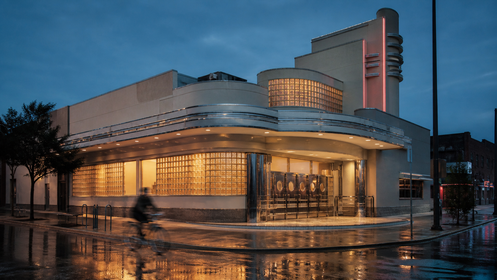
Art Deco emerged from the 1925 Exposition Internationale des Arts Décoratifs et Industriels Modernes in Paris: the exhibition that gave the style its name. It was the first 'total design' movement in the modern sense: architecture, interiors, furniture, typography, fashion, and graphic arts unified under a single vocabulary of geometric ornament, streamlined form, and luxury materials. Where Art Nouveau (its predecessor) drew from natural curves and organic motifs, Art Deco celebrated the machine: the crisp angle, the perfect circle, the gleaming surface.
The style reached its American apex in the late 1920s and early 1930s through iconic buildings: the Chrysler Building's stainless steel eagles and gargoyles (1930), the Empire State Building's lobby (1931), Rockefeller Center (1933), and hundreds of movie palaces, hotels, and radio stations across the country. The Depression paradoxically deepened the style's grip: when actual luxury was unavailable, the glamorous image of luxury in films and architecture provided aspirational escape.
Miami Beach's Ocean Drive district (built 1930–1941) is the most intact Art Deco streetscape in the world, preserved by the Miami Design Preservation League from 1976 onward. Contemporary revivals appear in luxury branding, jewelry packaging, high-end hotel design, and any context where 'Jazz Age glamour' is the emotional target.
The visual DNA: what makes it recognisable
- Geometric sans-serifs with sharp angles and high-contrast stroke weights
- Extended or condensed letter widths: never proportional/neutral
- Inline or engraved lettering on metallic or dark surfaces
- Capitals only: Art Deco has no lowercase register
- Symmetrical composition with strong vertical thrust (towers, fountains, figures)
- Stepped and tiered forms: pyramid upward, ziggurat silhouette
- Radiating sunburst patterns from a central point: the defining motif
- Octagon and hexagon as secondary geometric units
- Gold: warm #C9A84C or richer #B8860B against deep black (#0A0A0A)
- Cream or ivory (#F5ECD7) as a secondary warm neutral
- Metallic chrome silver alongside gold for contrast
- Marble, lacquer, and exotic veneers as surface textures
- Sunburst: radiating rays from a central circle
- Chevron and zigzag patterns as borders and fills
- Stylized animal forms: eagles, deer, greyhounds in leaping motion
- Stepped pyramid silhouette (ziggurat) in buildings and decorative elements
8-channel console - dominant channels taped & circled by the registrar
Your aesthetic passport - share the fingerprint
4 color interpretations of this aesthetic
How to shoot this aesthetic
Join waitlist for access
Join the waitlist for full access
Join the waitlistArt Deco: where the language earns its place
Art Deco is most effective when its visual decisions do useful work. 1920s–30s geometric luxury with gold accents, sunburst motifs, and streamlined elegance
The style gives styling, proportion, and image sequencing a clear point of view rather than treating them as decoration.
It can turn atmosphere, material, and spatial pacing into evidence of a distinct experience before a visitor arrives.
It helps a physical or editorial environment feel authored, which raises attention and perceived care.
They recognize the references, proportion, and restraint that make the language feel intentional.
They respond to visible judgment because it reduces the feeling of interchangeable product.
A coherent aesthetic gives them a usable standard for choosing images, objects, and collaborators.
The cost comes from consistent art direction, suitable locations or materials, and time to edit the details that would otherwise undermine the premise.
The challenge is conceptual. It takes visual literacy and a real point of view to avoid borrowing surface cues without their original logic.
Lighting, casting, type, color, material, and retouching must agree. A single weak choice can make the work feel like an imitation.
Art Deco creates its strongest advantage when it gives a brand a standard of judgment, not merely an attractive finish. It fails when recognizable cues are collected without a governing idea. The difference between average and exceptional execution is usually proportion: how much is shown, what is withheld, and whether every element belongs to the same world. The most capable teams pair an exacting art director with specialists who understand the medium, from photographer and stylist to set designer, editor, and typographer.
Should Art Deco be the strategic choice?
Surface imitation is easy. The language becomes generic when familiar cues replace proportion, specificity, and a coherent system.
Its visual ingredients appear regularly in contemporary work, but a rigorous execution remains distinguishable from a loose collection of references.
Its strongest principles depend on composition, material, and cultural literacy rather than a short-lived visual effect.
It asks for consistency across photography, typography, motion, environments, and the many details that make a brand feel believable.
Art Deco deserves serious consideration from brands and institutions that can articulate a real point of view and protect it through execution. It is less suitable for work that needs immediate instructional clarity, broad visual neutrality, or low-cost production flexibility. Its greatest advantage is differentiation through judgment: it can make a product, place, or editorial proposition feel authored rather than merely packaged. Average executions borrow recognizable signals, then lose coherence when type, casting, copy, or materials fail to agree. Exceptional executions understand the visual language as a system of choices, including what not to show. The largest mistake is treating the style as a finish applied after strategy. Adopt it only when the product and organization can carry the same standard of care the imagery proposes.
Join waitlist for access
Join the waitlist for editorial depth
Join the waitlistConnected across the creative knowledge graph