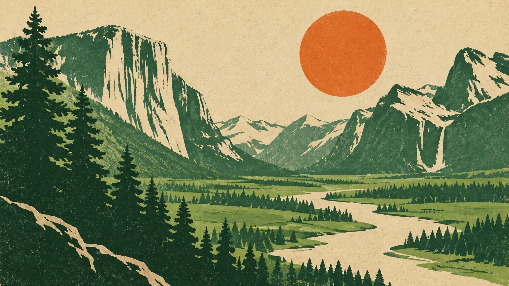
Sun Orange sets the weight of the palette in warmth and creativity, and Pine Green is the swatch that breaks rank: a single green that stops the set reading as one note. Sun Orange and Brick Red are close enough in hue and lightness that most people will read them as one colour, which makes them a pair to separate rather than two choices to spend. Sun Orange and River Teal sit on opposite sides of the temperature line, which is the tension the palette runs on and the pair to hold apart.
Pine Green a deep forest or pine green, growth matured into stability and quiet authority.
Sun Orange a citrus-bright orange: enthusiasm, playfulness, an unmistakable call to attention.
River Teal blends green's calm with blue's clarity, a color that reads as clean, modern, and trustworthy.
Brick Red reads as pure adrenaline: alarm, desire, the color of things that move fast.
Cream Paper signals warmth, approachability, and creative energy, friendlier than red, louder than yellow.
Screen-printed public posters in three or four flat inks: parks, health, plays and zoos in simplified shapes and bold slab type
Explore the full WPA Poster style guide