WPA Poster

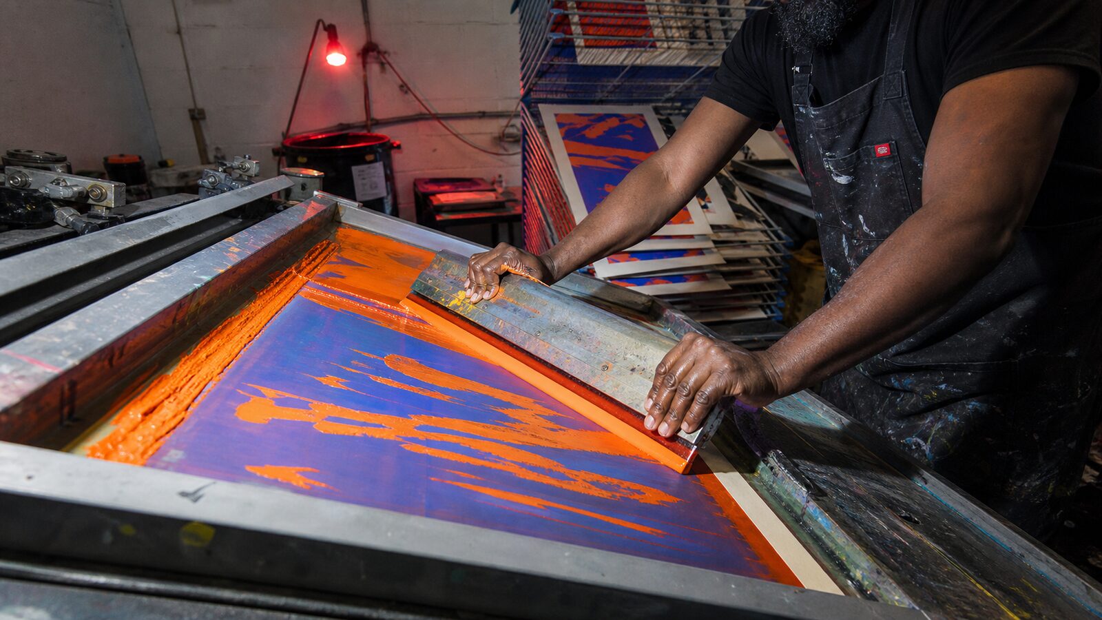
Screen-printed public posters in three or four flat inks: parks, health, plays and zoos in simplified shapes and bold slab type

Compare WPA Poster with another style →See the WPA Poster typefaces →
Record042-WP
AestheticWPA Poster
ClassAnalog / Nostalgic
StatusINGESTING
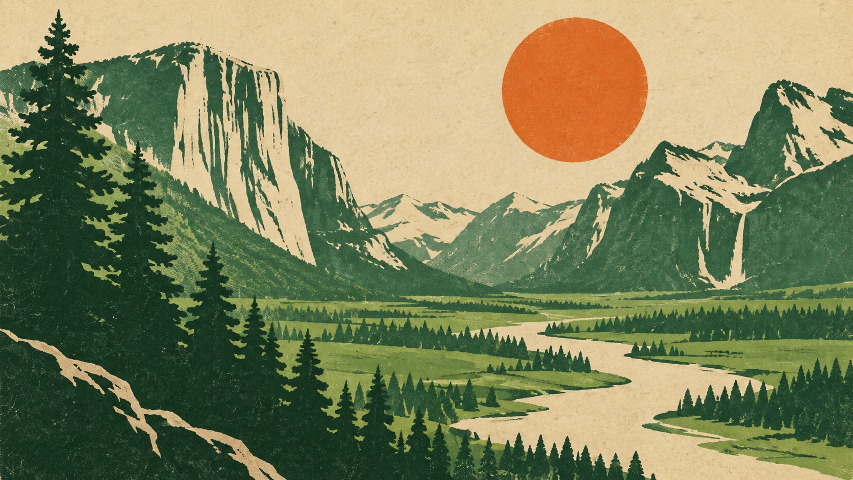
A screen-printed valley of pines, cliffs and a river under an orange sun, in green, ochre and cream.
Archive plate · WPA Poster
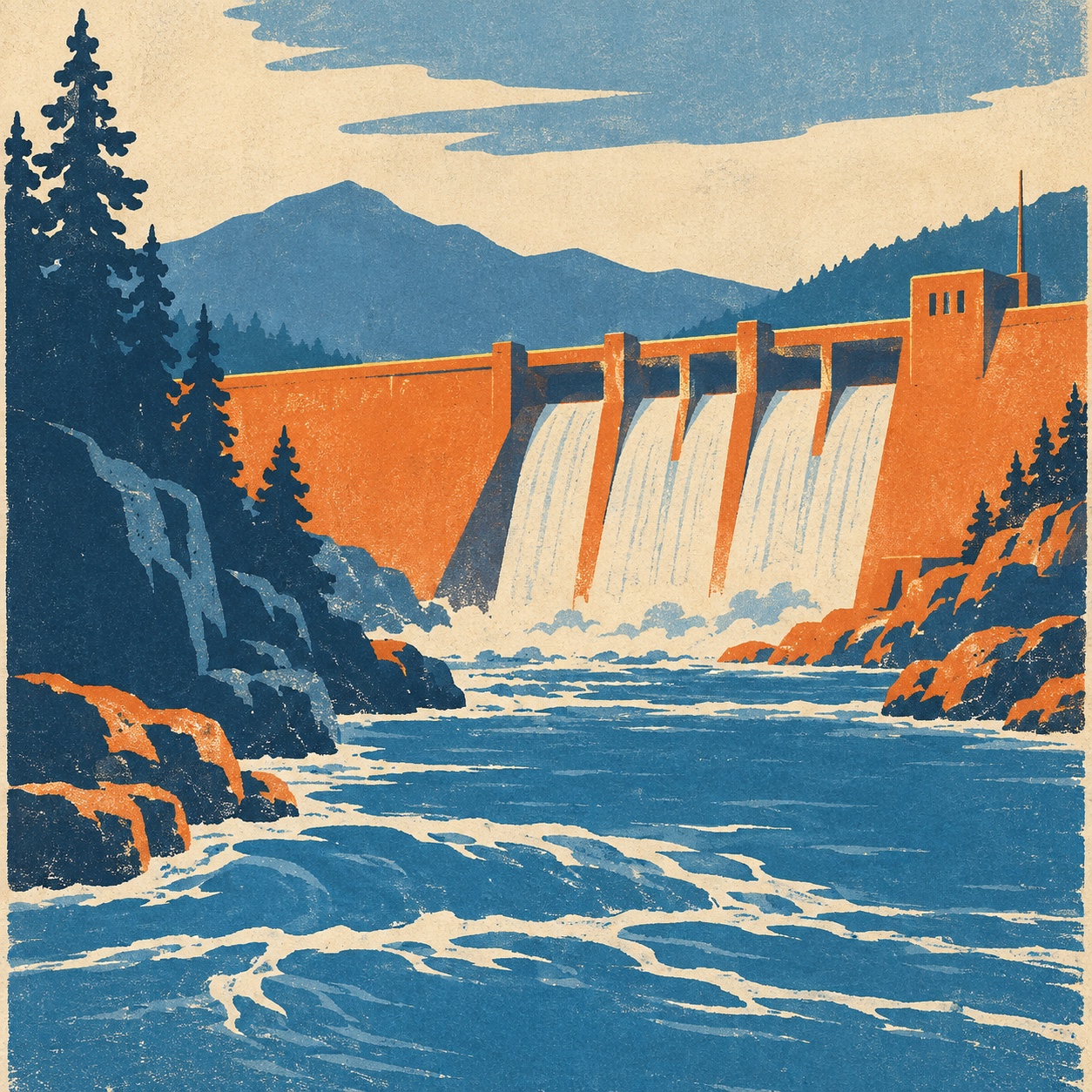
A screen-printed poster of a dam and river in blue, orange and cream with pines and mountains behind.
Dossier sceneDam · 1/5
01
The record

What it is, when it works, who it is for, and where it already exists.

How to use it

Record 042-WP - when it works, who it is for, what it looks like

FIELD 01

When to use it

  • Tourism, parks and outdoor brands that want an honest, printed look
  • Civic, public health and cultural institutions speaking to everyone
  • Events, festivals and theatre that need a poster series
  • Merchandise and packaging with a printed, hand-made feel
FIELD 02

Perfect for

  • National and regional parks, trails and tourism boards
  • Museums, theatres and libraries
  • Outdoor apparel and equipment
  • Public health and civic campaigns
FIELD 03

What it looks like

  • The Federal Art Project poster divisions, 1935 to 1943, about 35,000 designs
  • Anthony Velonis bringing silkscreen to the New York division, 1936
  • The See America and national parks series
  • The Library of Congress's collection of more than 900 originals

In the wild, WPA Poster aesthetic real-world examples

Where this aesthetic shows up in the real world · ↗ opens the source site

Omoro Style GuideEvery aesthetic, every field on this page, in one PDF.
Get the guide →
02
The anatomy

Where WPA Poster came from, what makes it recognisable, and the fingerprint it leaves.

History, WPA Poster aesthetic history

1935-1943 · The Federal Art Project poster divisions, United States

Between 1935 and 1943 the Works Progress Administration's Federal Art Project put unemployed artists to work, and its poster divisions produced around 35,000 designs and two million printed posters for other government agencies: health campaigns, theatre and concert programmes, national parks, zoos, exhibitions and safety notices. Early posters were painted by hand; in 1936 Anthony Velonis brought silkscreen to the New York division, which made short runs in flat colour fast and cheap and fixed the look.

The style came from the constraint. Three or four inks, hand-cut stencils and cheap stock produced simplified shapes, flat colour, bold geometric sans and slab type, and a plain-spoken civic voice, with the streamlined lettering of Art Deco and the reduction of European poster art behind it. The parks posters, with their mesas and pines in ochre and green, became the most loved, and the Library of Congress holds more than nine hundred originals.

It is the reference for a whole category now. National park posters are sold in every visitor centre, outdoor brands print their catalogues in its inks, and tourism boards, theatres and public health campaigns borrow its optimism when they want to sound like they are speaking to everyone. The current version keeps the flat ink and the plain voice, and updates the subjects.

Three inks, a plain voice and a poster for everyone.

Omoro dossier · 042-WP

Visual markers, WPA Poster aesthetic visual markers

The visual DNA: what makes it recognisable

typography

See the fonts
  • Bold geometric sans in stacked capitals
  • Condensed slab serifs for the headline
  • Hand-cut letterforms with stencil breaks
  • Short copy: a place, a date, an instruction

grid

  • One simplified image over a stacked headline
  • Flat colour fields dividing the sheet into bands
  • A wide margin of paper around the print
  • Series built from one layout and a changing subject

materials

  • Pine green #1D3B24, sun orange #E67530 and river teal #35776F as the inks
  • Brick red #BD382C on cream paper #EAD2A8
  • Silkscreen on poster stock, hand-cut stencils, kraft, enamel and postcards

motifs

  • Mesas, pines, lakes and lighthouses in flat bands
  • Animals and workers drawn as simple shapes
  • Rays, arrows and radiating lines behind a subject
  • Slight misregistration between inks

Aesthetic profile

8-channel console with the fingerprint on its display. Save the card, or share the page

Aesthetic Profile
WPA Poster
1935-1943 · The Federal Art Project poster divisions, United States
Attribute console · 042-WP
leans analog, nostalgic, structured
8 CH
FIG. 1
MinimalMaximalAnalogDigitalExpressiveRestrainedWarmCoolNostalgicFuturisticStructuredChaoticLightDarkGeometricOrganic
01Minimal
Maximal20%
02Analog
Digital80%
03Restrained
Expressive20%
04Cool
Warm30%
05Futuristic
Nostalgic70%
06Structured
Chaotic50%
07Dark
Light40%
08Organic
Geometric30%
AnalogNostalgicStructured
Omoro · Attribute console · 042-WP
omoro.io/styles/wpa-poster

Color Palettes, WPA Poster color palettes and hex codes

The definitive color scheme for this aesthetic

WPA Poster
#1D3B24 · #E67530 · #35776F · #BD382C · #EAD2A8
A parks poster in four inks: pine green, sun orange, river teal and brick red on cream stock
Omoro Palette Pack575 curated palettes across every aesthetic, 5 export formats.
Get the palettes →

Adjacent Palettes, styles related to WPA Poster

The colour of the styles sitting closest to this one

Screen Printing
Mid-Century Illustration
Risograph
Art Deco
03
The direction

How to shoot it, how to prompt it, and how to board it.

Photo Direction

How to shoot this aesthetic

"Shoot places and people as a poster would draw them: flat light, few colours, big simple shapes"

Shot list

  • A ranger or a lifeguard in a plain uniform against a flat sky, shot low
  • A lighthouse, a pine and a lake reduced to bands of colour at golden hour
  • A theatre foyer with a stacked-type poster on the wall and one figure reading it

Lighting

Flat, even light that removes fine detail: overcast days, open shade or a soft key without fill. Colour graded toward four inks, greens, ochres and brick reds, with cream highlights instead of white.

Omoro Director's Briefs212 photo shot-lists like this one, ready to shoot from.
Get the briefs →

Generative Prompt

Drop this into Studio to generate in this aesthetic

WPA poster aesthetic, 1930s Federal Art Project screen print, a simplified scene of a park, a lighthouse or a civic building in flat shapes, three or four flat inks, forest green, ochre, brick red and sky blue on cream paper, slight misregistration, bold stacked geometric sans and condensed slab headline shapes with no readable words, paper tooth, plain-spoken and optimistic, no gloss, no gradients, no fine detail

Paste as-is, or append your own subject

Mood Board

The record applied to your project. The record's kit is free; your brand, references and plates come with membership

Mood board
The WPA Poster board
8 frames · 4 selected
FIG. 4
Pine Green1D3B24Sun OrangeE67530River Teal35776FBrick RedBD382CCream PaperEAD2A8
Brand and references
IdleBrand and references open with membership
With membership: the brand's own facts and colours in every prompt, references carried into every frame, and the plates generated.
01 · Hero application
02 · Material and finish
03 · Palette in context
04 · Photography direction
05 · Pattern plate
06 · Object
07 · Environment
08 · Digital presence
Demo kit free, the rest with membershipThe record as a demo kit, free. Name a project and it is written for that
Omoro · Mood board · 042-WP
04
The judgement

Whether to use it, what it costs to do properly, and where it stands right now.

Creative verdict, WPA Poster feasibility and strategic recommendation

Two written calls, seven meters, and when to walk away

Creative verdict
Should WPA Poster be the call?
7 meters
FIG. 2
Assessment

Draw first, then reduce: three or four inks, flat, on cream stock, with the headline stacked and short. Print for real so the ink sits flat and drifts a little. Another mesa in ochre and green is a souvenir; find a subject of your own and give it the same treatment.

Verdict

Right when the brand speaks to the public and wants to sound honest: parks, tourism, outdoor equipment, museums, theatres and health campaigns. It rewards real printing and a subject of your own, and fails as a souvenir of itself.

Production cost
Low

A few inks, cheap stock and a screen or a riso; the form was invented to be cheap.

Creative difficulty
Medium

The layout is a template; the drawing and the subject are the design.

Execution difficulty
Medium

Simplifying a subject into three inks without losing it takes a good draughtsman.

Risk of misuse
Medium

The parks poster is so reproduced that a generic version reads as gift-shop filler.

Prevalence
Common

Parks, outdoor brands, tourism boards and museums use it as standard.

Longevity
Timeless

Ninety years old and still the default look of public optimism.

Brand investment
Low

A template and a few inks produce a whole series.

Avoid if
The brand needs to feel premium or polished
Flat cheap ink is the point; gloss and detail undo it.
The only subject is a landscape
The parks poster is the most copied image in the style; without a new subject it reads as merchandise.
The print will be a screen render
Flat digital fills lack the drift, tooth and ink weight that carry the look.
Omoro · Creative verdict · 042-WP

Editorial Depth

A Pro feature: origins, practitioners, and pitfalls

Editorial depth
The WPA Poster file
14 sections
FIG. 3
Context02Brands02Perception04Use04Index02
01Common MisconceptionThe principle beneath the surface
02Historical ContextOrigins, cultural moment, and reaction
03Brands That Accidentally Use This StyleNatural alignment, not category claims
04Brands That Perfectly Represent This StyleExceptional execution
05Psychological EffectHow visual decisions change perception
06Visual ChecklistInclude and avoid
07Creative FormulaThe visual system reduced to essentials
08Recognition SignalsHow to recognize it in two seconds
09When To Use This StyleContexts where the language performs
10Common Creative MistakesWhere imitation weakens the signal
11Best Brand ApplicationsIndustries with a natural advantage
12Creative Application AnalysisFit, feasibility, and production reality
13Related StylesClose languages and the key distinction
14Visual DNA SummaryThe sentence to remember
The editorial depth, with membershipOpening soon
Omoro · Editorial depth · 042-WP
05
The index

Neighbours, cross-references, blends, and the questions people ask.

Related concepts

Connected across the creative knowledge graph

Cultural relevance, WPA Poster cultural relevance today

Where it stands now, and what it costs you to use it

The WPA poster is the visual voice of civic optimism, and it is everywhere a brand wants to feel public-spirited and outdoorsy: park merchandise, trail maps, outdoor apparel, tourism campaigns and museum programmes. It works because the flat inks look printed and honest, and the plain voice reads as trustworthy.

Its failure mode is the souvenir. The parks poster has been reproduced so often that a generic mesa in ochre and green reads as gift-shop filler. The work that lands keeps the constraint, three or four inks and a real print, and finds its own subjects: a city bus, a clinic, a river clean-up.

Cross-references

Screen PrintingThe process that gave it its flat inksMid-Century IllustrationThe simplified drawing it led intoRisographThe current cheap press that reproduces its feelArt DecoThe streamlined lettering it borrowed

Blend

Mix WPA Poster with any style in the library

WPA Poster×
50%50%
84% alike
WPA Poster referenceScreen Printing referenceWPA Poster 50%Screen Printing 50%

Merged palette

#1D3B24

#171717

#E67530

#FF5A1F

#35776F

Leads analog, nostalgic, expressive

Typography · from WPA Poster

Space Grotesk over Inter

Materials

  • Pine green #1D3B24, sun orange #E67530 and river teal #35776F as the inks
  • Brick red #BD382C on cream paper #EAD2A8
  • Carbon black #171717: dense and slightly raised on uncoated stock

Use it

WPA poster aesthetic, 1930s Federal Art Project screen print, a simplified scene of a park, a lighthouse or a civic building in flat shapes, three or four flat inks, forest green, ochre, brick red and sky blue on cream paper, slight misregistration, bold stacked geometric sans and condensed slab headline shapes with no readable words, paper tooth, plain-spoken and optimistic, no gloss, no gradients, no fine detail (50%), infused with Screen printing aesthetic with flat spot-color layers and visible mesh texture, slight ink misregistration as authentic character, poster and t-shirt print tradition, bold graphic simplification, high-contrast layered color separation, color palette strictly #1D3B24 #171717 #E67530 #FF5A1F #35776F, overall character: analog, nostalgic, expressive

One-click generation opens with the studio

About this aesthetic

What is the WPA poster style?

The look of the posters made by the Works Progress Administration's Federal Art Project between 1935 and 1943: screen-printed in three or four flat inks, drawn in simplified shapes, with bold geometric sans and slab type, for parks, health campaigns, theatre and public events.

Why does it feel so trustworthy?

It was made by a public programme to speak to everyone, and the constraint shows: few inks, plain shapes, short copy and no gloss. The result reads as printed rather than produced, and as an invitation rather than an advertisement.

How is it different from Art Deco?

Art Deco is luxurious, streamlined and metallic, made for hotels and liners; the WPA poster borrowed its lettering but stripped out the gloss. It is cheap by design, flat ink on plain stock, and its subjects are parks, clinics and plays rather than glamour.

How do you make one for real?

Draw the subject as a few simplified shapes, limit yourself to three or four inks on cream stock, set a short headline in a bold sans or condensed slab, and screen-print or riso it so the ink sits flat and slightly misregistered. Then choose a subject that is yours rather than another mesa.

Build with the wpa poster aesthetic

Every style in the library is broken down like this one: the palette, the typography, the materials and the lineage.

Explore the style library →