Registrar's index cards on the platen glass - captured by the scanner
1960s–present (term coined 1993) · African American culture; music, literature, and visual art traditions
The term 'Afrofuturism' was coined by cultural critic Mark Dery in a 1993 essay, but the cultural practice it named had been ongoing for decades. Sun Ra's Arkestra (1950s onward) performed in Egyptian pharaonic costumes and claimed to have been born on Saturn. Parliament-Funkadelic's 'Mothership Connection' (1975) placed Black Americans in the role of cosmic travelers. Octavia Butler's science fiction novels (beginning with 'Patternmaster,' 1976) imagined futures where Black people were agents rather than objects of history. Visual artists like Jean-Michel Basquiat drew connections between Haitian Vodou iconography, African masks, and American urban experience.
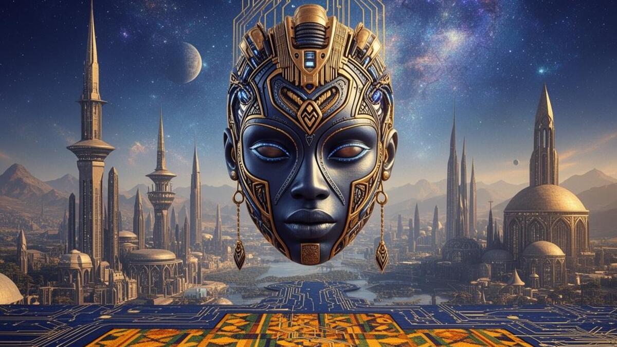
The aesthetic emerged as a synthesis of African traditional visual culture (Kente textile geometry, Egyptian hieroglyphic iconography, Yoruba beadwork, Malian Dogon cosmology) with the visual language of science fiction (spacecraft, futuristic technology, alien environments): filtered through Black American cultural experience (jazz, funk, hip-hop, the history of slavery and liberation). The underlying proposition: that African people have ancient cosmological traditions as sophisticated as any and that futures belong to all of humanity, not only those who colonized the past.
Afrofuturism entered mainstream visual culture through Ryan Coogler's 'Black Panther' (2018), whose costume designer Ruth E. Carter drew explicitly on the tradition. Beyoncé's visual album 'Lemonade' (2016) and 'Black Is King' (2020) applied the aesthetic to pop visual culture. Contemporary designers and visual artists: Kehinde Wiley, Kara Walker, Kerry James Marshall: engage with its visual vocabulary in fine art contexts.
The visual DNA: what makes it recognisable
- Egyptian hieroglyphic letterforms referenced in geometric sans-serifs
- Gold and metallic type on dark grounds
- Geometric Kufic or abstract African script patterns as decorative elements
- Bold, declarative type with African mask geometry informing letterform construction
- Centralized, bilateral symmetry: mask and portal compositions
- Concentric circles and radiating patterns from African textile traditions
- Cosmic scale: figures against vast stellar or galactic backdrops
- Collage layering of ancient artifacts and futuristic technology
- Gold: #C9A84C, #D4AF37, #B8860B: cosmic and royal simultaneously
- Deep space indigo: #0D0B2B, #1A0D3D, #2D1B69
- Earth terracotta: #C2592D, #A84226, #8B3A2A
- Kente accent: red #CC0000, green #008000, gold #FFD700
- Egyptian pharaoh headdresses and Nefertiti silhouettes reimagined futuristically
- Kente textile geometry as surface pattern
- Spacecraft designed as African masks or sculpture
- Stars and galaxies as home rather than alien territory
8-channel console - dominant channels taped & circled by the registrar
Your aesthetic passport - share the fingerprint
5 color interpretations of this aesthetic
How to shoot this aesthetic
Join waitlist for access
Join the waitlist for full access
Join the waitlistAfrofuturism: where the language earns its place
Afrofuturism is most effective when its visual decisions do useful work. African diaspora culture fused with technology, sci-fi, and cosmic mythology
The style gives styling, proportion, and image sequencing a clear point of view rather than treating them as decoration.
It can turn atmosphere, material, and spatial pacing into evidence of a distinct experience before a visitor arrives.
It helps a physical or editorial environment feel authored, which raises attention and perceived care.
They recognize the references, proportion, and restraint that make the language feel intentional.
They respond to visible judgment because it reduces the feeling of interchangeable product.
A coherent aesthetic gives them a usable standard for choosing images, objects, and collaborators.
The cost comes from consistent art direction, suitable locations or materials, and time to edit the details that would otherwise undermine the premise.
The challenge is conceptual. It takes visual literacy and a real point of view to avoid borrowing surface cues without their original logic.
Lighting, casting, type, color, material, and retouching must agree. A single weak choice can make the work feel like an imitation.
Afrofuturism creates its strongest advantage when it gives a brand a standard of judgment, not merely an attractive finish. It fails when recognizable cues are collected without a governing idea. The difference between average and exceptional execution is usually proportion: how much is shown, what is withheld, and whether every element belongs to the same world. The most capable teams pair an exacting art director with specialists who understand the medium, from photographer and stylist to set designer, editor, and typographer.
Should Afrofuturism be the strategic choice?
Surface imitation is easy. The language becomes generic when familiar cues replace proportion, specificity, and a coherent system.
Its visual ingredients appear regularly in contemporary work, but a rigorous execution remains distinguishable from a loose collection of references.
Its strongest principles depend on composition, material, and cultural literacy rather than a short-lived visual effect.
It asks for consistency across photography, typography, motion, environments, and the many details that make a brand feel believable.
Afrofuturism deserves serious consideration from brands and institutions that can articulate a real point of view and protect it through execution. It is less suitable for work that needs immediate instructional clarity, broad visual neutrality, or low-cost production flexibility. Its greatest advantage is differentiation through judgment: it can make a product, place, or editorial proposition feel authored rather than merely packaged. Average executions borrow recognizable signals, then lose coherence when type, casting, copy, or materials fail to agree. Exceptional executions understand the visual language as a system of choices, including what not to show. The largest mistake is treating the style as a finish applied after strategy. Adopt it only when the product and organization can carry the same standard of care the imagery proposes.
Join waitlist for access
Join the waitlist for editorial depth
Join the waitlistConnected across the creative knowledge graph