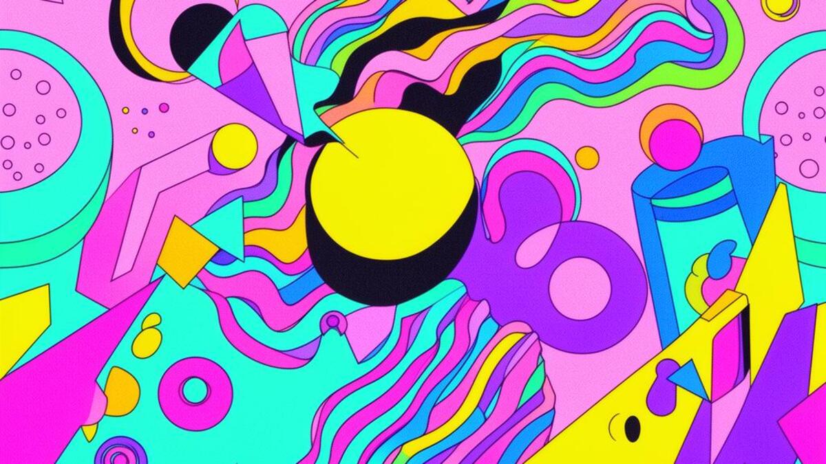
Memphis

80s Italian design movement with geometric patterns, terrazzo, and bold colors

Compare Memphis with another style →
Record032-ME
AestheticMemphis
ClassMaximal / Expressive
StatusINGESTING
Example of the Memphis aesthetic
Archive platememphis
Source document

Registrar's index cards on the platen glass - captured by the scanner

Omoro Archive - Registrar's OfficeMemphisFILE 032-ME
When to use it
  • Playful brand identities
  • Modern interior design
+2 more in the Style Guide
Perfect for
  • Playful product brands
  • Modern furniture
+2 more in the Style Guide
What it looks like
  • Terrazzo patterns
  • Geometric squiggles
+2 more in the Style Guide
Omoro Style GuideAll 151 aesthetics, every field on this page, in one PDF.
Get the guide →
History

1981–1988 · Milan, Italy

Memphis was founded in Milan on 11 December 1980, the night Ettore Sottsass gathered a group of young designers around his kitchen table while Bob Dylan's 'Stuck Inside of Mobile with the Memphis Blues Again' played on the turntable. By morning they had a manifesto and a name. The group: Sottsass, Michele De Lucchi, Nathalie Du Pasquier, George Sowden, and others: launched at the Salone del Mobile in Milan in September 1981, presenting furniture covered in plastic laminate with abstract patterns, pastel and primary color combinations, and forms that made no structural or ergonomic argument: pure aesthetic spectacle.

Memphis was a direct assault on the Functionalist and Minimalist orthodoxy that had dominated design since the Bauhaus and the International Style. Its inspiration was resolutely anti-hierarchical: pop culture, kitsch, Art Deco, Bauhaus, and tribal art mixed without concern for taste or appropriateness. The 'squiggle' pattern (a wavy diagonal line that became the movement's visual signature) was deliberately low-status, the sort of pattern that appeared on cheap formica countertops in diners.

Memphis officially dissolved in 1988 when Sottsass departed, and within years it was dismissed as the design equivalent of bad 1980s hair. Its rehabilitation began in the 2000s, accelerated dramatically around 2013–2016 when brands from Google to Apple rediscovered its bold geometry and primary palettes, and became embedded in the visual vocabulary of web and app design: especially in bright, accessible UIs for young audiences.

Visual markers

The visual DNA: what makes it recognisable

typography
  • Bold sans-serifs, often the same weight as structural shapes
  • Logotype-style type built from geometric shapes rather than standard letterforms
  • Black outlines on text and shapes: the coloring-book aesthetic
  • Stacked or scattered type without grid alignment
grid
  • No formal grid: elements float, overlap, and create tension through color contrast
  • Zigzag and squiggle line patterns as background fills
  • Objects treated as flat shapes stacked in front of patterned backgrounds
  • Asymmetric balance: large shapes off-center against small dense pattern
materials
  • Primary and secondary palette: red (#D62828), yellow (#F5D000), blue (#0055A4), green (#00A878)
  • Black (#000000) outlines as the unifying element
  • White (#FFFFFF) or pale pink/peach as neutral ground
  • Plastic laminate texture: flat, slightly shiny, non-precious
motifs
  • The squiggle: repeated wavy diagonal line pattern
  • Polka dots at varying scales
  • Triangles, trapezoids, and parallelograms stacked and floating
  • Zigzag borders and step-pattern fills
Aesthetic profile

8-channel console - dominant channels taped & circled by the registrar

Attribute Console - 032-ME 8 CH ACTIVEFIG. 1
CH01Minimal
MaximalR·80
CH02Analog
DigitalR·10
CH03Restrained
ExpressiveR·80
CH04Cool
WarmR·40
CH05Futuristic
NostalgicR·50
CH06Structured
ChaoticR·60
CH07Dark
LightR·50
CH08Organic
GeometricR·50

strongest channels circled - leans maximal, expressive, chaotic ✦

Profile card

Your aesthetic passport - share the fingerprint

Aesthetic Profile
Memphis
MaximalDigitalExpressiveWarmNostalgicChaoticLightGeometric
MaximalExpressiveChaotic
omoro.io/styles/memphis
Color Palettes

5 color interpretations of this aesthetic

Memphis
Squiggle pattern - postmodern and playful
Memphis Pastel
Knowing irony in pastel: squiggle and dot against black
Sotsass
1981 Memphis launch: Ettore Sotsass and the anti-good-taste
Tokyo Memphis
Japanese Memphis: kawaii meets Sottsass in Harajuku
Postmodern Soft
Diluted Memphis: squiggle faded through a decade of nostalgia
Playfulness
Photo Direction

How to shoot this aesthetic

"Ettore Sottsass's children playing in a world made of squiggles, terrazzo, and primary color"

Shot list

  • Full-body shot of subject in a Memphis-patterned environment where wardrobe and background share the same geometric language
  • Flat-lay of objects in primary colors arranged on a terrazzo-patterned surface
  • Environmental portrait in a space furnished with Memphis or Memphis-influenced pieces bold, playful, structured

Lighting

Flat overhead light with no shadow the graphic quality of Memphis does not benefit from shadow, and the pattern language should be read in full without the interference of light and dark

Mood Board

Join waitlist for access

Join the waitlist for full access

Join the waitlist
Creative Application Analysis

Memphis: where the language earns its place

Memphis is most effective when its visual decisions do useful work. 80s Italian design movement with geometric patterns, terrazzo, and bold colors

Best industries
Fashion and editorialFIT 9/10

The style gives styling, proportion, and image sequencing a clear point of view rather than treating them as decoration.

Hospitality and real estateFIT 8/10

It can turn atmosphere, material, and spatial pacing into evidence of a distinct experience before a visitor arrives.

Culture and premium retailFIT 8/10

It helps a physical or editorial environment feel authored, which raises attention and perceived care.

Best audiences
Design-literate viewersFIT 9/10

They recognize the references, proportion, and restraint that make the language feel intentional.

Considered buyersFIT 8/10

They respond to visible judgment because it reduces the feeling of interchangeable product.

Creative decision makersFIT 8/10

A coherent aesthetic gives them a usable standard for choosing images, objects, and collaborators.

Best products
Flagship productsA singular object benefits when the visual system concentrates attention rather than dispersing it.
Editorial publicationsThe language can hold a sequence of stories together while leaving room for individual subjects.
Spatial and service experiencesIt extends naturally into materials, signage, lighting, and the rhythm of arrival.
Best campaign types
Brand or product launchA defined visual language gives the first encounter enough conviction to establish a durable frame.
Editorial campaignIt rewards a sequence of related images rather than a single isolated hero shot.
Concept film or lookbookMotion, casting, set detail, and typography can all carry the same underlying logic.
Creative feasibility
Production costMedium

The cost comes from consistent art direction, suitable locations or materials, and time to edit the details that would otherwise undermine the premise.

Creative difficultyHigh

The challenge is conceptual. It takes visual literacy and a real point of view to avoid borrowing surface cues without their original logic.

Execution difficultyHigh

Lighting, casting, type, color, material, and retouching must agree. A single weak choice can make the work feel like an imitation.

Overall creative assessment

Memphis creates its strongest advantage when it gives a brand a standard of judgment, not merely an attractive finish. It fails when recognizable cues are collected without a governing idea. The difference between average and exceptional execution is usually proportion: how much is shown, what is withheld, and whether every element belongs to the same world. The most capable teams pair an exacting art director with specialists who understand the medium, from photographer and stylist to set designer, editor, and typographer.

Strategic Recommendation

Should Memphis be the strategic choice?

Best for
A brand with a real point of viewThe aesthetic works when it can sharpen an existing position, not invent one in its place.
High-consideration launchesA controlled visual system helps make an object, place, or service feel intentional before its details are fully understood.
Editorial, spatial, and experiential workThese formats allow composition, material, pacing, and typography to reinforce one another.
Creative portfolios and institutionsA sustained visual language can demonstrate discernment and make a body of work feel coherent.
Avoid if
The message must be read instantly by everyoneAesthetic nuance can compete with direct instructional clarity when accessibility is the first requirement.
The brand cannot sustain production standardsInconsistent imagery, typography, or material choices expose the gap between the concept and the execution.
The product has no credible relationship to the visual promiseStyling cannot compensate for a story, object, or service that does not support it.
Risk of misuseHigh

Surface imitation is easy. The language becomes generic when familiar cues replace proportion, specificity, and a coherent system.

Contemporary prevalenceCommon

Its visual ingredients appear regularly in contemporary work, but a rigorous execution remains distinguishable from a loose collection of references.

LongevityEnduring

Its strongest principles depend on composition, material, and cultural literacy rather than a short-lived visual effect.

Brand investmentHigh

It asks for consistency across photography, typography, motion, environments, and the many details that make a brand feel believable.

Creative verdict

Memphis deserves serious consideration from brands and institutions that can articulate a real point of view and protect it through execution. It is less suitable for work that needs immediate instructional clarity, broad visual neutrality, or low-cost production flexibility. Its greatest advantage is differentiation through judgment: it can make a product, place, or editorial proposition feel authored rather than merely packaged. Average executions borrow recognizable signals, then lose coherence when type, casting, copy, or materials fail to agree. Exceptional executions understand the visual language as a system of choices, including what not to show. The largest mistake is treating the style as a finish applied after strategy. Adopt it only when the product and organization can carry the same standard of care the imagery proposes.

Editorial Depth

Join waitlist for access

Common Misconception
Historical Context
Brands That Accidentally Use This Style
Brands That Perfectly Represent This Style
Psychological Effect

Join the waitlist for editorial depth

Join the waitlist
Related concepts

Connected across the creative knowledge graph

Cross-references
Bauhausparent movement that Memphis rebelled againstSwiss / Internationalthe strict system Memphis found too oppressiveKidcoreshares bold primaries and pattern maximalismPost-Modernismboth reject modernist seriousness and functionalism
Compare
Memphis vs BauhausMemphis vs Pop Art
About this aesthetic
What is Memphis Design?
Memphis Design is an Italian design movement (1981–1988) founded by Ettore Sottsass. It rejected Functionalist austerity in favor of bold patterns, primary colors, squiggle motifs, plastic laminates, and deliberately playful, non-functional form. It is the visual language of 1980s maximalism and anti-Modernism.
Why is Memphis Design popular again?
Memphis had a major revival around 2013–2018 in graphic design, particularly in brand identity, tech UI, and youth-oriented marketing. Its bold geometry, primary palette, and flat pattern translated naturally to digital contexts. Companies like Google, Apple, and Mailchimp used Memphis-adjacent aesthetics to signal accessibility and playfulness.
What are Memphis Design colors?
Memphis palettes use primary colors (red #D62828, yellow #F5D000, blue #0055A4) with secondary accents (green, orange, magenta), outlined in black, against white or pastel neutral grounds. Pastels (peach, mint, baby pink) appear in the softer variations. Black outlines are essential to contain and separate the competing colors.

Build with the memphis aesthetic

Omoro turns aesthetic references into on-brand visuals. Generate, compose and publish from one studio.

Join the waitlist