Naïve Design

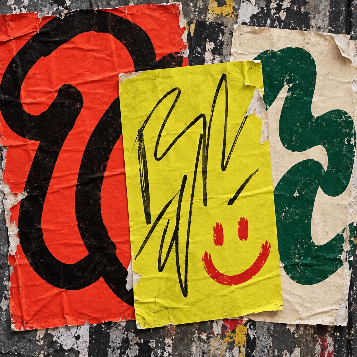
Graphic naïveté as a brand system: oversized abstract glyphs, loose handwritten marks, simple smiley, flower and fruit symbols, screenprint grain on cream uncoated paper, a six-colour palette and generous empty space

Compare Naïve Design with another style →See the Naïve Design typefaces →
Record033-ND
AestheticNaïve Design
ClassAnalog / Expressive
StatusINGESTING
Naïve Design aesthetic archive image
Archive plate · Naïve Design
Naïve Design aesthetic: Packaging dossier scene
Dossier scenePackaging · 1/5
01
The record

What it is, when it works, who it is for, and where it already exists.

How to use it

Record 033-ND - when it works, who it is for, what it looks like

FIELD 01

When to use it

  • An identity that has to feel handmade and optimistic without looking like an illustration
  • Brands that live in print: packaging, posters, menus, labels, tickets and boxes
  • Small teams that need a system one person can draw and any printer can run
  • Campaigns and cultural spaces that want warmth with a clear, repeatable mark
FIELD 02

Perfect for

  • Independent food and drink brands, bakeries, cafés and small producers
  • Bookstores, publishers and small-run print
  • Community campaigns, festivals and cultural spaces
  • Streetwear and footwear packaging that wants a hand in it
FIELD 03

What it looks like

  • Henri Matisse, Jazz, 1947, cut-paper shapes as a complete graphic language
  • Corita Kent, 1960s, screenprinted marks and words with the ink left rough
  • Jean Dubuffet, Art Brut, 1945, the untrained hand taken seriously
  • Keith Haring, subway drawings, 1980, one fast line repeated until it became a system

In the wild, Naïve Design aesthetic real-world examples

Where this aesthetic shows up in the real world · ↗ opens the source site

Omoro Style GuideEvery aesthetic, every field on this page, in one PDF.
Get the guide →
02
The anatomy

Where Naïve Design came from, what makes it recognisable, and the fingerprint it leaves.

History, Naïve Design aesthetic history

1947-present · Cut-paper and screenprint traditions in France and the United States, now the print language of independent brands

The naïve mark entered graphic language through painters who chose simplicity on purpose. Henri Rousseau, self-taught and mocked for his flat perspective, was defended by Picasso's circle, and Jean Dubuffet's Art Brut collection from 1945 made the case that an untrained hand could be more direct than a trained one. The decisive move for design was Matisse's Jazz in 1947: cut-paper shapes, a handful of flat colours and a scrawled handwritten text, printed as a book. It proved that a few simple forms with space around them could be a complete visual system rather than a picture.

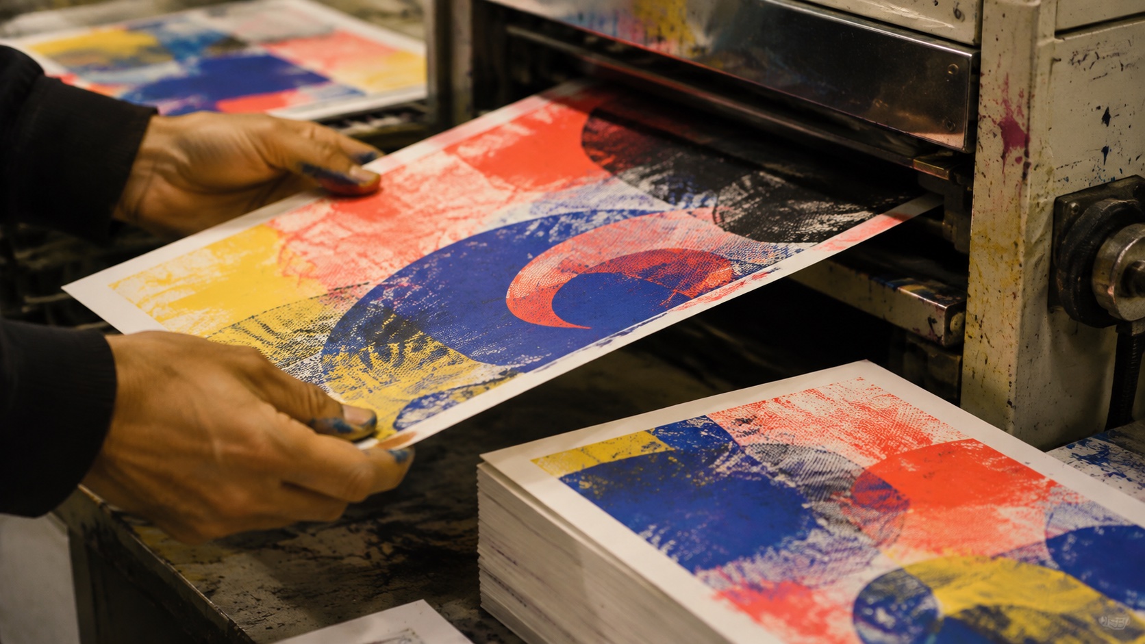
Print carried it forward. Corita Kent's screenprints in the 1960s left the ink rough and the letters loose, and the fly-posted street of the 1980s, Keith Haring's chalk line most of all, showed that one fast mark repeated across surfaces could hold an identity together without a logotype. The cheap presses of the following decades, silkscreen and then risograph, gave the look its texture: imperfect coverage, mottle, a slight misregistration, all on uncoated stock.

As a brand language it belongs to the last ten years. Independent food and drink, bookshops, cafés and small labels needed identities that felt handmade and optimistic, could be drawn by one person and run on any press. The answer was restraint: an oversized abstract glyph, a loose scribble, a smiley or a flower or a tomato, a tiny mono caption, a six-ink palette and most of the paper left empty. The discipline separates it from the wave of busy hand-drawn illustration that arrived at the same time.

Handmade but disciplined: one mark, six inks, a lot of paper.

Omoro dossier · 033-ND

Visual markers, Naïve Design aesthetic visual markers

The visual DNA: what makes it recognisable

typography

See the fonts
  • No headline face: the loose handwritten mark does the headline's job
  • A single oversized glyph, brush or marker, treated as the identity's main form
  • Tiny mono or bitmap captions in a column, small enough to read as texture

grid

  • One mark per surface, placed off centre, with generous empty paper around it
  • Small anchors in the corners: a symbol, a registration mark, a colour swatch strip
  • Surfaces split into flat colour fields, one colour per panel, can or cover

materials

  • Tomato red #E8412A, cobalt blue #1E3FCF, emerald green #1F8A4C, sulfur yellow #E8E322
  • Black #171515 for the mark that matters, cream #F2EBDD as the ground
  • Uncoated board, kraft, tissue paper, aluminium, ticket stock and wheat-pasted sheets

motifs

  • Oversized brush scribbles and looped glyphs in one colour
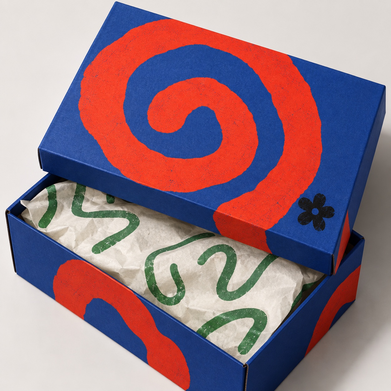
  • A smiley, a five-petal flower, a tomato, a spiral, three dots
  • Registration marks and printer's swatch strips left in as decoration
  • Screenprint grain, riso mottle, creases and imperfect ink coverage

Aesthetic profile

8-channel console with the fingerprint on its display. Save the card, or share the page

Aesthetic Profile
Naïve Design
1947-present · Cut-paper and screenprint traditions in France and the United States, now the print language of independent brands
Attribute console · 033-ND
leans analog, expressive, light
8 CH
FIG. 1
MinimalMaximalAnalogDigitalExpressiveRestrainedWarmCoolNostalgicFuturisticChaoticStructuredLightDarkOrganicGeometric
01Minimal
Maximal30%
02Analog
Digital70%
03Restrained
Expressive60%
04Cool
Warm50%
05Futuristic
Nostalgic20%
06Structured
Chaotic10%
07Dark
Light60%
08Organic
Geometric60%
AnalogExpressiveLight
Omoro · Attribute console · 033-ND
omoro.io/styles/naive-design

Color Palettes, Naïve Design color palettes and hex codes

The definitive color scheme for this aesthetic

Naïve Design
#E8412A · #1E3FCF · #1F8A4C · #E8E322 · #F2EBDD
Four inks on cream and no more: tomato, cobalt, emerald and sulfur printed rough, with black kept for the one mark that matters
Omoro Palette Pack575 curated palettes across every aesthetic, 5 export formats.
Get the palettes →
03
The direction

How to shoot it, how to prompt it, and how to board it.

Photo Direction

How to shoot this aesthetic

"Photograph the system in the world it was printed for: a billboard, a can, a menu on a table, a poster on a wall"

Shot list

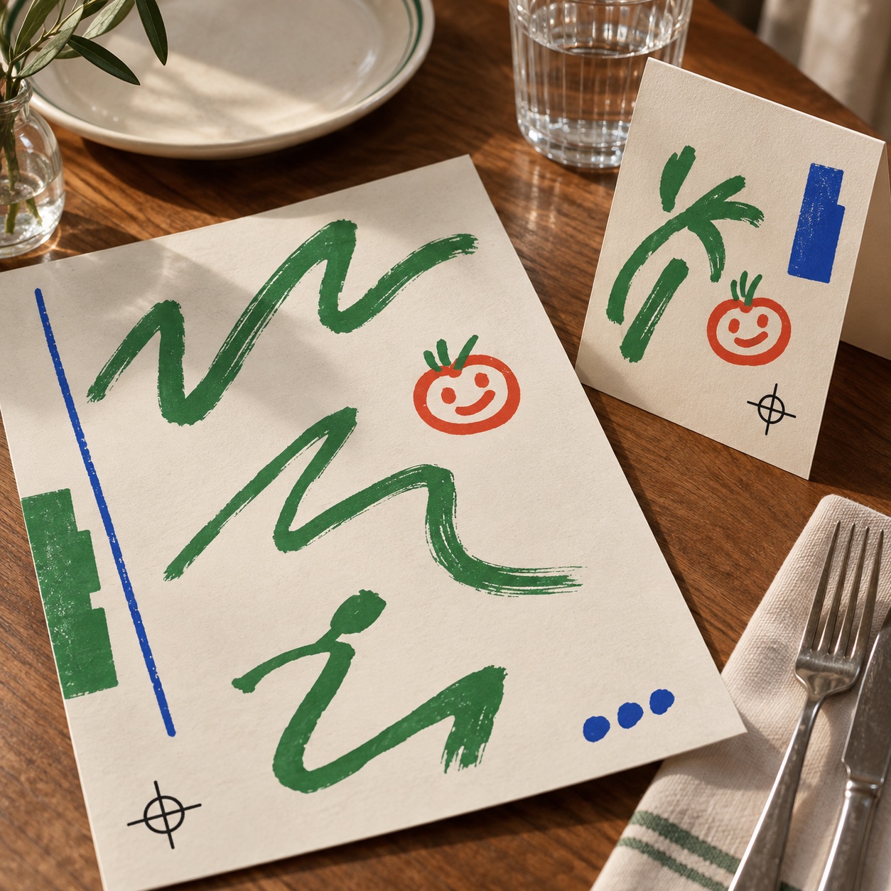
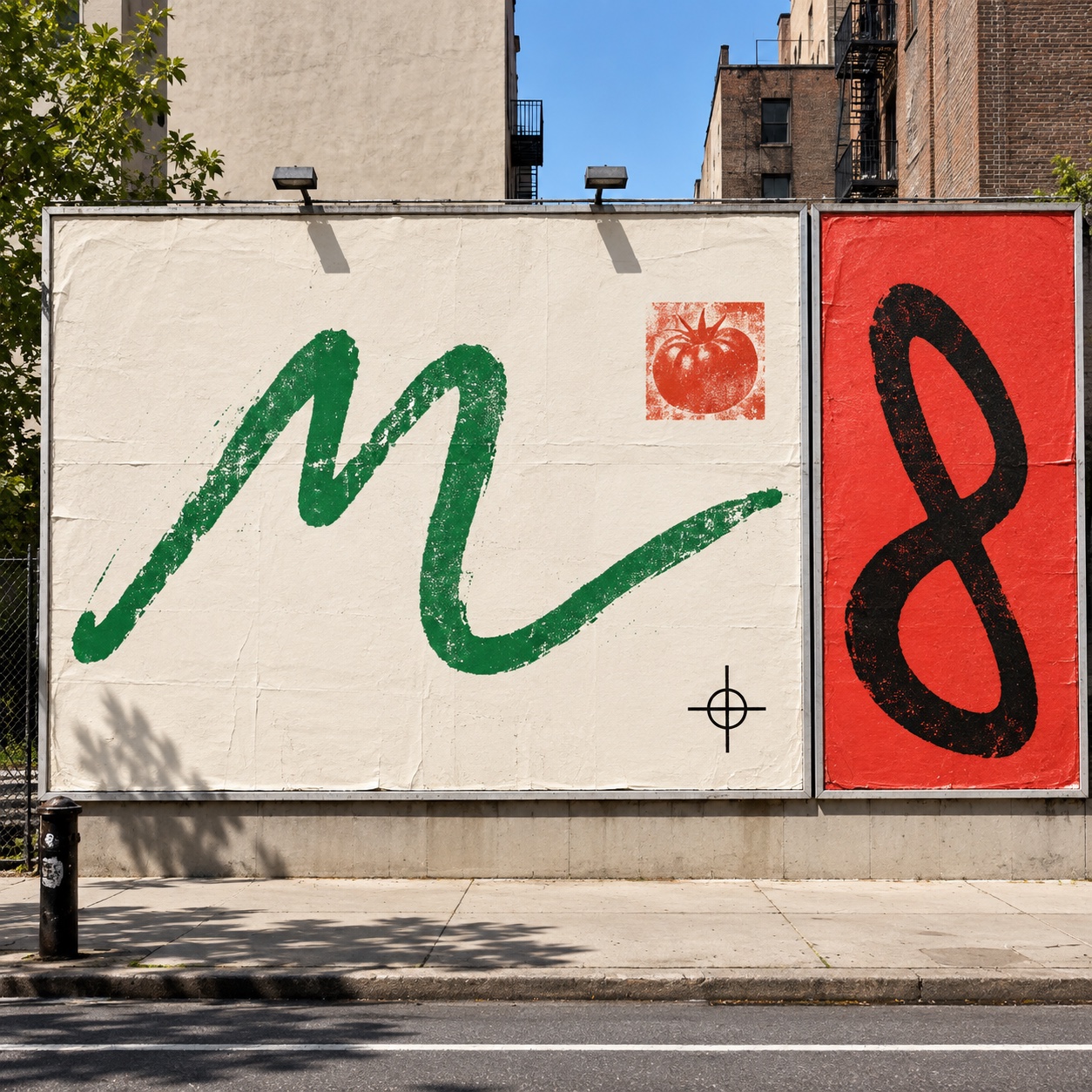
  • Wide shot of a street billboard split into two sheets: a cream panel carrying one huge emerald brush scribble and a small red tomato stamp, a tomato-red panel carrying one black looped glyph, wheat-paste creases visible
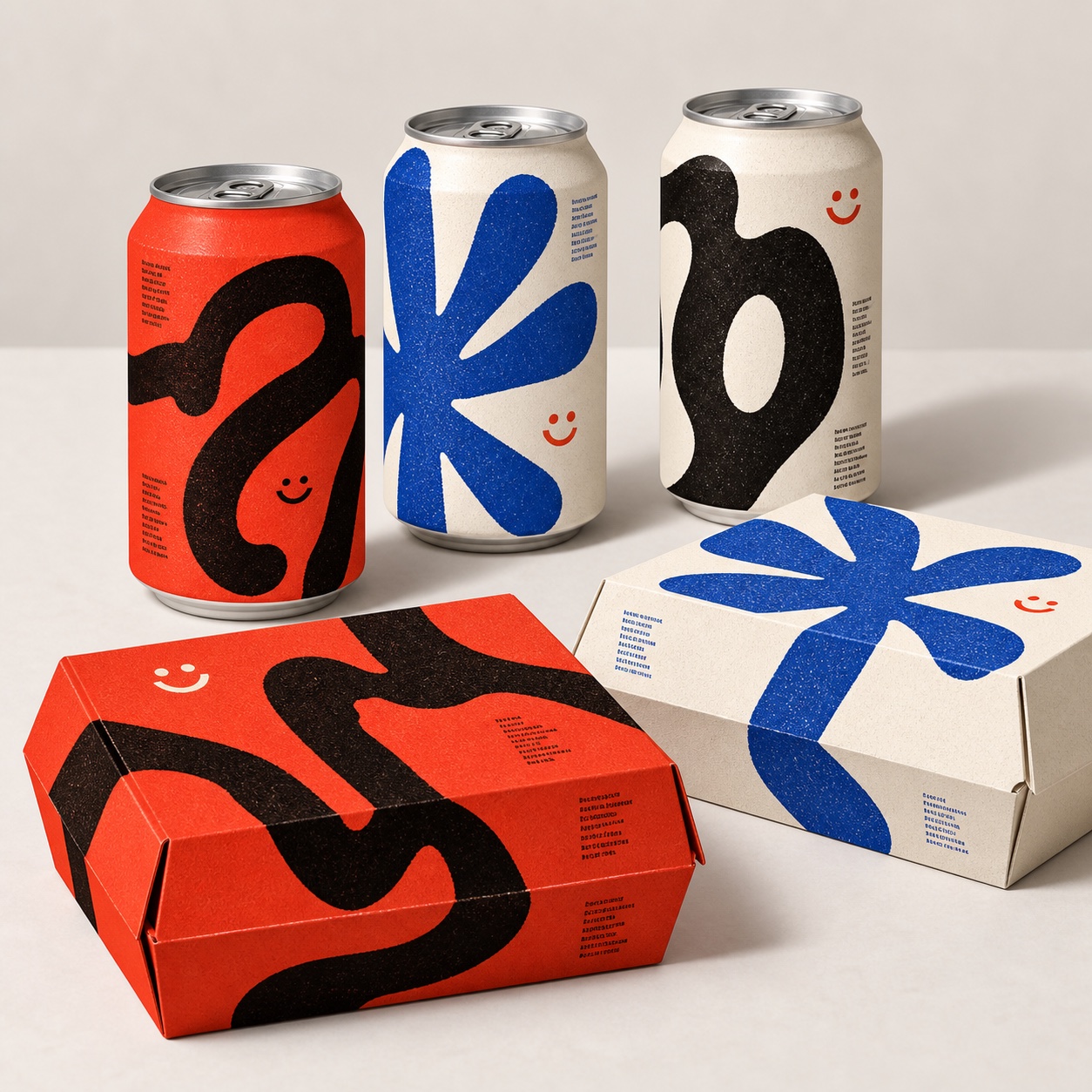
  • Product still of three cans and two folding boxes on a paper ground, each in one flat colour with a single oversized glyph and a small smiley, screenprint grain on the ink
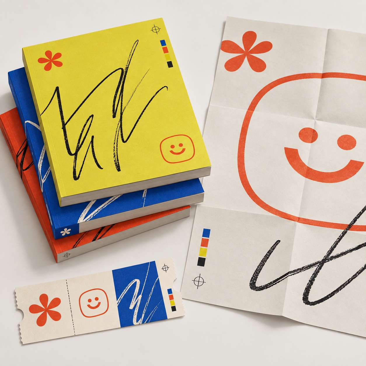
  • Overhead of a stack of books in sulfur yellow, cobalt and tomato with one black scribble per cover, beside a folded poster and a ticket stub carrying the same marks

Lighting

Plain daylight or a soft studio wash. No rim light, no colour gels. The ink texture has to read, so keep the light even and let the paper's tooth and the creases show.

Omoro Director's Briefs181 photo shot-lists like this one, ready to shoot from.
Get the briefs →

Generative Prompt

Drop this into Studio to generate in this aesthetic

Naive design brand identity aesthetic, handmade but disciplined, one oversized abstract brush glyph or loose handwritten scribble as the whole composition, simple symbols such as a smiley face, a five-petal flower or a tomato, raw screenprint and risograph grain with imperfect ink coverage, off-white uncoated paper, generous empty space, tiny registration marks and colour swatch strips as details, restricted palette of tomato red, cobalt blue, emerald green, sulfur yellow, black and cream, real-world print application, direct and optimistic, no busy illustrated scene, no characters, no gradients, no polished vector, no readable text, no logos

Paste as-is, or append your own subject

Mood Board

A Pro feature: a board generated from the record

A generated board, with membership

Opening soon

04
The judgement

Whether to use it, what it costs to do properly, and where it stands right now.

Creative verdict, Naïve Design feasibility and strategic recommendation

Two written calls, seven meters, and when to walk away

Creative verdict
Should Naïve Design be the call?
7 meters
FIG. 2
Assessment

Draw the marks by hand, print them rough and stop early. One oversized glyph, one small symbol, a caption in tiny mono and a lot of cream paper is the whole page, and the press supplies the grain. Keep to the six inks across every application. The moment a second mark, a scene or a gradient arrives, the system has lost its nerve.

Verdict

Right when the brand wants to feel handmade and optimistic and still behave like a system: independent food and drink, bookstores, cafés, community campaigns, cultural spaces, streetwear packaging, small-run print. Wrong when the brief needs authority or a story told in pictures. Draw fewer marks than feels safe, print them rough, and let the paper carry the rest.

Production cost
Low

A brush, six inks, uncoated stock and a screenprinter or riso. It is built to be cheap to run.

Creative difficulty
High

The whole identity rests on a handful of marks, so each one has to be the right one. Drawing badly on purpose is harder than drawing well.

Execution difficulty
Medium

The restraint is the difficulty: one glyph, one symbol, one small caption, and the discipline to leave the rest of the paper empty.

Risk of misuse
Medium

It slides into busy hand-drawn illustration or a corporate flat-vector wobble the moment the marks multiply or the hand is faked.

Prevalence
Emerging

Wobbly illustration is everywhere; the restrained version, one printed glyph and a lot of space, is still being worked out by independent brands and small studios.

Longevity
Enduring

The handmade mark has carried identities since Matisse's cut-outs, and print grain does not date.

Brand investment
Low

A small set of marks, six inks and a paper spec is the whole system; it scales by printing more things, not by adding rules.

Avoid if
The brand has to signal authority or precision
A rough-printed scribble says a person made this. Finance, legal and medical briefs need it to say a system did.
The plan is a vector wobble over clean shapes
The grain and the imperfect coverage come from a press. A filter reads as a filter, and the audience knows.
The story needs characters or scenes
This is one mark per surface with space around it. Once it fills up with illustration it has become a different style.
Omoro · Creative verdict · 033-ND

Editorial Depth

A Pro feature: origins, practitioners, and pitfalls

Editorial depth
The Naïve Design file
14 sections
FIG. 3
Context02Brands02Perception04Use04Index02
01Common MisconceptionThe principle beneath the surface
02Historical ContextOrigins, cultural moment, and reaction
03Brands That Accidentally Use This StyleNatural alignment, not category claims
04Brands That Perfectly Represent This StyleExceptional execution
05Psychological EffectHow visual decisions change perception
06Visual ChecklistInclude and avoid
07Creative FormulaThe visual system reduced to essentials
08Recognition SignalsHow to recognize it in two seconds
09When To Use This StyleContexts where the language performs
10Common Creative MistakesWhere imitation weakens the signal
11Best Brand ApplicationsIndustries with a natural advantage
12Creative Application AnalysisFit, feasibility, and production reality
13Related StylesClose languages and the key distinction
14Visual DNA SummaryThe sentence to remember
The editorial depth, with membershipOpening soon
Omoro · Editorial depth · 033-ND
05
The index

Neighbours, cross-references, blends, and the questions people ask.

Related concepts

Connected across the creative knowledge graph

Cultural relevance, Naïve Design cultural relevance today

Where it stands now, and what it costs you to use it

This is the current print language of independent brands that want to feel human without telling a story in pictures. Its advantage is economy: a handful of marks, six inks and a paper spec cover a can, a box, a menu, a book and a billboard, and the system reads as one voice on all of them. The grain and the creases are the proof that it was made by hand and run through a press, which is the quality audiences respond to.

The risk is the neighbour it gets mistaken for. The busy hand-drawn illustration wave, characters and scenes and a wobble applied in software, shares its palette and its warmth and has become a default. What keeps naïve design distinct is nerve: fewer marks than feels safe, real ink texture, and the space left empty on purpose.

Cross-references

RisographThe press that gives the marks their mottle and imperfect coverageHand-drawn DoodlesThe sketchbook cousin: many small marks where this uses one large onePoster CollageThe same street, the same paste, with layers where this leaves spaceMemphisShares the flat bright palette and the playful mark but builds pattern instead of restraintCorporate MemphisThe polished flat-vector version this style is a reaction against

Blend

Mix Naïve Design with any style in the library

Naïve Design×
50%50%
94% alike
Naïve Design referenceRisograph referenceNaïve Design 50%Risograph 50%

Merged palette

#E8412A

#FF48B0

#1E3FCF

#0078BF

#1F8A4C

Leads analog, expressive, light

Typography · from Naïve Design

Caveat over Lora

Materials

  • Tomato red #E8412A, cobalt blue #1E3FCF, emerald green #1F8A4C, sulfur yellow #E8E322
  • Black #171515 for the mark that matters, cream #F2EBDD as the ground
  • Riso standard inks: fluorescent pink #FF48B0, blue #0078BF, yellow #FFE800

Use it

Naive design brand identity aesthetic, handmade but disciplined, one oversized abstract brush glyph or loose handwritten scribble as the whole composition, simple symbols such as a smiley face, a five-petal flower or a tomato, raw screenprint and risograph grain with imperfect ink coverage, off-white uncoated paper, generous empty space, tiny registration marks and colour swatch strips as details, restricted palette of tomato red, cobalt blue, emerald green, sulfur yellow, black and cream, real-world print application, direct and optimistic, no busy illustrated scene, no characters, no gradients, no polished vector, no readable text, no logos (50%), infused with Soy-ink layered spot-color printing, visible halftone grain, deliberate misregistration between ink passes, limited two-or-three-color palette, transparent ink overlap producing accidental third colors, flat matte paper texture, zine-culture graphic economy, color palette strictly #E8412A #FF48B0 #1E3FCF #0078BF #1F8A4C, overall character: analog, expressive, light

One-click generation opens with the studio

About this aesthetic

What is naïve design?

Graphic naïveté used as a real identity system. Oversized abstract glyphs, loose handwritten marks and simple symbols such as a smiley, a flower or a tomato, printed with raw screenprint or risograph grain on off-white uncoated paper, in a restricted palette of tomato red, cobalt blue, emerald green, sulfur yellow, black and cream, with generous empty space. It is handmade but disciplined, and it lives in packaging, posters, menus, books, labels and printed ephemera.

How is it different from hand-drawn doodles or kidcore?

Doodles are sketchbook energy, small and fast and many. Kidcore is nostalgia for childhood objects and colour. Naïve design is a system: one mark per surface, a fixed set of inks, real print texture and space around everything. It is drawn simply on purpose, aimed at adults, and made to repeat across everything a brand prints.

Will it make a brand look unprofessional?

Not if the restraint holds. Decide the few marks, keep to the six inks, print on real uncoated stock and leave the paper empty. The look turns amateur when marks multiply, when a scene creeps in, or when the grain is a filter rather than a press. Briefs that need authority or precision should use something else.

Build with the naïve design aesthetic

Every style in the library is broken down like this one: the palette, the typography, the materials and the lineage.

Explore the style library →